How Fintech Products Build Real User Trust: Emotional UX Design in Practice

TL;DR
When users open fintech apps, they need more guidance and attention than in most other digital products—because money carries weight that ordinary products don’t. Users want to feel oriented and in control, making emotional design a strategic differentiator in financial services.
Why Surface-Level Emotional Design Falls Short:
- Cosmetic responses address visual harshness, not real source—uncertainty and loss of control
- Conflating simplicity with clarity, stripping context users need for reassurance
- 70% of institutions lost clients to inefficient onboarding (Fenergo 2025)—missed trust opportunity
3 Structural Qualities That Build Trust:
- Perceived control—unambiguous statuses, timestamped balances, helpful errors
- Predictability—consistent actions building reliable mental models
- Emotional continuity—coherent tone across email, app, web, support
The Article Goal: To provide you with framework for designing fintech products with emotional awareness—building unified experiences that give users the guidance, clarity, and confidence they need when interacting with their finances.
Money carries weight that few other things in a product do. Even confident, financially secure users tend to approach financial apps with a little more caution — a moment of attention before they tap, a quiet need to be sure before they act.
That is the nature of fintech. Users come with questions they want answered clearly: whether a payment went through, whether a balance covers what it needs to, whether everything is as it should be. The app is where they come to find out. And how the product responds in those moments — whether it offers reassurance or leaves room for doubt — is entirely a design decision.
This is one of the most underaddressed opportunities in fintech today. Not speed. Not features. Not onboarding conversion. The quality of the emotional experience — how supported, informed, and in control a person feels while managing something that matters to them.
In this article, you can learn how financial anxiety shapes user behavior in fintech products, why most emotional design approaches fail to address it, and what a system-level solution actually looks like.
What Is Financial Anxiety, and Why Does It Affect Every Fintech Interaction?
Financial anxiety is a persistent pattern of stress and worry around money. It is not limited to people in financial difficulty — and it directly shapes how people relate to the apps that hold their money.
A 2025 State of Fintech survey by the Financial Technology Association found that 79% of consumers feel a greater sense of control over their finances when using fintech tools compared to traditional banks — and that user-friendly design is the single highest priority for consumers choosing a financial product, named by 89%. In other words, the thing users want most from a financial app is the feeling of being in control. That is not a feature request. It is an emotional one.
What makes financial anxiety relevant to product design is how it changes user behavior. Users are more likely to scan for reassurance before they act. They interpret ambiguous information as negative. They abandon flows at the first sign of uncertainty. They do not explore — they execute the minimum necessary and leave.
This means every design decision in fintech product operates on top of an emotional baseline that most teams never explicitly design for. The default assumption is a curious, confident user. The actual user is braced.
That gap — between the user teams design for and the user who actually shows up — is where financial anxiety does its damage.

Why Do Most Emotional Design Efforts Fail to Reduce Financial Anxiety?
Emotional design is the practice of shaping how a product makes people feel — not just how it functions. In fintech, this is not optional. The emotional quality of the experience is directly tied to whether users trust the product with their money.
But the most common response to financial anxiety in product teams is cosmetic. Softer color palettes. Rounded corners. Friendly illustrations. Warmer microcopy. These are legitimate emotional design choices — but they address the surface of the anxiety, not its source.
Financial anxiety is driven by uncertainty and loss of control, not visual harshness. A user who does not understand why a transaction is pending does not feel better because the loading screen has a pleasant illustration. A user who receives an unexplained error message is not reassured by rounded corners. The anxiety comes from not knowing — and only clarity resolves that.
There is also a common trap in emotional design: conflating simplicity with clarity. A simplified interface removes information to reduce cognitive load. A clear interface gives users exactly what they need to feel oriented and in control. When teams strip the interface down in pursuit of “clean design,” they often remove the context that reduces anxiety — forcing users to dig for answers precisely when they need immediate reassurance.
Fenergo’s 2025 Financial Crime Industry Trends Report, based on a survey of 600 senior decision-makers, found that 70% of financial institutions lost clients due to inefficient onboarding — the highest rate on record. That is emotional design failure at the first moment of trust. But the same failure can recur throughout the product — in every ambiguous status and every notification that arrives without context.
How Does a Fragmented Product Experience Make Financial Anxiety Worse?
Financial anxiety does not spike in a single moment. It accumulates — and product fragmentation is the mechanism that feeds it.
Consider a scenario most fintech users have lived. An SMS arrives about a suspicious transaction. The user opens the app — but the interface looks nothing like the message format. There is no reference to the alert. They find a support chat, where the tone, the visual logic, and the information available to the agent are all disconnected from everything else. Each step functions in isolation. Together, they create an experience of incoherence that signals: something is wrong here.
Trust in a product is built through pattern recognition and repetition. When users interact with a consistent system, they develop a mental model — an internal map of how the product works. That mental model is what allows financial anxiety to decrease over time. Without it, every session starts from zero. The user never relaxes into the product. They remain perpetually on guard.
Fragmentation breaks the conditions for that mental model to form. Different voices, different visual languages, different levels of clarity across the mobile app, the email, the web dashboard, and the support chat — each inconsistency is a small signal that the system is not coherent. In a domain already primed by financial anxiety, those signals compound.
This is why emotional design in fintech cannot be solved at the screen level. It requires a unified experience system — coherent logic, consistent language, and a shared emotional register across every touchpoint. When the experience fragments, anxiety fills the gaps. This is the core of our approach to UX design for fintech — building one coherent system across every surface a user touches.
What Does Emotional Design That Reduces Anxiety Actually Look Like?
Effective emotional design for financial anxiety does not start with aesthetics. It starts with three structural qualities: perceived control, predictability, and emotional continuity.
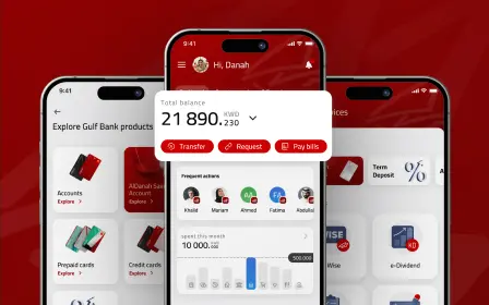
Perceived control directly counters the core mechanism of financial anxiety. When users know what is happening at every moment — when statuses are unambiguous, errors are explained, and next steps are always clear — the anxiety response has nothing to latch onto. Balance updates are timestamped. “Processing” and “Completed” are never treated as interchangeable. Error states explain what went wrong and what to do next. The interface never leaves a user in silence.
Predictability allows users to build the mental models that reduce anxiety over time. The same action produces the same result every time. Notifications follow a consistent format. The interface behaves identically between sessions. This is not about being boring — it is about being trustworthy. A product that surprises users, even pleasantly, is one they cannot fully relax into.
Emotional continuity means the experience maintains a coherent tone and logic across every surface. The email after a transaction should feel like it came from the same product as the app confirmation screen. Support should have access to the same context. The web dashboard should reinforce what the mobile app communicates. This is where most fintech emotional design fails — not within individual screens, but in the transitions between them.
When these three principles work together, the cumulative emotional effect is significant. Financial anxiety does not disappear — but it stops being amplified. The product becomes something users can trust consistently, which is the precondition for engagement, retention, and long-term loyalty.

Specific emotional design patterns that reduce financial anxiety in practice:
- Progressive disclosure in onboarding — one piece of information at a time, paced to reduce cognitive overwhelm
- Calm confirmation states after high-stakes actions — closing the psychological loop before uncertainty can form
- Plain-language explanations at decision points — no assumed financial literacy, no unexplained jargon
- Transparent waiting states — a specific timeframe and a human tone, never a silent loading indicator
Putting these patterns into practice starts with the right process — we break it down in our guide to design thinking in fintech.

How Should Product Teams Act on Financial Anxiety?
Treating financial anxiety as a design variable changes what product teams measure and where they invest.
Not every screen carries equal emotional weight. Transfers, errors, pending states, and onboarding are where anxiety concentrates. These are the moments users remember — and the ones that decide whether they stay. Auditing them first gives product teams the highest return on emotional design investment.
Consistency at scale requires a design system. The most effective structural response to financial anxiety across a growing product is a coherent design system — one that governs visual language, interaction patterns, tone, and component behavior across every surface. This is not a branding investment. It is consistency infrastructure. When the product speaks the same language everywhere, users can form the mental models that transform anxiety into confidence.
Emotional quality is a competitive advantage. The fintech market is crowded with products that are functionally equivalent. Features get copied. Speeds converge. What cannot be easily replicated is the feeling of using a product that consistently makes users feel safe and in control. Emotional design is the mechanism for building that feeling — and the teams that invest in it systematically are building something their competitors cannot quickly match. If you’re weighing who can help build that, our overview of the top fintech design agencies is a useful place to start.

Beyond the strategic shift, there are some practices any product team can apply to reduce financial anxiety. These are the moves that consistently move the needle:
- Audit your error and empty states first. Anxiety lives in the moments when something goes wrong or nothing is there. Every error message should name what happened and what the user can do next. Every empty state should explain why it’s empty and what to expect.
- Make money movement visible at every step. When funds leave or enter an account, show the user exactly where they are in the process — initiated, processing, completed — with realistic timeframes. Never let a transfer disappear into silence.
- Write status language for an anxious reader. Replace ambiguous labels with specific ones. “Pending” tells the user nothing; “Arriving by Thursday, June 12” tells them everything. Specificity is reassurance.
- Standardize tone across every channel. Define one voice for the app, emails, push notifications, and support — and document it. A user should never feel they’ve been handed off to a different company mid-task.
- Design the waiting, not just the result. Loading and processing states are where anxiety concentrates. Use a human tone, a clear timeframe, and a sense of progress rather than a blank spinner.
- Test for emotional response, not just task success. In usability testing, ask how confident and calm users felt — not only whether they completed the task. A flow can be 100% completable and still leave users anxious.
- Build it into the design system. Codify anxiety-reducing patterns — status components, error templates, confirmation states — into reusable system elements so consistency holds as the product scales.
The throughline across all of these: reduce uncertainty wherever it appears, and keep the experience coherent wherever the user goes.
Conclusion
Financial anxiety is structural. It will not go away as products improve or markets stabilize. Users will continue to arrive at fintech products carrying real emotional weight — because money is, and will remain, one of the most consequential parts of daily life.
The products that earn lasting trust are not those with the most features. They are those that understand the emotional state of the people using them — and design for it deliberately, at every level, across every surface.
Emotional design for financial anxiety is not a layer added on top of a functional product. It is a quality built into the system from the start — through perceived control, predictability, and coherence across every touchpoint.
With 19+ years of experience and over 700 projects delivered across fintech and financial services worldwide, Qubstudio designs exactly that. Unified digital experiences where the emotional experience is as intentional as the functional one.
Let’s Build a Fintech Experience Users Can Trust
FAQ
What is emotional design and why is it critical for fintech products?
Emotional design shapes how a product makes people feel—not just how it functions. In fintech, this isn’t optional: the emotional quality of the experience is directly tied to whether users trust the product with their money.
Most teams design for a curious, confident user. The actual user is braced. That gap between the user teams design for and the user who actually shows up is where financial anxiety does its damage.
Why do most emotional design approaches fail in fintech?
The most common response is cosmetic: softer color palettes, rounded corners, friendly illustrations, warmer microcopy. These are legitimate emotional design choices—but they address the surface of anxiety, not its source.
Financial anxiety is driven by uncertainty and loss of control, not visual harshness. Fenergo’s 2025 Financial Crime Industry Trends Report (600 senior decision-makers) found 70% of financial institutions lost clients due to inefficient onboarding—the highest rate on record. That’s emotional design failure at the first moment of trust.
What's the difference between simplicity and clarity in fintech UX?
A simplified interface removes information to reduce cognitive load. A clear interface gives users exactly what they need to feel oriented and in control. These are different qualities often confused by design teams.
When teams strip interfaces in pursuit of “clean design,” they often remove the context that reduces anxiety—forcing users to dig for answers precisely when they need immediate reassurance. Clarity beats minimalism in financial products.
Which principles of emotional design effectively reduce user anxiety?
Three structural qualities address financial anxiety:
- Perceived control—users know what’s happening at every moment, statuses are unambiguous, errors explained with next steps
- Predictability—same action produces same result every time, consistent notification formats
- Emotional continuity—coherent tone and logic across every surface, from email to app to support
When these three principles work together, financial anxiety stops being amplified. The product becomes something users can trust consistently—the precondition for engagement, retention, and loyalty.
What practical steps reduce financial anxiety in fintech products?
Seven concrete moves consistently move the needle:
- Audit error and empty states first—name what happened and what user can do next
- Make money movement visible—show exactly where users are in the process with realistic timeframes
- Write status language for anxious readers—”Arriving by Thursday, June 12″ beats vague “Pending”
- Standardize tone across channels—one voice for app, emails, push, support
- Design the waiting, not just the result—human tone, clear timeframe, sense of progress
- Test for emotional response—ask how confident and calm users felt, not just task completion
- Build it into the design system—codify status components, error templates, confirmation states
The throughline: reduce uncertainty wherever it appears, keep experience coherent wherever the user goes.