The Art of UX Storytelling: Resonating With Users
TL;DR
UX storytelling transforms research insights into narratives that help teams design products centered on real user needs and motivations.
Key Elements of UX Storytelling:
- User as Main Character — design around users’ goals, motivations, and pain points, not features
- Narrative Frameworks — use Story Circle, Working Backwards, or storyboarding to map user journeys
- Data → Stories — transform research insights into relatable scenarios that humanize complex data
- Emotional Connection — create experiences that resonate, build trust, and foster loyalty
The Article Goal: To provide you with storytelling frameworks and methods that bridge the gap between user needs and product decisions, creating human-centered experiences that truly resonate with users.
Have you ever used a product or service that felt like it truly understood you — your goals, views, and lifestyle? It’s an empowering feeling, isn’t it?
But connecting meaningfully with users’ diverse needs is no small feat. We each carry complex inner worlds, shaped by personal backgrounds, cultural trends, and historical events. Many companies don’t strive to comprehend these subtle differences and rely on broader assumptions instead.
So, how might you create experiences that resonate with users’ authentic experiences? The answer is thoughtful UX storytelling.
Why should UX research and storytelling go hand in hand, and how does this combination foster understanding between product creators and users?
And, most importantly, how can you use this approach to satisfy your customers and benefit your business?
Read on to learn more.
What Is Storytelling in UX Design?
The essence of storytelling in UX boils down to creating narratives to understand users better and design products to meet their needs. It’s about seeing product design through the lens of users’ motivations and pain points. Stories enable us to connect on an emotional level. Products that share a similar narrative will foster the same sense of relatability.
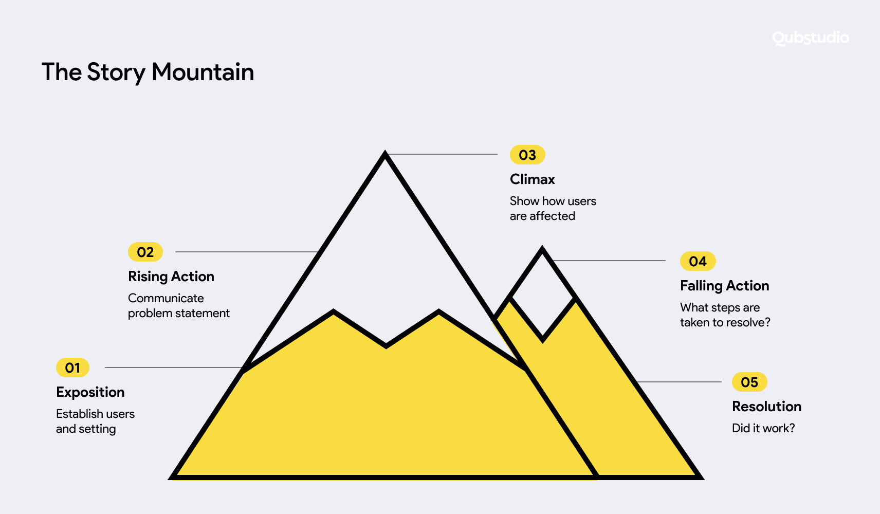
User personas are a powerful UX storytelling tool. Well-developed personas transform raw user research into engaging profiles that humanize target segments. These fictional-but-factual archetypes bring accuracy through background details of their context and unique wants.
Thus, with storytelling for user experience, you imagine the user as the key character in their own story. They may face rising tension and conflict in their quest for resolution. But what should that conflict be? Visualizing the arc of a target user can reveal this. Let’s explore a common example below.
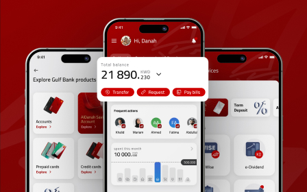
Fintech products tend to be complex, with loads of data and tables. You could create a story about a person who misses the bygone days of laying out their budget with a few spreadsheets, which was much easier, although not that effective. Now, they feel overwhelmed navigating interfaces filled with information. Understanding this tension allows you to better understand the barriers facing your users and uncover opportunities to streamline their user experience.
With this arc in mind, you can then introduce a succinct fintech app’s microcopy, explaining the context and reasoning behind each screen. Or you can reveal information progressively instead of all at once.
Therefore, UX design storytelling relies on familiar narrative structures and, thus, allows for creating sticky user experiences.
Let’s explore the benefits of transforming a utility-driven UX into a matching design.
Benefits of Storytelling for User Experience
Slick interfaces and neat features are great. But they’re useless if they don’t resonate with users. Here’s how you can benefit from storytelling in UX design:
- Guide unified decision-making. Stories keep the customer front and center in decision-making processes. From ideation and design to post-launch optimization, storytelling in UX reminds cross-functional teams of actual living target users with goals and obstacles that products and services must address. So, there’s less temptation to accidentally switch to technical feasibility.
- Humanize complex data. The raw data from surveys, interviews, and analytics tools often fails to reveal underlying behaviors and motivations. UX storytelling transforms this complex quantitative and qualitative data into relatable stories about target users and brings those “aha moments” to the table.
- Explore edge cases. Typical user personas concentrate on mainstream archetypes like “busy moms” or “working professionals.” But smaller niche segments still make up pieces of the total pie. Storytelling will allow you to cover all bases.
- Increased trust and loyalty. Scientists have found that good stories release the hormone oxytocin, which promotes social bonding. When you approach your end users with empathy and deliver products that fully align with their needs, that forms a connection. Users will know they’re seen and listened to and will be coming back for more.
- Enhanced team collaboration. Storytelling in UX design not only helps end users directly but also fosters teamwork. Product teams may struggle to balance design ambitions with development constraints. However, sharing real-life stories about users helps connect these differing perspectives.
Ultimately, well-crafted narratives will allow you to see real users’ preferences and struggles and offer them corresponding solutions. Now, let’s bring these benefits to life with UX storytelling tips and best practices.
How to Make a Good Story
When starting a new digital product design project, it’s best to lay the groundwork before putting on your writer’s hat and diving into a story.
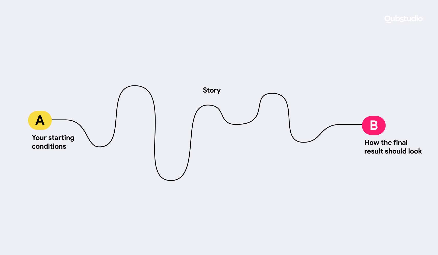
- A — Your starting conditions. Fully immerse yourself in understanding users’ current realities and business priorities. It’s necessary to uncover existing pain points across all audience groups and define their main goals.
- B — How the final result should look. Equally crucial is envisioning the ideal future state that addresses the needs of both customers and the company. What emotional, cognitive, or behavioral shifts do you want to achieve?
- The third element is the one that guides you from A to B, and this is a story. The story connects the initial user struggle to an eventual solution, bridging knowledge gaps and empowering people to address their needs with your product.
Aside from the basic tips outlined above, there are some comprehensive frameworks for your UX design storytelling.
Dan Harmon’s Story Circle as a Storytelling Framework
Joseph Campbell’s “Hero’s Journey” structure is one of the strong narrative frameworks that reveals common plot rhythms across myths and legends over centuries. Dan Harmon’s Story Circle model is a modern interpretation used extensively today. Let’s review this and more frameworks further.
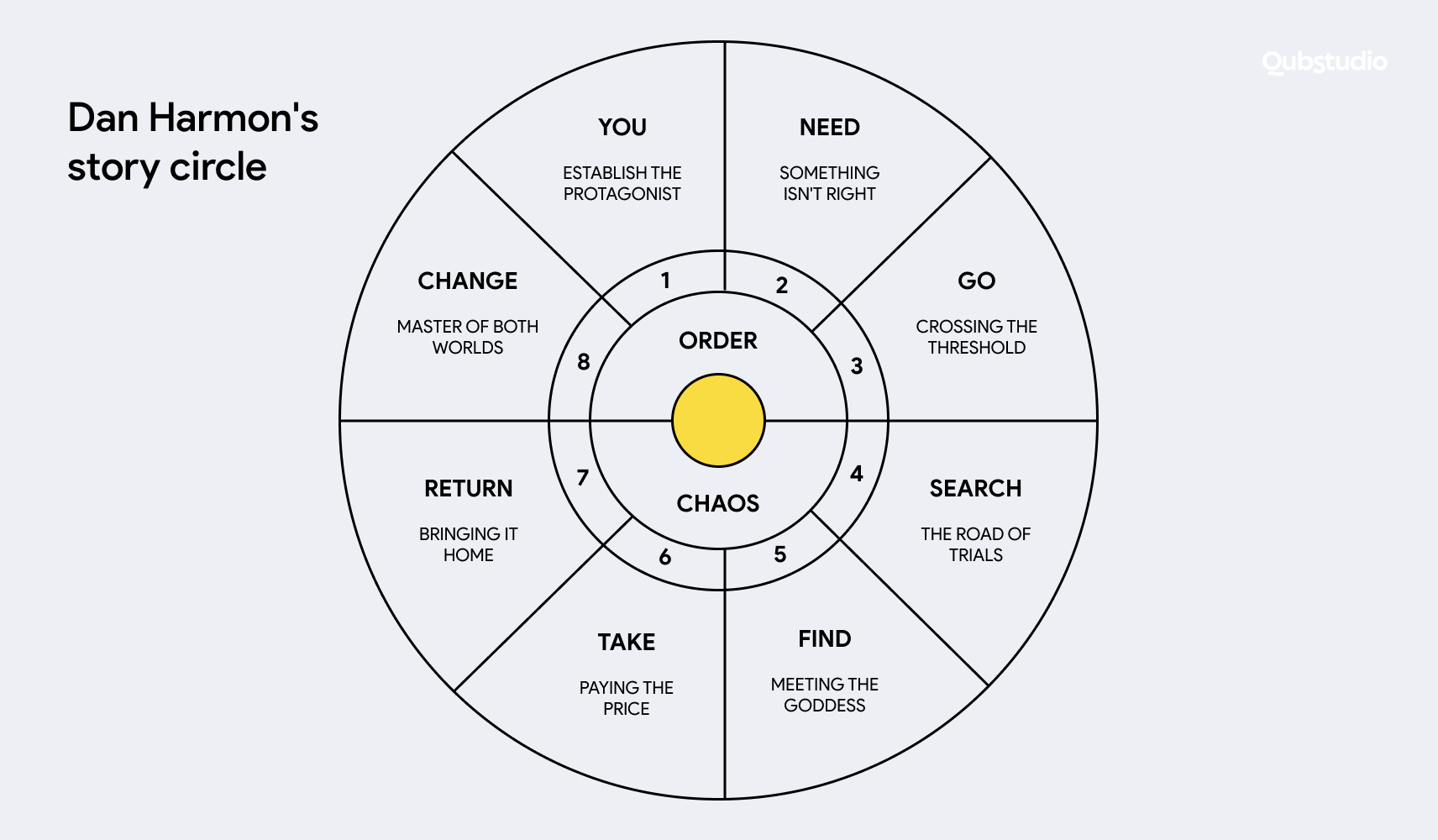
Dan Harmon is a writer best known for creating the TV shows Community and Rick and Morty. One of Harmon’s most useful concepts for fellow writers is something called the Story Circle.
The idea is pretty simple: All good stories tend to follow a similar narrative arc. Harmon’s Story Circle captures that arc in a lean eight-step framework.
Let’s walk through those steps briefly and how they translate into user experience terms:
1. You.
This step represents the users’ default state before encountering your product.
Possible questions to answer: Who is our user? What’s their background? What are their technical skills? What is their job?
Let’s take Dave as an example.
Dave is a young professional in his early career. Technical proficient. Works in a bottom-line position.
2. Need.
Next comes articulating the users’ conscious or subconscious desires for improvement. This sows the seed that the status quo may not fully meet evolving needs.
Possible questions to answer: What is their problem? Is the need big enough? Why is the need so big that our hero starts our adventure?
Dave works hard and is willing to prove he’s the best. Spending time cooking isn’t a priority, but he still needs to eat every day, and preferably, healthy food.
3. Go.
Now, users step outside their habitual comfort zones and engage with new approaches. In user experience terms, this may be finding, downloading, and opening an app.
Possible questions to answer: What is the starting point of the interaction? How does the user find the entry point? Do they require guidance? Do they need onboarding? What is the medium the user is working with? Do we speak the same language as the user?
Dave hears colleagues mention a new app, Eatr. The app offers meals from local restaurants with healthy, mouth-watering options. Dave decides to try it out. He opens the app, and the screen becomes filled with delicious offers for dinner. The interface is straightforward, so Dave starts browsing right away.
4. Search.
Much like a hero embarking on a quest for treasure in uncharted territory, users start looking for what they need using your solution.
Possible questions to answer: What is the actual user flow to reach the goal? How fast should they learn? What challenges are they facing?
Dave eagerly browses the app’s selection of salads, grain bowls, and other nutritious meals within his budget.
5. Find.
Foreign concepts start fulfilling previously unmet needs, i.e. users find what they need with the help of your solution.
Possible questions to answer: What is the final reward? Is that enough? Is that what the user was looking for? What is the shape of it? How is it represented? How do you deliver it?
Dave quickly finds a suitable meal from his favorite cafe.
6. Take.
At this stage, the user actually takes what they need. Your task here is to make this process as seamless as possible.
Possible questions to answer: What is the interaction cost? Are there any blockers along the road? Do we nudge the user nicely to finish the interaction? Do we thank our users enough for that? Was it an emotional revelation?
Dave places an order. Eatr offers intuitive checkout, so the process takes him a couple of taps. Dave presses “Confirm the order.” He receives a notification that his dinner is being prepared and will arrive in 25 minutes.
7. Return.
Users return to the familiar situation, i.e. complete the interaction.
Possible questions to answer: How does a user go back after the interaction is finished? What are the challenges abound the way? Do they have a shortcut? Do they understand the way to go back?
Nothing else Dave needs to do. Dave puts the phone aside and returns to what he was doing before. As the order is being prepared, he gets status updates, such as “Your order has been confirmed”, “Your order has started to be prepared ”, “Your order has been picked up”, and so on.
8. Change.
In user experience terms, change means that a user’s need has been addressed — that is, the initial state has changed. Your task is to communicate this change to the user properly and ensure that this change will linger (i.e. the user will continue using the solution).
Possible questions to answer: How has the system been changed? What is the new state? Has the need been addressed? How do we communicate the new state? What are visible changes a user sees? Are those changes permanent?
After Dave gets “Your courier is waiting for you”, he opens the door and the courier hands him the order. Once the order is completed, Dave receives a reward (20 tokens) for the order: 10 tokens are equal to a dollar, which Dave can use to order something for free. It turns out that eating healthy doesn’t require much time and a big budget. What’s more, the reward program makes the process fun.
The Story Circle provides a template for a user’s journey when adopting a new product.
By following these stages, from established routines to potential struggles associated with trying new tools, you can design products that truly match the user’s worldview and needs.
Furthermore, you can derive even more insights from your UX storytelling by mixing the Story Circle with the following frameworks.
The Working Backwards Method
Used by Amazon, Working Backwards flips the typical product development order — you start by defining the ideal end vision before jumping into requirements and execution.
Say you’re creating a new HR tech SaaS product. Instead of fixating on features, you focus first on creating a narrative arc of your potential user journey.
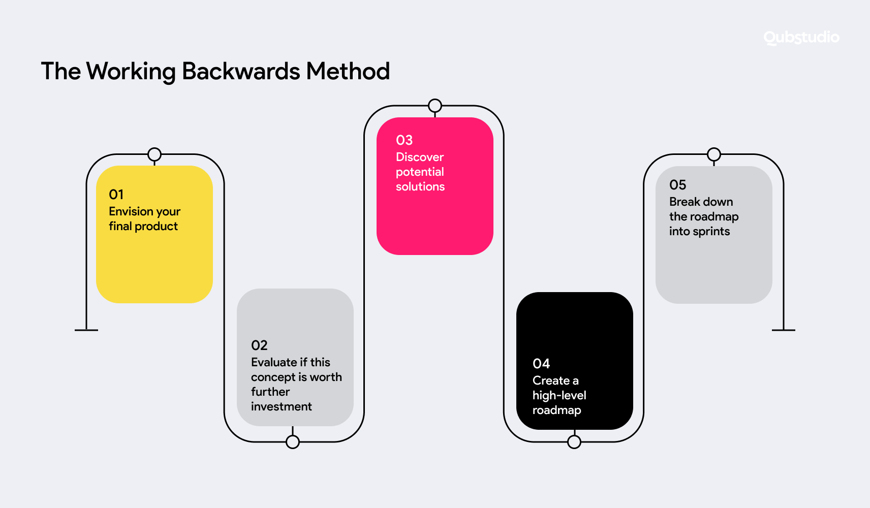
Here are the steps:
- Envision the end customer experience and market offering, summarizing them in a press release. You might outline how your HR tech product would delight users by making leave request approvals fast and transparent while reducing managers’ workloads.
- Use the draft press release to evaluate whether this concept is worth further investment. You might assess the demand for automated leave management balanced against the cost of its development.
- Research potential design solutions to deliver the customer experience outlined in the press release. Interview target users on solutions feasibility and refine based on feedback. You might consider creating simple one-click approval interfaces that allow managers to monitor employee requests and history.
- With a validated concept, map out a high-level roadmap to deliver value incrementally. The initial phase might focus on employee self-service for common leave requests. The next phase could layer in manager approval workflows. The last phase may incorporate expanded HR analytics and customizations.
- Break down the roadmap releases into actionable sprints.
Storyboarding Workshop Method
Within this framework, team members sketch flow storyboards while discussing challenges. This method lets you identify the user journey’s logical gaps and opportunities earlier on when changing course is cheaper.
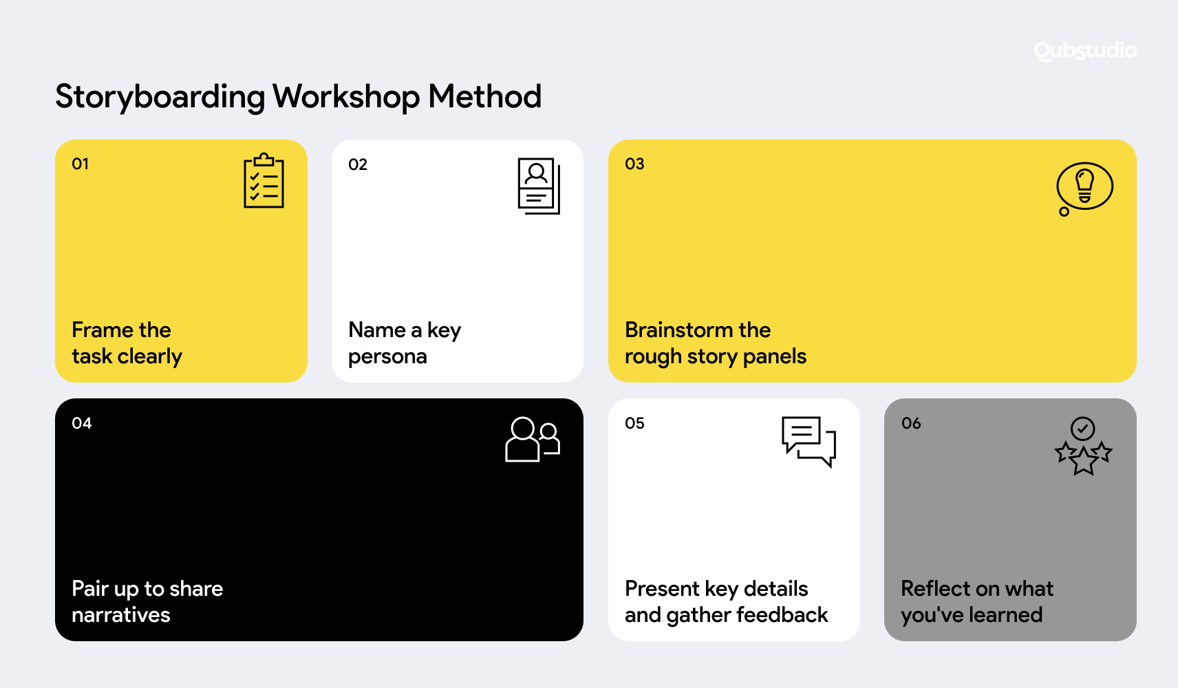
Here are some tips to host effective UX storyboarding workshops:
- Frame the task clearly around a priority user flow, such as onboarding, search, and purchase. Name a key persona. Offer a sentence summary like “First-time Etsy buyer finds handmade gifts.”
- Brainstorm and sketch the rough story panels individually. Using pencils and sticky notes, quickly capture key moments that communicate the essence of the user’s emotional journey and key actions.
- Pair up to share narratives. Discuss differences in sequence, assumptions, and questions that arise. Refine together — the diversity of perspectives leads to richer storyboarding.
- In the wider group, present key details from your narrative and gather feedback. What resonates/surprises about the sequence? Where might users disconnect?
- Reflect on what you’ve learned. Identify promising ideas and open questions to prototype later. Prioritize the most uncertain areas to explore first after the workshop.
By sketching narratives centered on critical user interactions, you can reveal a diversity of perspectives and ultimately connect planned experiences with user expectations.
Each framework has unique strengths that address different aspects of effective UX design. Dan Harmon’s Story Circle offers a fundamental narrative arc. The Working Backwards method puts the ideal user vision first before technical specifics. And collaborative storyboarding workshops uncover diverse insights early.
UX Storytelling with Qubstudio
Our team of 75+ professionals has successfully served clients from various niches, including healthcare, EdTech, logistics, and more. We know that no two businesses are alike and that there are real people with struggles and desires behind every product.
That’s why we make UX storytelling central to our design process and dive deep to understand your customer’s needs and perspectives.
Conclusion
Creating digital products that resonate with users can be challenging. People have diverse perspectives shaped by individual life experiences. Furthermore, designers may carry their own biases that influence solution designs. This gap between team assumptions and user realities threatens project success.
Thoughtful UX storytelling bridges this gap. It provides frameworks for deeply understanding target users beyond simplistic personas. Combining UX research and storytelling allows you to immerse in users’ struggles and uncover the authentic emotional and practical needs waiting to be addressed.
FAQ
How can user research inform a compelling UX narrative?
User research provides the foundation for UX storytelling by revealing real user behaviors, motivations, and pain points. Instead of relying on assumptions, designers transform qualitative and quantitative data into relatable user stories and personas, making insights more actionable and human-centered.
What are the key elements of an effective UX storytelling framework?
An effective UX storytelling framework includes the user’s current state, their needs or challenges, and the journey toward a desired outcome. Narrative structures like Dan Harmon’s Story Circle help map this journey through stages such as need, search, solution, and change, ensuring a clear and user-focused experience.
How does emotional design enhance the user's journey narrative?
Emotional design strengthens UX storytelling by creating relatable and empathetic experiences. When users see their struggles reflected in a product and feel understood, it builds trust and connection, making the experience more meaningful and memorable.
How storytelling improves user engagement in app design?
Storytelling improves engagement by aligning product experiences with real user needs and expectations. By structuring interactions as a journey—from problem to solution—designers can reduce friction, guide users more intuitively, and create experiences that users are more likely to return to.
What methods can be used to apply UX storytelling in design?
Common methods include Dan Harmon’s Story Circle for structuring user journeys, the Working Backwards method for defining the ideal user experience first, and storyboarding workshops to visualize flows and identify gaps early in the design process.
Why should UX research and storytelling be combined?
Combining UX research and storytelling helps bridge the gap between raw data and real user understanding. While research uncovers insights, storytelling makes them easier to interpret, share across teams, and apply in product decisions.

Head of Product Design
