Adamas
Branding for a luxury jewelry company.
The Jewelry Family
ADAMAS is a jewellery company founded in 1993 and based in Lviv, Ukraine. The main Brand values are family relations, national traditions, product quality, inspiration to give, love, appreciate.
The Project
Like jewelers, our team worked diligently on creating the identity which represents brand values and could be flexible for using in all needed cases: packaging, advertisement, interiors and web.
Creative Process
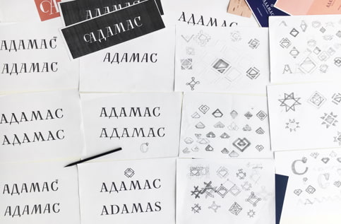
Analysis and Sketches
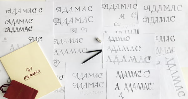
Dozens of ideas and sketches of the type and the signs were made to find the right concept - luxury, national, laconic, readable one.
Final Design
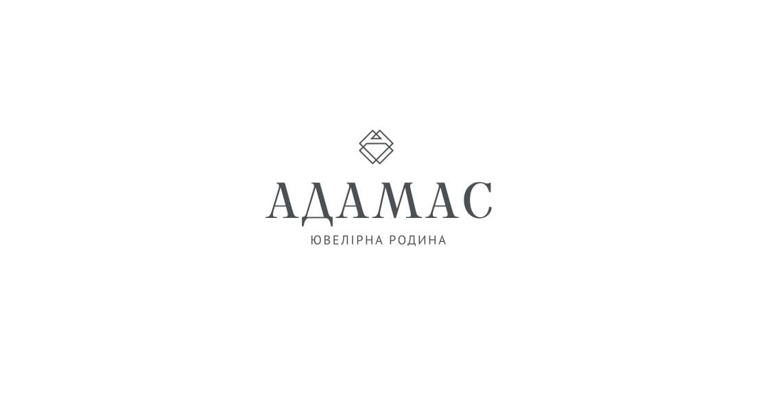
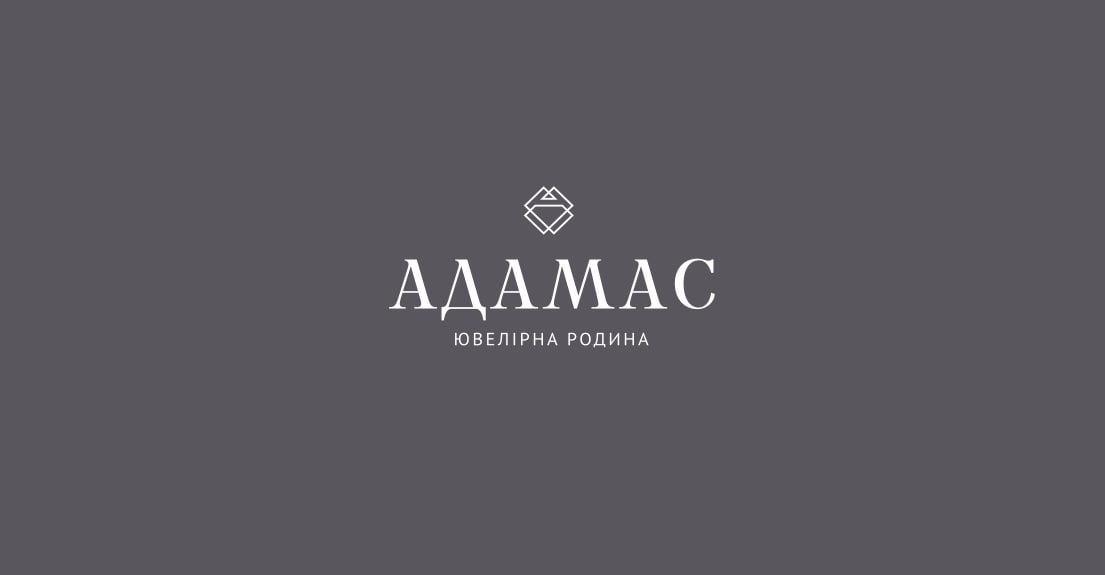
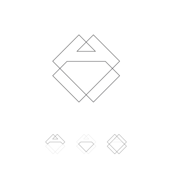
Logomark
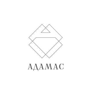
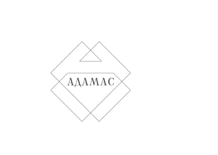
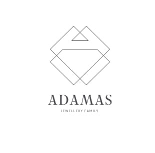
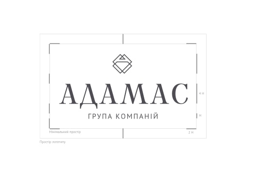
This geometric sign includes many important symbols: a diamond, letter A (Adamas), and an element from vyshyvanka, traditional ukrainian clothes.
Logo Design
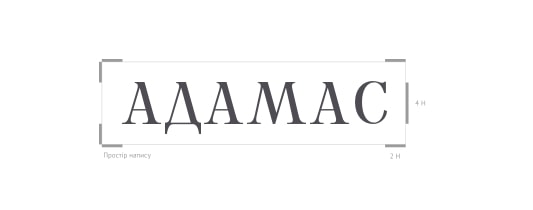
It is delicate, high-contrast serif font, made for Adamas. Like engravers we worked on these letters scrupulously since in typography, like in jewelry, every detail matters.
Through thick and thin
Family DNA Patterns
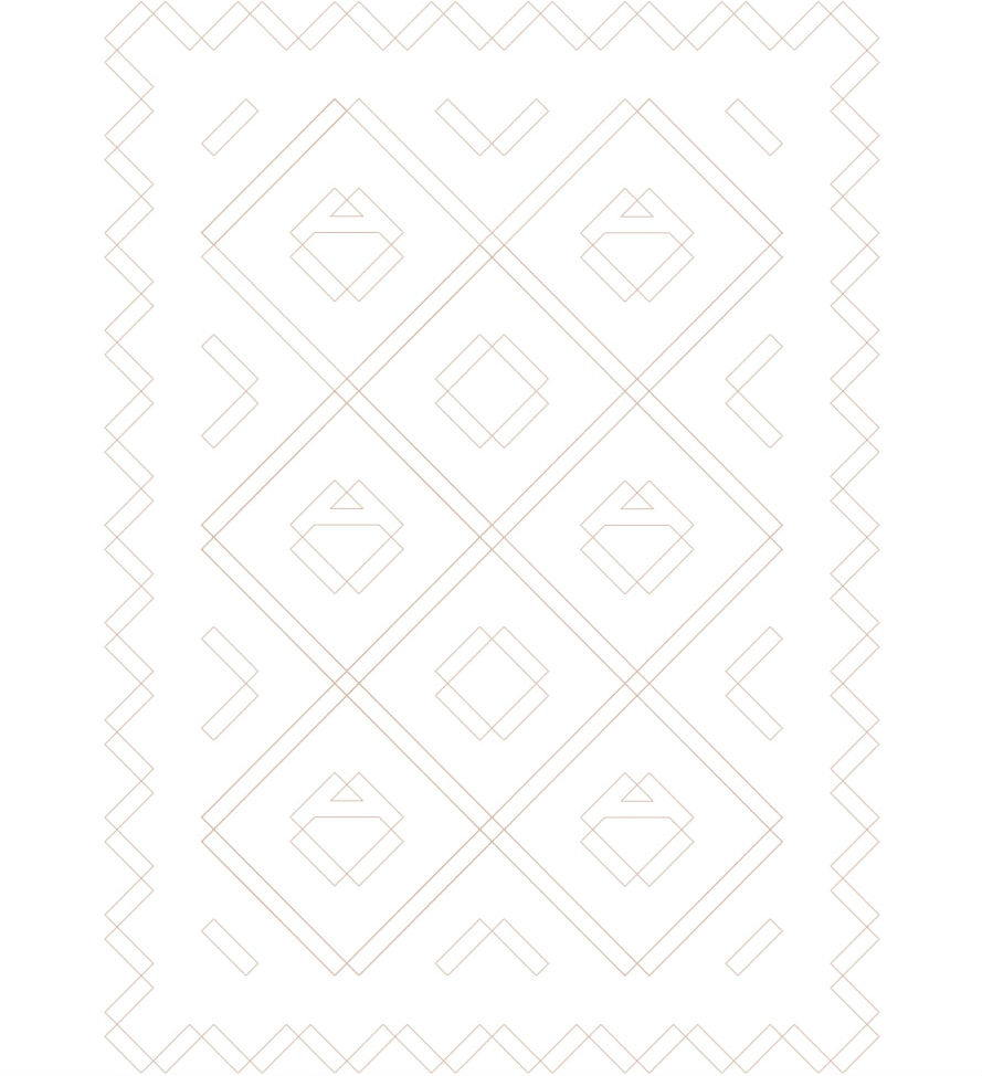
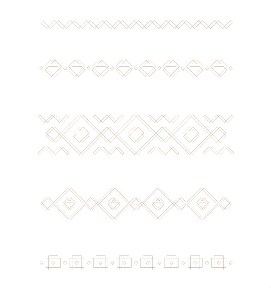
We created a set of patterns based on the Logomark. There are different variations from multipurpose and straightforward to special seasonal patterns. This significant graphic element implements a branding in packaging, advertisement, and interior.
Mrs Pink and Mr Gray
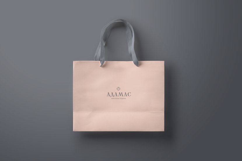
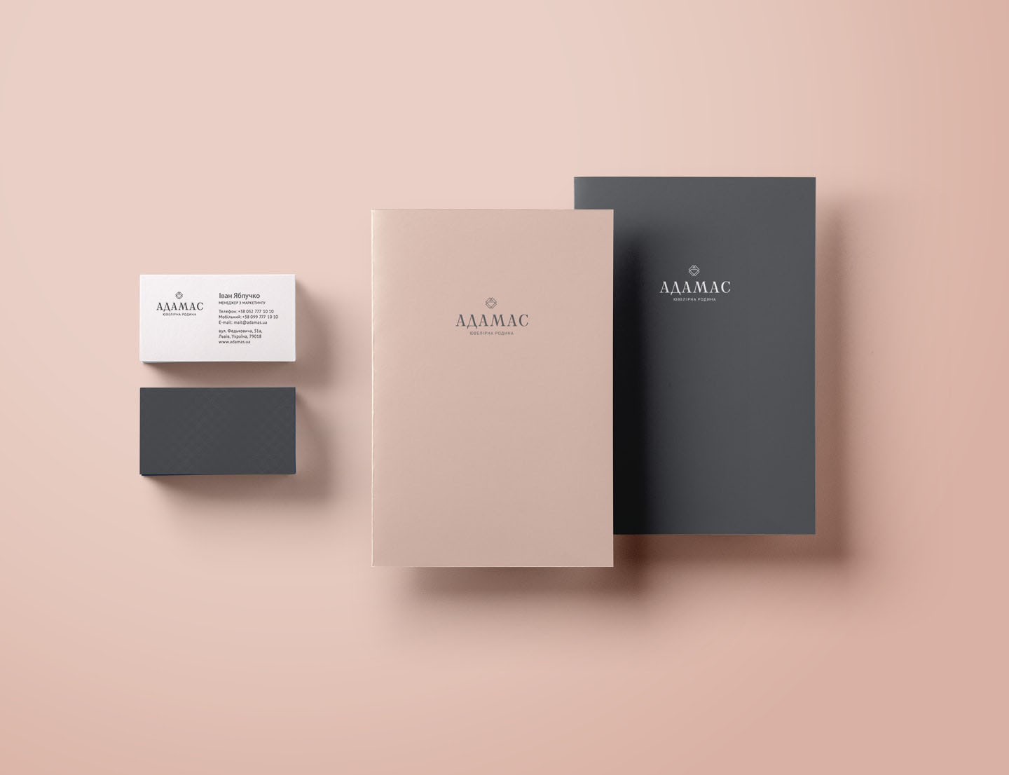
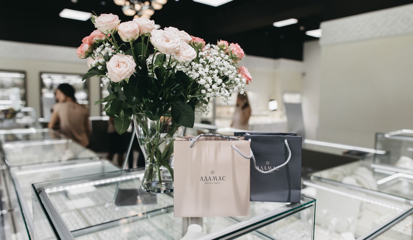
We were inspired by Ukrainian neckless corali and coral colors. Finally, the perfect couple was chosen - soft light pink and cold stone gray. Great to use as a gift packaging for someone special ;)


Polishing the Brand for Brilliance
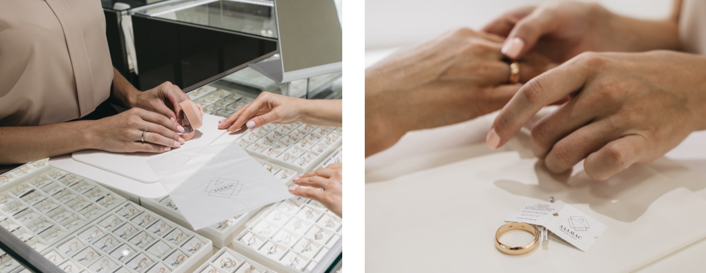
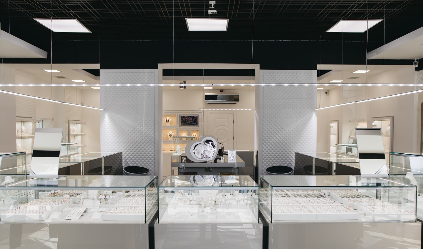
Every single detail that surrounds jewelry needs to be perfect. Packaging, documents, interiors should work for enjoying special moments of your life.

Project summary
Services:
Duration:
Team:
Art Director
Graphic Designer
