4 examples of UX personas
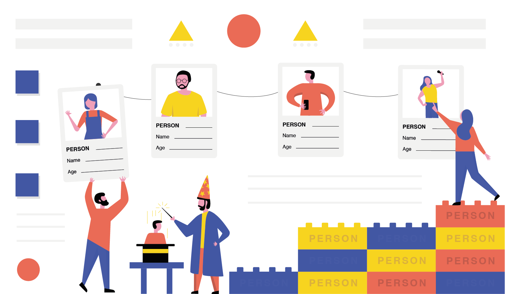
Even if you are new to the UX design magic, you must have heard about UX (or user) personas here and there. Spoiler alert №1: user personas are one of the cornerstones of UX design. Briefly speaking, it is nearly impossible to create a user-oriented design for a product without coming up with user personas first.
So, what are these mysterious UX personas? How are they created? Why are they that crucial? Keep reading to find out! Spoiler alert №2: at the end of the article, we’ve prepared 4 UX personas examples for you to use.
What Are UX Personas?
A persona in UX is not the same as one in the market segment. It is a fictional character that represents overlapping patterns a large group of users demonstrates. It complements a digital product’s basement and is not affected by design changes or trends. By the way, UX/UI design trends for the business needs we have already discussed. While market segmentation is all about raw numbers and stats, a UX persona is akin to a real person’s profile: it has a name, an occupation, a marital status, and, of course, details relevant to your product.
A UX persona’s profile includes:
- a fictional name;
- a photo;
- an occupation;

- demographics (age, location, marital status, relatives, income, etc.);
- goals and needs;
- pain points;
- relevant patterns of behaviors;
- a personality (can be reflected using quotes).
How to create the best UX personas possible? We’ll describe how we at Qubstudio do this.
First of all, our team researches potential (or current) users. We conduct UX interviews & collect stats. Then, designers look for patterns, especially regarding anything related to the product — common issues users have with such apps or similar use cases.
It is possible to create a persona for each pattern or combine them if it makes sense. But 4 personas are the maximum — otherwise, the product won’t cater to each persona’s needs.
Why do our UX designers dedicate their time to creating UX personas? First and foremost, they aim to ensure empathy between the designer and potential users. The two common pitfalls designers may fall victim to without user personas are self-referential design and the elastic user.
The self-referential design means that designers subconsciously create the products based on their own behavioral patterns. The elastic user issue, in turn, is about different stakeholders having a further potential user understanding & image that may even shift over time if it’s not written down.
4 Examples of Typical UX Personas
Having covered the basics, we’ve come to the most ‘yummy’ part of our article. There are 4 UX personas examples — get a deeper understanding and feel free to use them.
A note: we created these personas for a made-up banking app.
Typical UX Persona #1: Michael, an Entrepreneur

Fictional Name
Michael Johnson
Occupation
Self-employed, owns a coffee shop in the city center
Demographics
- 30 years old;
- Lives in Seattle, Washington;
- Married, no children;
- Has two brothers;
- Takes care of his father after a stroke, helps him out financially;
- Has an upper-middle-income level & a profitable business.
Goals and Needs
As a busy person, Michael doesn’t like wasting time, as time is money for him. So, he needs to make payments on-the-go and have access to most banking services like generating banking documents, applying for loans, etc.
Being a business owner, he needs to keep his business banking account and a personal one separate. Simultaneously, Michael wants to use both accounts easily and switch between them with no effort.
Pain Points
Switching between different accounts takes too many actions on Michael’s behalf. He would prefer to do it in one click. Besides, he still needs to go to a bank for the services that could be available online.
Relevant Patterns of Behavior
The man spends the biggest part of the day (5+ hours) on the smartphone making calls, negotiating, or messaging. He is tech-savvy and uses the latest iPhone. Michael’s phone is full of apps, as he prefers them to mobile versions of websites. The man knows his way around an app in a matter of seconds, so he always skips tutorials.
Personality
“I hate queues in banks. That’s why I use online banking – it’s a lot less nerve-racking and much faster.”
Typical UX Persona #2: Jennifer, a Housewife

Fictional Name
Jennifer Smith
Occupation
Unemployed
Demographics
- 51 years old;
- Lives in Austin, Texas, with her 57-year-old husband;
- Has two daughters, living in other states separately;
- Has a low-income level.
Goals and Needs
Jennifer uses online banking primarily for checking whether payments from her daughters reached her banking account. She doesn’t need any additional online banking services, as it is often too difficult for her to get how to use them. However, the woman would like to keep track of her expenses to put some money aside.
Pain Points
Jennifer doesn’t always have a stable Internet connection on her smartphone. Besides, she struggles with using complicated apps with many features, providing no explanation or tutorial.
Relevant Patterns of Behavior
Jennifer is not tech-savvy, so she rarely uses her smartphone (iPhone 5) for surfing the Internet — it takes her up to an hour per day. She is comfortable with browsing the web and doing simple tasks like googling something or logging in.
The woman rarely uses mobile apps and prefers mobile versions of websites or her PC when going about something more complicated. Jennifer uses only the online banking service desktop version to manage payments from her daughters.
She rarely makes payments online or uses her credit card. Instead, the woman prefers withdrawing cash and using it to pay for groceries or medicine.
Personality
“I am not into all the modern technologies. I prefer something reliable and easy-to-understand.”
Typical UX Persona #3: Robert, a Student & YouTube Blogger
Fictional Name
Robert Dawson
Occupation
Is obtaining a Bachelor of Arts degree at Argosy University, a YouTube blogger (posts reviews on films and TV series), wants to write fantasy novels
Demographics
- 21 years old;
- Lives in Atlanta, Georgia;
- Comes from a low-income family;
- Lives with his parents;
- Pays for his tuition.
Goals and Needs
Robert’s primary income source is the sponsored YouTube channel content, so he often receives payments on the banking account. As the income is not stable, the young man wants to check account details anywhere at any time using the smartphone. Besides, he pays for the tuition, so he needs to regularly put some money aside and avoid getting tempted to spend it on something else.
As Robert’s monthly budget is usually quite limited, he needs to keep track of the expenditures and save enough to cover the tuition fees. For expenses, the man prefers doing paying for anything (including tuition) on-the-go.
Pain Points
Robert is always in a hurry and has no time to deal with his finances. The mobile banking app the man is currently using is slow, and he is not satisfied with it, as he appreciates the time.
Relevant Patterns of Behavior
Robert surfs the Internet on his laptop for two to three hours per day, mostly to do university-related tasks and keep up his blog. He frequently uses video editing software and is proficient in it.
The man uses the smartphone (iPhone SE) for any other tasks, like scrolling the Facebook feed, checking the news, messaging, banking, etc. On average, Robert spends four-five hours a day on his smartphone. He prefers a smartphone to a laptop because it helps do the tasks faster.
The man prefers making payments online and on-the-go using his smartphone.
Personality
“I want to use my time as efficiently as I can, so I prefer using mobile apps. I get irritated when they are slow, freeze or crash.”
Typical UX Persona #4: Kate, a Journalist

Fictional Name
Kate Robertson
Occupation
Journalist, works for two online news outlets, mostly from home
Demographics
- 26 years old;
- Single, no children;
- Lives in Los Angeles, California;
- Her parents live in another state, she supports them financially;
Has a middle-income level.
Goals and Needs
Kate cares a lot about her presence online security. So, she keeps her data safe and looks for the most secure mobile banking app with end-to-end encryption.
As Kate gets paid depending on the number of characters she wrote, her income is not stable. Thus, the woman needs to keep the finances track and put some money aside to send it to her parents every month or two. Keeping separate mobile apps for expenses tracking is inconvenient for her, so she would have one app for managing the banking account. Besides, Kate would like to have a budget feature to remind her to limit the expenses.
Pain Points
She is not satisfied with her current mobile banking app because it is not secure enough and doesn’t provide integration with budget management apps.
Relevant Patterns of Behavior
Kate spends most of the time using the laptop for writing texts. She is comfortable using it for job-related tasks and communication purposes. But for surfing, the woman uses her Samsung Galaxy Note 9 phone (especially during commutes and before going to sleep). On average, she spends 6-7 hours on her laptop and 2-3 hours on her phone.
As Kate gets paid based on the amount of work she’s done, she often checks her banking account and keeps the expenses track with a separate mobile app.
Personality
“I just want a secure app for making payments and checking my account every once in a while, not a packed-up thirty-feature monster.”
Bonus UX Persona: Mark, a Project Manager
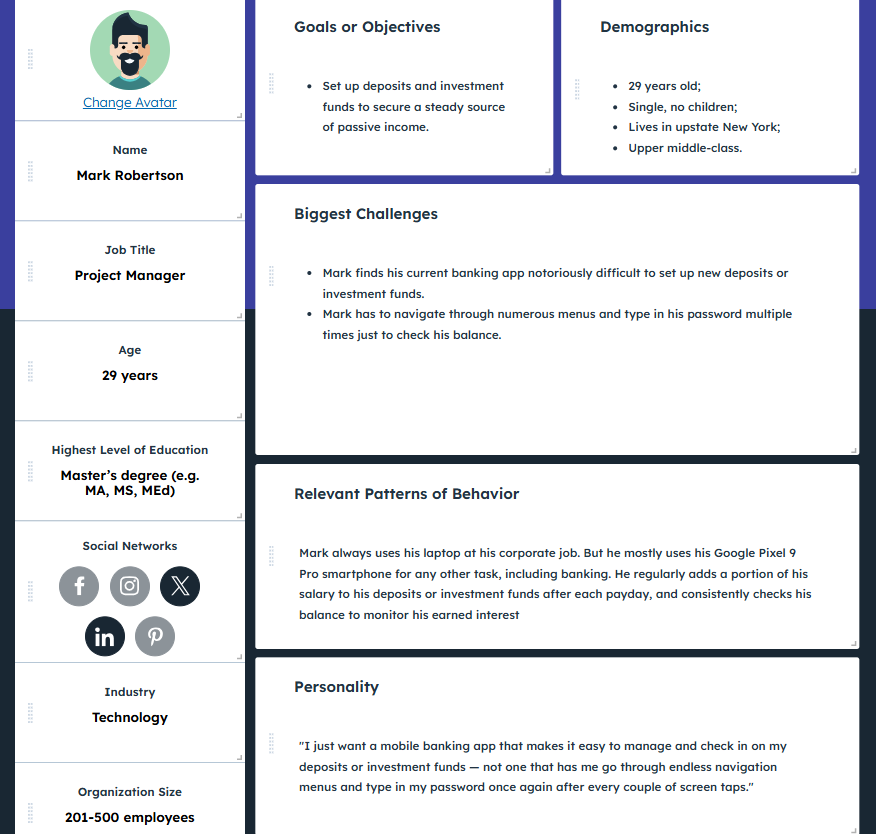
This one looks a little different because it was made using HubSpot’s Make My Persona — a quick and effective persona builder that lets us set up UX profiles through a visual interface you can easily share with other team members.
In Conclusion
Creating UX personas is a long and thoughtful process — it is not about typing whatever comes into mind and be done with this. The UX personas are based on real-life examples and cases, so it takes time to conduct user interviews and do your research. All in all, this endeavor is an investment that will pay off with loyal users for UX design company, that enjoy using the software.

