Best UX Practices for Search Interface

Need to make
your
product
easier to
navigate and explore?
Search that actually works starts with great UX.
We craft intuitive search experiences that help users find what they need.
Tell us more — we’ll help make it clear, fast, and user-friendly.


TL;DR
High-quality search interface design is essential for eCommerce, marketplaces, and educational platforms to ensure users find what they need instantly.
Key Design Principles:
- Visibility: Place the search box in a prominent, easy-to-find location.
- User Assistance: Implement auto-suggestions, spell-check, and filters to guide the user.
- Minimalism: Keep the UI clean and intuitive to reduce cognitive load.
- AI Power: Use semantic and conversational search to accurately interpret user intent.
The Goal: To build a seamless, high-performing search experience that increases user satisfaction and drives business growth.
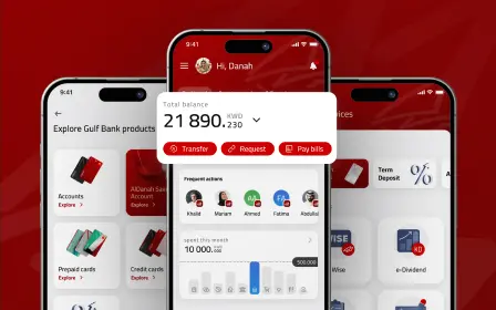
Search UI is one of the most popular ways for users to access your site. So, if your website or application offers a poor search UX, your business performance may suffer.
But here’s the challenge: the search box the users see is just the tip of the iceberg — beneath lies an intricate design process. So, how can you create a search UX that truly caters to your users? In this article, you’ll discover the key principles of good search design.
But do you need the search functionality in the first place? Let’s take a step back to find out where a search interface is necessary.
When Do You Need a Search UI on Your Website?
Not all websites need search functionality — one-pagers without any intention of expanding can do without it. However, there are many platforms where a convenient search is make-or-break. These include:
- eCommerce websites
- marketplaces
- news portals
- booking services
- educational platforms, like libraries or encyclopedias
Basically, any big website with hundreds of entries needs a robust search UX design.
But why is the search functionality indispensable in these cases? And why isn’t just having one in place enough for your business success? Let’s see below.
Why Is Search UX Design Important to Businesses?
Search is faster than navigation and is more intuitive, making a sublime search experience highly welcomed among users. Take eCommerce for example, 69% of shoppers prefer going straight to the search bar once they land on an eCommerce website.
However, convenience for users is the key reason you should prioritize your search design. Your search bar is a magnet to your most valuable visitors — those with a clear intent of making a purchase. In their joint study, Nosto and Censuswide also discovered that a whopping 79% of eCommerce website visitors would likely go ahead and buy a product they found through a website’s search. What’s more, 80% of consumers reported leaving a website because of a poor search experience.
As you can see, great search UX design is vital. Getting it right will give you an edge and high sales. So the question is what’s the best way to implement it?
The search feature design consists of two components: the search box and the result page design. In the below section, we’ll cover both.
How to Improve Search UX: Best Practices for Superior Search Box and Search Results Page Design
Robust search interface design is crucial, leading to an increased number of purchases, bookings, and other desired actions. But what does a good search page design consist of? How about search results UI? And finally, how do you make it consistent regardless of the device used, geographical location, or browser?
Here are the main rules Qubstudio designers stick to.
Use a Universal Symbol of Search
A magnifying glass is generally recognized as a search icon. Users subconsciously seek it out when they are looking for the search bar. So, being too creative here is a sure path to poor search UX design.
The magnifying glass icon should be simple, with minimal details and a large clickable area that clearly stands out.

Make Your Search Box Visible
Forcing your users to hunt for a search box leads to a poor search experience. You want the user to find it as soon as they open the page.
Placement in the center showed a result of 15.86% search usage, while placement at the top - 13.43%. The position at the top left, as it turned out, showed the worst results of use - 7.72%.
Visibility is paramount. So, place the search box strategically. Website visitors usually scan the page in an F-shaped pattern, almost immediately spotting a universal magnifying glass. Still, it’s recommended to use eye-tracking tools to establish the focus areas of your audience.


Add the “Submit” Button
While most users trigger a search by pressing “enter”, some prefer a traditional “submit” button. What’s more, it’s quicker to hit a “submit” button than “enter” on mobile. So, a good search UX design begins with the submit button.
Make it big enough that users won’t have to click or tap several times to hit the icon or need to take extra steps such as switching to the keyboard or zooming in.


Place a Search Box on Every Page
There are cases when users don’t use the search immediately as they enter a website. They might start by navigating through the site, and then, when nothing is found, they might type their request into the search box.
That’s why it has to be placed on every page of your website. Returning to the home page every time you want to type a query doesn’t feel like a great search design, does it?


Use Auto-Suggestion
Useful and well-thought-out auto-suggestions help a person quickly formulate an accurate search query. If a user is looking for boots, for instance, the auto-suggestion will provide options like rain boots, winter boots, hiking boots, kids’ boots, and more.
Add a Spell Check
Checking and re-typing every letter can drive anyone mad, especially while you’re browsing your smartphone on the go. Adding a typos recognition feature is a must for any search box design.
Make Your Search Field Long Enough
Make the search box long enough to contain the whole user’s query. When it comes to mobile devices which contribute to 79% of all online purchases, it’s important to make the search field as wide as a mobile device’s screen. This way, a person will be able to easily type the request regardless of finger size, eyesight, and so on.

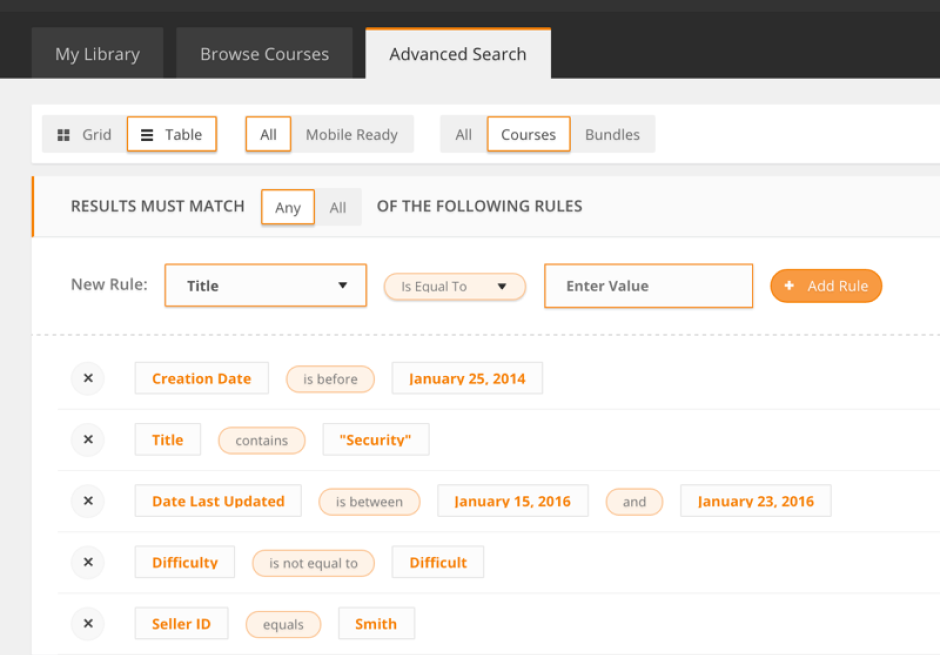
Provide an Advanced Search Option on Request
Some websites — like booking services and eCommerce — cannot do without filters and specifications. Manually searching through such platforms will take forever. In cases like this, it’s advisable to offer advanced search options to your users on demand.
Dealing with Poor Connectivity
How do you keep a visitor on your site when the connectivity is poor, and the results page or suggestions are taking too long to load? Add a progress indicator.
This psychological trick makes users a bit more patient. Set your creativity free and think of funny or unconventional ways to show progress instead of using a traditional bar or a sandglass. Another option is displaying the skeleton screen — to show users they’re almost there.


“No Result” as Part of Your Search Results UX
Surprisingly, the “Zero search results” page design significantly impacts the conversion rate. Studies indicate that approximately 56% of eCommerce website visitors are more inclined to continue their shopping journey on a site where the search results UI suggests alternative products when their query returns zero search results.
Also, along with demonstrating to your customers that you have something to offer, be crystal-clear about the status of the product they initially looked for. If the product is out of stock, for example, clarify the situation by explaining the issue, provide an estimated restocking date, or suggest alternative ways to get the product. This approach reaffirms your credibility as a business that values its customers, fostering trust and reducing customer churn.
Consider Your Context and Research Continuously
Don’t underestimate the role of context. For example, online clothing store customers have different search interface needs from those of video streaming platform visitors.
Given that, it’s critical to conduct user research not just before the search UX design process begins but also upon release. That is, when the search bar, all the inputs, interactions, and filters are implemented, check the user reactions. Use touch heatmaps, session recordings, and journey trackers to monitor customer search behavior and make adjustments according to their needs. Preferences change, and you should be ready to adapt.
At Qubstudio, for example, we stick to the Double Diamond design approach, which helps us keep focus on users all the time. If you want to apply one to your search design project, book a call with us.
Provide Enough Information
A staggering 68% of consumers prefer comparing products across various shopping platforms before making a purchase. Competition is getting fiercer, and you need to encourage the interaction to continue no matter what.
Make sure that your search results design includes all necessary information about the listed products: photos, short but informative descriptions, ratings, and the “Add to cart” button. This streamlines the search and minimizes the risk that your potential buyers will switch to a competitor providing more information on their products.
How to Avoid Frustration with the Search?
To avoid frustration with search, it’s crucial to design a search UI that anticipates user needs and streamlines the search process. Let’s check 5 don’ts that can significantly impact user experience.
1. Don’t Hide the Search Among Other Elements
The search box has to be visible and contrasting. If it’s hidden behind an icon, lost in too many graphic details, or masked in the header, people might fail to find it.

2. Don’t Make the Search Field Too Short
Sometimes, we want to check what we’ve typed or correct the request. Why not make it convenient? When users see a short field, they tend to write shorter and less precise queries, which leads to poor search results and affects the UX. The ideal search box is 27 characters long, which accommodates 90% of queries.

3. Don’t Make the Submit Button Too Small
On mobile, it’s quicker to hit a “submit” button than “enter.” Being too small for a finger, it makes the people do additional work by moving to the keyboard or zooming the screen – not a sign of an excellent search UI design.

4. Don’t Overdesign the Search Box
Creativity is good, but not in the case of search page design. A box must still be a box. If it’s overdesigned, it is harder to spot. Also, it should be instantly recognized by the user as a field to type the search query. Don’t make your potential buyers search for the search. It won’t do you any good.

5. Don’t Overload the Search
If the users see a big form they have to fill in to find the necessary thing, it freaks them out. Advanced functionality should be available on request: a button click, a drop-down menu, etc.
And as a bonus tip for anyone designing a search interface — bear in mind that time doesn’t stand still. Let’s see what this means in the context of AI and search interfaces.
The Role of AI and Machine Learning in Advanced Search UX
On the one hand, the principles of good search interface design haven’t changed much: the search box must be visible and long enough, saved searches and other shortcuts are still in use, zero results must be avoided whenever possible, and so on.
On the other hand, advancements in AI technology have significantly reshaped the search experience standards.
In recent years, AI and machine learning have changed the way people look for information. Enter semantic search and its more advanced form, conversational search — probably the most well-known outcomes of AI’s integration into the modern search experience.
Semantic Search
Unlike conventional keyword-based search, semantic search prioritizes understanding a user’s query intent based on the user’s device data, location, similar searches, and other information, resulting in more contextually appropriate outcomes.
For instance, if a user looks for “cell phone cases,” while your site terms them as “mobile phone covers,” the system understands the user’s intent, providing exactly what they were looking for. Or a search for “shoes” might yield results for sneakers in summer and boots in winter.
Semantic search capabilities can also come in handy when a user doesn’t know exactly what they need. For example, a tourist traveling in Norway can type in “things to do in Norway” in their travel app’s search box and see suggestions, like “visit Mount Fløyen,” “cruise the Sognefjord,” and “experience the polar night in Svalbard.”
Google and other popular search engines have semantic search capabilities, making it a norm for modern netizens.
Conversational Search
Conversational search uses semantic search techniques. But this type of search UI enables users to compose their queries and receive results in complete sentences.
Say, you are looking for a birthday gift for your friend who’s recently picked up ping-pong as a hobby. Rather than typing “ping-pong gifts” to spend hours sifting through search results, watching numerous video guides, and reading reviews, you can simply ask a search assistant “My friend is a beginner ping-pong player. What can I give him on his birthday?” and receive a comprehensive answer right away. As you can see, the technology can potentially spare users hours of searching.
Conversational search UIs can manifest as text-based chatbots. However, due to advancements in voice recognition technology, they often come in the form of voice assistants, like Apple’s Siri or Amazon’s Alexa.
For the time being, conversational and voice search isn’t a gold standard for eCommerce platforms or booking websites. But given that at least one in four mobile users showed a preference for voice search as early as 2018, be prepared that your customers will increasingly expect such an assistant within your search functionality.
Conclusion
These are the key rules of a good search design based on Qubstudio designers’ experience. Easy navigation, aids in creating and specifying user requests, simplifying the entire search experience with conversational AI, and beyond — all this leads to a smooth and pleasant interaction between the customer and your business.
If you’ve noticed that your website search UX design needs improvement, don’t hesitate to contact us, and we’ll be happy to help you right away.
FAQ
Why is search UX critical for e-commerce conversion rates?
Search is often the primary way users interact with a product catalog. Up to 43% of website visitors go directly to the search bar.
Optimizing search UX reduces friction, helps users find products faster, and can lead to a conversion rate that is 2–3 times higher compared to those who only browse.
Where is the best placement for a search box on a website?
According to usage data, the search box performs best when placed in the center (15.86%) or at the top (13.43%) of the page header. This aligns with F-pattern and Z-pattern scanning behaviors, making the search feature immediately visible to the user.
What is the ideal length for a search input field?
To prevent query truncation, the ideal search box should accommodate at least 27 characters. This width covers approximately 90% of typical user queries, allowing users to review and edit their full search term easily, which improves accuracy.
How to improve user experience in a search interface beyond layout?
To truly enhance the experience, focus on functional UX: implement auto-suggestions to speed up typing, ensure the system handles typos (fuzzy search), and optimize the “no results” page by offering related categories or popular products instead of a blank screen.
How does semantic search and natural language support improve UX?
Semantic search goes beyond simple keyword matching by understanding user intent and synonyms. Supporting natural language queries allows users to search using conversational phrases, which significantly reduces “no results found” pages and provides more relevant results based on context.
What are the must-have features for a high-performing search bar?
A top-tier search interface should include:
- Autocomplete/Auto-suggestions: To speed up the typing process.
- Visual Search Cues: Icons or product thumbnails in the dropdown.
- Error Tolerance: Handling typos and misspellings.
- Recent Searches: To help returning users find previous items quickly.
What should small businesses consider when choosing search interface software?
For small businesses, the focus should be on scalability and ease of integration. Whether using a managed search service or a specialized plugin, the software must support core UX features like mobile responsiveness, fast indexing, and customizable filters to ensure the search grows alongside the product catalog.