Data tables design basics

Not a fan of tables? You think there is no possible way to make them interesting and user-friendly?
Our lead designer Taras Bakusevych is here to convince you otherwise. Use his tips to create tables your users will love!
The ability to query and manipulate data is one of the key requirements of many products that are being designed right now. Do you want to make sure the product you are working on meets business goals and objectives and makes everyday work easier and more productive for thousands of users?
Let’s talk about Data Tables!
Working as designer at UX/UI design studio, especially if your focus is enterprise products, you always encounter a lot of data tables. Frankly, if we are talking about complex web apps majority of screens, you will need to design contain or just are a big grid. As I’m one of the lucky ones to work on this kind of projects, there is hardly a day when I don’t need to design one of those.
So what is a table? Is it a combination of columns and rows that help you present your data in a most boring way?
Well, it’s not so easy as it sounds. Here are several tips to make your data tables better.
When to use tables, and what are the benefits?
A data table is a great solution when you need to present multiple information points for a large number of items. For example, a list of clients with their IDs, status, contacts, last activity, etc. would be displayed best as a data table.
There are many other benefits:
- a great use of space,
- easy scalability, simplicity in development,
- users usually are comfortable working with grids (majority already working with Excel for many years),
- it’s easy to find and modify data in a table.
But remember, there are a lot of ways to represent data. A decision whether to use a table should be driven by user needs. When you need to provide an overview/summary, it’s better to use graphs rather than tables. For example, stock price history of some equity for a year can be shown in a huge table; however, a chart is a more effective way to digest this info.

What information to display?
The information you display in a grid and the order in what user sees it matters. Deciding what values to display, and it’s sequence, plays a crucial role in the end. It affects time and amount of effort it will require a user to complete his task. Selection of data points should be based on user personas and scenarios, previous application versions and common sense. Don’t rush to design it, just spend some time thinking about it.
Thinking is the hardest work there is, which is probably the reason why so few engage in it.
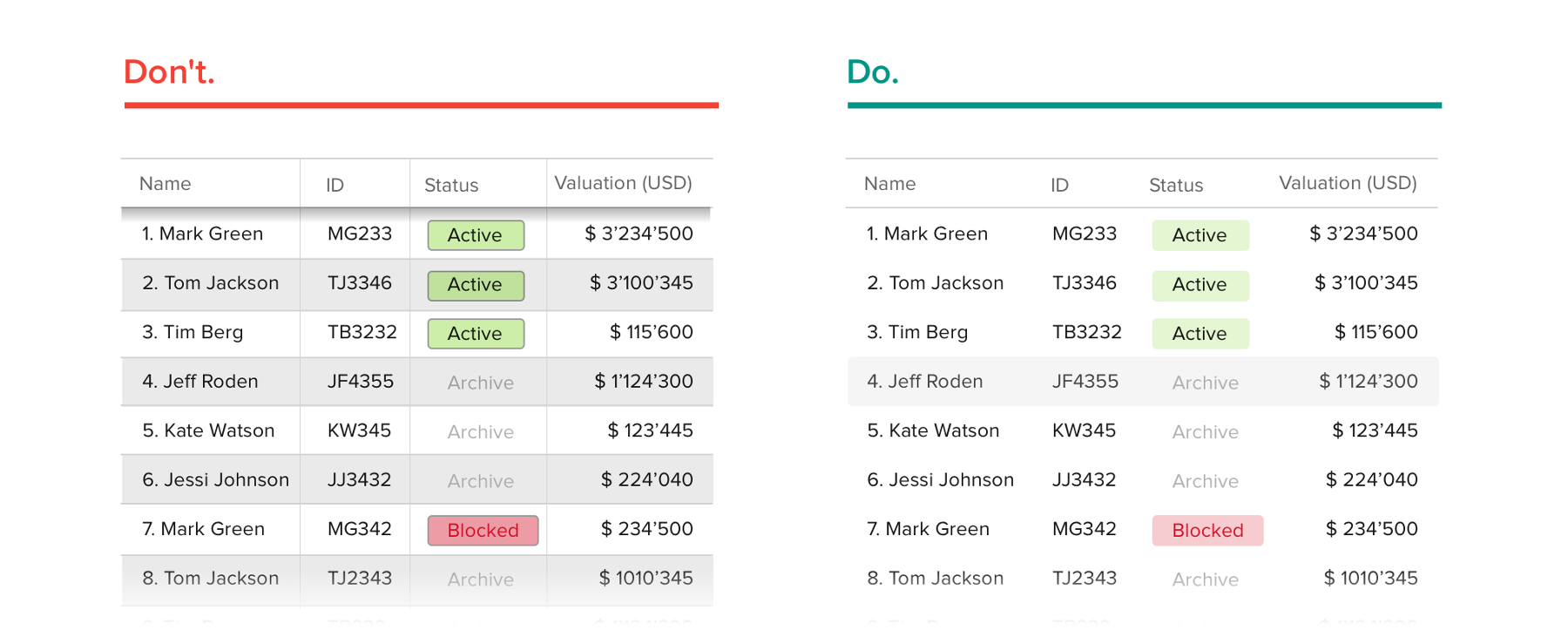
There is no point in adding needless columns to a table even if it looks empty; it will just distract user’s focus from important values. However, it’s almost never the case — usually, the situation is quite the opposite: you have a stakeholder’s request to fit 23 columns on their oldest and smallest monitor. But think about it as too much of a good thing becomes bad. The more columns you add — the harder it is for users to scan it. A better way to go about it is to be strict in your selection and remove everything unnecessary. Keep that secondary information hidden, unless the user is interested in checking it.
Focus on the most important
Try to position key columns from left to right (this may be the opposite way, based on the region you’re designing for) — this is based on the way we read. Columns on the left will get the most attention. We will check the other columns only if we’re interested in something specific.
The F-Layout relies upon various eye tracking studies for its foundational concept. They argue in favor of placing the most important elements of your site (branding, navigation, call to action) on the left side of the design.

Text Alignment
Alignment plays a big role in table readability, how easy you can do calculations in your mind, and comparison between different rows.
There are 3 simple rules to follow:
- Right-aligned numeric columns
- Left-aligned text columns
- Column names aligned according to column content
Following these guidelines will help make your text in the grid look appealing and easy to read. What your text says to users is important.

Size matters
The form of the table should be based on user needs and abilities. The more information a table displays and more complex it gets, the smaller fonts and row heights become in order to fit more information above the screen fold. On the other hand, if you are designing for fewer rows right from the start (list of items in your shopping cart, for example), you should set up generous row heights.
Very often a smaller size is the way to go. When you have huge lists of items, the number of items you can display without any scroll or interaction is very important. Decreasing row height sometimes doubles the number of items you display above the fold. That’s a big deal. Usually, you want rows to be shorter until it still looks clean, and information doesn’t blend in one big mess.
Don’t get me wrong — I am not encouraging you to cram as much as possible in your screen. Try to double your whitespace. Even if a data table has a ton of information, you can still save it with decent padding. Your design will not look heavy.

Typography
In design, typography is one of the key elements that make your work either great or ordinary, even terrible. Table design is not an exception. Discussing the art of working with fonts is not part of this article, and I am not the most knowledgable person to talk about it. However, here are several tips I can give:
- Don’t use all caps as it is hard to read;
- Avoid using Serif fonts as they create additional visual noise;
- Avoid using bold and italic;
- Use good fonts only:)

Remove everything unnecessary
You have probably heard the term “clean design” too many times. Less is definitely more. User interface should be as invisible as possible. Especially when dealing with big amounts of data, you are already putting a lot of pressure on users who will be working with your product. There is no need in adding visual distractions. Your goal is to make content shine not the other way around it.
- Remove needless separators;
- Remove row stripped background;
- Remove shadows, 3d effects, glow, etc.
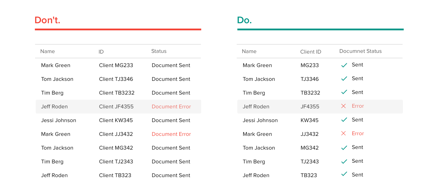
Avoid Duplication
I see needless duplication very often in UI design. It has big impact on readability as it adds extra items without any value.
Design Patterns and common interactions
UX designers can easily take advantage of users’ pattern-seeking tendencies. The key is in design patterns, which are reusable solutions to usability problems. They’re also time-savers. Patterns are the first solutions people go to when they don’t have time to invent something new. And like many “it just works” solutions, patterns tend to stick around.