Nailing It With FinTech UX: Top Strategies for Your Business Success
Whitepaper
Fintech & Banking Trends: Transforming Product Experiences in 2025


Designing FinTech UX flows is a unique challenge requiring specialized expertise — that is, if you want your app to stand out. The core challenge of FinTech is winning customer loyalty, as many vendors in every niche offer similar services. So, if an app fails to meet and exceed customer expectations, users are quick to switch to a competitor.
Qubstudio boasts over 15 years of UX design expertise. We know how to ideate, plan, design, and deliver intuitive and customer-centric FinTech UX. We create interfaces and customer journeys that instill a sense of security in customers while complying with regulatory requirements regarding data protection.
This article shares our vision on key aspects of Financial UX design. We reinforce every point with real-world examples of prominent apps, some of which we developed ourselves.
UX Design is Pivotal for FinTech App Success
Finances are a serious business. Highly regulated and complex, too: failure to comply with some obscure policy can cost a customer dearly.
FinTech apps promise a simple, transparent, yet secure way of handling various financial tasks, from money transfers between bank accounts to mortgage reimbursements, built-in insurance, and stock trading.
By default, FinTech app users expect the following:
- Simple completion of their tasks.
- Security and compliance.
- Reliable and predictable outcomes.
A great UX design is essential here, as it allows companies to convey that sense of security, transparency, and intuitive availability. It also guarantees that outcomes are repeatable and predictable.
But this also poses a serious challenge for a variety of reasons:
- You can’t define a specific target audience for a FinTech app. Well, you can — but that would limit the app’s potential as, ideally, everybody should be able to use it.
- User authentication and validation are crucial to ensure security but should not cause too much friction in the journey to avoid customer frustration.
- The app should be able to integrate with a constantly growing FinTech ecosystem while retaining a user-centric approach.
A successful FinTech app is one that tackles these challenges head-on. At Qubstudio, we believe that UX design is the backbone of a FinTech app’s success. Properly designed UX ensures a smooth customer journey, enabling your customers to fully use the app capabilities without friction.
Core Principles of FinTech App UX Design
No matter the business domain, every FinTech app must enable its users to do financial operations faster, simpler, and easier than visiting a bank branch.
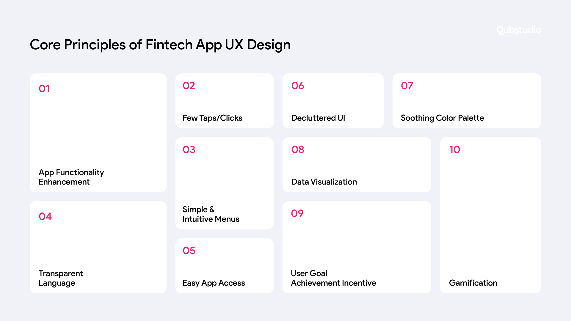
Here are the main FinTech UX principles that help achieve this goal:
- Provide users with an opportunity to do more with a single app.
- Enable users to complete the intended action with as few taps/clicks as possible.
- Create simple, easy-to-navigate, and intuitive menus.
- Use exact, concise, and transparent language that users can easily understand.
- Allow users to easily access the main function of your app on the top screen.
- Declutter your user interfaces (multi-level dropdowns were bad in Microsoft Office and are a no-no in mobile apps, too).
- Use a calm and soothing color palette, button shapes, and fonts.
- Allow users to visualize their data with charts and other customizable tools.
- Set incentives for expected actions to motivate users to achieve their goals.
- Use gamification where possible. Finances are serious but not necessarily boring.
These principles may seem like common sense (and many of them actually are). But combining them all into one app is a lot harder than it looks. Let’s explore how to follow these principles so that your app is pleasant to use.
Must-Have Features for a FinTech App
Whatever the domain they cater to, all FinTech apps should provide certain core functionalities to satisfy customer expectations.
Smooth Registration, Login, and Onboarding
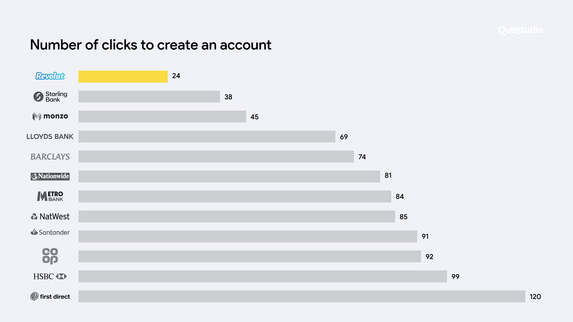
Users must be able to register and log in hassle-free and accomplish the task at hand in no time. For example, it only takes 24 taps to register with Revolut — but as many as 120 with First Direct.
Ukrainian analog of Revolut, Monobank, lets you register an account on the go and have “a bank in your smartphone” without visiting a bank branch.
Data Visualization
Graphs, bars, pie charts, and other visual elements offer users a quick overview of their financial situation and the trends associated with it. For example, Simplifi provides easily-customizable dashboards, enabling users to display data in their preferred way.
Watertight Security with Minimal Obtrusion
One-time passwords, popups with PIN checks, TouchID, FaceID, and other biometrics can help quickly validate the customer without disrupting their user journey.
One-tap Payment Capabilities
Google Pay, Apple Pay, and now Revolut Pay exemplify seamless payment experiences. The apps store the banking details and automatically use them at checkout, so the customer needs to tap just once.
Simple API Integrations
A FinTech app will only truly thrive if it is designed to become an integral part of an ecosystem. Instead of trying to capture the market on your own, it’s better to collaborate with others and benefit from a shared customer base. To achieve this goal, API integrations are essential.
For example, there is no need to develop KYC procedures, payment gateway integrations, bank account information, or booking engine aggregators from scratch. From Robinhood to Venmo to PayPal to Braintree, there are a variety of FinTech APIs that can enrich any customer experience. The key is choosing the most appropriate design to integrate them into your app.
Data-Driven Personalization
Some FinTech companies already offer users to sync their contact lists, payments history, and/or even browsing history. This way, when customers want to order pizza or buy groceries online, they get instant suggestions of their favorite pizza places/local grocery stores offering delivery services. This trend goes far beyond, up to wealth management, stock trading, and investments.
Gamification
From scoreboards to badges and personal achievements, there are multiple ways to engage audiences and incentivize expected behavior. For example, Monobank, a Ukrainian neo-bank, gives awards in the form of funny digital cat badges for certain achievements — buying groceries five times, paying utility bills thrice, paying in six different cities in Ukraine, paying for flowers four times, etc.
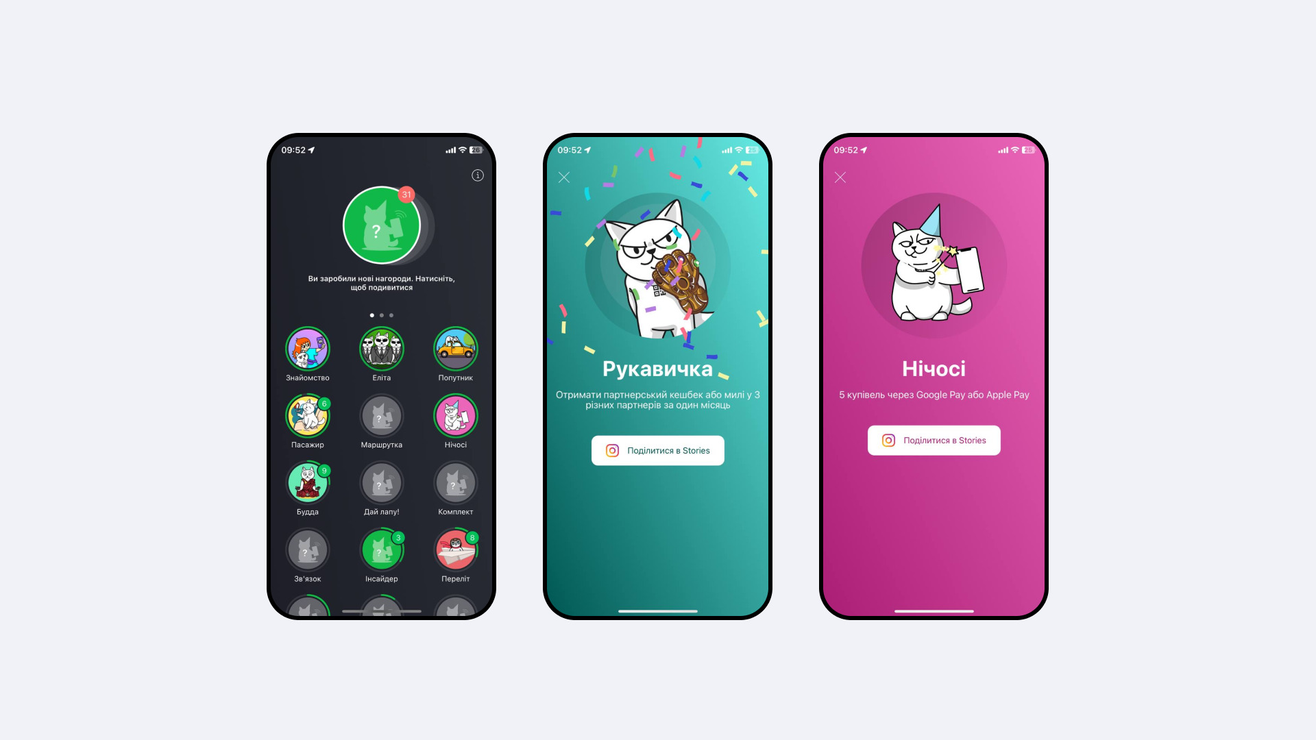
There are 120+ achievements in total, some of which are quite hard — and expensive — to unlock, like booking eight different hotel rooms or buying something in seven different countries. However, upper-middle-class customers, the target audience of Monobank, can try and collect all the badges.
When someone unlocks all the badges, they get an invitation to a business dinner with one of Monobank’s C-suite executives and are welcome to suggest any new features to implement. Certain suggestions have already been implemented, making it a win-win for all the parties involved.
And this is merely the tip of the iceberg. A proper approach to UX design leads to great customer experiences and soaring popularity. As a result, FinTech apps can become superapps — self-contained financial and social ecosystems covering all customer’s personal and business needs.
When users can handle all their financial needs with a single app, they just switch to it and never look back. MoneyLion (US), Wise (UK), WeChat (China), Revolut (Lithuania), Monzo (Germany), ila Bank (Bahrain), and Monobank (Ukraine) are great examples of such apps.
Let’s zero in on specific UX design techniques that brought these FinTech apps to the top of the market.
Real-World Examples of Great FinTech UX
To stand out, gain traction, and succeed, FinTech apps must blend simple, elegant design with useful features, secure workflows, and memorable positive experiences. Here are some market leaders that are doing just that.
WISE
Former Transferwise, this product has grown well beyond money transfer services. By providing comprehensive packages like “Wise Business” and “Wise Platform,” they were able to form user-centric one-stop solutions handling a wide range of tasks for their users.
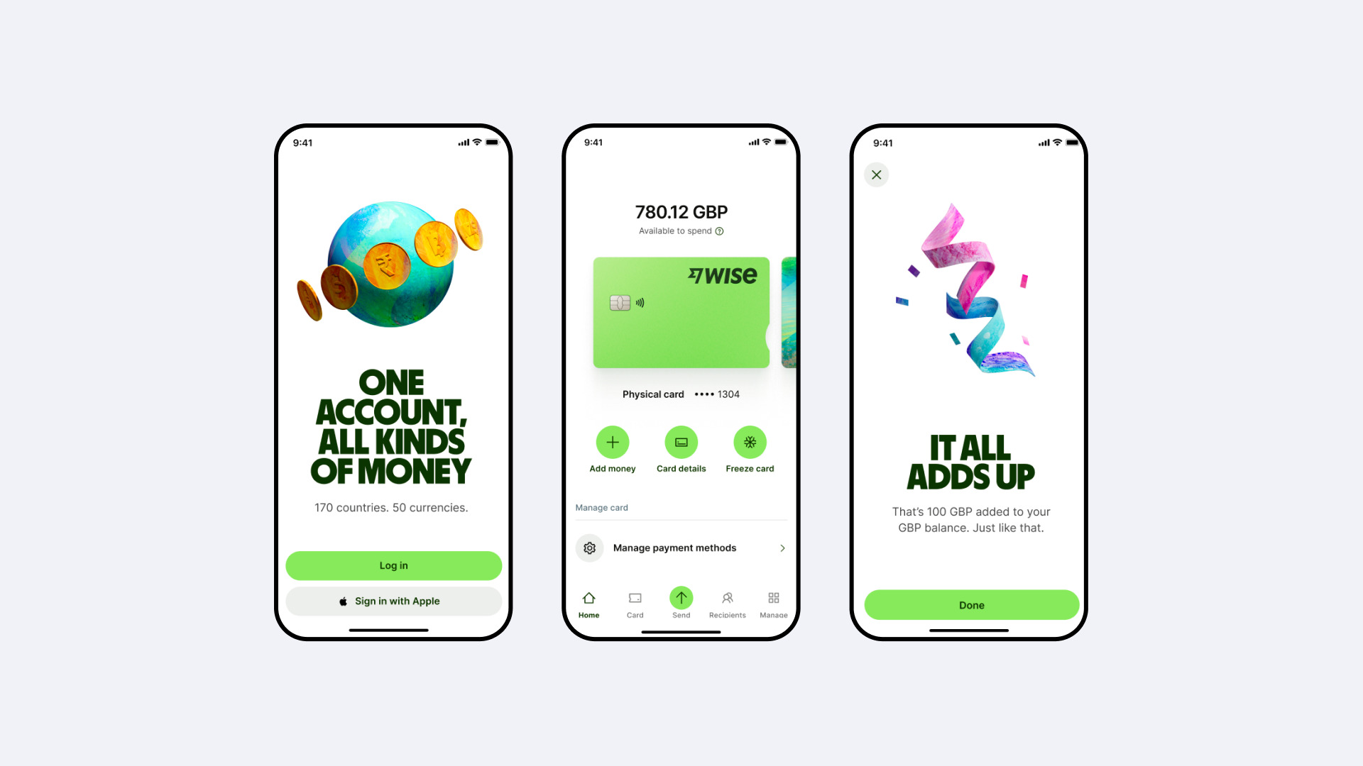
But what helps Wise stand out from the crowd is its memorable design and attention to customer feedback. The team evolves the product in a way that meets the customer’s expectations best. Minimalistic yet intuitive layouts with multiple logon options and self-explanatory screens earned Wise wide recognition in and outside the EU.
George
Widely used in the Czech Republic and Austria, George is a mobile-only offering from the Erste Sparkasse bank. It combines clear designs with user-friendly language without too much financial jargon. This means both teenagers and seniors can easily navigate the app and accomplish any necessary tasks.
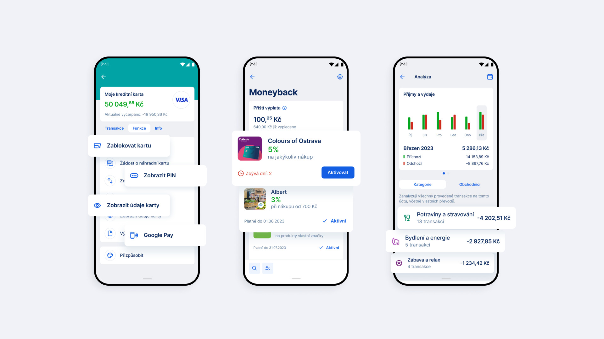
The app also offers a clear view of financial transactions and facilitates convenient payments to various recipients, from gyms to hotels to travel agencies.
Revolut
Revolut aims to digitalize and revolutionize banking by providing comprehensive and user-friendly financial services. It offers clear and intuitive workflows for a range of tasks, from money transfers and currency exchange to vacation planning and transactions overview.
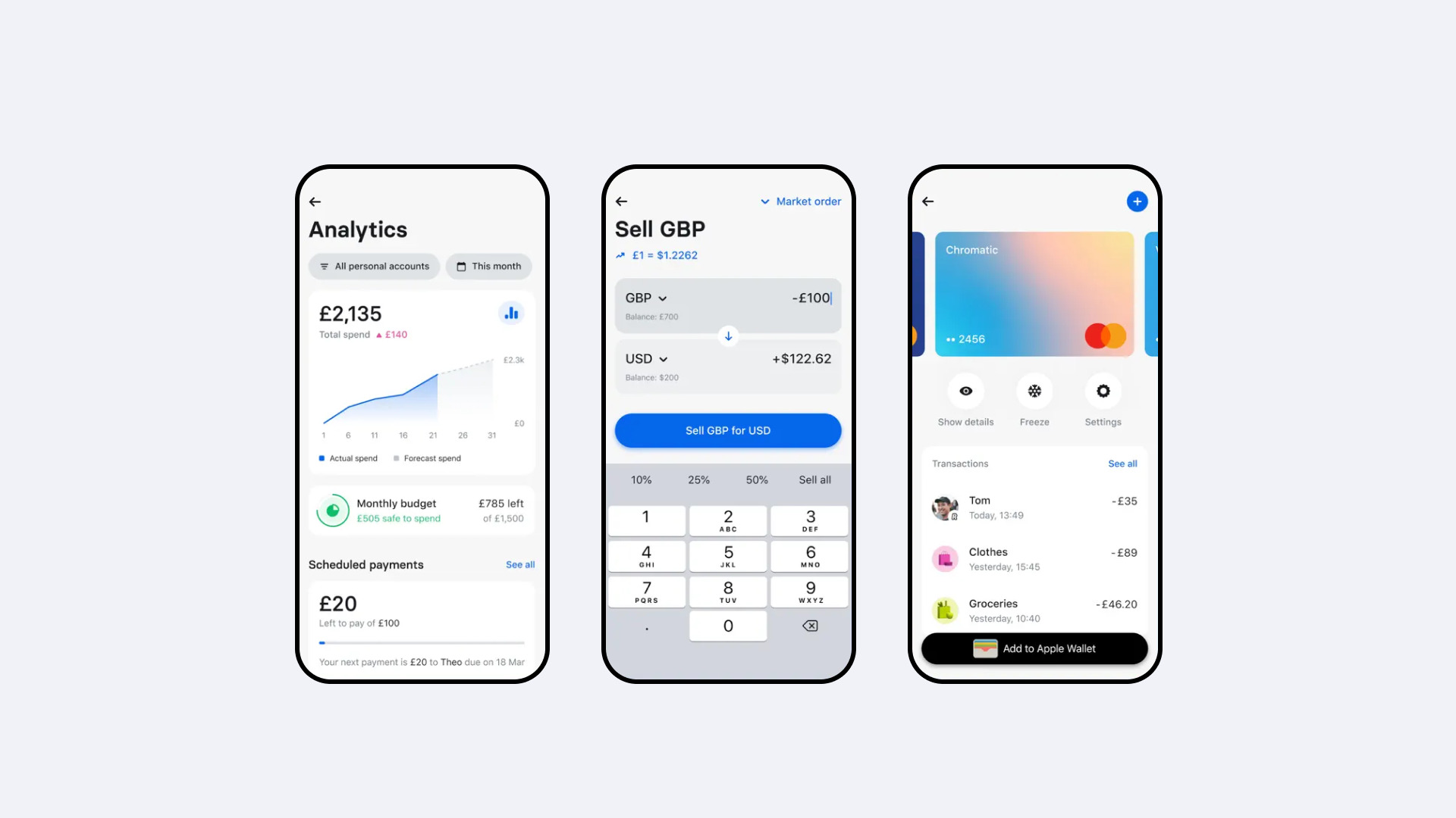
But what really sets Revolut apart is its stellar customer support, which is easy to access and has chat history stored in one place. This means that users can pick up any conversation just where they left it off.
ila Bank
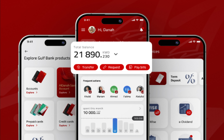
ila Bank is a Bahrain-based neobank powered by ABC Bank. By providing mobile-first experiences, easy group money saving, and convenient money transfers within Bahrain and internationally, it quickly became the market leader in the MENA region.
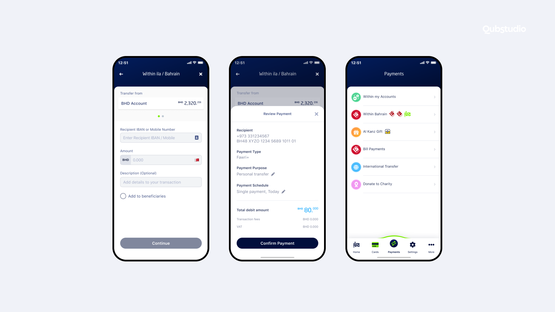
Qubstudio stood up to the challenge and formed a dedicated team that aligned the delivery with the design-driven process. By leveraging our in-depth design expertise, we adjusted the development process and were able to add new features quickly without compromising the quality.
This process included stakeholder interviews, user surveys, iterative testing, creative sessions, and close collaboration with the development team.
User testing and data analytics provided insights into user behavior: preferences, interaction with digital products, past experiences, and familiar patterns. We determined the users’ perceptions and improved the product based on this information.
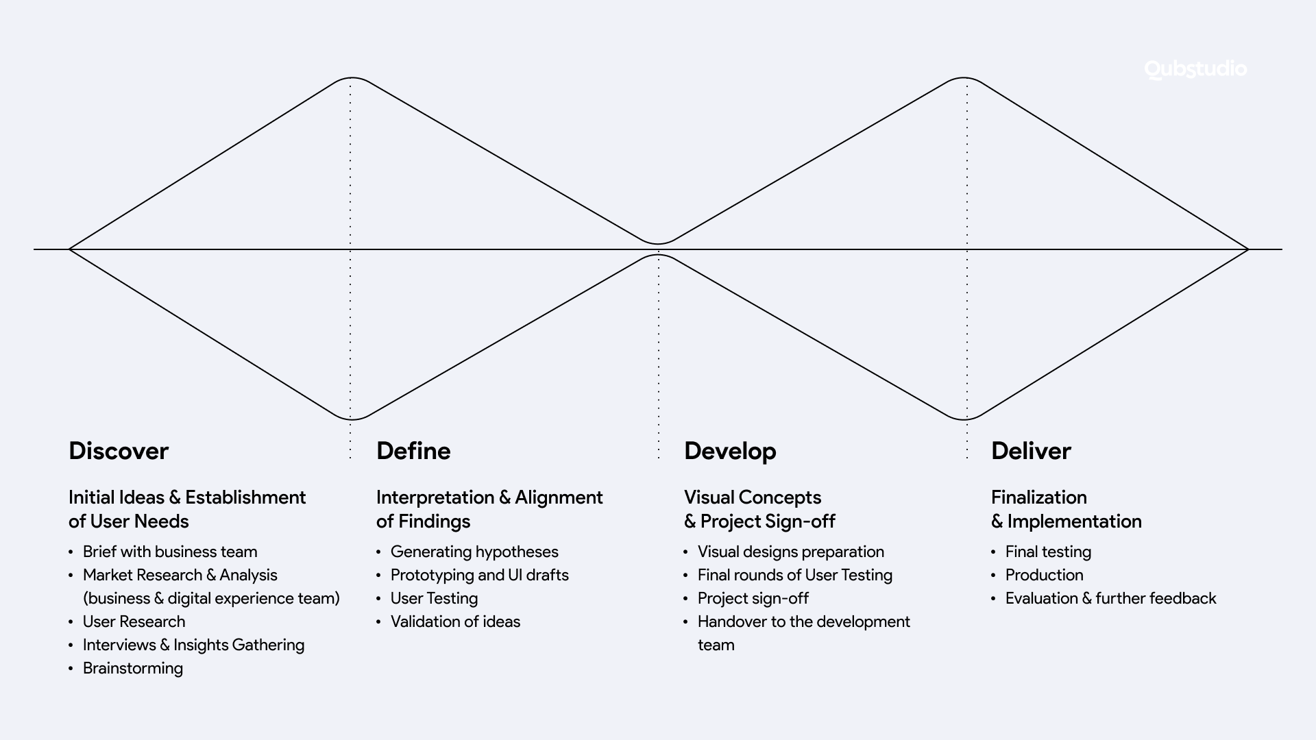
As a result, both the client’s vision and users’ expectations were rapidly transformed into clickable prototypes, which were thoroughly tested and passed on to the devs.
Qubstudio’s FinTech design expertise enabled us to create ideas and designs that gained swift approval from stakeholders, which greatly sped up the delivery process.
The product is now actively scaling and developing new features following a transparent and predictable roadmap.
Why Qubstudio?
For more than 15 years, we have been providing design services of exceptional quality for startups and enterprises around the world.
Our deep FinTech product design expertise helps us deliver the right solutions for each stage of the product journey, from ideation and market research to development and launch and all the way to scaling and continuous improvement.
Qubstudio’s excellence is proven by multiple accolades from Clutch and Red Dot. Over 500+ accomplished projects and 75 experts on board ensure we can deal with any design project and help your business achieve the expected results.
Conclusion
FinTech UX is like no other. An app must be simple and intuitive to use and yet guarantee the security and reliability of financial operations. It should use plain language, encourage positive actions, and foster memorable experiences to build brand loyalty. This is crucial in a saturated FinTech market.
We at Qubstudio are happy to leverage our rich expertise to create user-friendly, neat, and memorable Financial UX design. We can join the project at any stage and with any collaboration model to help your business better communicate your values, engage your audience, and successfully grow.
FAQ
What is a good FinTech UX?
Good FinTech UX is simple and intuitive, enabling customers to achieve their goals with ease. It also clearly communicates that the app manages financial operations in a secure, compliant, and reliable manner.
How to design or redesign a FinTech app well?
Step into the customer’s shoes. Imagine the most straightforward way of doing something with your money — but doing it securely and transparently. Gather data through surveys and testing, and match up user expectations with your vision. Qubstudio can help transform your ideas into working product designs.
What is a good business strategy regarding FinTech UX?
Your branding should express your vision, build trust in your reliability, and look appealing to most of your audience. Use simple and clear language, a soothing color palette, and memorable design features to create positive user experiences and build brand loyalty in customers who are more informed and distracted than ever before.
