A font can express much more than you think. It can be both an ideal tool for attracting users and a brake that will prevent you from establishing communication with people.
Of course, if the whole site design sucks, then no font will help. A font is not the primary key to success (at least not always), but it’s an essential component. And we will talk a little about how to use it more efficiently.
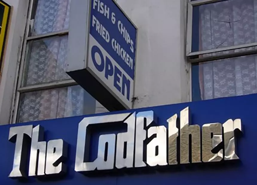
Take a look at the signboard of the place. What’s wrong with it? What do you think it offers — vinyl records, electric guitars or fried chicken? Probably the owner of the shop wasn’t concerned at all about it — who cares how the letters will look like if the main thing is the point. And that’s where he was fundamentally wrong.
Typography is key to creating a special brand identity, pleasant first impressions and attract the user’s attention. At the same time, the better the first impression is, the longer the user will remain on your site. The font and meaning of the name should be a continuation of each other, forming a single image that doesn’t cause any doubts. A correctly selected font will help you get people to buy something. Sounds incredible? Well, let’s talk about the importance of typography.
Look from the inside
Typically, typography is used in many areas, but we will talk about UI/UX design, branding, and marketing.
Typography for Branding
Creating the perfect logo designs, signboard, or business card, you should remember a few things. Not only the meaning that you are trying to convey to potential buyers is essential, but also brand typography fonts that display this meaning visually. A person’s perception processes many indicators at the same time: size, tracking (distance between letters), fat letters, etc.
There was supposed to be “Kid’s Exchange”, but something went wrong...
Depending on their values, associations are immediately lined up in the human brain. Bold and large letters immediately suggest the idea of something sturdy, heavy, weighty. A thin font with adjusted tracking is associated with grace, beauty, lightness. Therefore, the gym with the signboard printed in serif type will confuse visitors, and the beauty salon signboard with bold letters will attract only the desperate fashionistas.
Even similar fonts can cause different emotions and associations.
Try to guess which font is used by a newspaper and which one - by a glamorous magazine?
Making a thing that gains recognition, choose typography for your brand wisely. Think twice before using systematic and widely popular fonts. The best solution would be to find a concise yet untwisted font and make it the hallmark of your brand. It should also be noted that untwisted fonts that are visually appealing to the eyes are mostly paid. But think for yourself — this is a meager price compared to the benefits that you will get in the future.
By the way, typography can have a direct impact on the emotional state of users. Kevin Larson, a psychologist at MIT, investigated this aspect of typography. Twenty volunteers (10 women and 10 men) were divided into 2 groups, and each of them was provided with one of two versions of The New Yorker magazine’s article.
Articles with well-designed and poor typography
One of them was an example of well-thought-out typography; in another, the basics of typography were not taken into account at all. The results showed a direct effect of typography on the emotional state of a person. This process takes place at a subconscious level — a page with thoughtful typography aroused interest among users, they lingered on it longer. Good typography stimulated an inexplicable burst of joy in the subjects and raised their spirits. On the other hand, poorly thought-out typography caused volunteers discomfort, irritation, and even physical depression.
The correct font can set the desired mood. No matter how thoughtful your product or brand is, if it does not cause the desired emotional state, then it will not go far. Emotions are best remembered, and memory of them can last for many years. Thanks to emotional outbursts, we prefer one product to another. And the font will be an excellent tool for awakening in customers the emotions you need — joy, peace, confidence, or excitement.
The same “magic” is applicable in business. There is a common belief that B2B is operated mainly by logic and profit, and emotions there are not as crucial as in B2C. However, B2B brands that communicate with customers on an emotional level receive twice as much benefit as those who pay attention exclusively to the business or its functional aspects.
Typography for Marketing
Do you believe that well-thought-out typography can increase the effectiveness of your advertising, and make any information more trustworthy and reliable? Most likely not. But Yieldmo’s research has proven that the role of fonts in marketing should not be underestimated. They conducted an experiment by presenting 2 million users with GEICO ads written in six different fonts.
And the results of the study showed that people prefer only some of them. The best of them was Times New Roman, it received 15% more clicks than Helvetica and Verdana, and as much as 30% more than Garamond (although this is also a serif font). But this doesn’t mean that the secret of success lies in a particular font. After all, the font’s connection with the advertisement message itself plays an important role.
The typography’s influence on the perception of information is also evidenced by the results of an experiment made by designer Phil Renaud. During his studies at the university, Phil published and submitted 52 essays. When typing, he used three fonts: Georgia, Trebuchet MS, and Times New Roman. And, surprisingly, regardless of content, articles written by Trebuchet MS averaged gained a B- rating, lower than grades written by Georgia (A) and Times New Roman (A-). And the point is not that university professors hate Trebuchet MS — they simply associate serif fonts like Georgia at the subconscious level with something scientific, familiar and correct.
And Trebuchet MS (without serifs) as typography typeface resembles something simple and modern, unusual, so there is less trust in it.
Another study was conducted by Korean professors Kang and Choi — they created mobile phone ads using different fonts for the same advertising phrase. The results of the study showed that when the advertisement says about the thinness of the device, its compactness, then a high thin font with reduced tracking is more suitable for it.
On the other hand, for the ad about the elegance of the phone wins the calligraphic (handwritten) font.
The study proved that typography enhances user associations with the information that the text conveys.
Typography for UI/UX
Is it possible to control the user’s attention by just changing the font and its size? Typography design claims it can. And although it is only one small gear in the mechanism of your site, without it, the whole system can go to hell. Here are a few components to help you make better use of typography for design.
Body text (font size)
As obvious as it may seem, words printed in small print are slower and harder to read than in large print. However, different font sizes are suitable for different areas of use. Do you need a catchy title that will attract more users? Feel free to choose a larger font size. Need to determine the size for footnotes? Then the smaller the font, the better! Still in doubt about the power of typography? Then how is it for you: Clicklaboratory.com optimized conversion rates for Numara Software by 133%, just increasing the font and line spacing on their website.
Thanks to this, the guys from Numara Software began to earn $330,000 more. And there was no magic, just typography.
Let your texts breathe more
No need to sculpt words on top of each other, as if you are doing a craft from plasticine. The message is easier to read if there is enough space between letters and words. However, not all fonts need an interline height of 1.5 (accepted by the conditional standard rule of thumb). Its size varies depending on the type of letters and their x-height.
Everyone knows that for ease of reading the letters must be contrasted to the background. However, typography here has its own characteristics, which are not known to everyone. The standard “black and white” is immortalized in history, but in practice, it has already outlived itself. From reading completely black letters on a white background, people’s eyes quickly get tired. This is confirmed by a study that showed that in 58% of adult Americans, after working with a computer, their eyes were overly tired. The reason is that most often they deal with texts printed in black on a white background. And if you do this for some time, a sharp contrast causes discomfort, your eyes tighten and get tired faster. Large companies like Airbnb and Amazon have found a solution to this problem. For example, instead of black, Airbnb uses dark gray, which makes texts in their application more comfortable to read and pleasing to the eye.
Amazon came up with an excellent solution when creating Kindle e-books — they made the black text paler and the background less contrasting white. As a result, even after a long reading, users’ eyes get tired less than if they read the book in black and white.
You can check the compliance of the text and background with contrast standards offered by WebAIM.
Examples of well-thought typography
After looking at a bunch of bad examples, you might get the impression that few people are puzzled by typography in the world. No wonder – choosing photos for the article, we believed that a student with the formation of a locksmith rivets signboards and logos for brands around the world. However, every world-famous and popular brand applies the concepts of typography in the development of its style. Finally, we cite examples of decent and well-thought-out typography that matches the message of the brand.
The image above shows a great example of well-targeted and relevant typography, that doesn’t lose a sense of the whole brand, but giving it particular changes to access the audiences’ subconscious. The target audience is children, so the font is funny and childlike.
An example of how the logos’ font reflects the meaning of the product — site for social journalism.
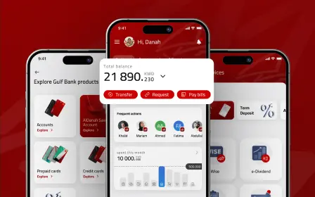
Now we will show how the well-thought typography makes any message more understandable and good-looking. Users are reading these interfaces’ texts enthusiastically and perceiving more info. So it’s a vital moment if you want to grab more attention from your audience. Just look, how popular companies manage with typography applying.
How to determine whether typography is correctly applied in a particular text? Proper typography enhances the meaning of the message and makes it more accessible to understanding. There is no single norm or successful standard — you can choose dozens of options that will equally well support the message of your text. And the secret of success lies in clearly understanding its purpose and the target audience that should be interested in it.