Interaction design patterns
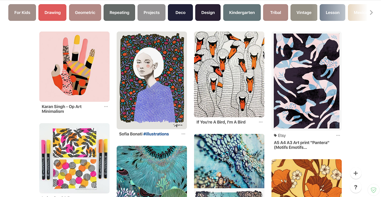
In order to understand the role of patterns in interaction design, we look into experiences with objects from the real world: repetitive patterns can be found in wild nature, interior design, fashion, and even human behavior. On a basic level, a pattern is a replication of an elementary composition in an obvious way. When it comes to user interface design we can apply similar decisions to solve typical problems. No need to reinvent the wheel, 99% of design issues already have a well-known solution.
Once you gain an understanding which pattern solves what problem, you’ll start saving time by working effectively. Lots of designers at the beginning of their carriers make the same mistake – they spend a lot of time producing a unique solution. It’s better to search for the right one instead. In this case unique doesn’t mean the best. There is no shame in learning from someone else, so don’t forget to check yourself — do the results you get overrun affords you applied?
It’s also common for a designer to choose a pattern without having a deep understanding of the problem. As a result, a chosen pattern is inappropriate and instead of solving a problem, it causes a chain reaction of issues that will be hard to resolve.
Do not forget about those who will work with your design afterwards – developers, support service and of course — users. They will appreciate it.
Deeper into the theory of interaction design patterns
Now that the importance of interaction design patterns is now obvious, let’s go through the main principles of UI design patterns.
All interaction design patterns are divided into these levels: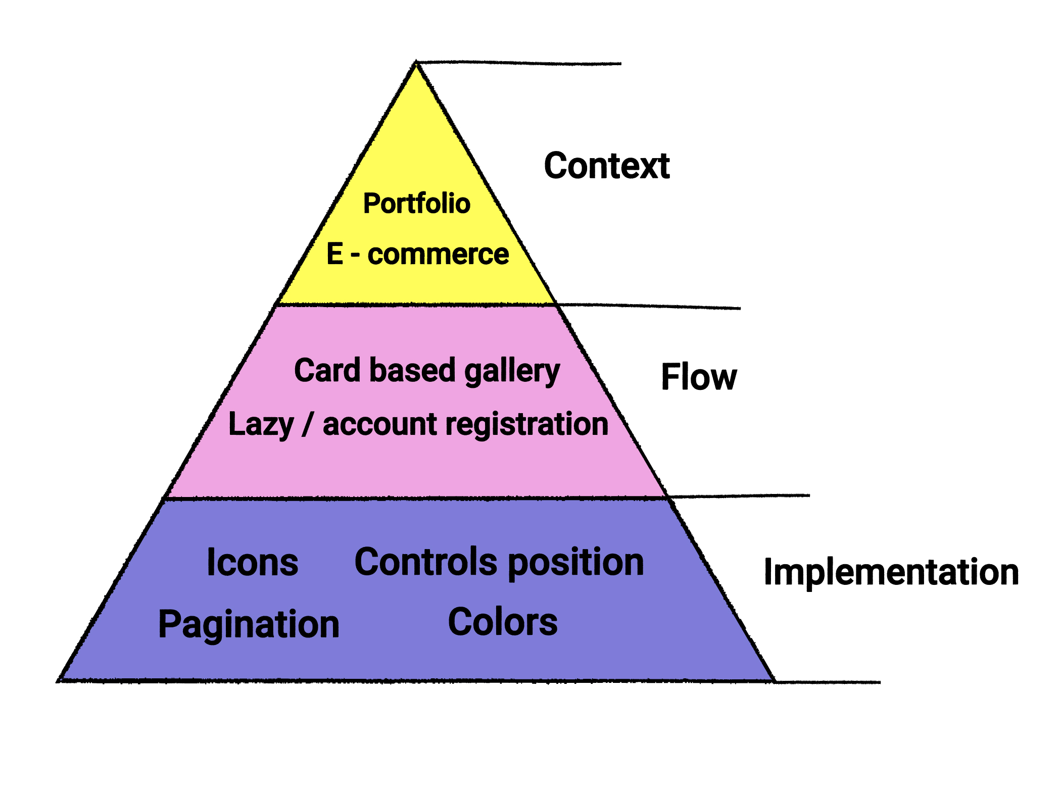
On top of the pyramid — Context level, — relies on the overall direction of solution we are working on – it could be a healthcare product or corporate website, the source of information or a marketplace. In order to choose the right style, we analyze the target audience.
During the Flow stage, we consider the typical user scenarios and sequence of actions needed to reach users goals.
On the Implementation level, we work on pointwise problems of the product, such as: placing items on the screen, picking the right color (red – dangerous, green – auspicious), etc.
Wide-used interaction patterns
Let’s go through the Flow stage in detail, as on this level we face most of the mistakes:
1. Navigation patterns
Help users understand the product, easily find needed functionality (samples: menu, tabs, bread cramps). Let’s check some of the best UX/UI Design companies practices:
https://dribbble.com/shots/3369590-Assembly-Analytics
2. Getting input patterns
Help users interact with the system by filling the data and receiving results (for instance: text fields, select boxes, drag and drop, pickers, etc).
https://dribbble.com/shots/2473854-Daily-UI-Day-031-File-Upload
3. Dealing with data patterns
Organize content for quick review, easy search and processing (samples: galleries, tables, cards).
4. Social patterns
Optimise users’ communication between each other online (chats, boards, testimonials, follow).
How to use patterns
Check if a particular pattern corresponds with your needs:
- Problem: Which system problem are you solving?
- Pain-point: Which action precedes the problem?
- Principle: Is the pattern based on one or more ergonomic principles?
- Solution: What is an essence of the problem, and what are the ways to solve it.
- Reason: Why should we use this interaction pattern as a solution and how will it affect the convenience or interaction?
- Sample: Do we have a sample of successful implementation of the pattern?
- Implementation: How can we apply this pattern to our problem?
Let’s make a sample check through all 7 items:
https://dribbble.com/shots/4766438-Cloud-Mining-Calculator-Interface
1. What is the problem?
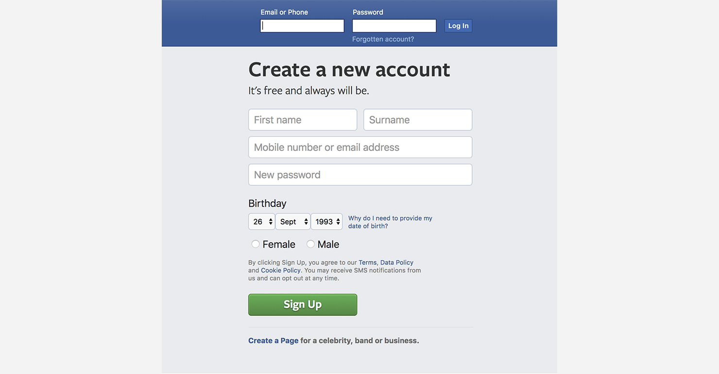
Users are entering incorrect data, which causes mistakes and system inability to process the information.
https://dribbble.com/shots/4876786-Percentage-Calculator-UI-Design
2. When does the problem appear?
You are creating an application that requires users to enter their data in order to perform a mathematical calculation. The data should be provided in numerical values only.
Yet users can enter the data in a wrong format, which will cause the system mistake. As a result — users won’t be able to make a correct calculation.
https://dribbble.com/shots/3826735-DailyUI-004-Calculator
3. Which principle to apply?
Preventing User Errors (Nelson).
4. How to solve the problem?
You should minimize the number of conditions wherever there is a possibility for the user to make a mistake. Restrict user from entering wrong data and implement error message.
5. Why we need to solve it?
By removing a system mistakes we will increase system credence among the users.
6. Was the pattern used before for a similar problem?
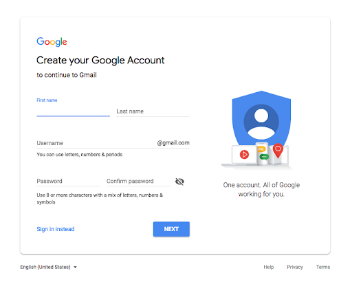
Google use hints to prevent users from making a mistakes.
You can also use numbers-only keyboard.
https://dribbble.com/shots/2337385-Calculator-App
Or an input mask.
https://dribbble.com/shots/5078965-Add-bank-card-animation
7. How to implement it?
By locking invalid keyboard characters we keep the user from entering wrong data (an input Mask).
P.S. In fact, we make decisions based on our previous experiences, which is a classic example of using interaction patterns in design. By learning to understand our motives and relevance of those decisions you can make an impact on the product, and even increase your own professional level. Alike centipede, who learned running only after it realized how to walk. Wish you to succeed in this marathon.
And to simplify your track, here are few resources that will give you a slightly deeper understanding of the topic:
The three levels of design patterns: Implementation, flow, and context
User Interface Design patterns
10 Great Sites for UI Design Patterns
