Our design internship experience of improving design for Liki24 medicine delivery service
Based on PPV Knowledge Networks research within the last 10 years, Ukrainian design has been rapidly progressing. For example, in the five biggest Ukrainian cities, there are 490 companies and 3323 PE (Private Entrepreneurs) that identify design as their primary occupation. Due to the high of demand, there is a growing need for professionals.
The expansion of the industry is closely dependent on a designer’s ability to create a high-quality product. One of the key problems of academic design education is a disparity between postgraduate qualifications and market demand. A disoriented beginner is left alone with a robust search engine that displays 376 000 results for “UI/UX courses”.
Importantly, a market for flexible and dynamic design education has also been on the rise. The majority of the courses provide a curriculum that is concise, basic and fragmented. These organizations target large student groups with a quick academic cycle. Here at Qubstudio, we created a unique internship program that aims to help the Ukrainian design industry to grow effectively. We have reviewed hundreds of applicants and carefully selected the most motivated, passionate, and skillful students to study with us for free. This kind of iterative improvement cycle is exactly what our continuous UI/UX design service formalizes for product teams that need sustained design support.
We start by assigning an experienced mentor to each intern. Most importantly — we involve interns on real projects with real tasks. Our two-month program is not limited to simply advancing user interface design skills. By participating in real projects, the interns realize full responsibility every design decision has on services and overall product user experience.
Our main goal is to shape a user-centric design thinking. In particular, an important element in such education is the formation of user flows. During our internship program this year we selected six talented interns. We pay close attention to graphic design background and soft skills. In this article, we will share a story of our intern participating in the design process for Liki24 service.
Liki24 — the uniqueness of the project and our tasks
Liki24 is a first in Ukraine service of medication delivery. The user doesn’t need to scout through pharmacies in the neighborhood, wait in endless lines and be overcharged for purchases. Liki24 buys medication at the lowest prices and delivers directly to customers at a convenient time. The service is new and is quickly developing. It has already processed 150,000 orders and successfully delivered 847,000 items of medication. According to statistics, the majority of orders were submitted via cell phones. Naturally, the service soon realized the need for improving user experience on mobile devices. Therefore, a lot of diverse tasks with shared functionality have accumulated.
We were involved with two big chapters of the service: registration flow and personal account. Our main goal was to optimize the path a user follows in order to make it easy, understandable, and a little exciting. This typical task has become a real challenge for our team. There are no services with the same functional requirements as Liki24, and therefore we were on a lookout for atypical solutions that could combine multiple parts within.
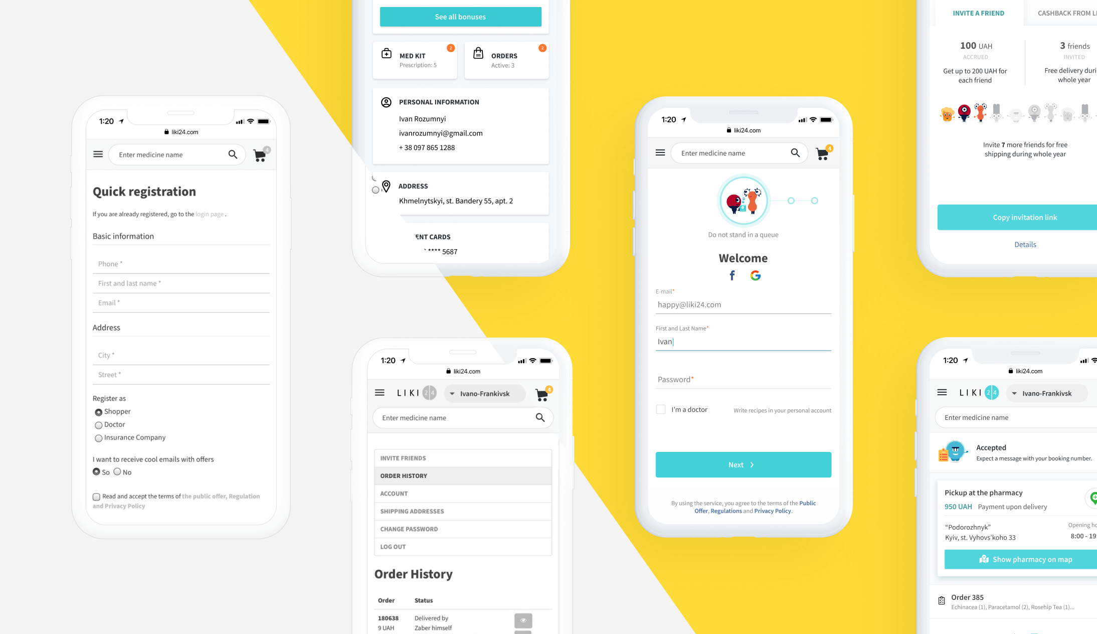
Fun improvement of a mundane sign-up flow
The original registration process on Liki24 seemed too complex and was in need of an upgrade. Every additional form field of any service can decrease the conversion rate by 30%. Liki24 has multiple types of registrations with corresponding scenarios. For a person who is looking to quickly order medication, such a process is more complicated than desired. In order to solve this problem, we analyzed the processes of popular services that our target customer would be familiar with.
We start by studying the target audience in order to base the decisions on the user experience. The research found three audience segments: individuals, medical workers, and insurance companies. At first, our attention was focused on the individuals’ group, as it is the base customer. The functionality of this profile is the widest and the most complex.
The process of registration was divided into a number of steps. In order to keep the attention concentrated, the service keeps reminding the customer of the value. For each step, we added benefits and brand characters of Liki24.

The product is transparent. It tells users why specific information is being collected. For example, mobile number verification is needed for the renewal of personal accounts. The service can also contact the customer for purchase clarifications.

Strategically, it is important for Liki24 to identify doctors for possible future cooperation. For this purpose, a special checkbox field was added to the registration form. If it is marked by the user, the system will recognize the profile as a medical worker and expand additional functionality. These fields will not obscure the flow of other profile types.

As a result, we have cleared up the registration user flow and it became minimal and a little more fun. Lovely brand characters motivate the user to finish signing-up and start receiving the benefits of the service.

Personal account — how to combine the uncombinable
The functionality is robust for both types of accounts — registered and unregistered. One of the tasks that were given to our intern was to systematize all possible order statuses for unregistered users: book, order, shipment.
At first, we analyzed all service capabilities:
- Selection of medication
- Three types of delivery
- Payment – cash/card
- Booking of medication
- Selection of a pharmacy
- Creation of personal medical kit
- A search of medical kits by occasion
At this stage, our task was to create a personal account that could combine not only these capabilities but also personal information, delivery/tracking details, payment information, order status, archive, medication kits, bonuses, etc. Shortly, this was a mission to combine the uncombinable.

We decided to use the JTBD principle in order to align and prioritize the functionality. This is simply a methodology that bases the decisions on user needs. A registered user needs the ability to control personal information and track purchases and bonuses. The information blocks were prioritized. The most needed/commonly used landed on the main screen together with shortcuts to other important features.
Our next step was to aid in the optimisation of logistic processes. Most of the time our customers are in different locations throughout the day. This is important in the context of Liki24 service because the location is considered in the medication selection process. We solved this problem with a customizable list of user’s locations, any one of which can be chosen when placing an order. With this feature, the user can get medications delivered to work, home, or for someone else.
Atypical scenarios of delivery and payment
One of the most challenging tasks for an intern is figuring out an effective user flow of delivery and payment processes. This user flow hosts multiple atypical scenarios that need to be predicted and be prepared for. Liki24 provides three types of delivery: courier from Liki24 or “Nova Poshta”, pick-up at one of many “Nova Poshta” locations, and “Self pick-up”.
There are also several types of payment methods. They are variable based on the delivery type, which presents a challenge in outlining an optimized flow. For example, if the purchase is being delivered by the courier, the order can be paid online or in cash. At the same time, the purchase can only be paid online if the delivery is done by “Nova Poshta”. “Self pick-up” option allows users to pay offline only at the pickup location.
If the customer chooses courier delivery or by “Nova Poshta”, then he will be prompted to complete a mandatory order confirmation. This step is not optional because sometimes prices can change between the booking time and payment.
It is common for people to order different medications from multiple pharmacies. In such cases, the logistics department chooses an optimal route in accordance with price differences. In case of an increased price, the customer has to pay the difference in person or online. On the contrary, if the price drops, the client can choose where to receive the return: to the original card or a bonus account.
For self pick-up, a customer has to receive and show a booking number. In addition, every order has a sequence number. Both are easily confused, so we contrasted them visually.

Our goal was to make sure the service stays clear and simple, no matter which delivery or payment method is chosen. One of the solutions was to create a system of cards with corresponding order statuses. Each card contains basic information and a specific call to action for a corresponding type of order. As a result, we made it possible to preview and access top-level information at any time. The actual status for every type of delivery is shown at the top of the screen. It communicates exactly what is happening and what, if any, actions are to be done but the user. Order status history can be accessed if needed.


How to untangle complex bonuses
There are currently two bonus programs working on the website: “Invite a friend” and “Cashback from Liki24”. The first one lets users invite friends and receive bonuses in return. For each invitee, the user can receive up to 200hrn for their first three orders. The second program accumulates cash back for purchases, which can be used for future orders or be transferred to a bank card.
The task was clear — to visually separate bonus programs, because the similarity both was confusing to customers. The funds earned from both could be used to pay for an order, but transfer to a bank card was possible from the cashback program only. For this reason, we added explanatory brand characters and created two sections users can switch between.

Mentor closing statement
An intern learns how to find correct solutions for non-standard problems during a real project. Of course, not everything works out right away. A young designer is not always able to generate adjacent theories and test them. A lot of time he/she can clearly imagine the desired result but isn’t sure how to achieve it. Liki24 service had many pre-existing working solutions. A specific style was sometimes limiting. At the same time, it helped develop a sequence of solutions and see the wholeness of the brand. It is my pleasure to see our intern overcome these challenges.

In this case the mentor’s mission is to push towards alternative solutions. Qubstudio internship’s mission is to teach young designers a variety of design approaches that will not only work visually but will also equally influence user experience as a whole.