Marketplace UI/UX design: Best practices and features

Your mother hands you a grocery list of foods and items you and your family will need. Your mission is to track down these things and successfully purchase them and deliver the goods.
So where do you start? Finding a place that meets your criteria for selling goods. Something affordable, or has a special stock, or maybe someplace familiar or convenient.
When we look to buy things, the first thing we do is find a marketplace for the grocery list of things, both in-person and online. An increasing trend of online shopping has revolutionized the way marketing and purchasing works. Websites and apps changed the way businesses and consumers interact with each other. It’s no surprise that e-commerce won’t slow down anytime soon so that means an increase in the need for UX and UI marketplace design to compete with other companies.
What Is a Marketplace?
Simply, it is a place, physical or digital, that sells various goods, where customers can come and browse and make purchases. There are various merchants to sell you things like electronics and gadgets, and another to sell you kitchen appliances and utensils or even foodstuffs and toiletries. Places like Amazon and eBay are some of the biggest online marketplaces we have today that have changed the way we go shopping.
There is a large difference between walking into a store with a grocery list and clicking on a link to a store to complete a purchase, but some of the main ideas around shopping are similar.
Designing a marketplace focuses on two main aspects that make a marketplace successful. They work with the merchant or company to understand how they want to showcase their product or service in the most valuable way.
The other focus designers work with is with the consumers of the products or services and how they can find what they are looking for and lead them through that process. In the center of merchant/consumer is where marketplace design lies, to create a beneficial relationship between the two.
Key Features Needed For Marketplace
Knowing how to design a marketplace requires plenty of knowledge of what a user expects from their platform. Marketplace platform design and innovation are based on some of these key features.
Detailed Product Description
A marketplace has many products from different companies, so the products themselves vary. Having detailed descriptions will help customers navigate and make decisions easier with more information about a product.
Advanced Filtering
A search bar is vital for digital marketplaces for customers to find the products they want because they do intend to make a purchase. But narrowing the scope of what they are searching for will make the process of shopping and buying much easier.
Product Catalogues
A detailed and well-maintained product catalog can coordinate with many other things like a service catalog, asset, procurement, request, contract, and vendor information. A potential customer browsing your marketplace will need plenty of information regarding their products.
Automated Invoice Processing
Having automated invoice processing will reduce the amount of manual work needed and also reduces the margins for error. The database can be accessed as needed for validation and other things.
Traffic Reports
Traffic reports shed light on what isn’t being used and what needs to be changed to become more effective. Unique visits and return visits can also show if your marketing is working or not. The bounce rate, or the rate of how many visitors browse and leave without purchasing, can also be utilized as a measurement of how well the website or app is doing.
Integrations with Inventory management systems
Inventory is important in e-commerce, knowing what you have, what you don’t have and what you will have in stock are what the business depends on. Combining accounting and back-end systems with inventory can present you benefits such as inventory visibility for vendors and increased accuracy for financial reports.
Customer Service
It’s always good to ask questions about a service or product, so providing support when they need it will push them closer to making a decision. Building a relationship with customers also means building trust, so the ability to provide personal customer service will make the customer feel at ease when purchasing.
Customer Tracking
This is useful for marketing purposes and to understand how the customer reached your site and what they were doing. Did they click on photos, did they follow other links, did they eventually purchase something? This information can show if your design is working the way you want it to or not.
Promotions
Who doesn’t like saving money? Promotions are a way to attract new customers and retain current ones. Cost is a huge factor when purchasing online so having a promotional sale could be the difference in clicking “BUY” or not.
UI UX design role for Marketplace Success
UX and UI are important in Marketplace website design and marketplace app design because they handle everything about the user, in this case, the business or client looking to buy something. Some of the best practices of UX UI design in the marketplace can make or break a business.
A customer or clients journey through purchasing needs to be addressed in marketplace platform design. The client needs to feel comfortable and happy with their experience from beginning to end. Knowing the customers and what they need will help with the UI UX marketplace design process.
Features for Marketplace Design
A marketplace connects consumers and businesses together so it’s important to include marketplace design features specific to these actions as a designer.
Ease of navigation
The easier it is to buy something, the more things are bought. A few clicks here and there and you’re checked out. Simple and maneuverable navigation not only promotes sales but makes the experience much better than having to figure out how to buy something on a website
Security
Dealing with sensitive information isn’t easy especially in modern times when access to information is important to everyday life. Secure networks and databases storing customer information need to be secured by a reputable company. This will make the consumer relax that their credit card info will not be stolen or their home address compromised. The level of comfort with a particular company for shopping increases when the consumer feels safe and secure.
Relationships
Building rapport with customers and clients attract new business and is sort of an advertisement. Customers’ testimonies and reviews are a result of business done and having good relations with the customer will show positive feedback.
Visuals
The difference between shopping at home and online are many, but one important aspect is seeing the actual product or service in action. Human interaction will always feel personal when it comes to shopping, but designers have to achieve this digitally. Photos of products, the look, and feel of a website or app, the aesthetics are all very important to the design.
Best Practices to Design a Marketplace at All Stages of Development
Some practices of UX UI design for marketplaces include many different ideas, especially when it comes to marketplace website design and marketplace app design. But most UI and UX marketplace design practices remain the same between the two.
Web
Marketplace web design requires much attention from to detail from UX/UI design company so that everything moves smoothly and creates a memorable experience.
The focus of a good design is to make things simple and easy for the user. So designers will need to understand the client. Are they your average person shopping for personal use or a business buying in bulk? Do you need to make text or buttons larger for older audiences, should colors be bright or neutral tones? All these questions revolve around the client.
Customer satisfaction is also a large concern to designers. From beginning to end, the customer should be satisfied with the marketplace platform design and with the customer support and experience. This means creating an intuitive and user-friendly web design for the marketplace. Things like live chat or FAQ’s and even feedback forms show that the company cares about the client.
Innovation is also a key component for marketplace design practices. Having a new way to show off an item, or a quicker and safer way to pay at checkout or even a clever way to give discounts and referrals are innovations that clients care about and are attracted to.
App
Marketplace app design is very similar to marketplace website design, with a few key differences.
Users on mobile usually looking to complete a purchase quickly, so availability of everything needs to be on the app. Things like stock information, item information, customer support, or search functions might be present on the website, but a bit more difficult to translate to a mobile app. Making things available to both website and app will draw in more users
Designers will need to make an app more interesting to use, so providing notifications and ways to get the customer open their app more often is essential. Sending reminders of carted items, or out-of-stock items, as well as shipping notifications, can multiply sales and will give the user a better experience overall.
Common Marketplace UX UI Mistakes and How to Avoid Them
Design plays an important role in our daily lives and even dictates how we buy and sell things on a day-to-day basis. Plenty of companies are flocking to UX/UI design to create a more profitable business, but many fail to achieve such a goal. They lack innovation or functionality to appeal to clients, they fall short when it comes to technical work, and don’t live up to their promises to their clients. Here are some general marketplace issues.
- Lack of customer trust towards sellers
Trust is built with users by having reputable security measures and connections. Knowing that a seller requires special captchas or logging-in to check out will put a user more at ease, rather than wondering if the will get their money back. - Sub-Optimal user journey
Getting from point A to point B shouldn’t prove to be difficult for users. Having to click on several links to get to your account information or your payment information will make users frustrated and eventually leave the website without a purchase. This is more of a marketplace design issue, so UX and UI are responsible for this. - Lack of optimization for the target audience
Many marketplaces fail to realize a niche for their buyers, and don’t get to optimize their experience. Amazon knows its customer base well enough that they created subscriptions for daily/weekly/monthly recurring purchases such as groceries or office supplies. Nike provides a special experience for trying on shoes by giving a 360 view of the shoe, pictures on foot, off foot, and even some augmented reality views of a certain shoe. - Bad customer support
There will always be problems and there will always need to be customer support. But automated messages and e-mails distance the company from the buyer and makes it extremely impersonal. This is easily the easiest marketplace mistake Successful marketplaces provide only the best customer support and will give more than generic responses, and instead provide a genuine experience with support.
Tips on How to Create a Marketplace Design
Visibility
The experience of buying online or through an app relies more on visual cues rather than gestural or audible cues. The design team should think of a creative way to involve logos, photos, text, and adverts that make the website “visible” to customers. Using space and colors effectively will provide a smoother user experience, just as going to a well-planned store layout would. Company logos, payment system icons, and brand logos can be utilized to make the marketplace familiar and memorable.
Simple Processes
People don’t enjoy filling out long forms to register for a site they aren’t particularly invested in. People buy online because it’s easy and requires less work, so making the entire process streamlined and easy appeals to those online shoppers. Simplifying the signup page to one email address or phone number is easier than providing an address, billing details, etc. even before checking out.
Trustworthiness
A customer always returns when they trust a product, so it’s no surprise that being a reliable website or app will continue to bring in good business. And its also trusting a business with sensitive information like credit card info and personal addresses.
Design Case Study: MyLoqta by Qubstudio
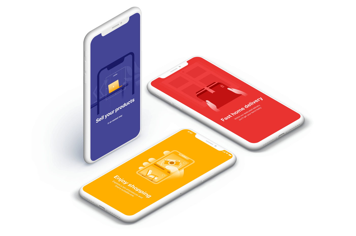
MyLoqta is a smart platform designed to connect and help individuals and small businesses sell new and pre-owned products online. Designed by Qubstudio, MyLoqta makes buying, selling, and delivering simple and easy to do, something that most e-commerce businesses are looking to do. Here is a marketplace design example presented to you by Qubstudio.
User Research
Knowing the user helps design ways to satisfy them. Having unique ways to shop attracts new customers and keeps others returning. But since this is a marketplace for new and used items, the needs are different.
Product Design
Qubstudio presents this platform as a unique shopping and browsing experience, giving users the ability to personalize their experience. A feed that is based on your search history, follows, and previous orders give the experience of personalization. The ease of the application also creates a desirable user experience, as everything they need is just a few clicks away.
Mobile App Design
Some innovative features are best used for a mobile app experience. Qubstudio designed real-time order tracking to make sure the uses has eyes all over their products sold and bought. This allows a better flow of user-to-user communication, having an open feed that piques your interests. They have also designed a way to look at platform insights, how and who is interacting with your items and store. This helps businesses and users see what kind of item attracts attention and which ones sell the best.
Good Examples of Design Marketplaces
Some good examples of marketplace design are the ones we all have come to know and love. Amazon and Ebay have paved the way for how e-commerce marketplace design has become today.
Amazon
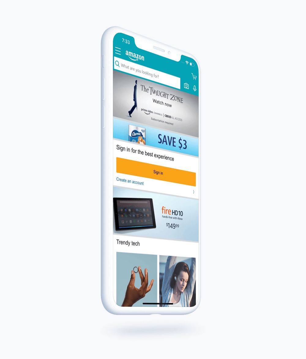
Amazon has streamlined its website and mobile application so they work seamlessly and without effort. Checking out has become simple with 1-click shopping, and delivery options range from same-day shipping to standard international shopping. They have adapted and evolved the online shopping game according to the needs of the user: fast and easy. Now Amazon has become the best place to buy anything you want on the internet.
eBay
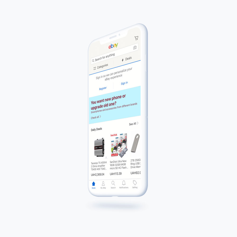
One of the largest P2P e-commerce marketplaces, eBay has grown into what it is today through many iterations and changes to their policies. Online security has always been a major problem for e-commerce, so platforms had to step up to the plate to address the problems and implement smart, secure ways to process sensitive information. Prompting users of any strange changes, password resets, disputes and refunds, eBay solves conflicts with their state-of-the-art captchas and verifications to ensure safety purchasing and selling on the platform. People trust the name eBay nowadays because they have built this reputation.
Xero
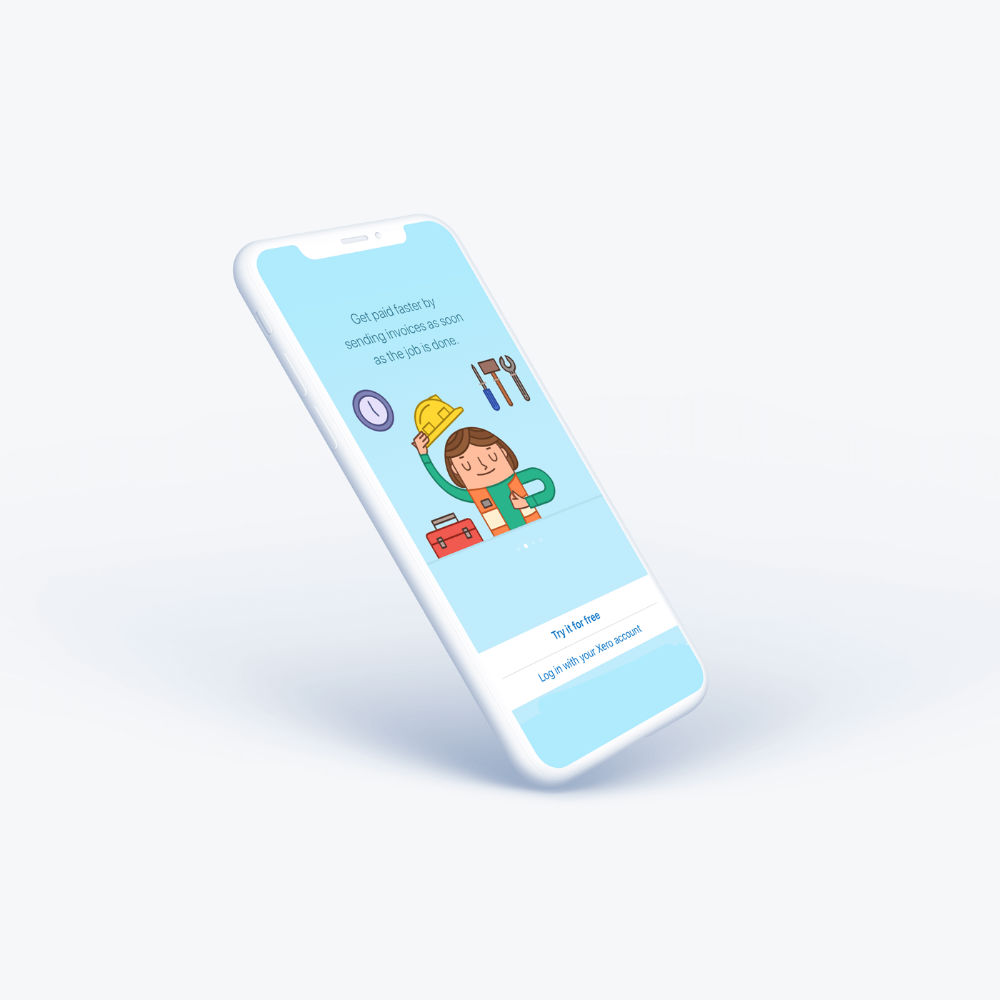
Managing your own business is challenging in all different areas possible, but Xero has created a platform to better organize your finances. It has the total package; easy onboarding experience, secure connection with banks, mobile app accessibility, and a plethora of other great features suited for conducting business more efficiently. Business will gravitate towards platforms that can do it all for them, and Xero is one of the best in its class.
Etsy
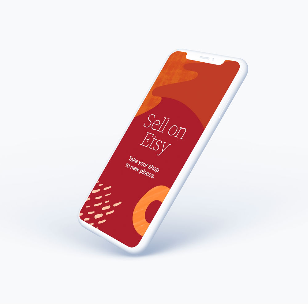
Another popular P2P e-commerce site, Etsy allows creatives and inventors to showcase and set up shop. Allowing uses to create a personalized feed, Esty brings social media and shopping together in this versatile marketplace. We see this trend becoming increasingly popular, with instagram and Facebook implementing ways to sell and buy things right there on their platform.
Bonanza
One thing about e-commerce is how users react to changes and how users can affect how business is conducted. Bonanza prides itself on more of the user experience and feedback that it listens to and adjusts to their needs. Creating an easy platform for sellers, Bonanza is rapidly growing to become one of the best e-commerce sites to start your own dream business.
How Can Qubstudio Help You?
UX design for the marketplace is becoming a crucial factor for modern businesses. The success of an e-commerce company often hinges on the quality of its marketplace experience. With Qubstudio leading the design process, you’ll gain not only strategic insights and bold ideas but also a smooth, collaborative journey from concept to launch.
If UI/UX design for a marketplace is essential for your business, bringing Qubstudio’s expertise on board is the first step toward building an exceptional e-commerce experience.
Ready to elevate your marketplace? Contact us or book a meeting to get started.
Conclusion
Designing a marketplace isn’t just about setting up a store—it’s about crafting a seamless experience that connects users to what they need in a way that feels intuitive, engaging, and purposeful. Anyone can launch a shop, but it takes strategic UX and UI design to build a marketplace that truly resonates with its audience. UX for marketplace platforms is what transforms a basic store into a seamless, intuitive journey.
Great marketplaces don’t happen by accident—they’re built with intention. Avoid the common pitfalls of poor UX/UI by investing in design that pushes boundaries and elevates everyday shopping into something memorable. After all, business success starts with user experience.
