Trends & best practices of designing best SaaS product design in 2019
What is the secret behind the success of big corporations with large user bases like Google and Twitter? There are a number of things you could name, starting from backend programming and ending with the very idea behind the platforms. However, the thing that is often overlooked is the design that they use. One of the most important steps in gaining audience is quality SaaS UI design – if anything, it may become the turning point in your startup’s development.
So how do you achieve that winning layout? In this article, we will review everything you need to know about SaaS product design to create a project that will bring you success and money.
SaaS Overview
The Software-as-a-Service model is on the frontlines of modern software production. This is not surprising – some of its features are revolutionary for the IT industry and make it clearly superior to other delivery models:
- Low computer space requirements;
- Lower overall cost;
- Higher flexibility;
- Enhanced UX/UI due to the cloud computing method;
- More intuitive and accessible interface.
You could consider several SaaS application examples of major companies successfully implementing cloud computing. For instance, Microsoft Office 365 expands its features beyond the standard stationary Excel and Word applications. It allows users to access and modify content from any platform and any device in real time and securely connect with other users. Other famous platforms include Google Apps, Slack, and Dropbox.
Common SaaS Product Design Standards
Design for SaaS applications has its own recommendations and standards – things that make the website look better and more user friendly by default. It is not compulsory to follow these rules, but you really are better off implementing them:
- Your brand logo should be on the left of the screen. Users don’t register logos if they’re on the right – it’s a fact. The top left corner is the best option, although sometimes you can see the logo in the central part of the screen;
- Make sure your website is mobile screen-friendly. People are gradually switching from computers to mobile devices, and having a website that is accessible from both is an advantage;
- Use a light background. A dark-colored website might be confusing and hard to read. Besides, having a light background creates a friendly and easy-going feeling about the interface.
Design Issues for SaaS Product
For every type of web design, there are definite dos and don’ts. UI design for SaaS is not an exception. One of the biggest challenges for SaaS interface design, UI design company is facing, is incorporating new features, and deciding which ones are worth keeping.
First of all, you need to figure out whether the new component you’re considering is making the product more interesting or targeting the audience you’re catering to. Then you should think about whether it’s making your product more complicated. You probably have the main goal for your design – does the new feature add new goals or strengthen the existing one?
You also have to think about yourself. Does this new detail make your life more difficult? How does it affect management and maintenance? Does it make your product more expensive? If so, you should carefully balance it out with the value that it adds to the SaaS interface design.
Finally, decide whether it’s absolutely necessary and non-replaceable. If you can easily substitute it with another product or a simpler element, it is probably not worth the cost or the effort. Minimize the steps and investment to maximize your profit.
SaaS Design Best Practices
Having considered the standard procedures and issues with designing a SaaS application, we can now move on to SaaS design best practices. We have compiled a number of top hacks used by most successful enterprises that have shared their experiences.
1. Navigation
The most important step when you design SaaS platforms is to provide users with easy to learn navigation and intuitive interface. This is your chance to present your company in its best light – since you don’t have adverts, consultants and conferences to promote your services, you need a nicely made and easily navigable website.
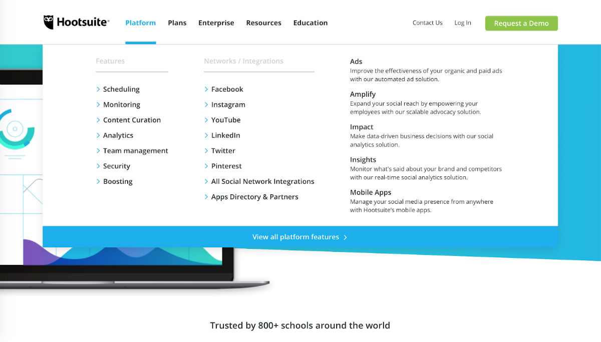
The front page should contain a dashboard with all the important links. Here, we’re coming back to the previous point – ensure you only have the most essential features lined up there so that it’s readable. The best way to lay such a menu bar out is a horizontal or vertical slide column like in this example:
2. Dynamic Sorting
Imagine how terrible it would be if, for any search result you requested, you received a bunch of completely irrelevant data gathered from the entire stock of the website. This is what the dynamic sorting feature resolves: it enables refining searches so that you only get the results you need.
The search bar is best positioned in the top part of the web-page for users’ convenience. It is also a good idea to incorporate it into the drop-down menu bar discussed in the previous section so that it doesn’t crowd the interface.
BuzzSumo is an excellent example of the implementation of dynamic sorting. Their search option allows you to search for very specific information on social shares. You can even define the time frame, as well as the type of data such as which social media it comes from, etc.
3. Simple SaaS UI Design
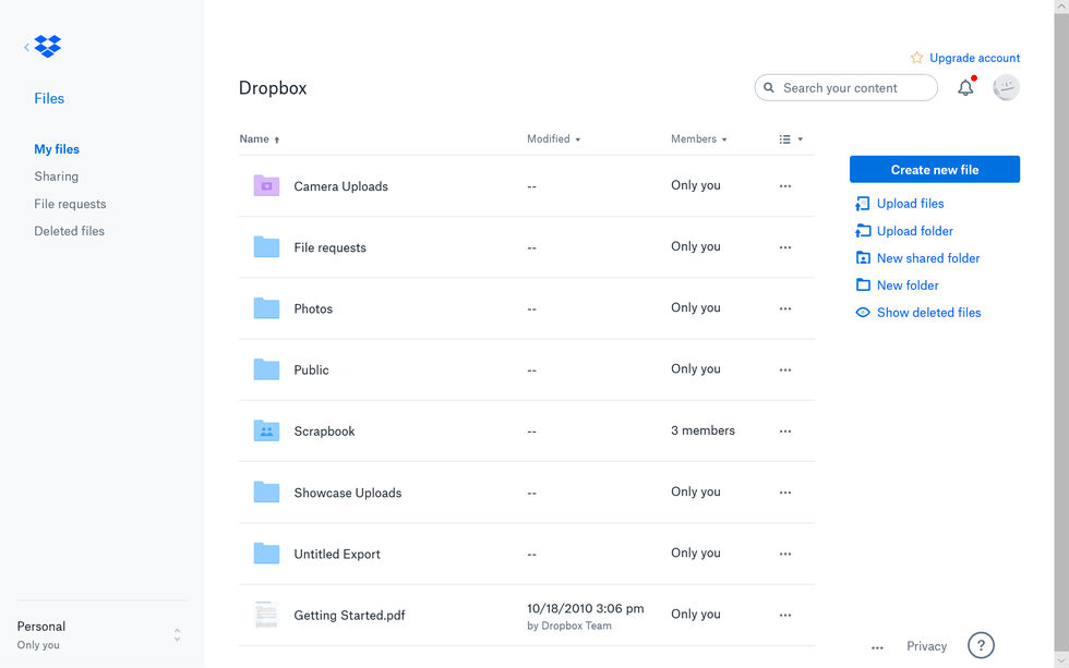
The programming of a SaaS product is complex and intricate. This can cause a range of issues, including inherently complex UX/UI. This is a major risk to your website’s success – users don’t like complex and confusing design. It is really hard to achieve a simple and easy to comprehend design which successfully covers all the nuances of SaaS architecture. Dropbox is an excellent example of such simplicity and accessibility, and that’s why everyone loves it.
4. Easy Sign-Up
No one likes to go through pages after pages of sign-up sheets and forms – it takes ages, and who has this much time and patience these days? So the fourth most important practice in SaaS design is to make the sign-up process effortless if you don’t want to scare your customers away. There will be many opportunities to learn more about your user while they’re engaging with your app.
Only collect the essentials at the start, such as the name and the email. Each extra step takes a client away from you. It’s more difficult if you’re offering a free trial – however, most users will expect you to ask for credit card details.
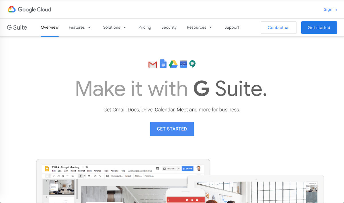
To attract more people into signing up, consider putting a vivid call to action on the landing page, making the buttons obvious. A great example would be Google Apps, who have dedicated the whole of their front page to this.
5. Product Needs to Be Personable, Makes a Great First Impression
Users love it when they feel like the website has been made just for them. Provide them with first-class service by making company representatives easy to approach, such as by incorporating an online chat window with either someone from the office or with a bot. This will help you gather suggestions to further improve the website. A FAQ section is also important to include for those who prefer self-help to direct communication.
6. Involve Your Customers During the Design Process
All successful companies know how crucial it is to keep in contact with your customer base. Let them help you make your website even better – you have a range of free tools available. Communicating through Twitter and Facebook and putting up online surveys on social media and on the website itself will allow them to take part in the production process.
7. Focus Design Time on Your App’s Most Common Features
Google has been very successful in terms of incorporating everything a user needs into a single common platform. They made sure their users have everything they need on the same page, and every one of their applications has the same familiar design – minimalistic logos, easily navigable toolbars on the top part of the page, links to other useful resources. This allowed their customers, whatever they’re doing with the platform, to comfortably move around in just a few clicks.
8. Focus on Your Target Audience
Even though your SaaS product should be appealing to everybody, don’t forget who you’re designing it for in the first place. Your landing page should be directed towards attracting that target user first and foremost. You can easily expand the range of services you provide by customizing the registration process to different kinds of users. For example, if your product is a website with learning materials for students, you should make your CTA about inviting them to sign up for free to access textbooks. However, the registration process could branch out and offer different routes for students and teachers that also want to gain access, but for different purposes.
9. Client Support
When your client decides that they like the free version of your SaaS website enough to pay for a subscription, they are more likely to want to go through the process on their own. Ensure that they have everything to avoid calling the support team – set up a step-by-step instruction page and make the process as straightforward as possible. As was previously discussed, an extensive list of FAQs should be obvious and easy to find.

10. Continually Upgrading Your Product Design
Your project will grow and develop as you gain usership, and such a process always requires tweaks and improvements to UI/UX — and sometimes a full saas platform redesign — to make your website’s class correspond to the business’s scale.
SaaS Product Design Trends for 2019
The future is here – and this applies to not only technology, but to visual arts and web-design as well. We have caught some SaaS design inspiration and found the most noteworthy trends of this year:
- Custom illustration is moving from 2D to 3D;
- Logos go from quirky and styled to plainer, simpler helvetica-style fonts;
- Inclusive design for users of all sorts of backgrounds;
- Front page focused on a massive call to action and free trial offers;
- Obvious feedback forms.
Summary: Things to Avoid in Your SaaS Product Design
Designing a SaaS product is not a piece of cake. For one thing, it is exceptionally difficult to find a balance between complex backend architecture and simplicity of the interface. When working on your SaaS product, make sure to avoid the following:
- Complex, crowded landing page;
- Excessive menu bar features;
- Hard-to-read, dark background;
- Long and daunting registration process;
- Spreading out on many different audiences rather than focusing on a single target one;
- Getting stuck on the old version of the website;
- Avoiding the mobile version of the website.
It’s understandable that sometimes no amount of text will make the design process easy, so we offer our help. We are a SaaS design company with extensive experience in the field and dozens of successful projects completed. Contact us today for advice and guidance with your website.
