What is information architecture for UX design and why do you need it?

Usually, a seamless user experience is taken for granted, while a bad experience sparks negative feedback instantly. Well, to make your intricate website or app user-friendly, you have to invest in designing its information architecture first. If used correctly, information architecture is your road to a smooth user experience and delightful feedback from satisfied users. At Qubstudio, we are huge fans of information architecture, and we’re here to talk about the role of IA in design, what it means for the user experience and how to apply it to get the best results. Let’s go.
What Is Information Architecture (IA)?
The reality is harsh. If users have a bad experience with your website, web, or mobile app, in 88% of cases they will never come back. And it takes only 0,05 seconds for the user to decide whether to stay or to leave. But a carefully designed information architecture will become the foundation of a solution your users will want to keep interacting with.
According to the Information Architecture Institute, information architecture is the practice of arranging the parts of information in an easily understandable way. IA for UX design is a structure of knowledge and ideas that helps make easy-to-find online content and a user-friendly interface. Improved performance, convenience in use, effortless navigation — all these are the results of an information architecture built right.
You’ve probably already seen information architecture in practice. The way books are categorized in libraries is an excellent example. The system helps the librarian find the necessary book quickly and hassle-free. Just like that, you have to understand what the users expect to find when launching your app or website and provide them with the necessary things in a few clicks, scrolls, and searches as possible.
The Role of Information Architecture in Design
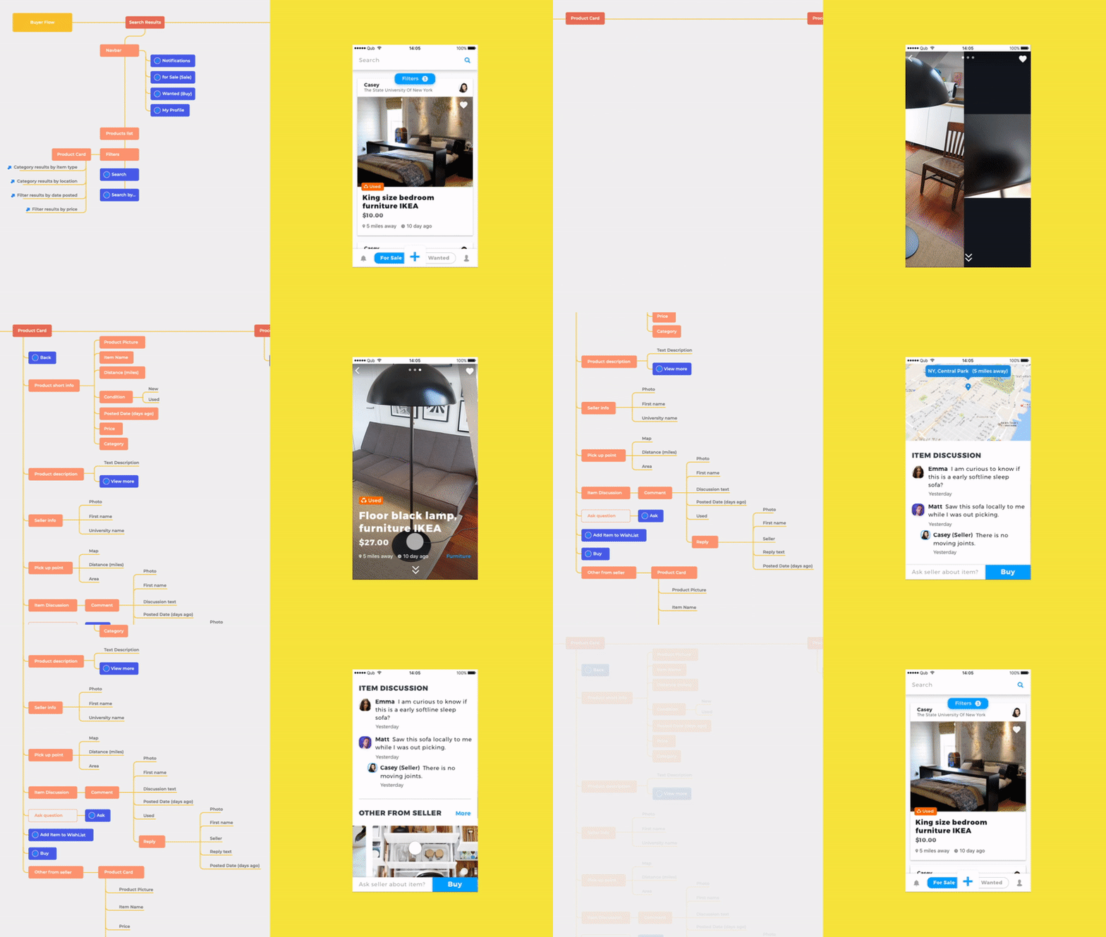
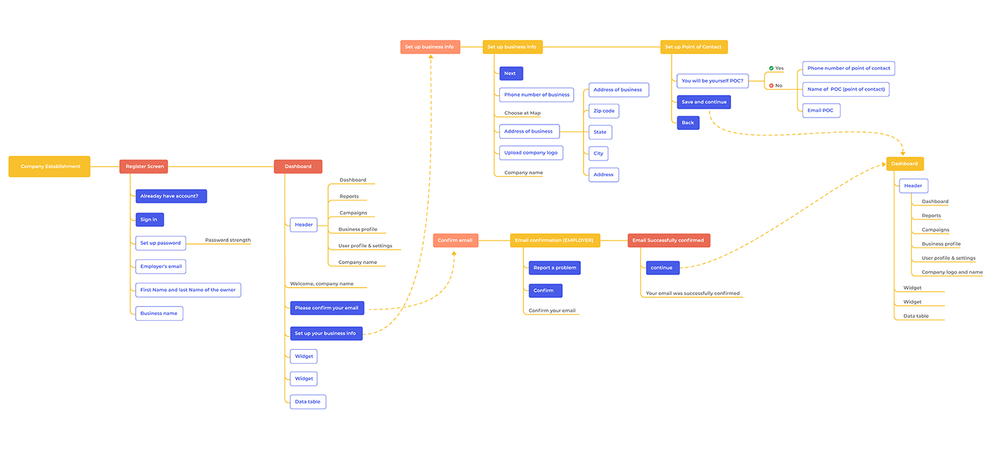
Design in the absence of content is just a decoration. And the decoration is no longer enough. You have to make sure people get value from using your website or application, and applying the principles of information architecture in design is the first step. It includes creating sitemaps, thinking the navigation through, deciding on the hierarchies, and considering the categorizations.
But hold your horses. Locking up an information architect in a room with a computer, whiteboard, and a coffee machine is not the way to go. You can’t create a solid IA without interacting with the entire design team. Information architecture is the skeleton you have to build before layering the functionality on it. When information architects cooperate with designers, the wholesome approach usually results in an elaborate IA and a delightful user experience.
Even the most eye-catching UI won’t save your web solution if the navigation frustrates its users. So, if you’re looking to create a high-quality web product, we recommend building the information architecture before you start designing the UI elements. True, this may take time, and not every designer is skilled to create an IA. But doing things right from the very beginning is easier and cheaper than fixing issues that have already annoyed your customers.

What Is Information Architecture for UX?
User experience is everything the visitors do on your website, what they get from the interaction and what they feel. Well, information architecture is all the job done before that: the whole team’s actions are aimed to satisfy the customers and solve their tasks or issues quickly.
To make the interaction between your users and the web product seamless, the UX has to be logical and goal-oriented. It means straightforward navigation and no extra elements or information that can distract the user from the primary goal. Moreover, to structuralize the information about your customers, and satisfy their true needs, we recommend creating UX personas. Implementing information architecture and knowing your users, their struggles, and desires are the critical factors that will help you.

Tips on How to Apply IA for UX
Have we convinced you that information architecture is crucial for UX design? If so, let us also share some tips our Qubstudio design experts use to build a proper IA.
Know your users
The user’s problem is to be solved efficiently, quickly, and effortlessly — that’s a no-brainer. But the key is knowing what the problem is. Luckily, there are many tools for that. You can create persona cards, run user research, make questionnaires, use other specific UX agency tools, etc. The point is that businesses have to listen to their customers, take their necessities and desires into account and not make them think for too long.
Understand your purpose
Sure, you have to know your customer well. But to have an excellent understanding of your website and its goals is also extremely important. What values does your brand have? What made you start this website or app in the first place? What’s the purpose of the entire website? How can the users help you meet your goal? It’s a good idea to try and sum up your business in a couple of words. It will help you see the goal and focus on it whenever you feel off track. Is the goal to sell? Is it to entertain? Educate?
Your industry or niche plays a significant role in determining the purpose too. If you’re an online store, then the goal is to sell. It means that the AI has to funnel the user to the purchase. If it’s a blog, the AI has to make the reader glide from one article to another.
Make sure the structure is logical and attractive
Structuring information requires applying working methods. The card sorting method is one of the ways to make this task easier. The idea here is to use cards to organize topics into categories. It is excellent for building the website structure, choosing what goes on the homepage, and classifying types and navigation. Here’s where you kill two birds with one stone: the easily understandable structure also becomes pleasant to the eyes. Intuitivity will make your website or app attractive (but that doesn’t mean you can skip on the UI design).
Show people what they expect to see
Always use corresponding recognition patterns, which coincide with the visitors’ idea about the product or service they need. If users browse through a gift certificate website, you have to show them real photos of happy people experiencing whatever the certificate offers. Then, give information they require in the tone of voice they want to hear: the certificate details, its price, the possible preparation, and other steps or requirements.
Depending on the page type, the content and page design should be corresponding.
| Interactive page | An interactive page should include fun, educational and easy-to-read content. The more, the better. |
| Sales page | On a sales page it is better to place the necessary information about the products or services you sell, as characteristics, price, or payment options. |
| Landing page | A landing page should contain a direct sales copy and a registration form. Having filled it, users can access exclusive products or services in exchange for personal info. |
A sales page design won’t work for those who came for fun or entertainment. Similarly, people who came to buy a vacuum cleaner wouldn’t want to read about vacuum cleaners’ history. Give your users what they came for, and they’ll return.
Create a user flow scheme
Make an order of actions the user will accomplish at your website. For instance, if users are looking for male winter shoes, here are the logical steps they are most likely to take:
- First, the user chooses the season (winter) and the type (shoes).
- Then — the size, the height, the material, etc. The website should automatically narrow the selection down from 220 to 20 items.
- When the user picks the model they’ve liked, the page should show the details, photos, available colors, reviews, and other item-related info.
- The user can then add the item to the cart or save it to the “Favorites” list.
A user flow doesn’t have to be linear since it takes different actions into account. And along with being an indispensable part of IA, a thoroughly designed user flow scheme is a great way of UX optimization.
Conclusion
Everyone knows what lousy user experience is from experience. But once more companies realize the importance of proper information design, there will be far less infuriated and puzzled users.
Creating information architecture is essential for all types of websites with a collection of products, pages, or items so big that trivial navigation won’t suffice. Online stores, news platforms, website directories all need to implement information architecture in their design. The reasons are threefold:
- Satisfied customers
- Low bounce rate
- Reliability and popularity
To build a logical and practical information architecture, it is necessary to understand your users and your own goals, structure information accordingly, create a user flow scheme, and understand what types of pages they expect to see. Or ask a professional to do that.
Qubstudio specialists know the process inside out and always comply with the information architecture principles. So, contact us anytime, and we’ll gladly help you build an excellent IA for your UX.


