Why you should consider usability heuristics in UI/UX design. And what happens if you don’t…


- TL;DR
- What are usability heuristics
- System and the Real World
- Aesthetic and minimalist design
- Help and documentation
- Error prevention
- Help users recover
- Visibility of system status
- User control and freedom
- Recognition rather than recall
- Consistency and standards
- Flexibility and efficiency of use
- Research more
- Conclusion
- FAQ
TL;DR
Usability heuristics are essential guidelines for creating natural interfaces—Nielsen’s foundational principles separate successful products from failed ones, demonstrated by iPhone’s revolution against Nokia and Windows Mobile.
Nielsen’s 10 Usability Heuristics:
- Match Between System and Real World — natural interaction reflecting expectations
- Aesthetic and Minimalist Design — simplicity as competitive advantage
- Help and Documentation — accessible support empathizing with users
- Error Prevention — anticipating mistakes before they happen
- Help Users Recover — meaningful error messages with next steps
- Visibility of System Status — keeping users informed
- User Control and Freedom — undo/redo and easy escape paths
- Recognition Rather Than Recall — leveraging visual memory
- Consistency and Standards — industry patterns reducing adaptation time
- Flexibility and Efficiency — shortcuts for experts, simple paths for beginners
The Article Goal: To provide you with comprehensive guide to usability heuristics—understanding Nielsen’s foundational principles and Weinschenk-Barker’s 20 extended rules for building intuitive interfaces that prevent costly UX failures.
It often seems that digital interfaces came to our life so long time ago that the era of the analog world is a distant past. And despite the fact that the Generation Z was growing up together with cybersports, smartphones and wireless networks, do not underestimate the fact that we are still those people who were acquiring their instincts offline for a thousand of years, and our parents were developing our fine motor skills, logic and cause-effect relationships in the living room or on the playground.
What are Usability Heuristics
Sure, we are transforming deeply for the past few decades, but in most cases, while dealing with digital devices, we are still waiting for quite analog interaction — so similar to the real world.
At the end of the past century, with the development of the first software with GUI, the first attempts of researching these usability principles were taken, and fortunately, they were excellent.

Heuristic Evaluation is not the set of rules — it is more about recommendations of making interface natural for the end-user. And all the magic is hidden there. In this article, we will focus on Jacob Nielsen’s research, published in 1995 — 10 Usability Heuristics for User Interface Design. Despite the time and significant changes in digital interfaces, they are still works and still recognized across the designers.
For better understanding, let’s first look into the past. Do you remember Windows Mobile smartphones or Nokia N-Series before 2007? Those devices were not for everyone. Windows Mobile devices required a stylus, and its user experience was too complicated for regular customers. Nokia with Symbian OS didn’t support touch screens, and its UI was more similar to typical cell-phones but more complicated and slow. Both systems were rather geek-oriented and scary for regular users. So what happened then?
Match Between the System and the Real World
Steve Jobs was a great marketer, and he was well acquainted with usability design principles. iPhone was a complete rethink of users’ interaction with a mobile device.
So what helped the first iPhone to change the world? It wasn’t the revolution from a technological point of view. But it didn’t require stylus, its UI was simple and completely rethought compared to existing devices. So it was attractive for the user because of its natural way of interaction and skeuomorphic UI design on a big screen. It’s all about just one of Jacob Nielsen’s Usability Heuristics — Match Between the System and the Real World. When the system looks and behaves naturally, users will always be thankful. It was the design and out-of-the-box that caused a revolution in the case of the iPhone — designers, as well as product owners, should always remember this case during their career. Underestimating of this approach killed Nokia and Windows Mobile.

Aesthetic and minimalist design
I used to think that if the program is easy enough to understand, it cannot be a professional tool. And it was right for some time: tools for professionals with specific functionality probably did not require much design thinking approach and simplicity at the beginning of 2000. But the digital world is growing fast, everybody wants to have cute photos with their cats, and today you are able to edit your pictures with just a few taps on your phone. And the result will be good enough to upload them on social networks. Simplicity in design now is a big trend, and it also appears from design heuristics, from basic human needs — people want to use what is simple. People would prefer using and buying simple tools instead of complicated ones.
And now think about the IKEA phenomenon — have you ever had a chance to assemble the IKEA furniture? And something from the local market? You will never fail with IKEA instructions and will definitely have some issues while assembling a regular commode — the same goals but different approach. IKEA wins because of its simplicity. Never distract your users with useless details and information. Take into account only useful features.
Help and documentation

Ok, cheap furniture taught us about the importance of simple & clear instructions. In the digital world, designers often underestimate the importance of Help and Documentation because they are not the end-users of the system.
Empathize user, try to explore possible pain points, use documentation from the support department if available. Help & Documentation should be simple and prominent — use IKEA’s approach in this case too. A good example is Amazon.com, where thousands of users are forming Q&A section themselves by asking questions and giving the answers — it’s a decent and cheap way to cover all possible questions from users and to give them complete answers.
Error prevention
Nowadays we don’t worry about plugging cable into the wrong computer port or even filling our cars with the wrong fuel — possible errors are prevented by engineers. We even do not afraid of being lost in the forest because all tourist routes are well marked. The same thing applies to the digital world: designers help users walk through the flow correctly and to prevent possible errors instead of describing them.
Airbnb is disabling unavailable dates in a calendar while selected dates by the user can be changed almost on each screen.
Google Travel is giving suggestions inside of the search field, and text fields are designed to provide the ability of entering information only in a proper format.
Or even more interesting: Google Maps is recommending you the route with the lowest traffic jam in the morning before you getting into the car.
And here is the most epic example of what could happen if we DO NOT consider this heuristic. Samsung put a special film onto the screen of its revolutionary flexible Galaxy Fold. But this film wasn’t just for screen protection — it was actually the part of the screen. It was placed just like a typical screen protector film: with the small space on the edges. So users considered this film as a protective and a lot of them tried to remove it. The result was disastrous: lots of screens were damaged, Samsung had to call off the batch of devices for providing improvements, the start of sales of the innovative device failed. Just because designers did not manage to prevent possible incorrect user actions. Considering reputational damage, Samsung even won’t be able to calculate the loss caused by this case.
The same thing is in digital products: if the designer does not predict possible errors, users will lose time, information, and money in the future.
Help users recognize, diagnose, and recover from errors
But for sure it’s impossible to avoid all of the errors, so we need to help our users how to deal with them.
‘Error 404’ — is a good example of how we should NOT describe an error. ‘The Page Cannot Be Displayed’ — much better. But what to do next? Imagine that you stuck inside the elevator. What would you do? Probably you need a connection with the operator, or maybe — open the door button. So you can use a similar approach here. Moreover, in the digital world, you can go even further.
Dribbble designed a search by the color tool of the 404-error page and, for sure, with the traditional search, ‘Home Page’ & ‘Contact Us’ links in addition. In more typical cases, for example, when the user got a duplicate file while copying, the system may suggest not only ‘Skip’, but also ‘Replace’ and ‘Keep’ both.
Visibility of system status

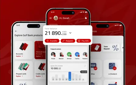
Probably, this is one of the essential heuristics. People enjoy understanding what’s going on around us. That’s why we invented the time, seasons, location, etc. Visibility of statuses is equally crucial in the digital world too. The minimum information that you can provide is the understanding of the current user’s location on the flow. But the detailing of useful information is always good in this case. For example, that’s fine when you’re informing the user when his message sent. But it’s better to tell that the message has been read in addition, and even better — by whom (group chat on Facebook Messenger). Notification sound for the incoming message, LED indicator on your phone, all kinds of the progress bars, by whom the document was edited last time — all of this information is extremely important and simplifies the user’s life — so never skip it!
User control and freedom
The case with messages describes this heuristic very well. Have you ever been in a situation when you sent somebody a message by mistake? That was a disaster, wasn’t it? So this heuristic teaches us to consider such cases and to support undo/redo. And edit/delete button.
So how do you solve this problem nowadays? Try not to use tons of pop-up screens (like Microsoft does) — use Google’s or Monobank’s approach when user can see Undo button for a few seconds.
Recognition rather than recall
While lots of designers run after terms “clean interface” and “dribbble style” the reality is a bit elsewhere. What are design principles in UX? A designer should always work on solving users’ problems and one of them — making the experience comfortable. Ask yourself this question every time you are trying to invent or design something new: “What user’s problem will this app (screen/function) solve?”.
Visual perception is a great tool to create a strong user experience. Our constant memory contains huge massive of data that we can use for building correct associations, recognizable elements instead of teaching users something new.
Good example: using recognizable icons’ home’, ‘search’, ‘edit’.
Bad example: creating a completely new icon without any subscription.
Do not hide menu items into a burger button if there is no other need except the beauty. It will take time for the user to find recognizable sections. The only reason to hide menu elements into the burger menu is if you want to focus your user on the main (landing) page — the rest of the pages are secondary and do not bring much value.
The other case where this heuristic is appliсable is to display user filter settings in a comfortable way (like recently viewed items, unfinished bookings, etc.)
For example, Airbnb is displaying (and gives the ability to modify) booking settings on every screen of your booking flow.
It’s always better to take a grocery list in a supermarket instead of keeping everything in your head.
Consistency and standards
During a human’s life, lot’s of typical behavior patterns are forming according to the environment. Some of us can’t wake up without coffee while others — without a cold shower. Somebody’s morning begins from going to the cafe with croissants. And if the cafe would be closed or the water supply is blocked one day — these people would be frustrated.
When I was driving my first car, I required some time for adaptation. Then I change the old for a new one. And I’ve got some stress because some buttons were in another place, steering was slightly different, mirrors had another design. That’s why many people prefer buying cars of the same brand.
These examples show us that you have to think twice before changing some typical, industry-standard patterns — is it worth the user’s time for adaptation?
Inside of the system, it’s also quite important to keep consistency and standards. CTA buttons should be the same color everywhere, despite the light or dark interface applied. The logic of the system and visual hierarchy must be the same across the platforms. Each user flow also should have a similar logic.
As a vivid comparison, we can remember the organization of Settings in MacOS and Windows: since Windows 8, Microsoft decided to build the new Settings Menu, instead of the old Control Panel. New Settings look more simple and modern, but it didn’t replace whole Control Panel functionality, so Microsoft decided to keep both menus: Old Control Panel and new Settings. And it was terrible! Until today in Windows 10, I don’t know where to find some controls. In this case, MacOS things get much better because everything is organized in one place. Another advantage of MacOS is its visual part: all system elements are designed in one style while Windows 10 keeps the history of its design evolution: you can find the elements of the latest Fluent UI and also some Windows 95-styled windows deep inside the system. It makes us, designers, sad.
Flexibility and efficiency of use
This one is very easy: Shortcut — the word from the offline world that caught on well in our favorite programs together with ‘Hotkeys’. And this functionality can be quite useful for professionals while it can be completely useless for most of the regular users who are using the menu. Usual customer can look through the catalog of the eCommerce website, while some of them has come with the exact need and will use the search bar for achieving the goal. The same idea works on the desktop: some users are using dialog windows when adding new photos to the app and others are using drag’n’ drop. You have to work out all possible scenarios to make your users feel comfortable while interacting with your app.
Research more
Jabob Nielsen’s Heuristics Evaluation is, for sure, a powerful tool, and most designers use it. But it’s always good to learn more and to search for new opportunities: sometimes you can find beneficial and more suitable things.
In 2000 Susan Weinschenk and Dean Barker created heuristics and rules categorization gathered from a lot of strong sources (incl. Nielsen’s). It is a list of 20, and for sure you should pay attention to it:
User Control: User may feel he has enough control over the interface
Human Limitations: Don’t overload interface with information – users will just skip it. Consider limitations, which customers have
Modal Integrity: The interface should use the most relevant modality for each task: audio, visual, or motor/kinesthetic.
Accommodation: Interface should fit the way the user works and thinks
Linguistic Clarity: Communication with the user should be efficient, clear and understandable
Aesthetic Integrity: Design should be visually attractive and appropriate for the target audience
Simplicity: The interface would contain only the required information and communicate with the user in a simple way
Predictability: The interface would behave in a way user expects, and each step should be predictable
Interpretation: The system can make logical assumptions of the next user’s steps
Accuracy: The result of the user’s actions should meet his goals
Technical Clarity: Design of the system would fully match its Target Audience
Flexibility: User may have an ability to adjust the interface for personal needs
Fulfillment: User experience is fully satisfying
Cultural Propriety: Social customs of the users are taken into account
Suitable Tempo: The tempo of the system actions and its flow is suitable for the user
Consistency: Interface and its components are consistent
User Support: Help & Support are easily accessible for the user if required
Precision: Systems flow will bring the user to the desired result of the task
Forgiveness: Actions performed by the user must be recoverable
Responsiveness: System is providing the feedback for its status and users actions.
Conclusion

The truth is that we all are trying to make interfaces as much similar to the real world as it is possible and even better. That is why we are waiting for the proper VR which could replace us the reality. And that’s why heuristic evaluation will always be the best friend for the designers. They are reflecting our behavior and needs. They were described a long time ago but still actual because we didn’t change much inside. For sure, you should not use them as design axioms — as we said in the beginning — these are not rules. They can be not applicable in some specific cases, but they are truly helpful when trying to answer yourself on how to design better for the user.
It’s quite a cheap and effective method of testing your prototypes before providing other types of testing. And it’s an excellent tool for product owners as well — knowing of heuristics evaluation may help to be on the same page with the design team.
For sure, the best way to make a great interface is to consider User Interface Heuristics from the beginning of the design process.
FAQ
What are usability heuristics?
Usability heuristics are recommendations for making interfaces natural for end-users—not strict rules, but proven guidelines. Despite digital transformation, humans still expect analog-like interaction similar to the real world, formed by thousands of years of offline instincts.
Jakob Nielsen’s research published in 1995—10 Usability Heuristics for User Interface Design—remains the foundation. Despite significant changes in digital interfaces, these principles still work and are recognized across designers today.
What is heuristic evaluation in UX?
Heuristic evaluation is an effective method of testing prototypes before conducting other types of testing. It’s an excellent tool for product owners as well—knowing heuristics helps stay on same page with the design team.
Heuristics reflect human behavior and needs. Described long ago but still relevant because humans haven’t changed much inside—they’re truly helpful when answering “how to design better for the user.”
Why is "match between system and real world" critical?
When systems look and behave naturally, users feel grateful. The iPhone wasn’t a technological revolution—it eliminated stylus, simplified UI, used skeuomorphic design. That natural interaction caused the revolution.
Designers and product owners should always remember this case throughout their careers—natural interaction beats technical complexity.
What does "recognition rather than recall" mean in UX?
Our constant memory contains huge data we can use for correct associations—designers should use recognizable elements instead of teaching users something new. Use recognizable icons (home, search, edit), not completely new icons without subscription.
Don’t hide menu items in burger button just for beauty—it takes time to find recognizable sections. Airbnb displays booking settings on every screen, allowing modification anywhere. It’s always better to take a grocery list to supermarket than keep everything in your head.
How can visibility of system status improve UX?
People enjoy understanding what’s happening around them—that’s why we invented time, seasons, location. Visibility of statuses is equally crucial in digital world: minimum information should show current user location in the flow.
Detailing useful information always helps: not just “message sent” but “message read” and even “by whom” in group chats. Notification sounds, LED indicators, progress bars, last-edit timestamps—all extremely important and simplify users’ lives. Never skip this information.
How do Weinschenk's 20 heuristics expand Nielsen's framework?
In 2000, Susan Weinschenk and Dean Barker created expanded heuristics categorization gathered from strong sources including Nielsen’s. The list of 20 covers broader aspects:
- User control & Human limitations—don’t overload users with information
- Modal integrity & Linguistic clarity—relevant modality and clear
- communication
- Aesthetic integrity & Simplicity—visually appropriate for target audience
- Predictability & Interpretation—expected behavior, logical assumptions
- Cultural propriety & Suitable tempo—social customs and appropriate flow speed
- Forgiveness & Responsiveness—recoverable actions and system feedback