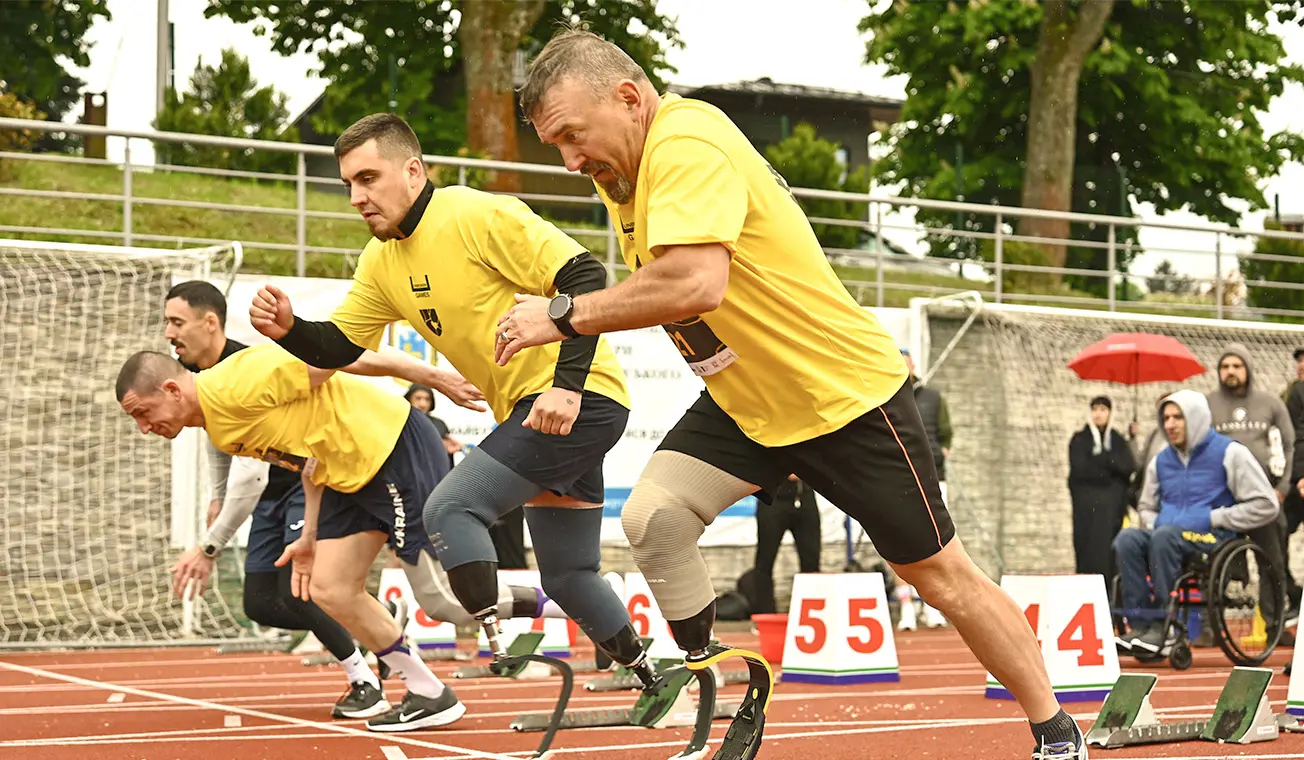
Lviv Military Sports
Creating a Visual Identity That Speaks of Strength, Support, and Healing
Capabilities
Branding
Motion Design
Duration
3 months
Team
Brand Designer
Art Director
Project Manager
Location
Ukraine
Industry
Non-profit organization
Sports organization
Capabilities
Branding
Motion Design
Duration
3 months
Team
Brand Designer
Art Director
Project Manager
Location
Ukraine
Industry
Non-profit organization
Sports organization
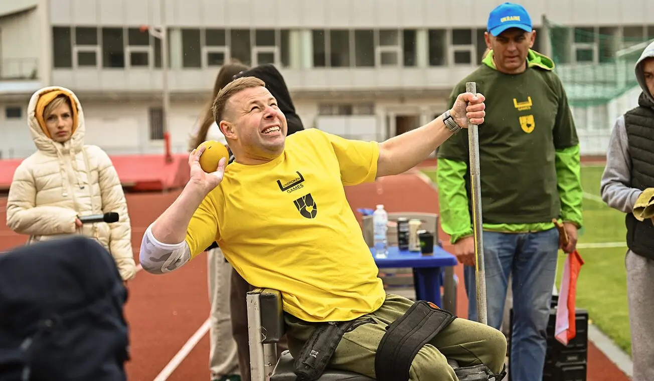
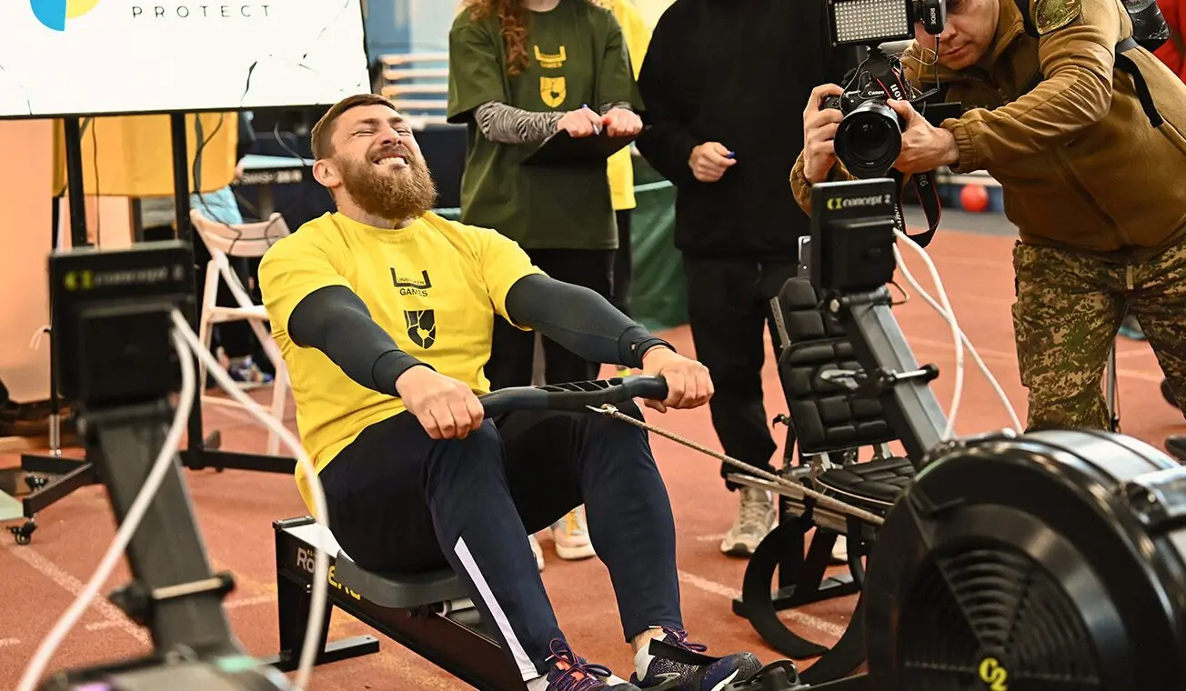
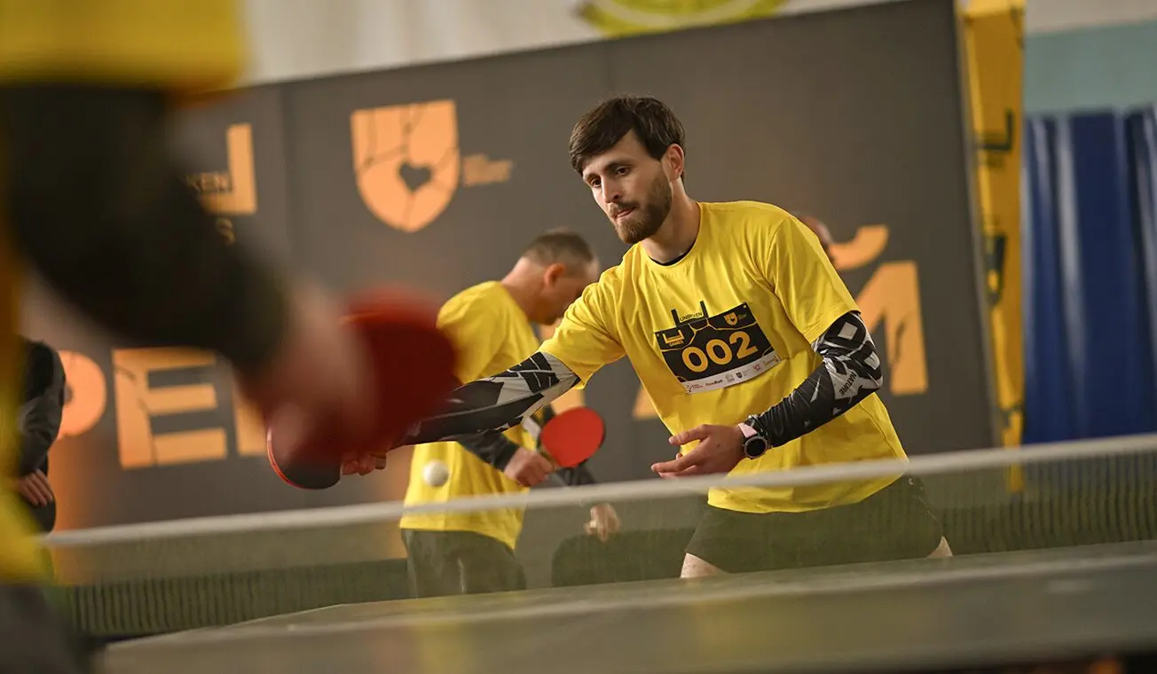
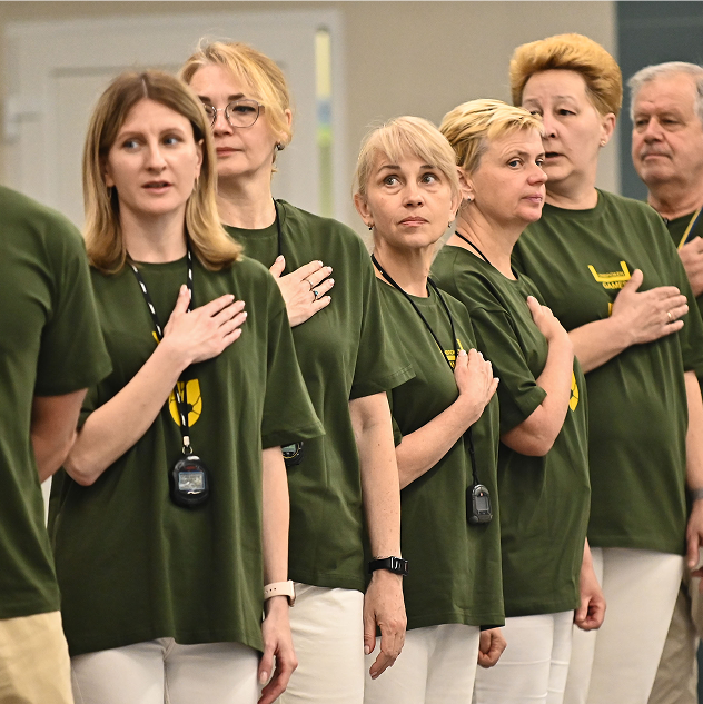
Lviv Military Sport is a nonprofit sports organization that supports veterans and military families through physical activity and community-building programs. Its mission is to promote recovery, resilience, and reintegration for those affected by war. We developed a visual identity that starts with meaning and stays strong in every detail.
Turning Healing into a Visual Language
A newly established division under the Lviv City Council approached us with a request to create a brand for the Lviv Military Sports from scratch. The key was to move away from abstract visuals and build a concept rooted in purpose, emotional depth, and impact.
As the organization serves military personnel returning from combat zones, the brand needed to evoke a sense of support, stability, and community. Our task was to communicate all of that through design. We weren’t just creating a logo — we were crafting a symbol of resilience and protection.

Recovery as the Heart of the Brand Design
We began by exploring the core meanings behind the brand and identifying what needed to be communicated through design. Close collaboration with the client, including a series of strategic workshops, helped us uncover the essence of the brand together.
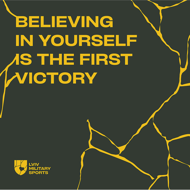
A strong brand carries a promise. In this case, that promise is restoration, inspiration, and support.
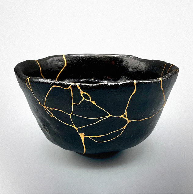
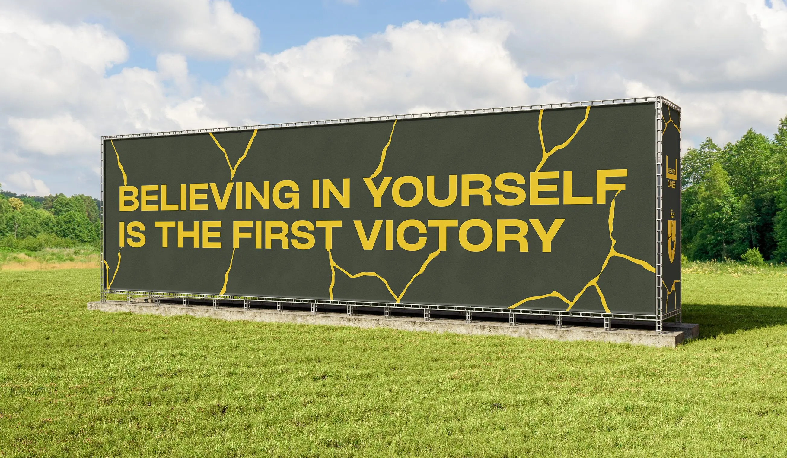
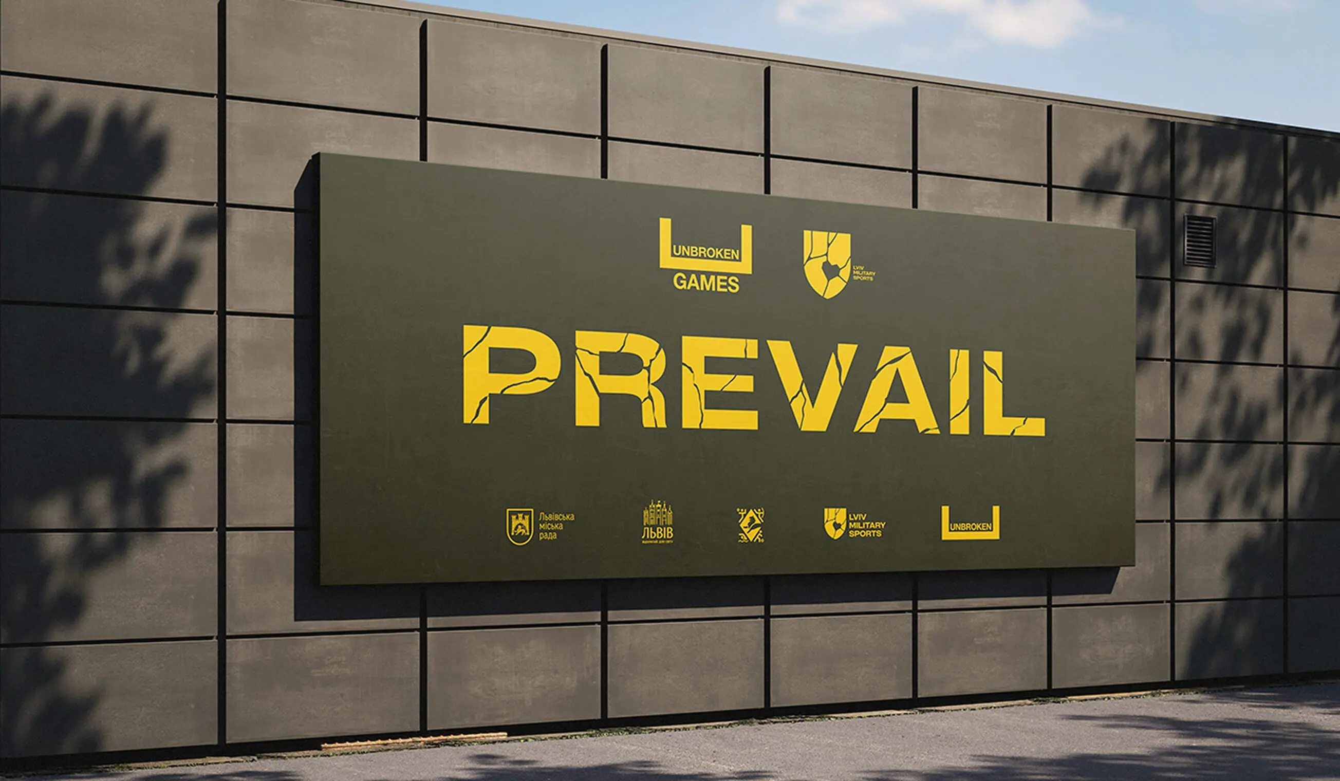
To visually communicate restoration, we turned to the Japanese art of kintsugi — a method of repairing ceramics with gold. But more than just a technique, kintsugi is a philosophy: it embraces flaws as part of an object’s history, transforming damage into beauty. This symbolism perfectly aligned with the emotional mission of the organization.
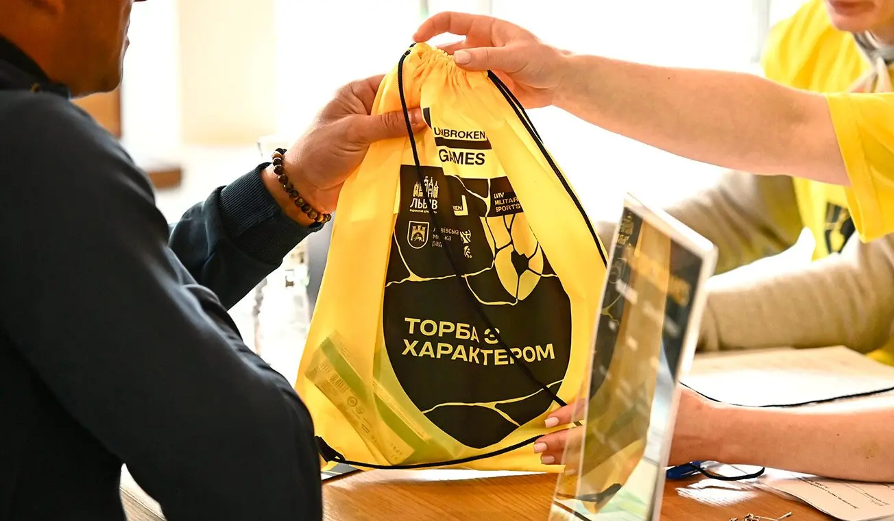
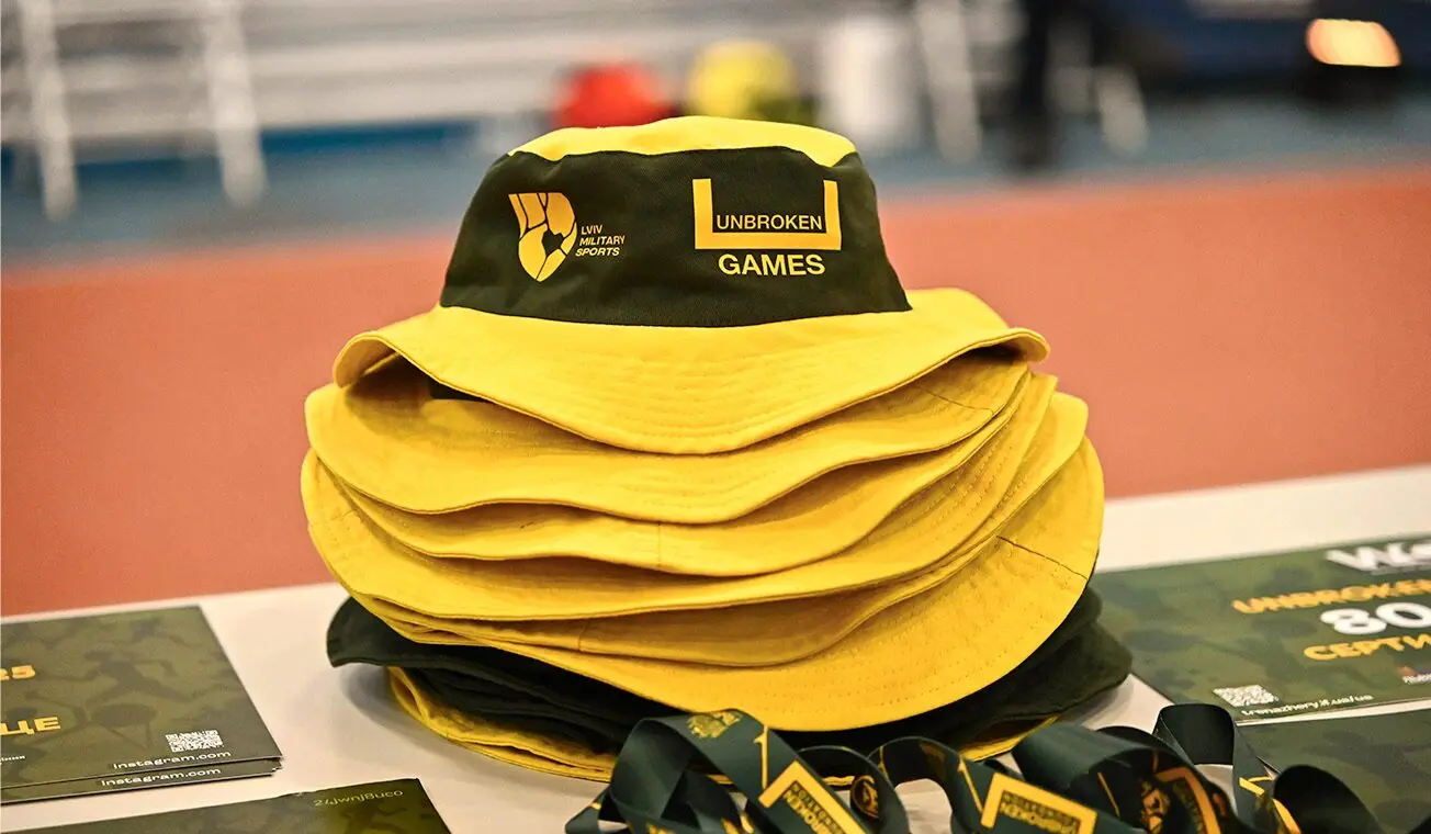
A Strong Brand Promise Expressed Through Every Touchpoint
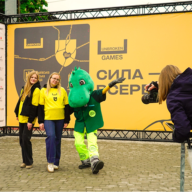
We crafted a brand that doesn’t just speak — it heals, unites, and inspires through every detail.
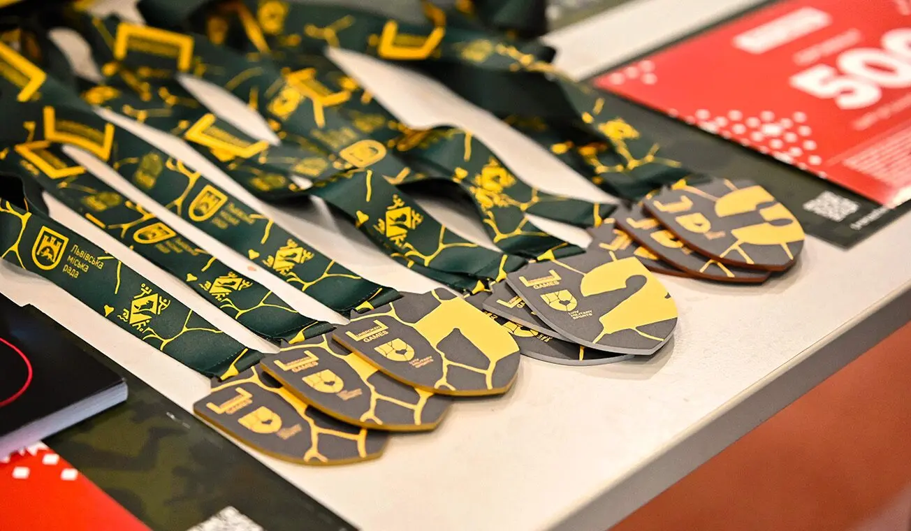
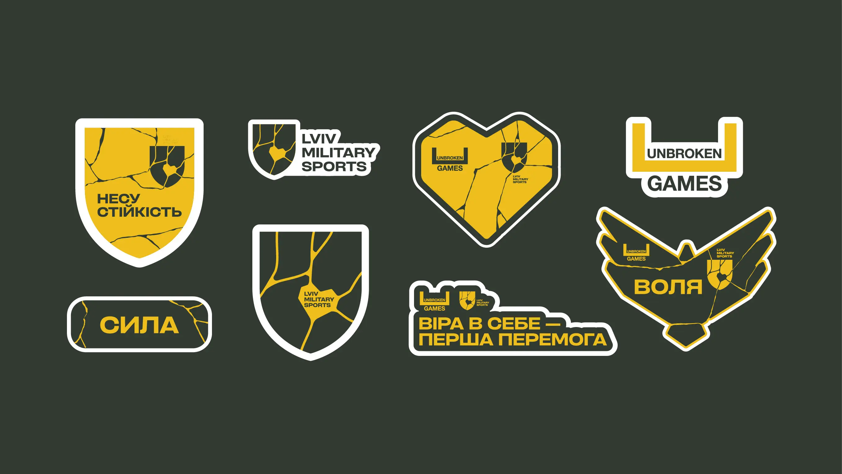
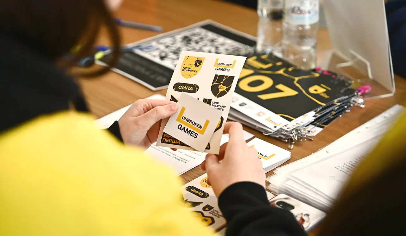
Logo
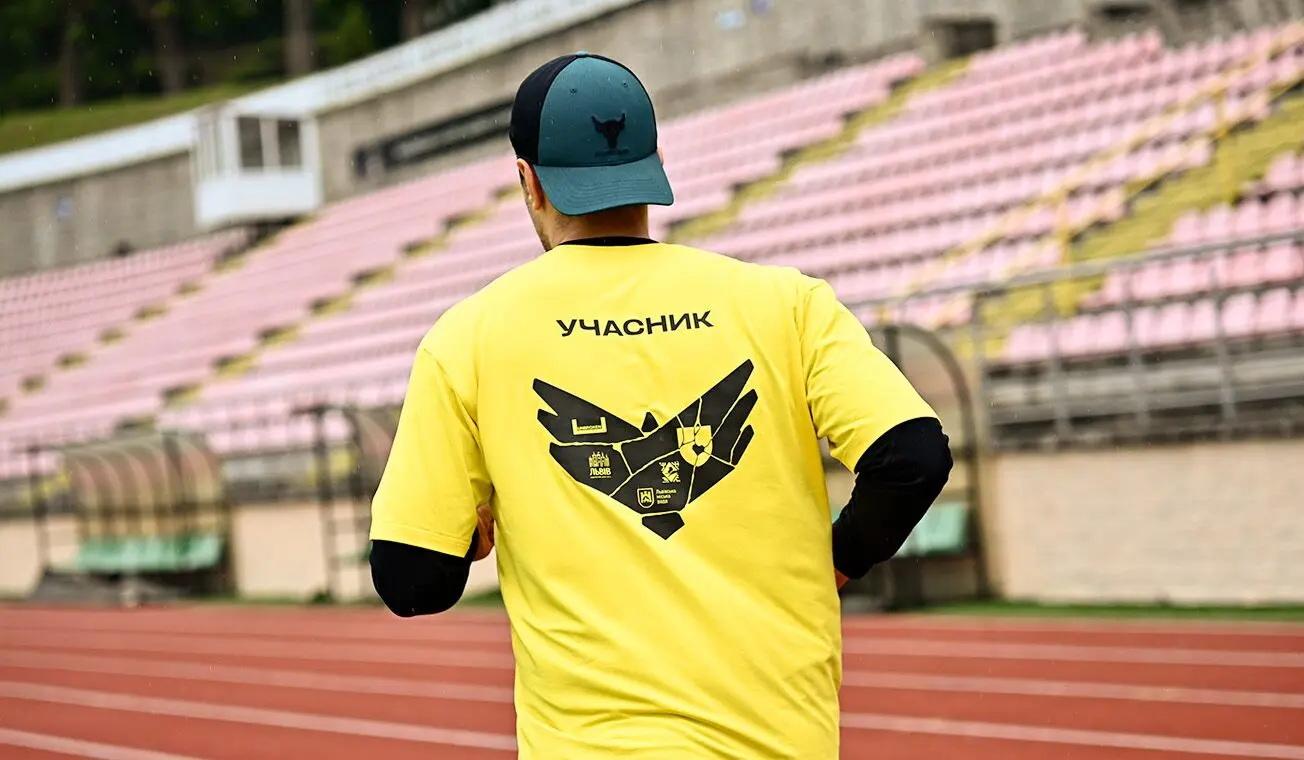
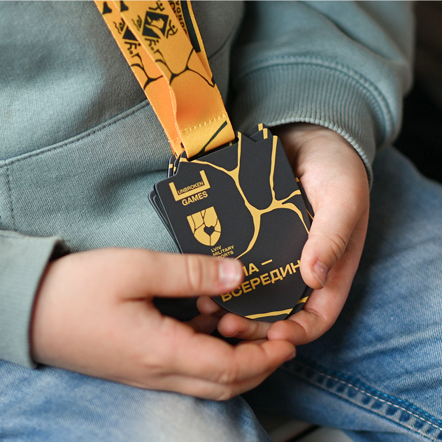
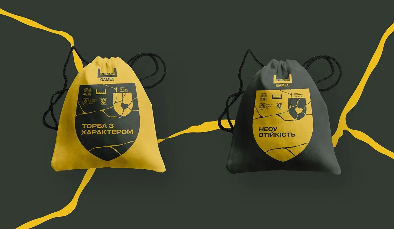
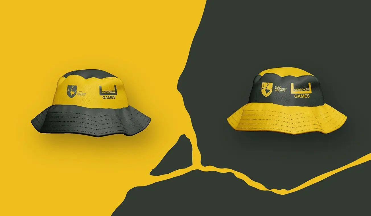
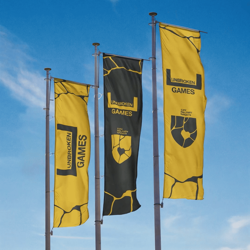
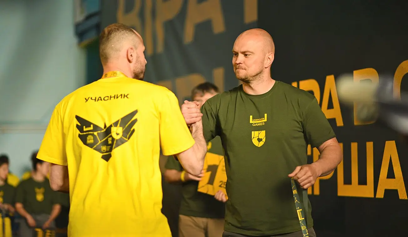
The logo brings together three core elements: kintsugi, a shield, and gold.
We embedded the idea of kintsugi throughout the broader brand identity — symbolizing recovery not by hiding the cracks, but by embracing them and creating something even more meaningful.
Gold emphasizes uniqueness and value. We also incorporated the image of a shield — a powerful symbol of protection. It represents the safety offered to veterans within the organization, and the very protection they fought to provide.
 before
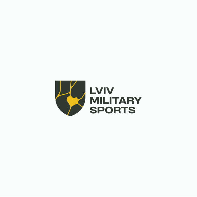 after
after
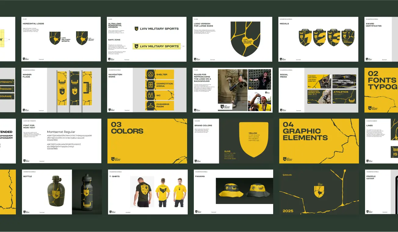
Messaging
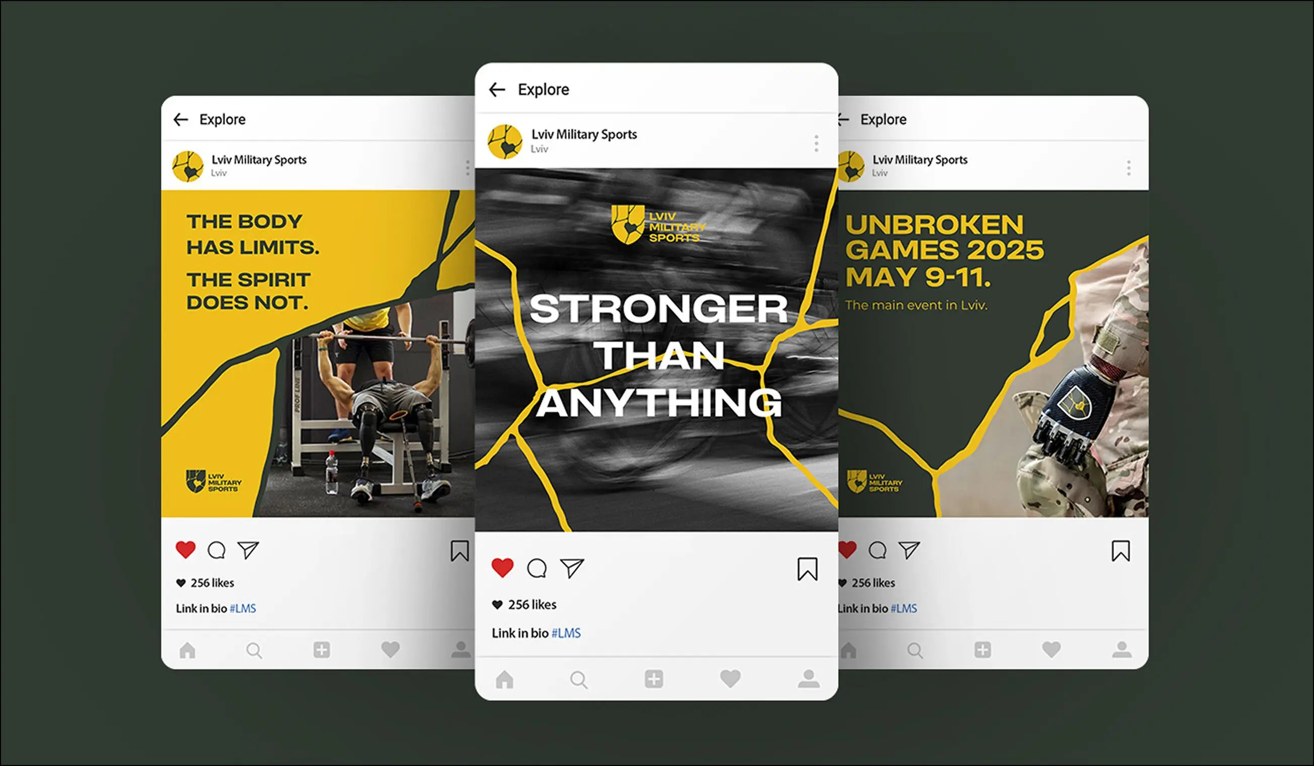
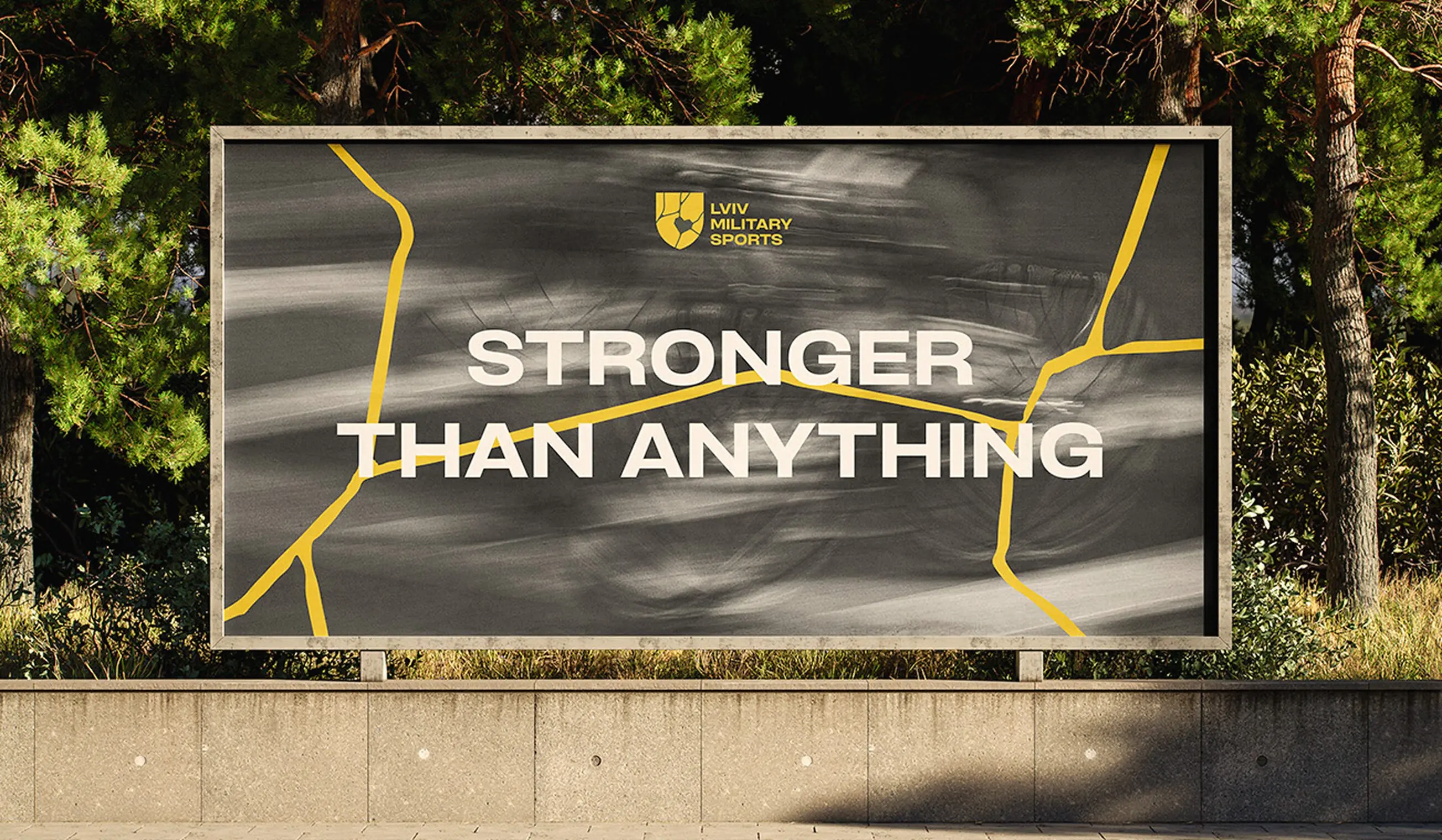
All brand messages centered around the themes of support, inspiration, and unity. They were crafted to reflect the Lviv Military Sports as a safe community — one that offers connection, care, and remembrance.
Every message reinforces the idea that this is a place where veterans are not just welcomed, but truly seen and supported.
Visual Language
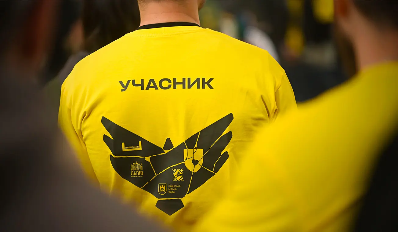
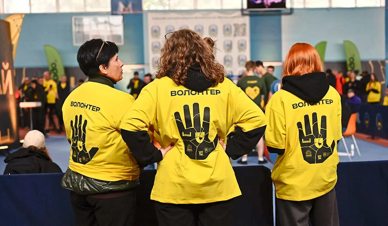
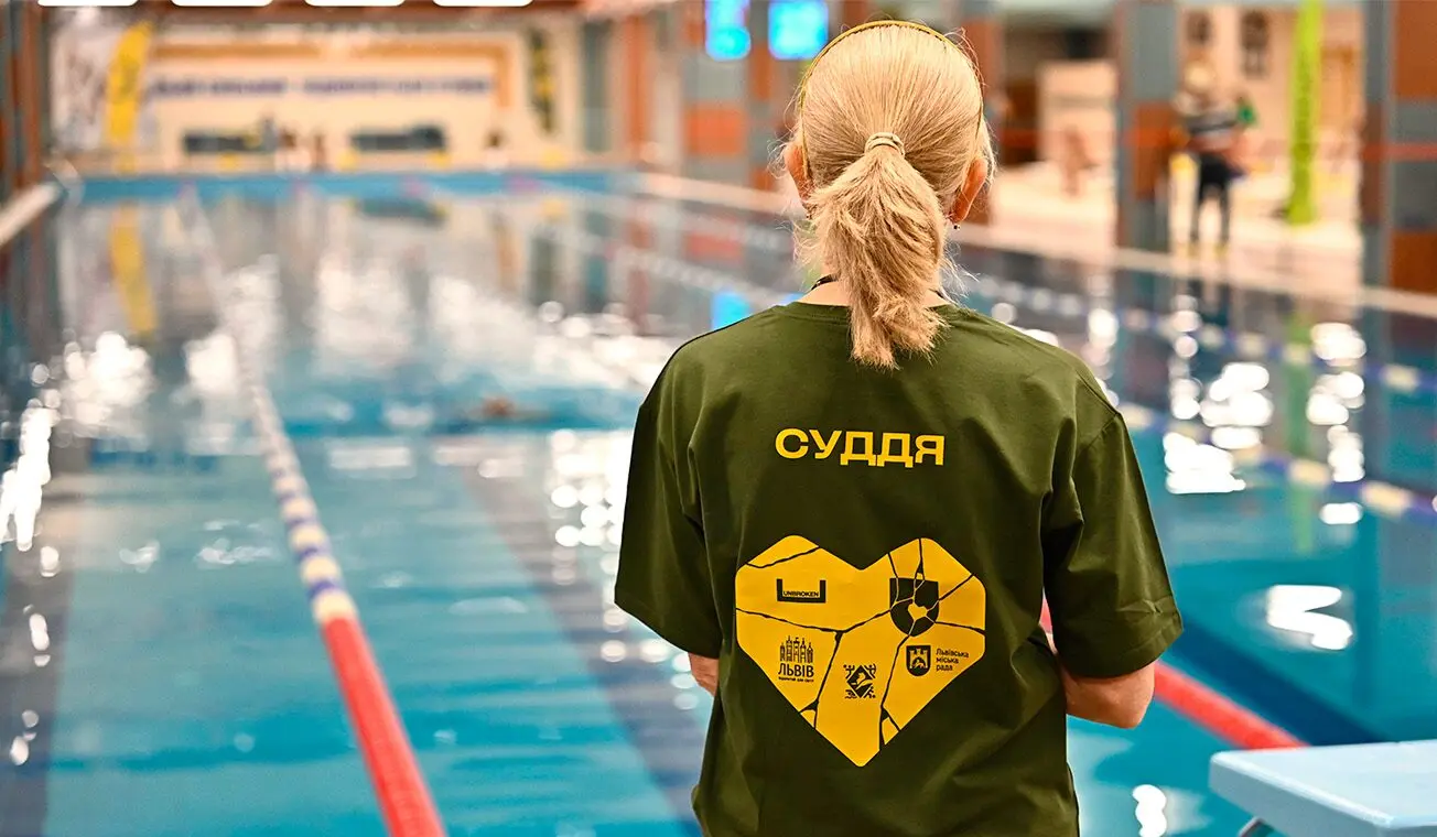
Beyond the logo, the visual system extended into symbolic representations of all key roles within the community.
- The heart represents the people — the emotional core.
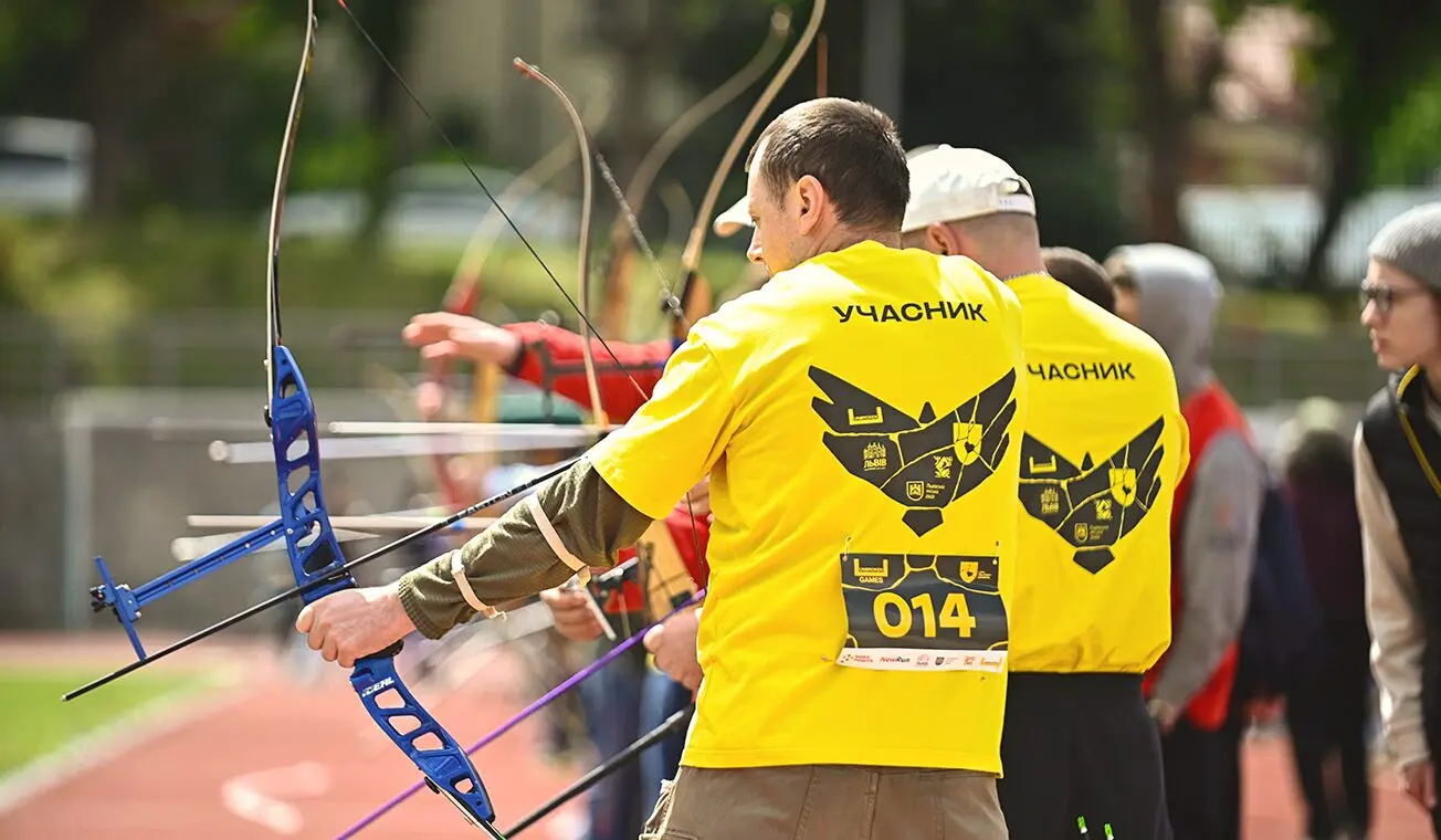
- Falcons stand for the participants — resilient, sharp, and ready to rise.
- Shields represent the organizers — structured and protective.
- The hand symbolizes volunteers — those who offer help and build bridges.
Each element works together to tell a story: every link matters.
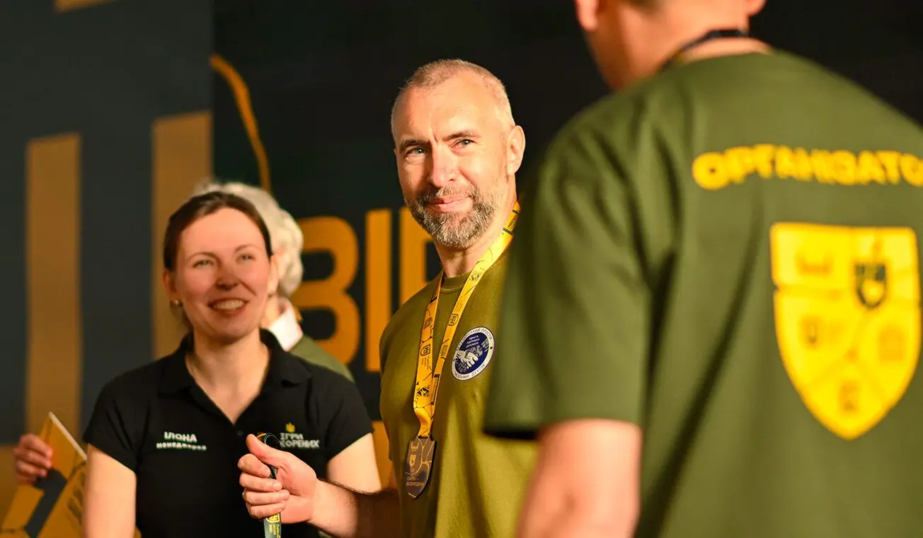
Qubstudio created a visual identity that was both meaningful and beautiful, inspired by the idea of healing and inner strength through the art of kintsugi. Their team’s dedication, empathy, and genuine care made the collaboration not only effective but deeply inspiring; we couldn’t have asked for a better partner.