2019 Trends in UX for e-commerce websites

In this article, we have gathered seven universal recommendations that will help you create a fundamentally new user experience and, thereby, raise your web resource to the top search results positions.
Ecommerce UX Best Practices
Creation of ecommerce websites is a huge niche in the software development, the activities of which are aimed at the implementation of commercial and financial transaction solutions. Unlike non-commercial products, these are created in such a way as to prompt users to spend their money.
In the modern e-commerce, the entrance threshold is quite low (for example, one can create a simple one-page website with their own hands, completely free on a basis of a ready template). That is why the competition between such websites becomes more and more fierce every day and their owners are looking for increasingly sophisticated ways to attract traffic.
In this article, we strove to describe our top of seven non-trivial ways for how UX design company can create an excellent user experience for your e-commerce solution.
List of Best Ecommerce UX Practices
Below we propose to your attention the best practices of UX design that would be helpful in creating the most positive user experience within your software solution.
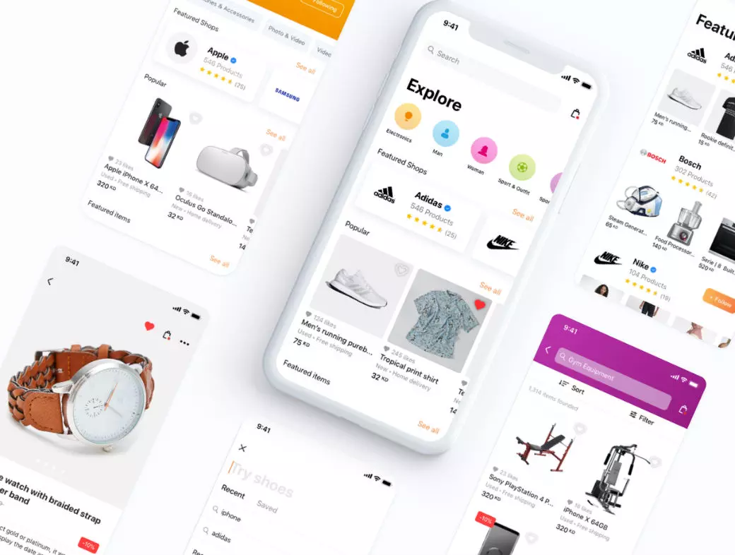
1. Provide all the possible search capabilities (including voice and picture recognition routines)
The first thing that defines a well-designed site concept is the accessibility of the services provided by the platform. The most trivial way to give your users access to what they are looking for is to create a carefully considered search function. These days, it is not enough to have a simple input field, which would serve an interface to a search engine.
In particular, today the search (especially if your commercial platform proposes at least several hundred products) can become either the main feature of your solution or something that will cancel all of its positive characteristics. Let us identify the four main attributes of the modern search, which receive a lot of approval from users:
- Automatic proposal selection. The most useful addition to a standard search function will be the automatic selection of propositions that are displayed in the form of the drop-down menu under the input field in the process of typing after the first three letters were entered. Not only will it help to improve your UX for ecommerce but also increasing the conversion rate;
- Multi-parameter filtering and sorting. It would be great if, in addition to the standard sorting – by the price/popularity/manufacturer of the products (the latter being the most commonly employed filtering option), you would propose several additional filters. A great example in this regard is the renowned Amazon store;
- Voice search. Though not exactly the most common feature yet, it is capable of driving a rather serious traffic to your e-commerce site. Fortunately, today it is not so difficult to implement (Google Cloud Speech-to-Text API will be helpful here);
- Image search. And, finally, the picture search is an ideal auxiliary option for visuals-oriented people who remember the names poorly but are perfectly guided by the goods appearance. Here Google Image Search API comes to the aid.
2. Avoid overloading the product pages with useless text and CTA

Remember the terrible examples of the web site design in the late 1990s? In the last years, web designers strove in every way to move away from this, reducing the total amount of text, buttons, and CTA banners. And this is due to the fact that modern users are fed with lots of incoming information daily thus becoming too lazy to read long texts. Moreover, every year increasingly more traffic is generated by mobile users. That is, those to whom each excess line of text may be quite annoying. Surely, this will force them to leave an irritating web resource and never return to it. Therefore, if you truly value each new user, try not to overload the pages of your site with text blocks and calls to buy something.
In particular, instead of literally cluttering up every centimeter of the site with informational banners, it is better to rely on the high-quality visual content (product pictures). Few photos of goods, captured from different angles by a professional photographer, will produce a much more positive impression to potential buyers than an exhaustive description accompanied by the brightly colored “Buy” button.
3. Provide as high website efficiency as possible
A slowly loading website can put an end to the success of your business. And, if in the above-mentioned 1990s no one minded the page loading periods over 10 seconds, today the site, which is loaded for more than 3 seconds, can be safely called slow. How to evaluate the performance of your website? There is a whole bunch of the thematic software tools (for example, GTMetrix, PageSpeed Insights or Pingdom).
If your site contains more than a single landing page, then the test results may not be very promising. What to do in this case? In fact, there are several options to solve this problem:
- Employ the webpage caching. Server caching is the basics of site speed optimization. Nevertheless, you have to keep in mind that, firstly, not everything can be cached, secondly, you will need to consider the cache reset options, and finally, this method will not be effective for the new visitors;
- Optimize images. This is a very effective way to speed up the work of the site, which, however, is not always correctly executed (we are talking about scaling pictures with CSS). Among the “right” tools for the compression, the most effective currently are considered Kraken.io and JPEGmini. Otherwise, you can simply convert the images into an innovative WebP format specifically designed for the websites;
- Contract the CDN services. Content delivery networks distribute copies of the member websites’ content over the series of geographically distributed servers all over the world. When opening the page address, users receive the data from the server nearest to them;
- Activate the GZip content compression. GZip is a specific file compression method that is implemented in the most advanced webserver appliances. Due to the compression, browsers have much fewer data to download – the difference can be up to 10 times;
- Refactor the code modules. If all of the above methods did not really help in your case, it is probably the high time to start using the “heavy artillery”. One of such methods is the complete code refactoring (in particular, for sites that are based over the self-written engines). As a rule, companies use the services of third-party agencies to implement the refactoring procedure;
- Use the forward proxy technique. Employ Nginx instance as the forward proxy server for the cluster of webserver instances collectively serving the user request. For instance, you can use Nginx to increase the performance of static front-end files and a bunch of Apache of same Nginx web servers for the backend.
4. Create comfortable pagination to ensure top UX for ecommerce store
Obviously, this clause applies exclusively to multipage websites with complex structures. To provide the optimal navigation on such sites in recent years advanced designers began using so-called mega-menus. Fortunately, if you use a premade CMS engine, templates for such menus are available publicly as configurable plugins (WordPress example).
In any case, you will have to plan thoroughly the structure of your website so that even new users can intuitively navigate through it and in no more than three steps get to the needed section.
5. Don’t overload the site with filters
The filters, which we discussed in our first recommendation, can play a trick on some developers: their excessive abundance risks making the site too incomprehensible for new visitors.
In order to avoid this, we strongly recommend that you carefully study the design of the site we consider exemplary in this account, Macy’s.

As you can see, the filters, in this case, are few, and they are presented extremely compactly, without distracting users from the central object – the catalog with goods.
6. Make sign-up and checkout as simple as possible
On many sites, the user registration procedure can be a real headache. Multiple input fields take too much time, and only a few customers have the patience to finish this event. In order not to irritate the visitors to your site, be sure to provide the possibility of quick authorization, for example, with a social media profile or user account. Most of the popular internet services provide the corresponding APIs (Facebook and Google, for instance).
As for the extended registration forms, try to make them as compact as possible. In addition, you can equip each field with a hint explaining why you request this data and how it will be used. Make it possible for users to refuse providing the non-critical information about themselves and, thereby, speed up the registration procedure.
7. Make your website look credible
And finally, let us discuss the appearances. We can identify eight major ecommerce trends of web design that were popular in 2018 and most certainly would stay topical in 2019:
- Animations. If we are to call a major trend that gains popularity in the digital world rapidly, it is the usage of animated elements in the design. The reason for the popularity of animation is simple – in a matter of seconds it helps to transmit complex ideas but does not require as many resources to implement as videos. It should also be noted that animation is a customizable concept, in contrast to the same video files. If we talk about individual animated elements – for example, logos, then, in general, they are more fun in comparison with their static counterparts and help to fill the visual content with meaning. Tools such as, for example, Crello, have already picked up the trend – in just a couple of minutes you can create an animated design element here;
- Original illustrations. Original illustrations are another way to provide individuality to a commercial site. So, even small hand-drawn elements can easily become a distinctive feature. The main thing is to choose a color spectrum that will combine harmoniously with the rest of your commercial platform design;
- Gradient fills. Gradients are not a new trend but it had not lost popularity over the years. Firstly, using gradients you can emphasize the color gamut of your brand. Secondly, using modern approaches to animation, the gradient fills can be made dynamic and this is a sure claim to success among aesthetic visitors. Thirdly, a smooth gradient looks much more neutral than a usual white or black background (which means you risk to irritate the users with hyperesthesia much less);
- Custom fonts. Despite the fact that San Francisco, designed by Apple, is still the most trendy font, it is quite obvious that all-consuming passion to follow the tried patterns and established traditions will make your website impersonal at the least. Will this affect the user experience? Most likely, users would not be able to distinguish such site among the competition. Thus, if you have the time and money, it is better to order an independently developed custom font that would resonate with the rest of the site concept and thus make it recognizable at a glance;
- Asymmetric elements. Asymmetry is not only a “perfectionist hell” but also a great way to capture the eye of a site visitor. Thus, the asymmetrical design introduces a certain surprise at the initial visit and encourages curiosity, forcing users to open new and new pages;
- Volumetric graphic objects. We all remember the ubiquitous Flat design, which at one time became exemplary in the niche of mobile design. Volumetric fonts began to be considered a bad taste and were replaced by minimalist and overly graphic alternatives. Today, web designers are no longer so categorical in their choice and are striving to create depth if not in fonts, then at least in images. So, special techniques for creating a three-dimensional effect (which is achieved either by scattered shadows or by perspective transformations) come to the rescue;
- Bright colors. The statement that bright colors would again come into popularity next year sounds at least surprising, given that many web designers had been rushing towards monochromatic and nude tones in the last years. However, fashion is a cyclical concept and it moves to the acid shades characteristic to the late 1990s;
- Dynamic elements instead of static. If you have been interested in web design trends in the past few years, you may have noticed the designer craze in the form of varying geometric forms. Now, this trend is slowly being replaced by new ones: geometric shapes are moving (animated or set in motion as the user moves through the site). This approach does not just make the design recognizable but is also able to make visitors stay on your site for a long time.
Summary
Let’s sum up. As you may have understood, in order to raise the UX of your commercial solution to a qualitatively new level, it is necessary to conduct a fairly serious amount of work. It is possible that in order to take into account all the above best practices of UX design, you may need to not only redo the old design but also build a completely new platform from scratch. In either case, we are ready to come to your aid. Our programmers and web designers will implement their best skills for your project so that as a result you will receive a solution that will definitely inspire envy in your competitors. Would you like to discuss cooperation? Fill out this contact form and we will get to you very soon.