Banking Web Design: Building Engaging User Experiences
Whitepaper
Fintech & Banking Trends: Transforming Product Experiences in 2025


People only trust credible banking institutions with their money, and one of the ways they gauge your credibility is through your website. This means you cannot trifle with your banking web design. The design process should create results that have the right aesthetics and intuitive usability to make a good impression.
In this article, we’ll examine the features and elements that make for an exceptional bank website design.
Top 5 Bank Website Design Features
Particular website features are crucial to ensuring a seamless online experience for banking customers. Here are some functionalities that should be at the top of your list:
1. Navigation Links
A conspicuous menu of links on your bank website design allows users to figure out the overall structure of the website and go directly where they need to. Important navigation links include a log-in portal, an about us page, and links to categories like business services, retail banking products, news, resources, and contact information.
2. Site Search
If you have an especially information-intensive banking website design, users might struggle to find the exact information or form they need, even if the site is easy to navigate. That’s where on-site searches come in. Instead of navigating through multiple links or pages on the site, make sure users can type what they’re looking for into a search box and let the search algorithm do the digging for them.
3. Financial Calculators
Calculators provide users with answers and recommendations based on information that’s unique to their personal circumstances. They provide a self-service option that delivers results instantly and takes personalization to the next level.
4. ATM and Branch Location Maps
People jump online when they need to find a nearby ATM or bank branch. Make sure your website can deliver this information with a map-based locator.
5. Payment Portal
Today’s consumers like to conduct everyday transactions online, from sending money to friends and family to paying bills. Your website must include a portal that makes payments quick and easy.
Banking web design features like a payment portal and financial calculator not only provide a great customer experience but also earn your site SEO brownie points. In the next section, we’ll talk more about some factors that contribute to a superior bank website design.
Design Elements that Make a Banking Website Exceptional
Some banking websites are better than others. Those that stand out have managed to nail the essential bank website design elements listed below.
1. Security
Bank websites need to have airtight security. Your site’s design plan should incorporate third-party integrations that enable security measures like multifactor authentication and anti-malware protection.
2. Accessibility
Your banking website design must accommodate people with disabilities. In addition to being inclusive, accessibility features, like color contrasts and text-to-sound conversions for the visually impaired, add to your site’s usability for people without disabilities. Moreover, failure to take accessibility into account can get you in legal hot water.
3. Aesthetics
It was revealed long ago that an attractive website design adds to the perceived credibility of content. Plus, it’s an opportunity to present a strong brand identity that makes your business memorable.
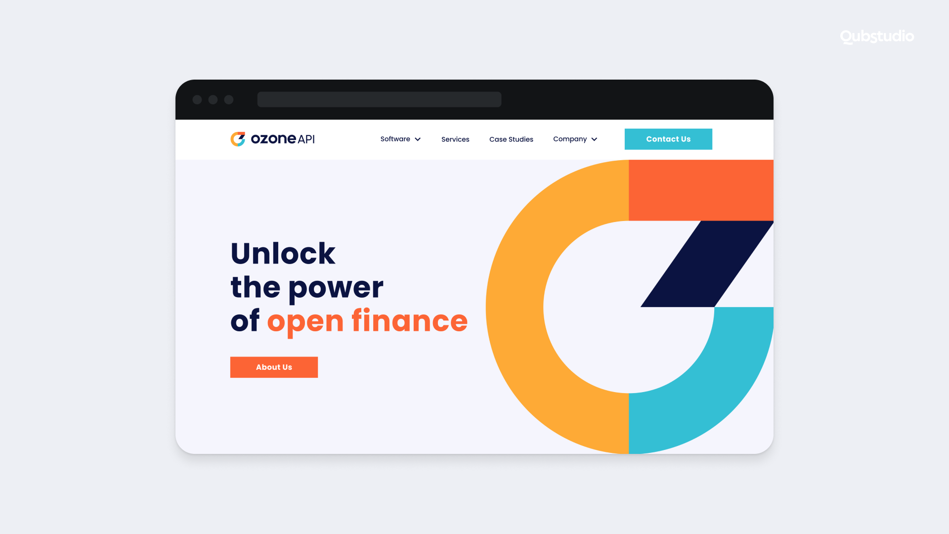
Qubstudio made this happen for the UK-based FinTech, Ozone API, with aesthetics that reflect a corporate identity that’s both credible and caring. The overall look is as modern as it is timeless, and the color palette is as vibrant as it is balanced.
Four Stages of Website Design for Banks
Familiarize yourself with the process of designing a banking website so you know just what to expect when you begin work with the tech specialists who will execute the design. Here’s a rundown of the key stages.
Stage #1: Discovery
For a design team, the initial stage is to delve into their client’s needs and requirements. Here’s what they will do during the discovery stage:
- Carry out a needs assessment. Look into the strengths and weaknesses of the client, taking stock of their existing assets and any room for improvement.
- Perform competitor research. Learn about opportunities and threats in the banking industry, and see how the client’s top competitors are faring.
- Identify website goals. Figure out what business needs the website is expected to address, as well as the functionalities required to achieve them.
- Review any existing analytics. If a website already exists, leverage Google Analytics to assess its performance and plan to make enhancements wherever necessary.
- Check for conversion opportunities. Take stock of lead conversion elements like contact forms and callback requests, then determine any need for improvement.
- Craft user personas. Use detailed customer personas to create user stories and brand messaging that resonates with the target audience.
- Diagram the user journey. Map out the steps a user would take to accomplish whatever goal they visit the site for.
- Craft a sitemap. Determine the necessary pages and their connections to each other, creating a structure that enables intuitive site navigation.
- Create a rough wireframe. Work with the client to create a rough outline of the site that shows its design.
- Determine functionality requirements. Home in on the technical specifications needed to build the end product.
Overall, the discovery stage ensures that the design team provides client-centered service.
Stage #2: Content
Designers need to cooperate with the marketing department to craft content that delivers the right customer experience and earns the website a high ranking on search engines. This kind of teamwork will ensure effective website design for banking.
Together with key stakeholders, they will craft a plan for website content that effectively conveys the desired message, meets business objectives, and is also aesthetically pleasing. And a website that makes users stay on its pages longer (i.e., has a low bounce rate) is good for search engine optimization.
Stage #3: User Interface (UI)
During this stage, the design team ensures that the bank website design has a look and feel that appeals to the client’s target customers. Here’s what they need to do:
- Finetune the wireframes. Create a visual representation of the end product with carefully prepared content and stylistic elements.
- Optimize the user experience (UX). Revert to the user journey diagram crafted during the discovery stage and use the flow to streamline the UX.
- Build a prototype. Develop an interactive mockup that shows just how the functionalities and related buttons will work.
At this point, the client already has a good idea of how the completed website will look and function.
Stage #4: Website Development
Now that the design team has the bank website design elements all sorted out, it’s time to bring them to life. Here’s where the bulk of the development process happens. But there’s no need to dive deep into technical details. Instead, here’s a brief look at the steps the team takes in this stage.
- Convert the design elements into a functional HTML/CSS template.
- Turn the HTML/CSS template into a CMS-based website.
- Add all the functional units.
- Conduct user testing of the website to test functionality and user reactions.
- Revise the design as necessary.
The development and deployment stages are where the heavy lifting happens. But your relationship with the design team lasts long after website deployment. Make sure you work only with service providers who understand this.
Bank Website Designs that Inspire
You can draw design inspiration from banks that have done it right. Here are just three of the best bank website designs out there:
KeyBank
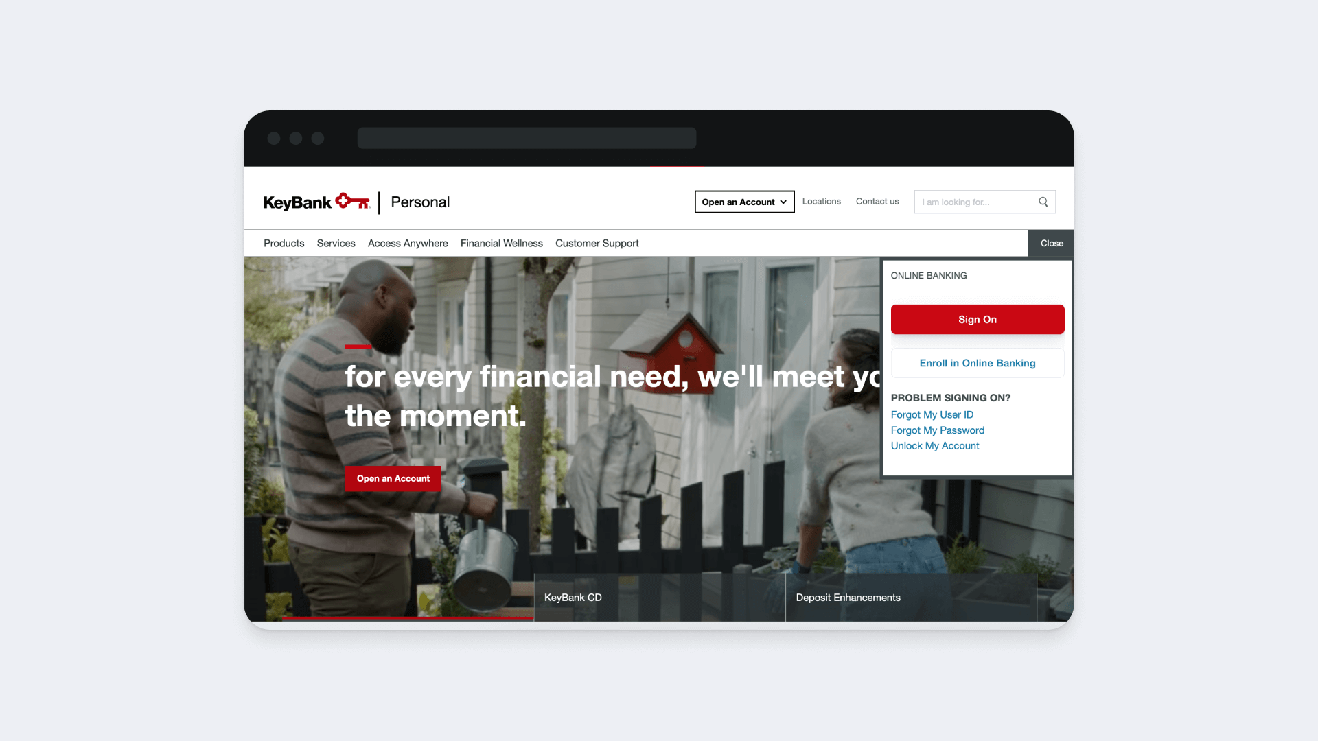
KeyBank’s website is notable for its clean layout and easy navigation. One quick scroll shows you their top products and compels you to click on the call to action (CTA).
M&T Bank
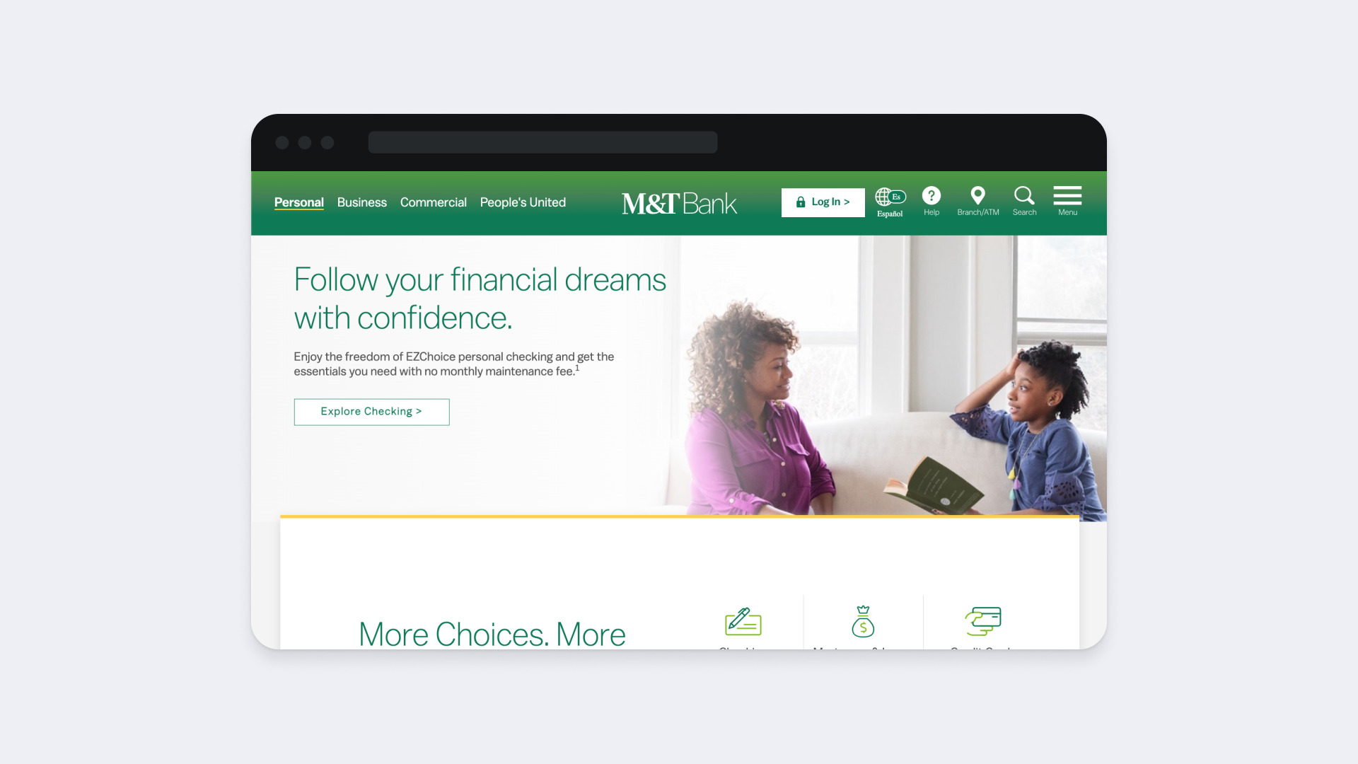
M&T Bank has distinct brand colors that make it memorable. It also boasts straightforward navigation.
Bank of Melbourne
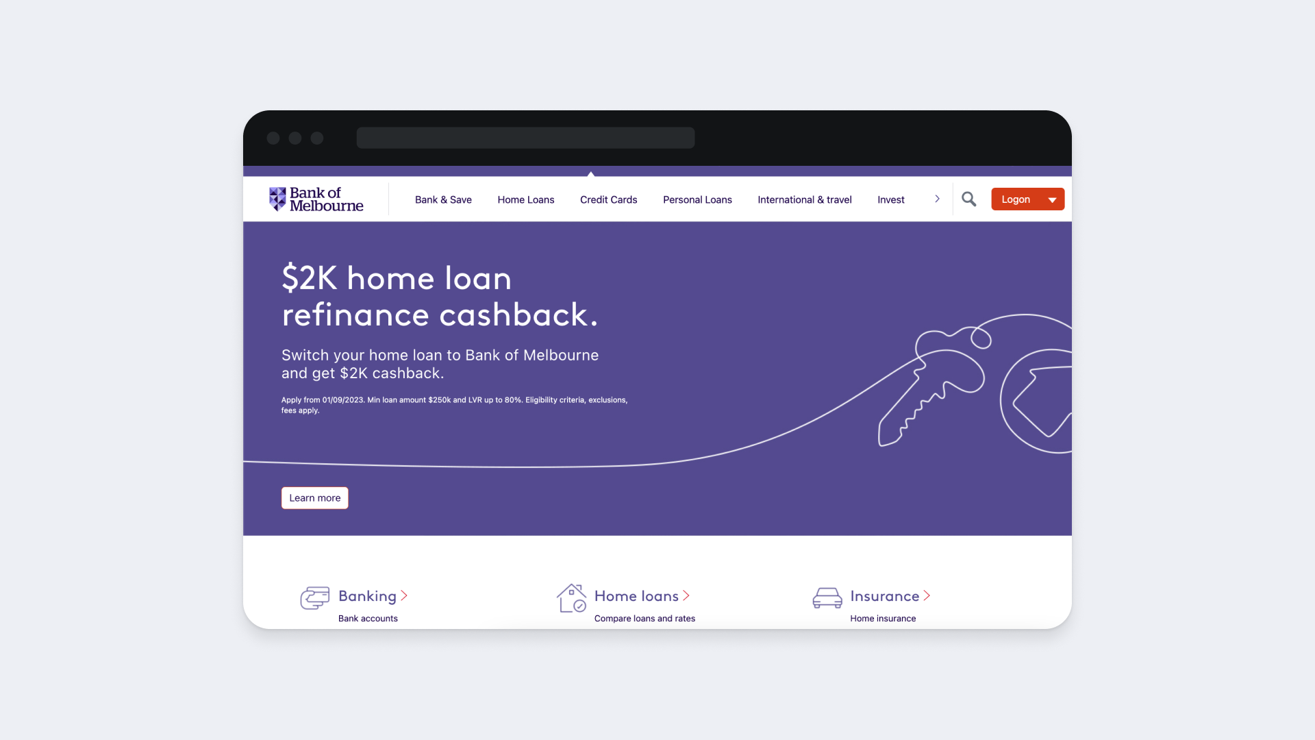
Bank of Melbourne’s website is easy on the eye with its pastel colors, ample white space, and stylish graphics. Its aesthetic is much more welcoming than most banks that use the usual stately and institutional colors.
Your banking website can be a success story, too. You just need to start with the right design team.
Bank Website Design with Qubstudio
Qubstudio is just the technology partner you need in your bank website design journey. Established in 2007, our digital product design and branding agency has made it to Clutch’s TOP-2 UX Design Agencies and has a Net Promoter Score of 97%.
Case in point, we gave Ozone API’s website a fresh look and feel that helped them stand out in the FinTech market. And we didn’t just wing it. We carried out painstaking visual and competitor research to make it happen. And we can bring the same results to your website project.
Count on our team of seventy specialists to deliver our proven expertise for your banking and FinTech design needs.
Conclusion
The factors that make a bank website design exceptional seem straightforward. It needs to be easy to access and navigate, attractive, responsive, and secure.
But actually achieving these design goals entails a painstaking process that only seasoned experts can carry out. Considering the financial stakes, you need to get it right. Which means you need to work only with reliable designers.
FAQ
How much does bank website design cost?
Because the design complexity of bank websites varies, so does pricing. It all depends on the tech stack, specialists, and time spent on the project.
Why is bank website design important?
Banks handle sensitive information, and gaining the trust of consumers can be extra challenging. The design of a bank’s website must inspire confidence.
