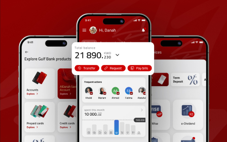
How to Create an Exceptional FinTech App Design
Whitepaper
Fintech & Banking Trends: Transforming Product Experiences in 2025


In this article, we explore the key ways of how to create an exceptional finance app design, including the importance of conducting UX research and creating a business plan, choosing the right tech stack and team, and designing wireframes and prototypes. We’ll also showcase some of the best financial app designs in the industry and provide insights on common web design mistakes to avoid.
By the end of this article, you’ll have a clear understanding of what it takes to design a fintech app that stands out in a crowded market and meets the needs of your users. Let’s dive in!
What Distinguishes Great Finance App Design From Others?
In today’s digital world, the financial technology industry has experienced tremendous growth, with the global fintech market expected to reach $460 billion by 2025. With this rapid expansion comes increased competition, making it crucial to have a standout finance app design that sets your app apart. A great finance app design is no longer a luxury but a necessity for success in this industry.
A great finance app design is user-centric, intuitive, and visually appealing. It should be easy to navigate and should provide users with the information they need to make informed financial decisions. An exceptional finance app design should also have a strong brand identity and should be consistent across all touchpoints.
The best finance app designs have a clean and minimalistic look, with an emphasis on typography and colors that complement each other. The design should be consistent throughout the app, and the finance app UI should be intuitive and easy to navigate. Additionally, the app should offer useful features and functionality that help users manage their finances efficiently.
Features of the FinTech App
Wondering how to kickstart the creation of your FinTech app? Make your app up-to-date by highlighting and focusing on the following features.
1. Biometric and Secure Sign-In
Security and data protection is the key when it comes to FinTech app creation.
Replace complex passwords with seamless and user-friendly interactions. This is where biometric authentication comes into play: fingerprints or facial recognition elevate the user experience and fortify your application’s security.
Also, consider adding a multi-factor authentication: combine biometrics with another layer of security, like a one-time password (OTP) sent via SMS or email.
Still, it’s crucial to strike a good balance between keeping things secure and making it easy for users. Authentication processes that are overly complex can drive users away, which is why it’s really important to design the processes in a simple and easy way for users to understand and use.
2. Push Notifications & Alerts
Notifications and alerts play a significant role in enhancing user engagement, security, and overall user experience.
For example, the most common notifications are:
- Real-time updates about financial activities (transactions, payment confirmations, etc.). This will help users stay up-to-date regarding their finances and be aware of any activities that take place with their account.
- Security alerts. They help detect any suspicious activities and take immediate action to secure the account.
- Payment reminders. Notifications for upcoming bill payments or loan installments help users stay on top of their financial commitments and avoid late fees.
3. API Integrations
Make your app a one-stop solution for all user needs. With the help of API, users can connect with external services (payment getaways, banks, etc.), which enable them to perform a variety of financial activities without the need to switch an app. This leads to a better user experience and more time saved.
4. Payments and Transfers
A user-friendly, intuitive, and secure interface enables users to manage their financial transactions efficiently and securely.
Financial transaction management should be accessible to all users, with a clear representation of different types of transactions (money transfers, P2P payments, bill payments, etc.)
Also, it’s crucial to create a user-friendly form for users to input transaction details, such as recipient information, amount, currency, and purpose of the transaction.
5. Data Visualization
This feature empowers users to visualize spending trends, assess investment progress, and monitor their investment performance.
Incorporating dashboards, personalized widgets, visualizing transaction history, and tracking goals are just a few examples of the features. Those can be seamlessly integrated to provide users with a comprehensible and informative overview of their financial data.
Examples of the Best Finance Apps Design
So, what is mobile app design that stands for exceptional?
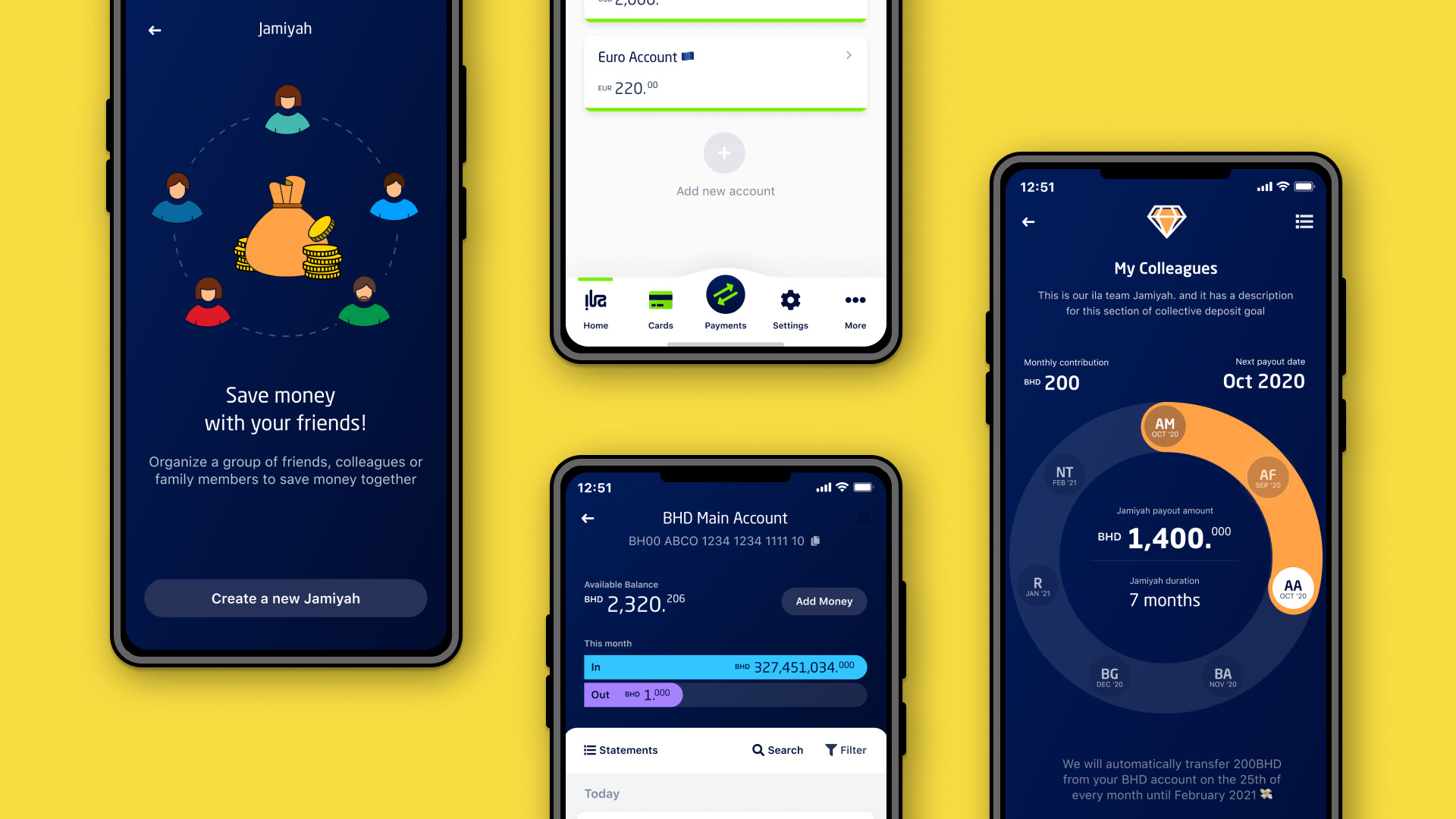
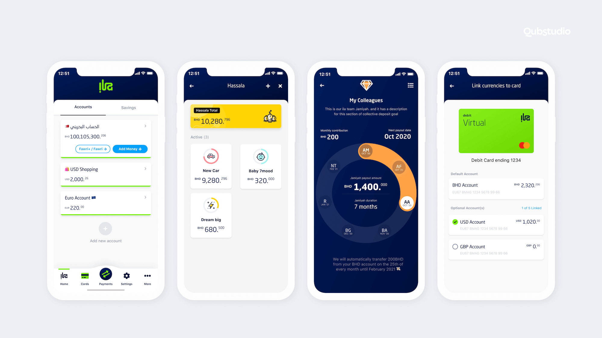
ila Bank, a finance app designed by Qubstudio, is a great example of a well-designed fintech app. The mobile banking app’s user interface is simple and intuitive, allowing users to easily manage their finances. Its typography and color scheme are also carefully designed to make navigation a breeze. Thanks to its user-friendly design, ila Bank has received consistently high ratings from its users and has been recognized as one of the best fintech apps by multiple publications. Moreover, the app design received the Red Dot Design Award 2022.
Read more about the design process in our Case Study.
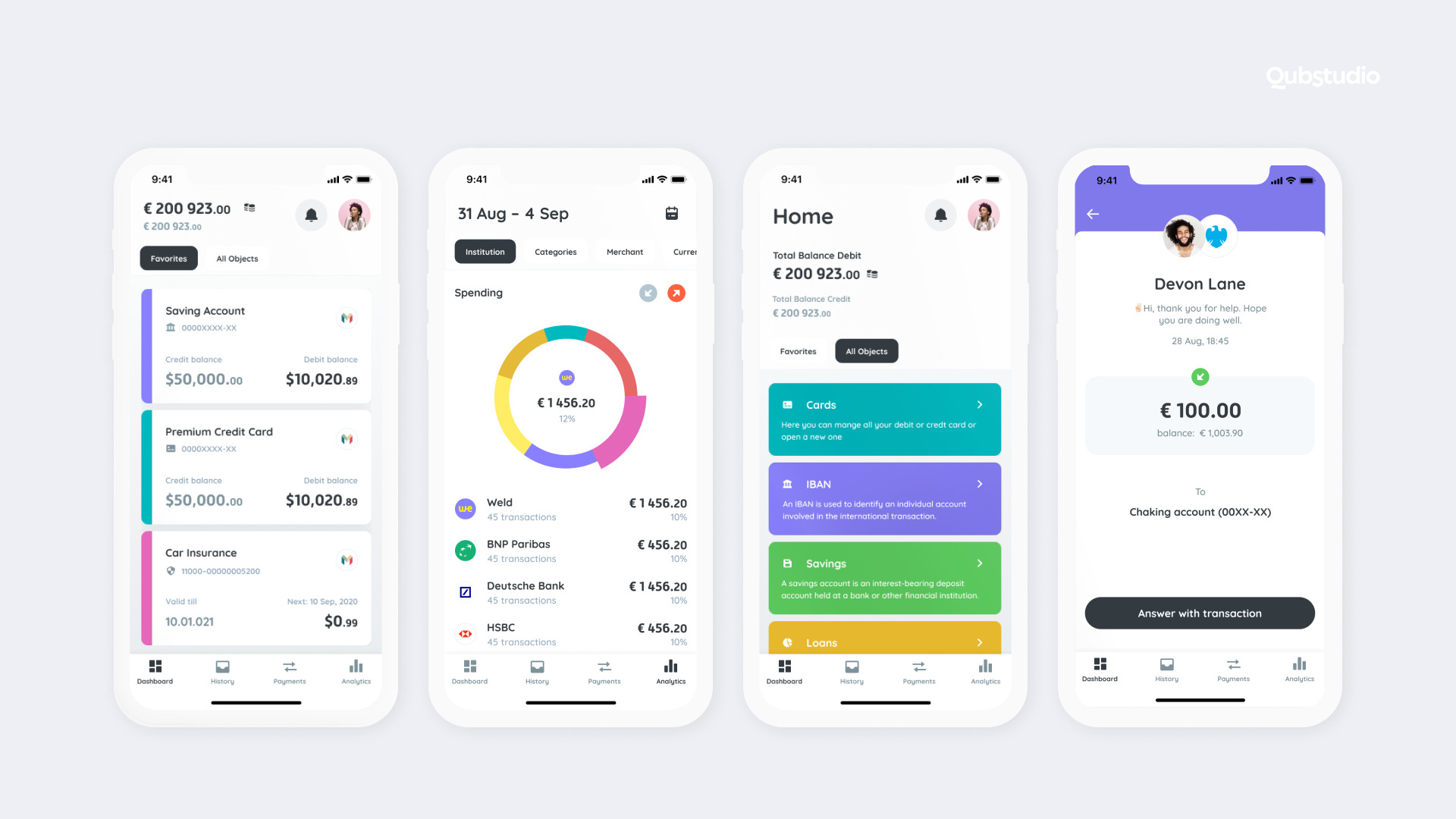
Weld, another financial app designed by Qubstudio, is a great example of an excellent design for a mobile investment app. Weld has an appealing visual design that has helped it attract users. The app’s color scheme is warm and inviting, and the FinTech app UI is easy to navigate, making it simple for users to invest small amounts of money. Weld’s design is also aimed at making investing more accessible and less intimidating, particularly for novice investors.
Finally, BARQ, the mobile app designed by Qubstudio, offers a seamless user experience with its clean and modern interface. The app’s design elements prioritize functionality and simplicity, making it easy for users to navigate and complete financial transactions quickly. With a focus on the fintech market, BARQ offers a range of features such as mobile payments, account management, and investment tracking.
BARQ’s design is carefully crafted to meet the needs of modern users and provides a clear understanding of complex financial concepts. The color scheme used in the app is soothing to the eyes, making it a pleasure to use. The app’s intuitive layout ensures that users can easily access features and perform tasks with minimal effort.
The BARQ app design sets it apart from other fintech apps by offering a personalized approach to its user interface. With its user-centric design, the app offers a seamless and engaging experience that users can trust. Its ease of use and modern design have played a significant role in its popularity, making it one of the most widely used financial apps in the market today.
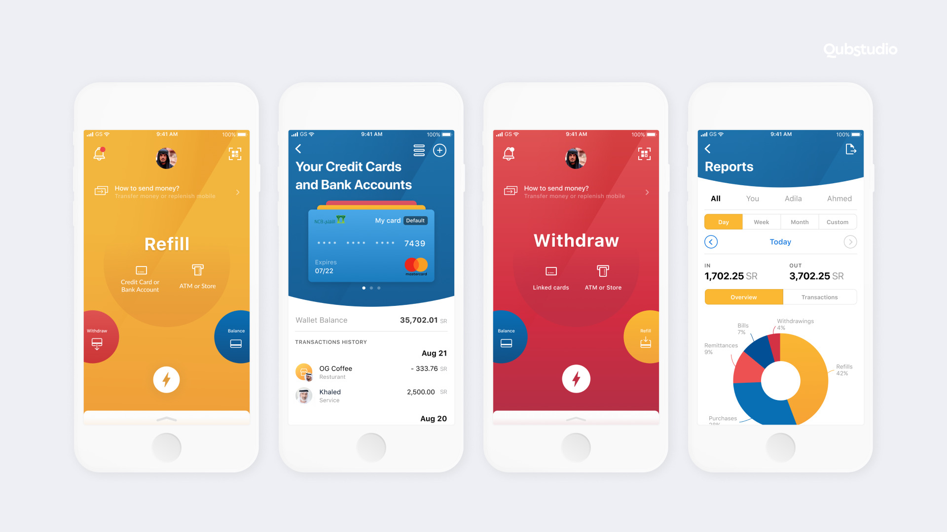
These examples of the best financial app designs highlight the importance of creating an exceptional user experience through design. By focusing on the user interface, color schemes, and functionality, fintech apps can attract and retain users, leading to increased engagement and ultimately, business success.
Tips on How to Create an Exceptional Financial App Design
Let’s delve into some useful tips and strategies that can assist in designing a great fintech app.
1. Business Plan and UX Research
According to a study by Buildfire, a leading app development company, only 25% of app users return to an app after the first use. This highlights the importance of conducting thorough UX research and creating a solid business plan before designing your FinTech app.
Moreover, a study by Clutch found that 77% of app users will delete an app if it is difficult to use or navigate. This underscores the significance of conducting UX research to ensure your FinTech app is easy to use and navigate.
Therefore, before creating your FinTech app UI design, it’s crucial to have a solid business plan that defines your app’s goals and target audience. This will help ensure your app is relevant and meets users’ needs. Additionally, conducting UX research will provide valuable insights into users’ pain points and expectations, enabling you to design an app that is intuitive, user-friendly, and meets their needs.
2. Choose Your Tech Stack and Team
Choosing the right tech stack is essential for creating a robust and scalable FinTech app. A study by Forrester Research found that 45% of users abandon a transaction if their preferred payment method is not available. Therefore, it’s essential to choose a tech stack that supports multiple payment options.
Additionally, a team with experience in FinTech app development can bring valuable insights into the design and development process. A report by Deloitte found that FinTech startups that collaborate with experienced partners can achieve better performance and faster growth compared to those who work alone. Therefore, it’s crucial to choose a team with relevant expertise and experience in financial app design.
3. Wireframe Design
Wireframing is an integral part of the design process and serves as a foundation for your app’s design and functionality. It enables you to visualize and plan out the structure and layout of your app’s features and user interface. Wireframes are usually created as simple sketches or digital designs that outline the basic elements of your app, including buttons, navigation, and other essential components.
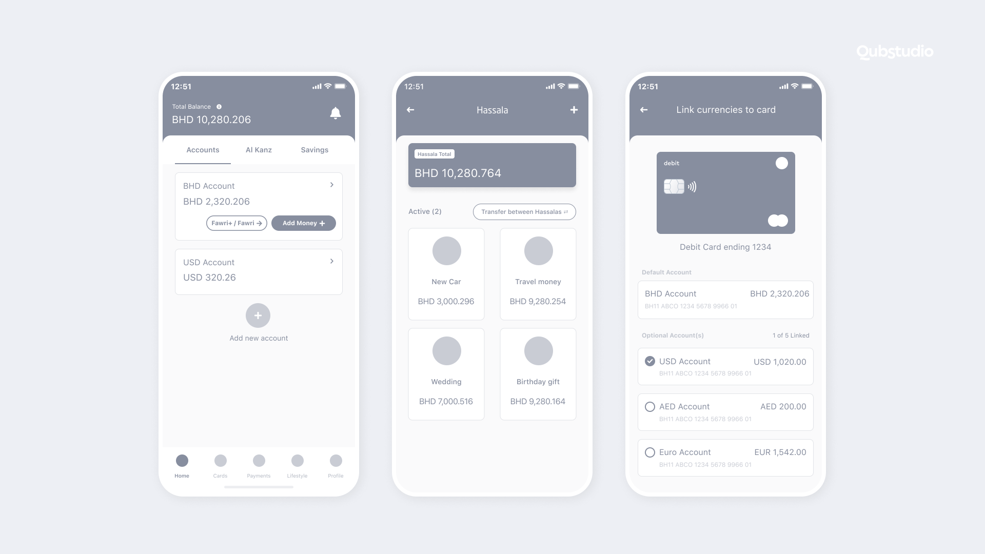
Wireframing also helps you to identify potential design flaws and make necessary adjustments before moving on to more advanced design phases. This can save time and resources in the long run, as it can prevent costly design changes later in the development process. Additionally, wireframes can be used as a reference point for development teams, ensuring that the design is accurately translated into functional code.
Researches shows that wireframing can greatly improve the overall success of an app by ensuring a solid foundation for the design process. According to a study by Justinmind, 77% of successful app developers use wireframes in their design process. Additionally, the same study found that incorporating wireframes early on in the design process can lead to a 10% reduction in overall development time.
4. Prototype and Release
After creating the wireframe design, the next crucial step is to develop a working prototype of your app. A prototype helps you test the functionality of your app and validate its design with real users. It also allows you to gather feedback and make necessary improvements before launching it to the market. Once you have completed the prototyping stage and incorporated feedback, it’s time to launch your FinTech app to the market. Launching your app is an exciting milestone, but it’s important to continuously monitor and improve it to meet the ever-changing needs of your users and the FinTech industry.
5. Maintenance and Support Services
Maintaining and supporting your FinTech app is a crucial aspect of ensuring its success in the market. Approximately 51% of users expect mobile apps to be updated at least once a month, with 15% expecting updates on a weekly basis. This means that regular updates and bug fixes are necessary to keep your users engaged and satisfied. In addition, maintaining the security of your app is also vital, as data breaches and cyberattacks can have severe consequences for both your users and your business.
To provide effective maintenance and support for your FinTech app, it’s essential to have a dedicated team in place. This team should be responsible for monitoring the app’s performance, identifying and resolving any issues, and implementing updates and new features. In addition, providing excellent customer support is also critical to keeping your users happy and loyal. According to research, 90% of users who have a positive experience with a company’s customer service are more likely to return as customers.
6. Copy and Microcopy
Copy and microcopy are crucial components of a successful financial app design. Copy refers to the text displayed on the app, while microcopy refers to the smaller pieces of text, such as button labels or error messages. The language used in your app’s copy and microcopy should be concise, clear, and easy to understand. It should also reflect your brand’s tone and values while providing users with the information they need to make informed financial decisions.
Researches have shown that using clear and concise language in financial apps can improve user engagement and satisfaction. In fact, a study by the Nielsen Norman Group found that users are more likely to trust and use an app when the language is simple and easy to understand.
ila Bank’s mobile app exemplifies the perfect use of user experience (UX) writing. With clear and concise language that is easy to understand, ila Bank has hit the nail on the head when it comes to creating a seamless user experience.
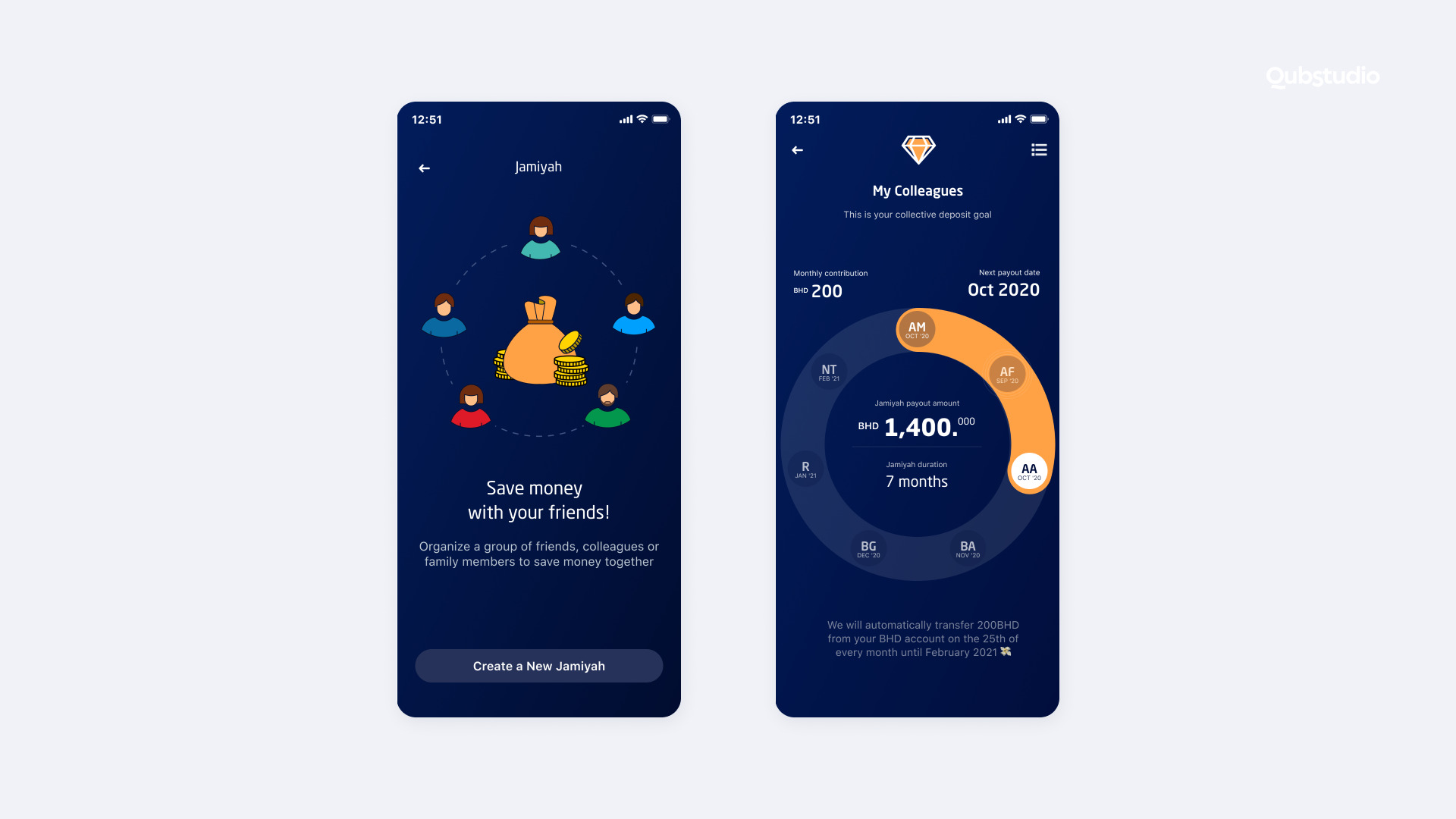
Moreover, microcopy plays a crucial role in guiding users through the app’s features and functions. A clear and concise microcopy can help users understand how to complete tasks or avoid errors. It can also help users feel more confident and in control of their financial decisions, leading to a better user experience overall.
Read article about microcopy and UX writing for Fintech.
7. User Flow
The user flow is one of the most important aspects of a FinTech app’s design, as it directly affects the user experience. A well-designed user flow should guide the user through the app seamlessly, allowing them to complete tasks easily and efficiently. This involves creating a clear hierarchy of information and actions, making it easy for users to find what they need and navigate the app.
To design a good user flow, it’s essential to understand the user’s journey and how they will interact with the app. This requires conducting extensive user research and testing to identify pain points and areas for improvement. Once you have a clear understanding of the user’s needs and expectations, you can design a user flow that meets their requirements.
It’s important to note that the user flow should be adaptable to different user scenarios, such as first-time users and experienced users. The flow should also take into account different user personas and their specific needs and preferences.
8. Colors
Colors have a significant impact on users’ emotions and perceptions of a brand. According to a study by the Institute for Color Research, people make subconscious judgments about a product within 90 seconds of initial interaction, with up to 90% of those assessments based on color alone.
In FinTech app UI design, the color selection should align with the brand identity and the emotions it wants to convey. For example, blue is often used to convey trust and security, while green represents growth and financial stability.
On the other hand, red is associated with danger and caution, and yellow represents caution and warning. Choosing the right colors for your FinTech app can help to create a positive user experience and enhance your brand identity.
9. Display of Content and Device Adaptation
Designing a FinTech app that is responsive and works well on different screen sizes and devices is important to ensure that users have a seamless experience, regardless of the device they are using.
Designing for mobile devices requires careful consideration of the size and layout of your FinTech app UI. A study by Google found that 53% of users will abandon a site if it takes more than three seconds to load, which emphasizes the importance of designing an app that is quick to load and responsive.
It’s also important to consider the orientation of the device when designing your app. According to a study by Flurry Analytics, users spend 90% of their time on their mobile devices in portrait mode, which means that your app should be designed with portrait orientation in mind.
In summary, designing your FinTech app for different screen sizes and devices is crucial to provide a seamless user experience. It requires careful consideration of the size and layout of your FinTech app UI, as well as its responsiveness and load times.
Fintech App Design: Best Practices
Simplicity & Clarify
Maintaining simplicity and clarity in your app helps users navigate it smoothly, minimizing potential frustration or confusion. Try to avoid clutter and add new features without overwhelming users with unnecessary complexity.
Security
Offer clear explanations to your users, when it comes to app security features. Also, provide transparent and easily accessible privacy policies that outline how user data is collected, used, and protected.
Personalization
Adjust the app to match each user’s preferences and needs.
For example, in a budget-tracking fintech app, you could let users set their financial goals. This means they’ll get personalized alerts and summaries that fit exactly their goals.
Also, it’s important to give users control over their notifications. Some might want instant real-time alerts about each action, while others don’t want to be disrupted and prefer only important alerts regarding security.
User-centricity
User research & user needs should be the core of your financial services app design process.
For example, a foreign exchange app can recall the currency conversions users perform most often and present these as convenient shortcuts. Also, use the constant feedback to drive iterative improvements and polish the app’s functionalities and design.
Employ these strategies while prioritizing the user’s requirements. However, don’t forget that during the fintech app design process, it’s still possible to face some challenges.
What are the FinTech App Design Challenges?
Designing for FinTech presents several challenges, including:
- Navigating complex regulatory environments. Fintech apps should follow regulatory frameworks to ensure legal compliance and protect users’ rights. This includes staying up-to-date with all evolving regulations, to ensure a safe user experience.
- Addressing security concerns. Strict regulations and security standards can impact the app’s design and functionality. It includes designing secure login processes, API integrations, transaction security, and more.
- Building trust. Proper FinTech app UI should create an environment where users feel confident and assured about their financial interactions. Achieving this involves effective communication, robust security measures, and empowering users with control over their experience.
Critical Web Design Mistakes to Avoid
There are several critical web design mistakes that you should avoid when designing your FinTech app. These include cluttered design, confusing navigation, slow load times, and poor accessibility. Avoid these mistakes by focusing on clean and minimalistic design, intuitive navigation, fast load times, and accessibility features.
Finding the Team
Finding the right team for your FinTech app is critical to its success. Look for a team with experience in FinTech app development, design, and UX research. Consider working with a design agency or freelance designers to ensure that your app’s design is exceptional.
Final Thoughts
If you’re wondering how to design a fintech app, Qubstudio is here to help. Our team of expert product designers has over 19 years of experience creating user experiences that balance functionality, security, and user experience. We understand the unique challenges of designing for fintech and can help you navigate them to create a successful app that meets the needs of your users.
Contact us today to learn more about how we can help you design a fintech app that stands out from the competition.
FAQ
What is the most important for FinTech mobile app design?
The most important aspect of FinTech app design and development is to prioritize the user experience. The design should be intuitive, easy to navigate, and visually appealing. It should also provide users with the information they need to make informed financial decisions.
What are the best FinTech app fonts?
When selecting fonts for your FinTech app, it’s important to choose fonts that are easy to read and align with your brand identity. Some of the best fonts for FinTech app design include Helvetica, Open Sans, Roboto, and Lato.
What colors are best for FinTech apps?
Colors can play a significant role in financial app UI. When selecting colors for your app, consider the emotions you want to evoke and how they align with your brand identity. Some of the best colors for FinTech app include blue, green, and orange.
Why is FinTech app design important?
It is essential for creating a positive user experience and ensuring the success of your app. An exceptional financial app UX design can help users manage their finances more efficiently, build trust with your brand, and differentiate your app from competitors.
Interested in designing your FinTech application? Our team of experienced designers and UX researchers can help bring your vision to life. Discover how we can help you.
