Deaglo
Designing an Innovative and User-Centered FX Risk Management Platform
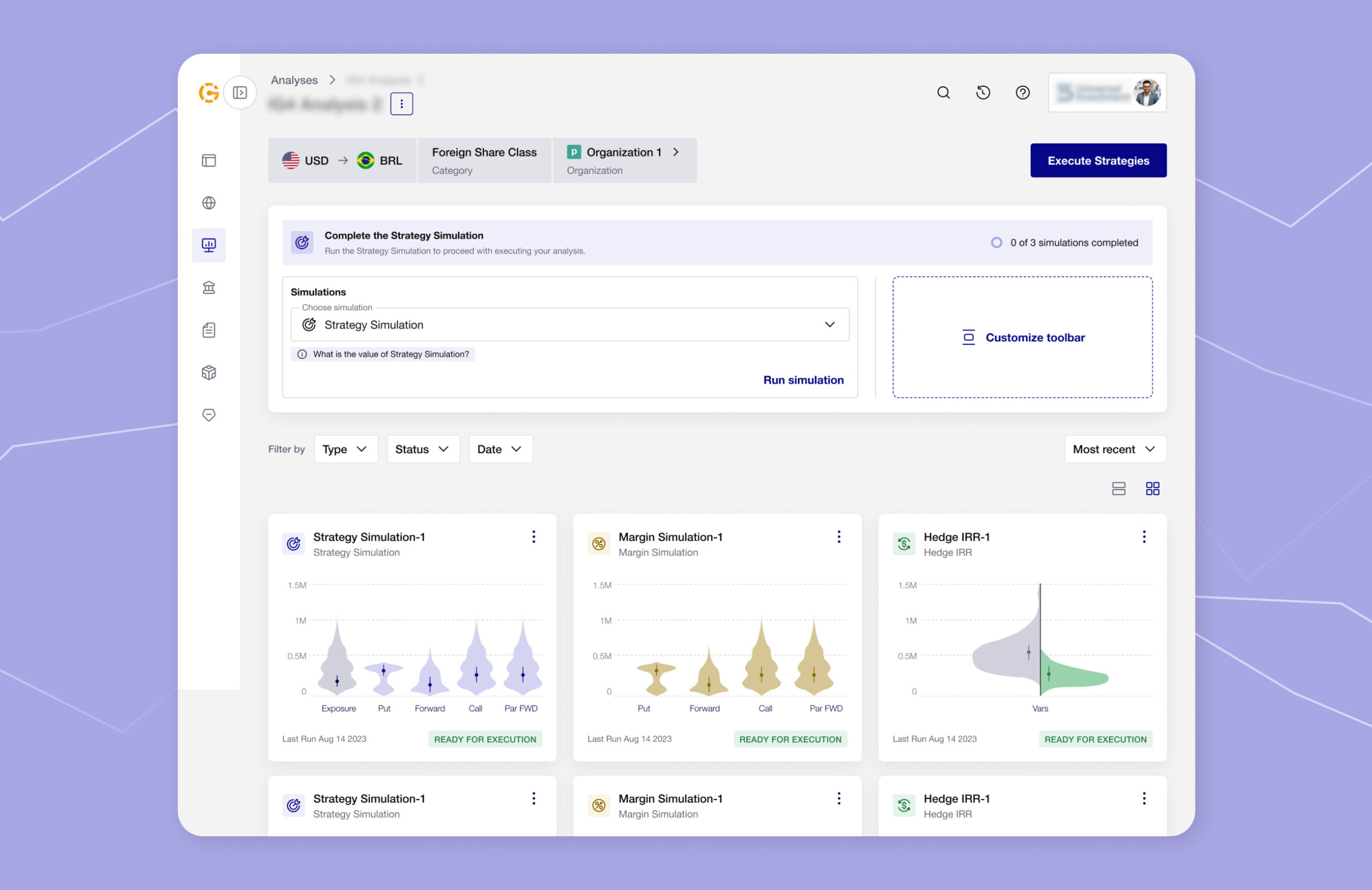
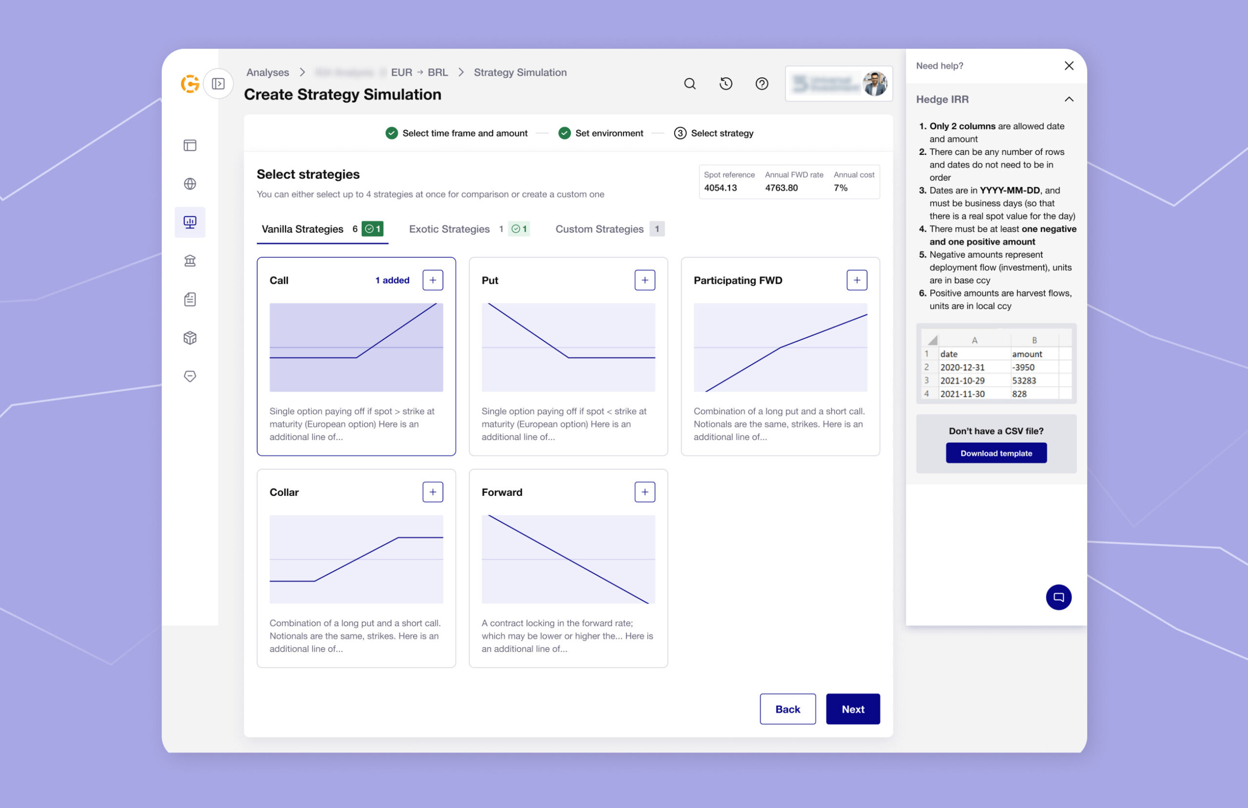
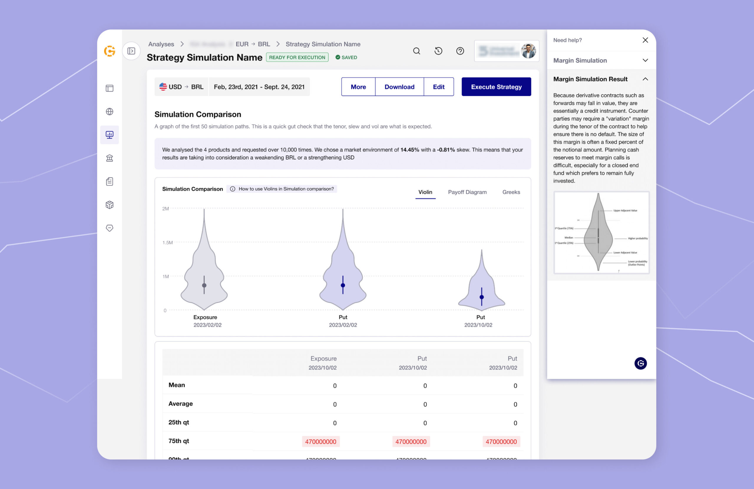
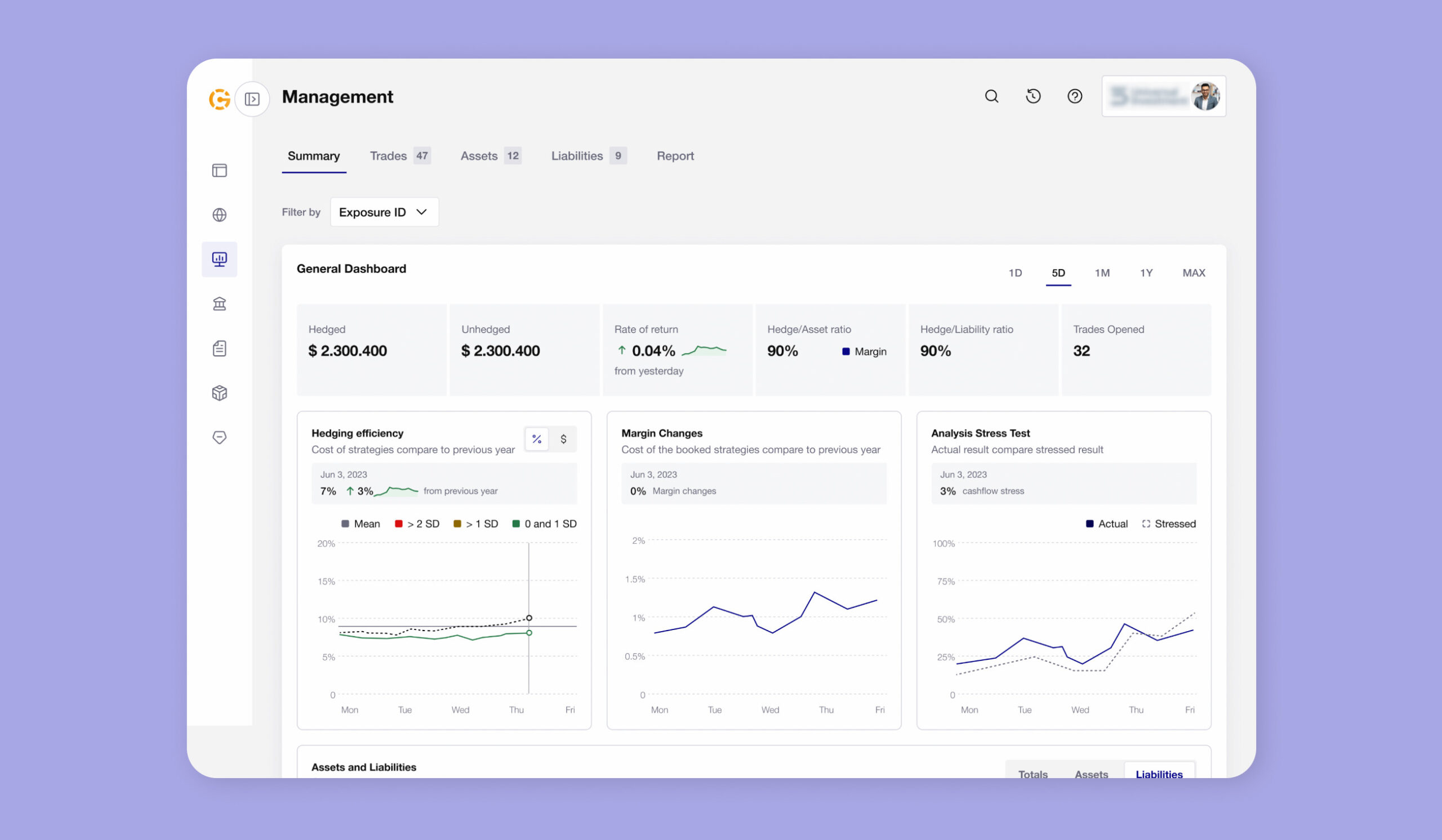
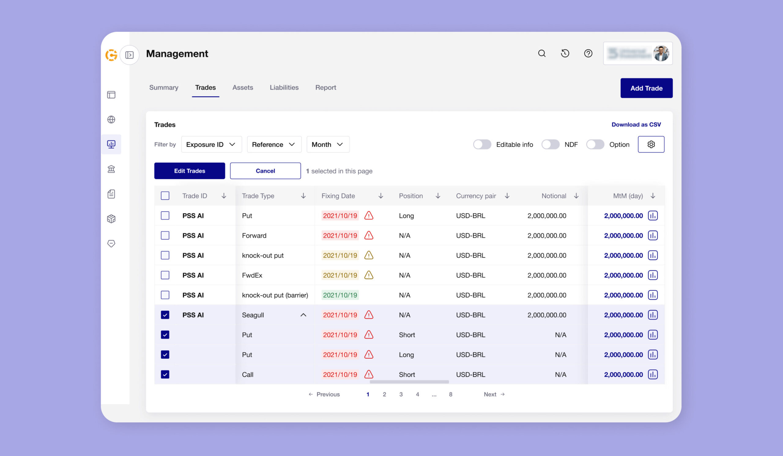
Deaglo is an enterprise FX risk management solution for financial institutions. The platform makes it easy to test various hedging strategies and how they could potentially perform, allowing users to confidently manage currency fluctuations. The tool is used by financial institutions for their clients and global investors to make data-driven decisions.
Qubstudio collaborated with the Deaglo team to revamp and redesign this cutting-edge solution.
Capabilities
Business Value & Market Research
Design Review
Information Architecture
User Interview & Testing
UI Conceptualization
Prototyping
Product Design
Design System
Team
Product Designer
UX Researcher
Project Manager
Model of Cooperation
T&M
Industry
FinTech
Location
USA
Duration
9 months
Capabilities
Business Value & Market Research
Design Review
Information Architecture
User Interview & Testing
UI Conceptualization
Prototyping
Product Design
Design System
Team
Product Designer
UX Researcher
Project Manager
Model of Cooperation
T&M
Industry
FinTech
Location
USA
Duration
9 months
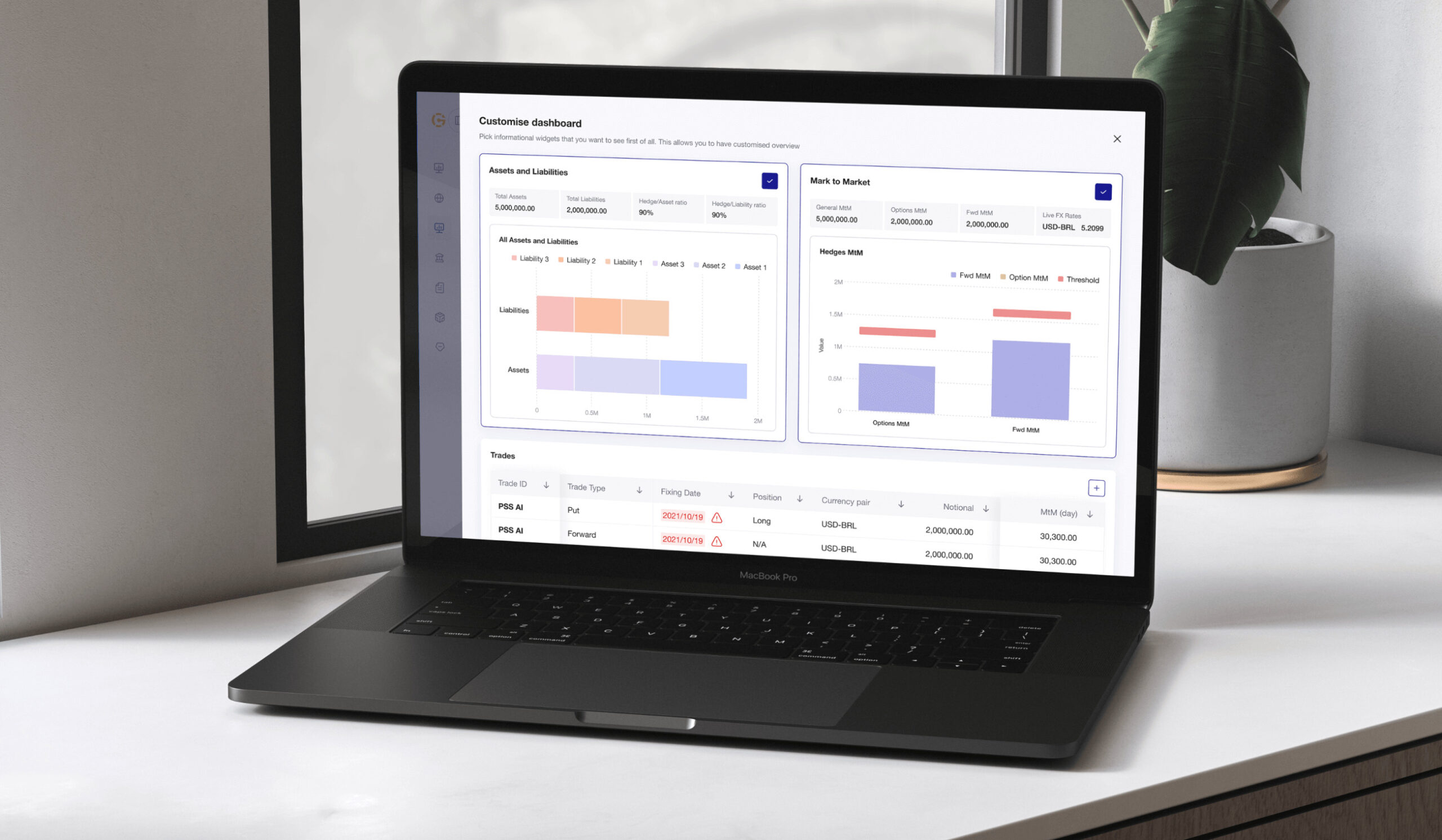
Simplifying and Redesigning a Complex FX Risk Management Platform
The FX domain is complex, even for seasoned experts. This complexity can make it challenging for financial institutions to effectively serve their clients in an objective way, as they have to carefully consider multiple factors before identifying a suitable FX strategy.
While Deaglo designed its platform to simplify how FX risk management could be objectively handled, its UX overshadowed its unique capabilities. Deaglo’s UX needed a complex redesign.
However, solving the usability issues required a deep grasp of the client’s existing platform—a challenge in its own right—and a solid understanding of the industry.
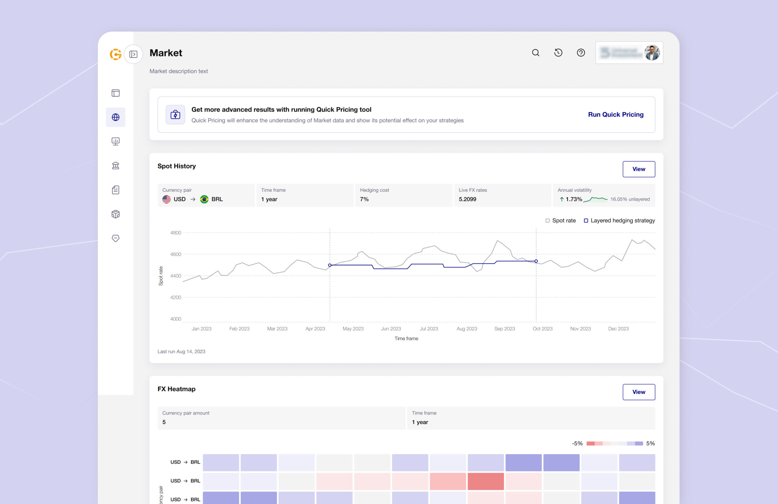
Putting Users First: A 360-Degree User and Business Research
To build a truly intuitive UX, we first needed to determine how Deaglo’s target users—bank sales representatives, managers, and global investors—defined “easy.” Simply dissecting the intricacies of risk management practices wasn’t enough; we needed a more user-centric approach.
We kickstarted this project with thorough business and market research to compile a detailed checklist of issues requiring attention and build a clear project roadmap. Additionally, we interviewed dozens of users and tested prototypes to get a 360-degree customer view.
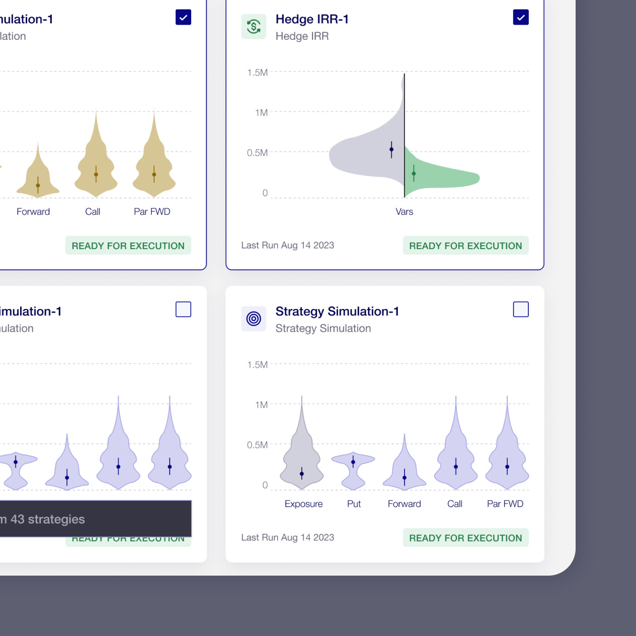
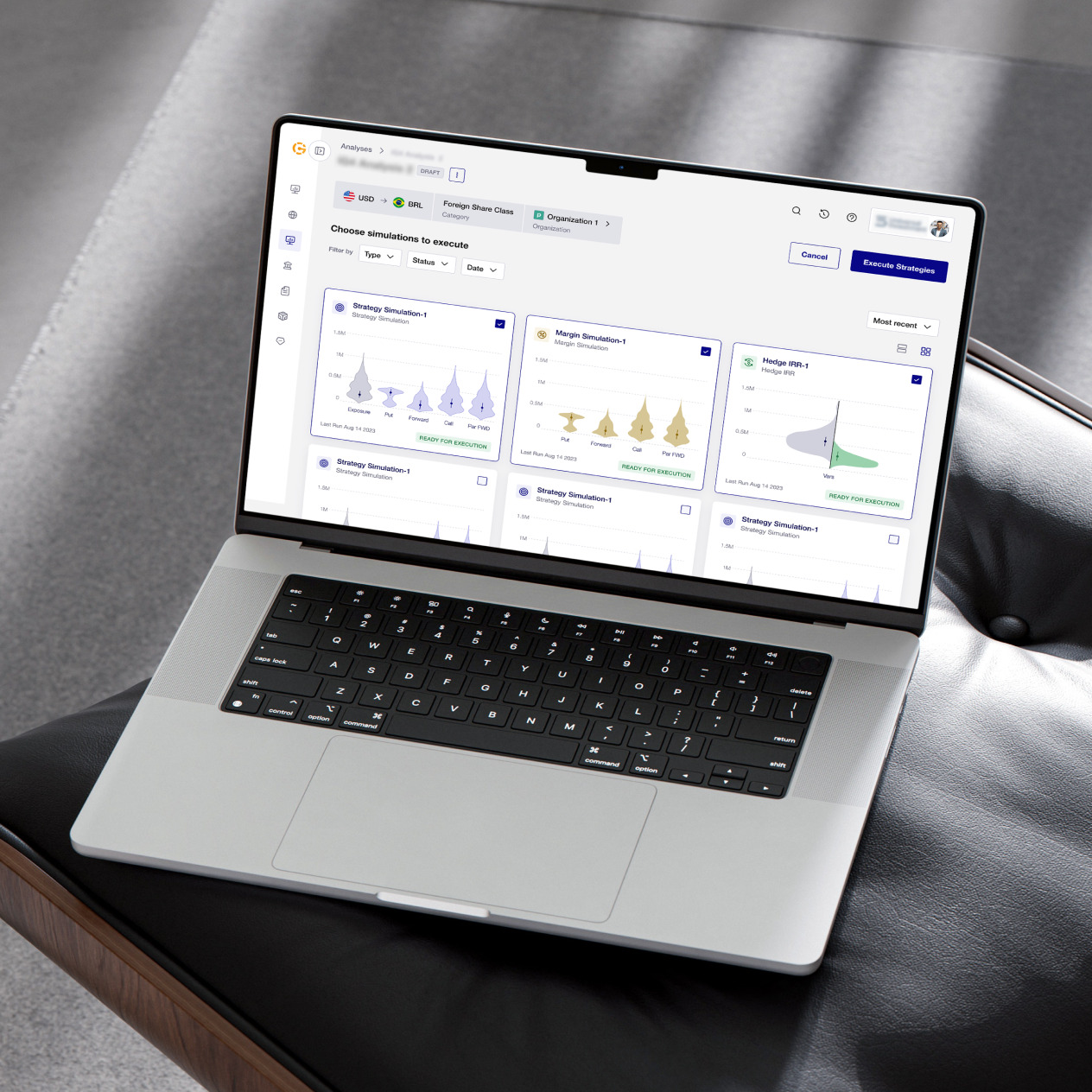
Enhanced FX Risk Management Platform Centered on Innovations, Simplicity, and User Satisfaction
We helped the Deaglo team create a holistic revamp of the platform, that is focused on data-driven decision-making.
- We enhanced navigation to address usability concerns of various user personas. Thanks to its intuitive UX, the platform’s unique value became obvious to all users, including bank consultants who can now use analytics to explore various strategies for their clients, helping them manage FX risk management strategies with confidence.
- From user interviews, we discovered the main pain points and suggested integrating new features to address the previously unmet needs.
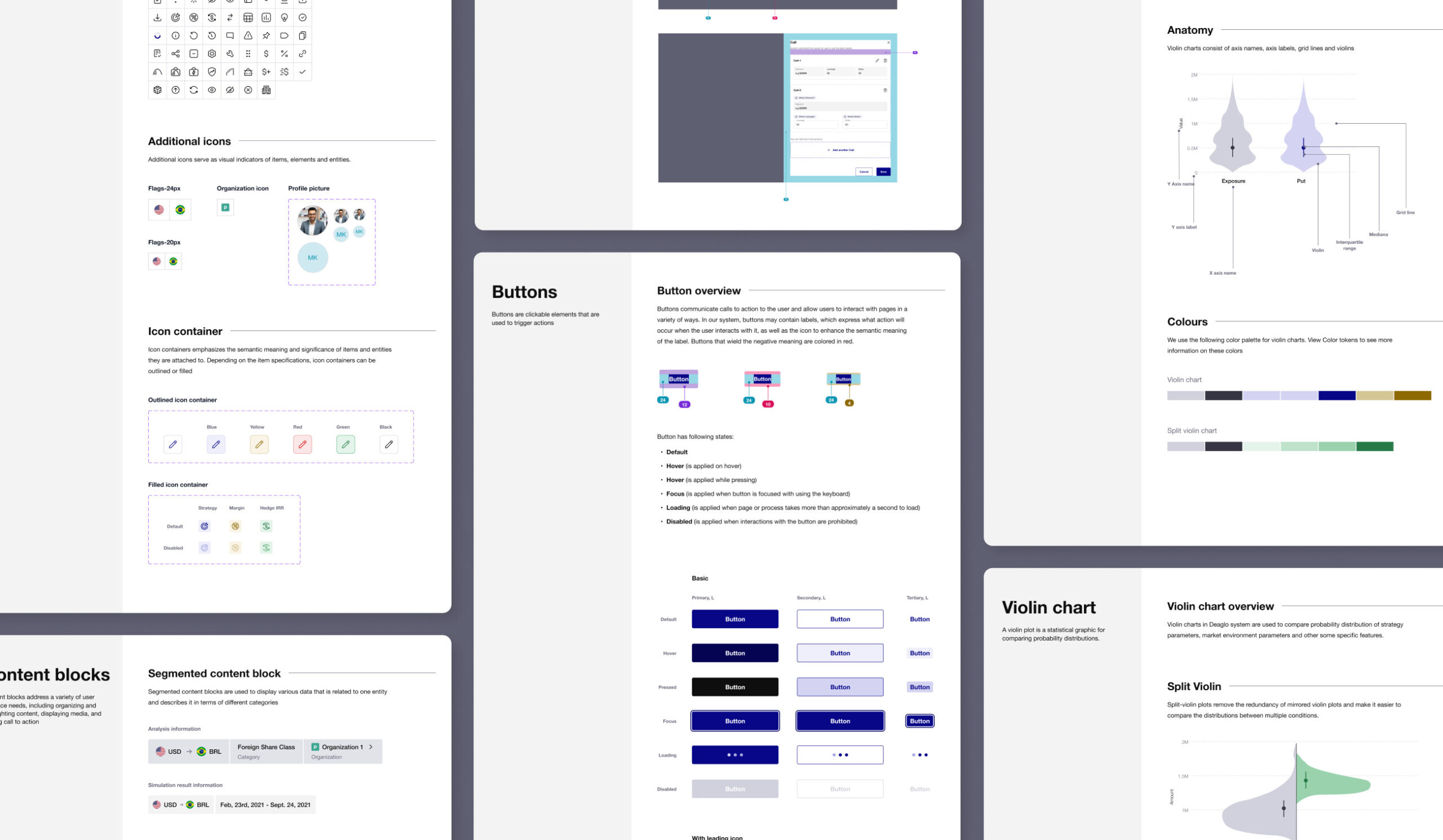
- We updated the UI to match a brand-new design system.
75+
new features implemented
30+
features added beyond
the initial scope
700+
components featured in the design system
