Lane Health

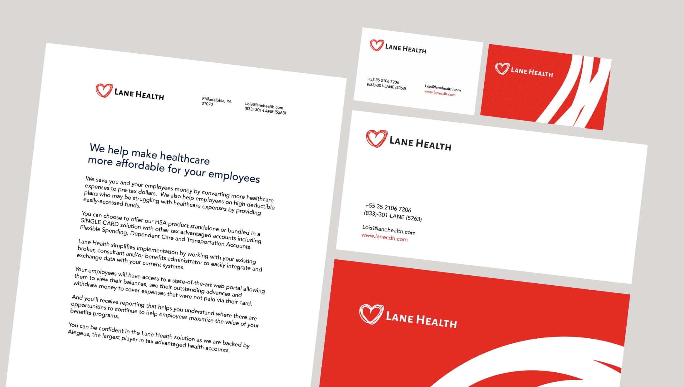
Lane Health is an American business in medical insurance. It has a health saving account program that helps American companies and employees that opt into a high-deductible healthcare plan (HDHP). Lane Health allows them to benefit from more health care items and services so that they can feel secure and save money. Specifically, it enables employees to get medical care when they need it, just by swiping their BeWell card. We have carefully preserved the concept of Lane Health's corporate style. Still, we have provided the brand identity and site with consistency and maturity.
Achieving brand consistency for strengthening trust
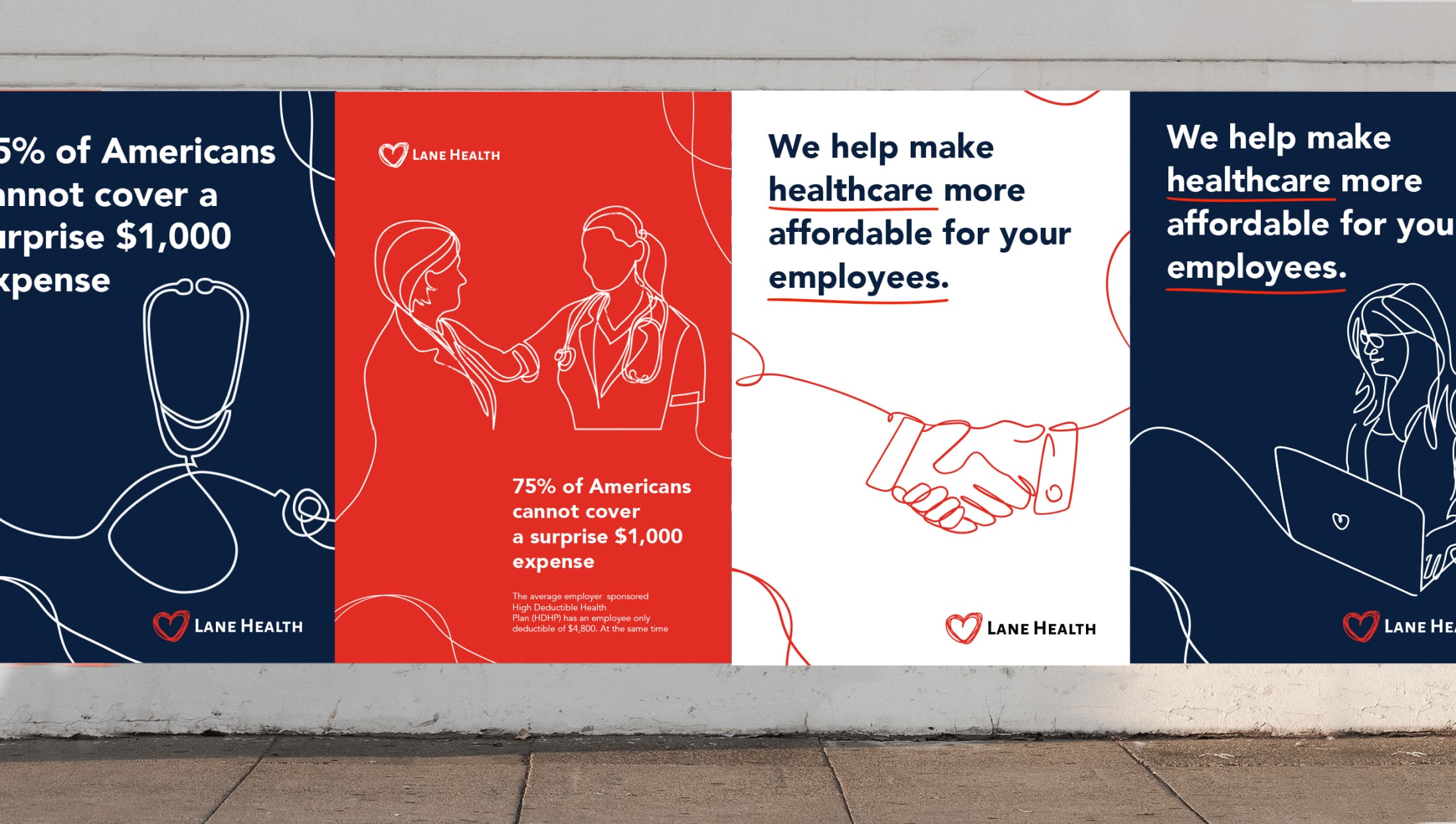
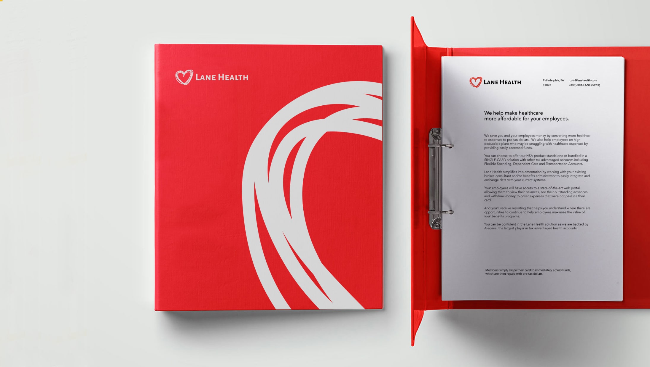
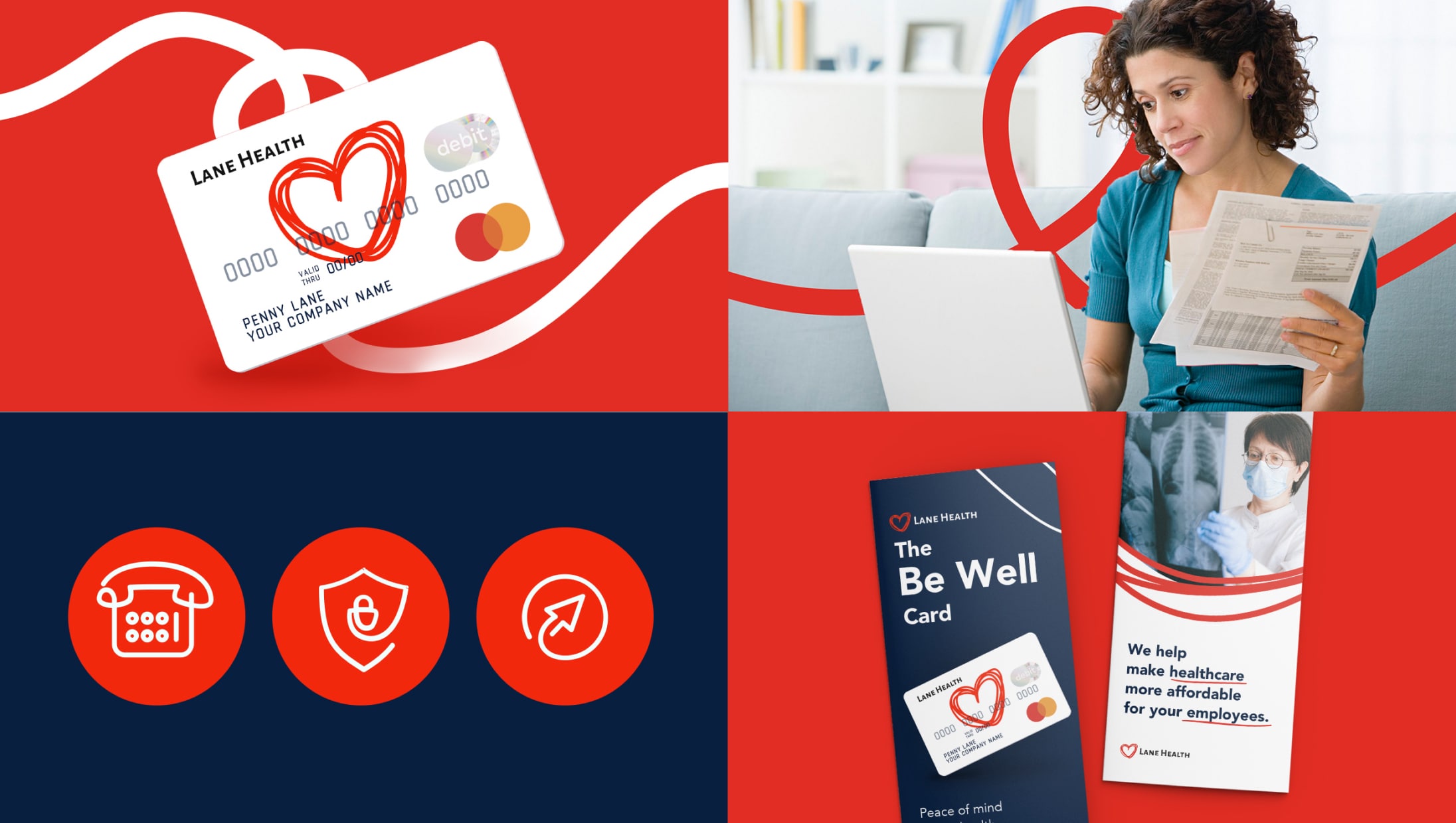
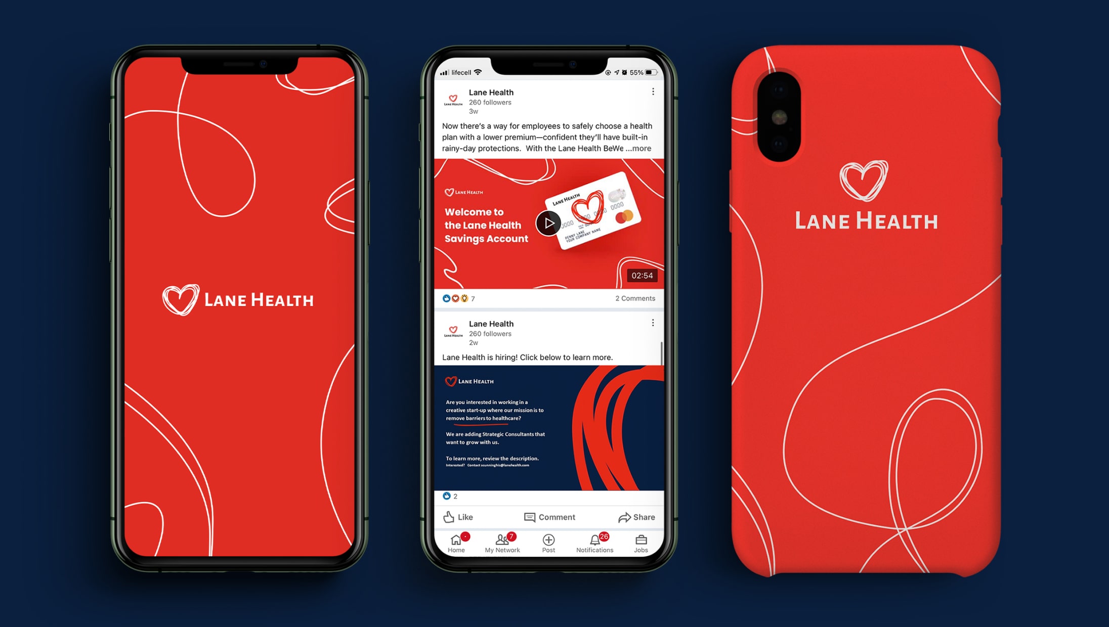
The original logo of Lane Health has already had a crafted and easy feeling and was well recognized by the brand’s customers. Our team preserved the logo and strengthened that heart-warming emotion by creating hand-drawn one line illustrations and elements. Red evokes medical associations, so we kept it, but updated the other hues.
Bringing structure to the site
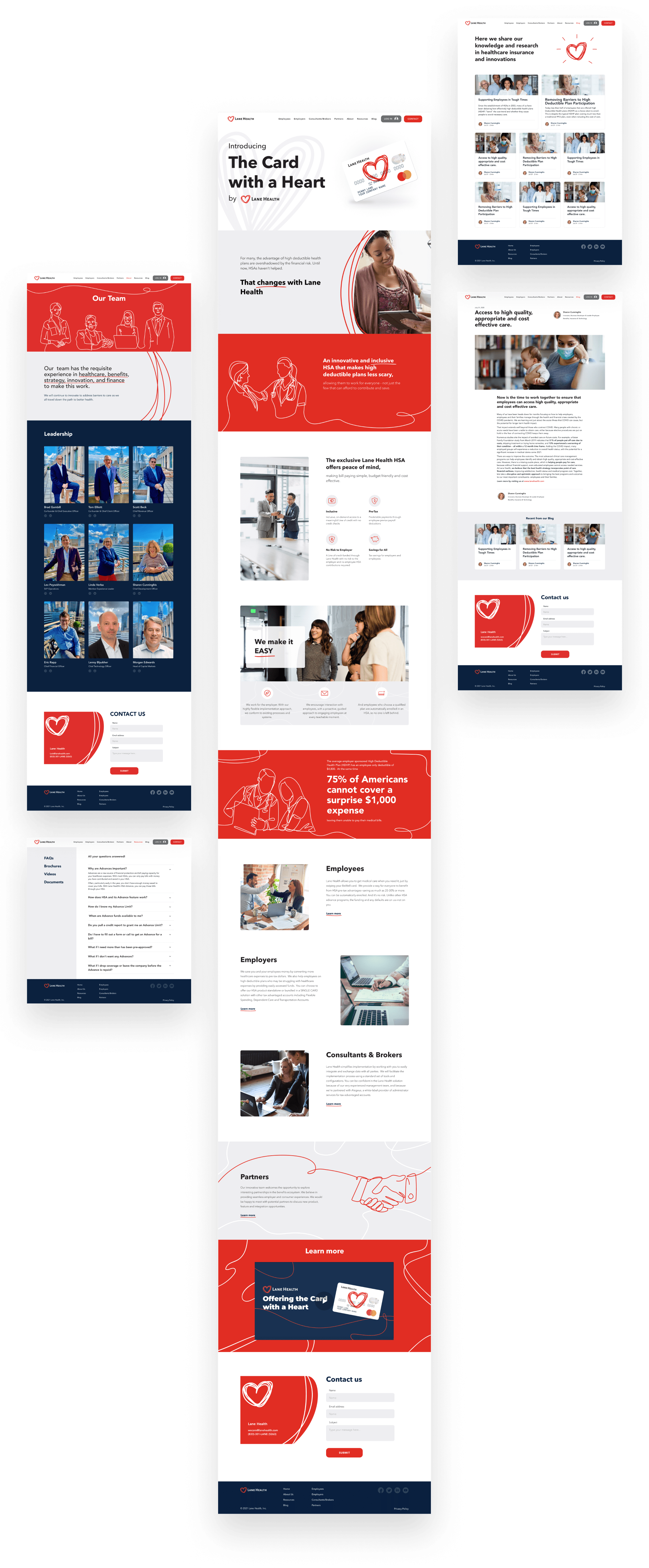
The initial look of the website was oversaturated with information. There were no key points to drive customer's attention. Moreover, it contained vertical scrolling tabs and sliders that didn't appear correctly. Our team added two more sections about the company and put the onboarding video to the main page. Now customers can find all the information needed.
Qub did a great job reflecting a consistent brand look and feel. All the work was done on time and they were always transparent with their hours and resources throughout the entire process. The team is incredibly responsive and is a valuable thought partner on our design decisions.
Services:
Collateral redesign
Website design
Team:
Graphic designer
UX/UI designer
Project manager
