LinkIt!
Capabilities
Brand DNA
Rebranding
Collateral Design
Website Design
Digital Product
Design
Team
Brand Strategist
Lead Designer
Brand Designer
Web Designer
Product Designer
Motion Designer
Industry
Location
Model of Cooperation
Duration
LinkIt! is a digital educational SaaS platform serving data warehousing, assessment solutions, and analytics for K-12 schools, districts, and education providers. It has been 15 years on the market already, established in the southern states of the USA and extended to Australia.
Redesigning a brand with millions of users is always a great responsibility, as people react differently to changes in interactions that have become familiar. So our team worked through dozens of design concepts throughout the lengthy collaborative process until we successfully created an out-of-the-box design while keeping users comfortable with interactions.
Our Target Audience consisted mainly of conservative education providers. So the key challenge was ensuring careful rebranding without changing the flows users were accustomed to.
Branding
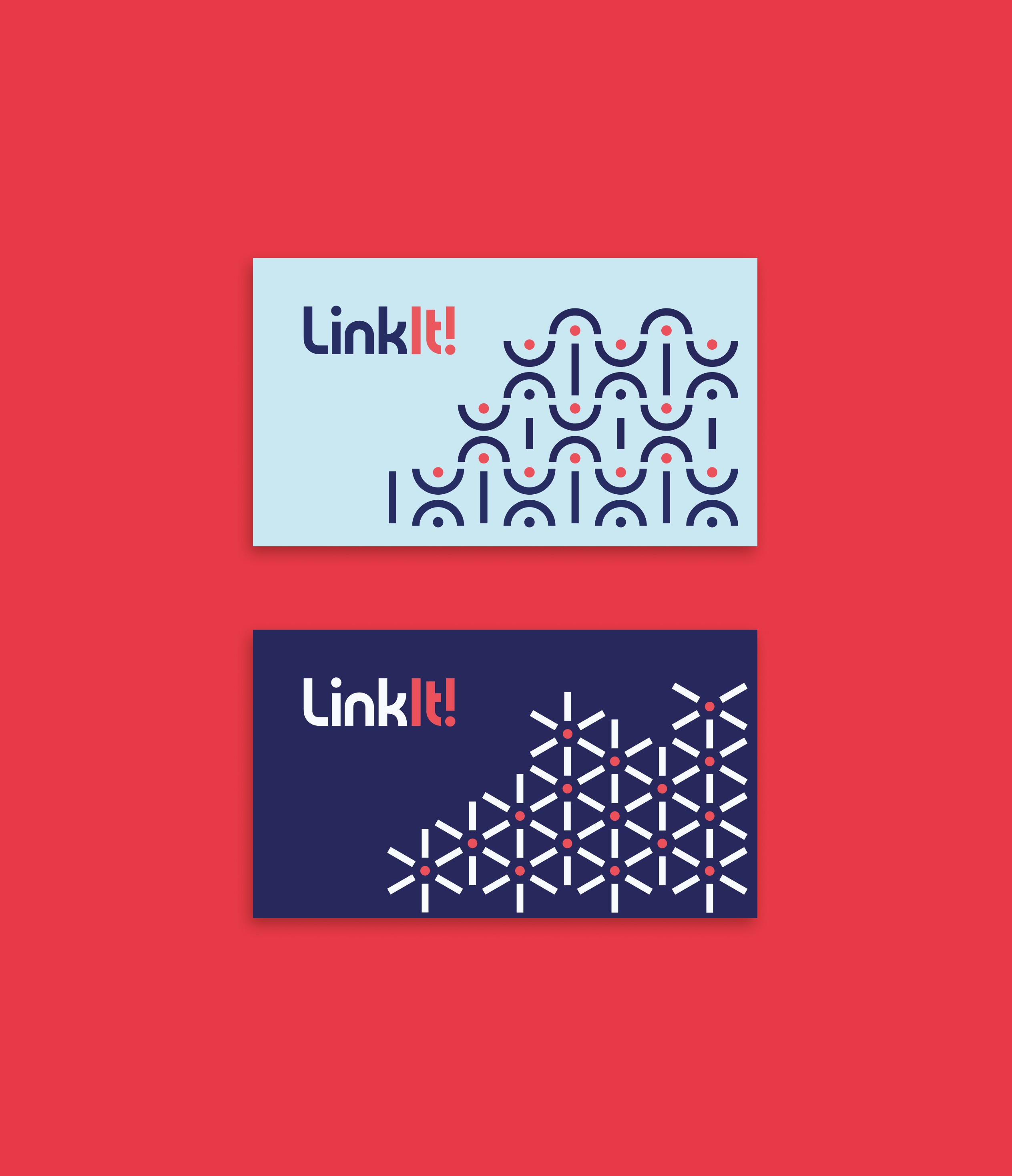
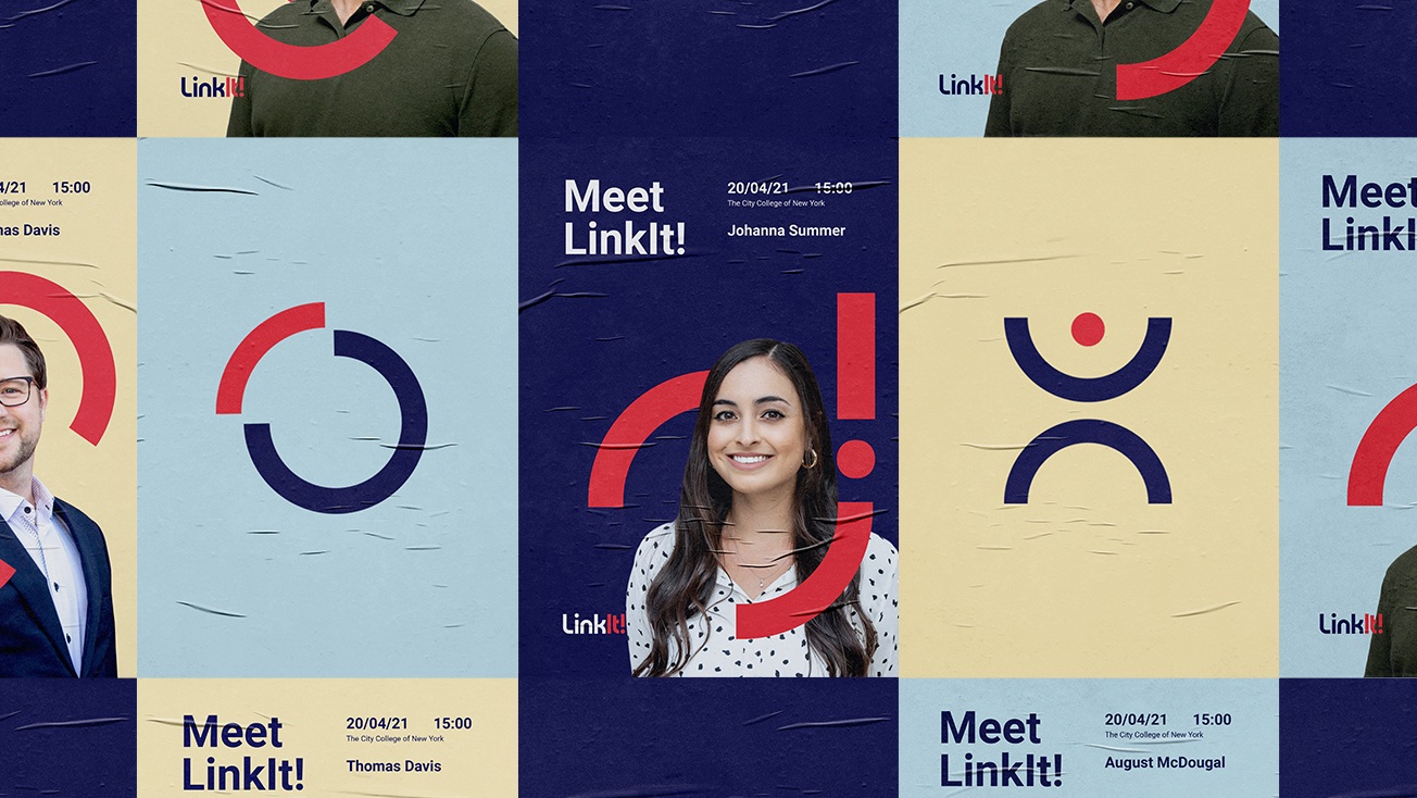
Our team was involved in giving a makeover to LinkIt!'s logotype and corporate identity, so we began with the brand strategy and worked out brand values Collect, Analyze, and Grow. Thus, we spruced up and updated the logo lettering. Then, we proceeded with the visual identity elements, making them partly cartoony yet still serious and mature enough, as the primary target audience was education providers, not students.
Website Design
We aimed to show the product benefits and engage users without sharing the platform screenshots on the website. So, for this purpose, animations served perfectly. Icons, bright hues, and animated functional elements got together to set consistency and submerge the user in the website interaction.
Platform Design
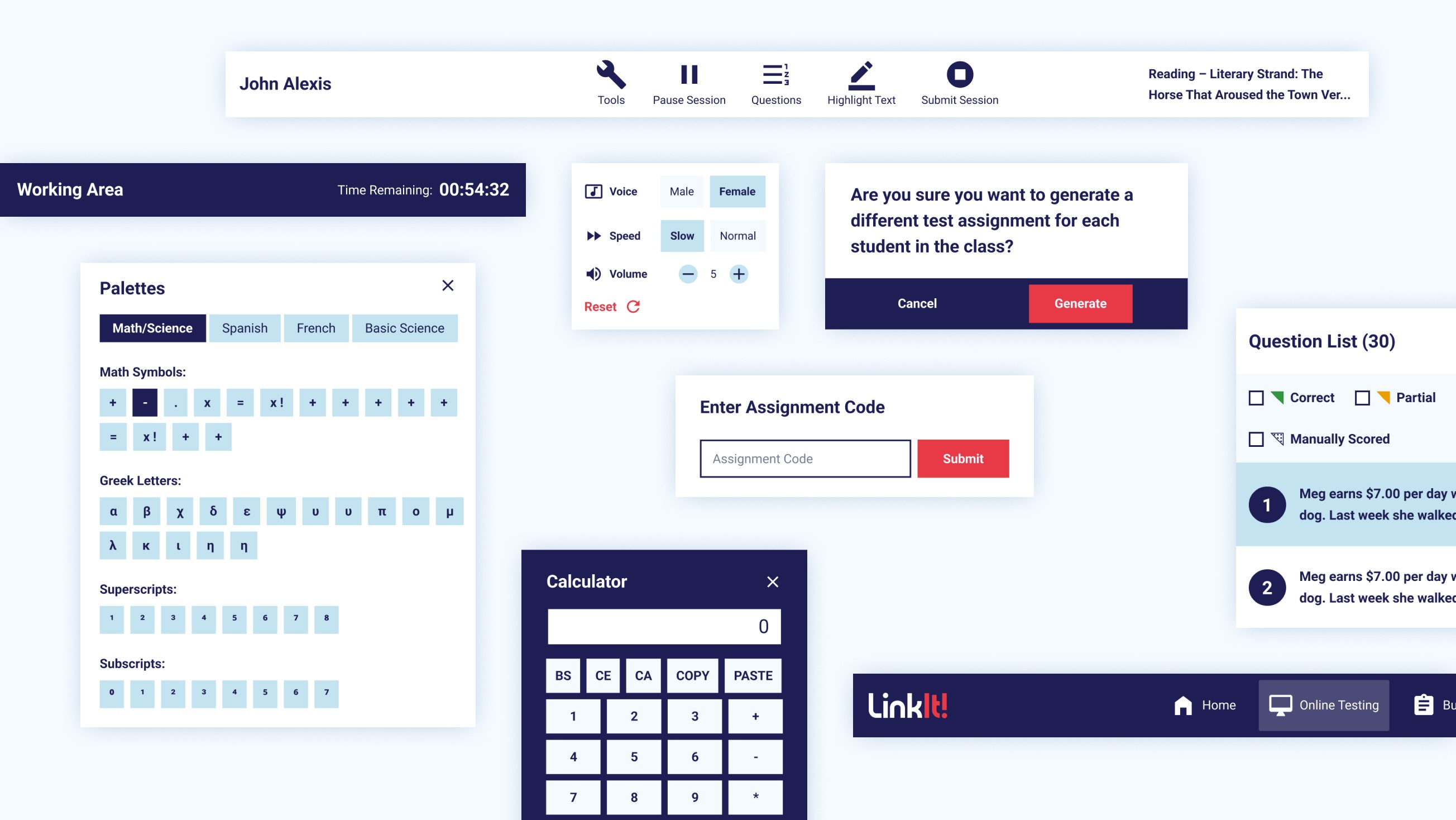
According to the renewed branding, we redesigned the TestTaker platform, used by students for taking exams, Parent & Student Portal, and Staff Portal. Our UI solutions were reinforced via best practices and data evidence, which helped establish trusting cooperation with the developer and designer from the client's team.
I was really impressed with Qubstudio’s brainstorming process and the brand identity that they came up with. We liked that they could back up their design choices; every detail and design element was well thought out and employed for a reason.
