Scoutbee
Re-branding for Ai-based SaaS company
scoutbee is an
AI-driven platform
that connects
purchasers with
suppliers from all over the world
scoutbee is a sage
The sage brand archetype is subtle and measured in look, motion and words.
We found a direct symbol for it via several brand identity design iterations.
With a sense of magic
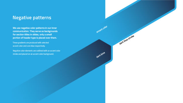
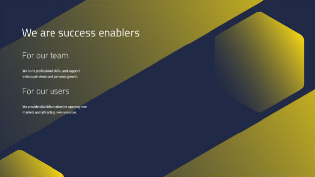
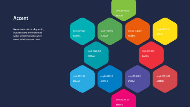
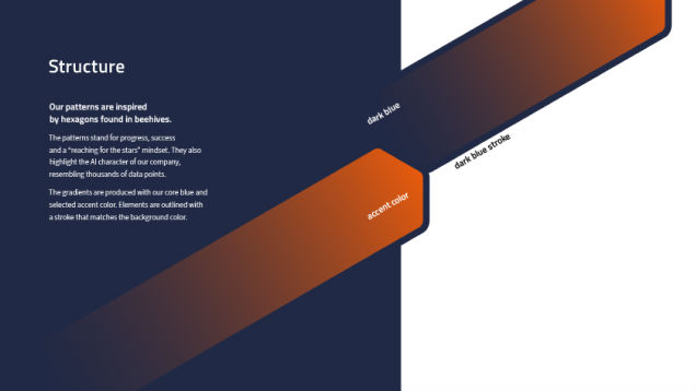
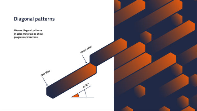
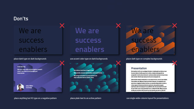
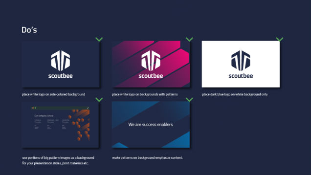
As a branding company, we designed a set of colorful patterns that represent brand positioning, data points, information and progression.
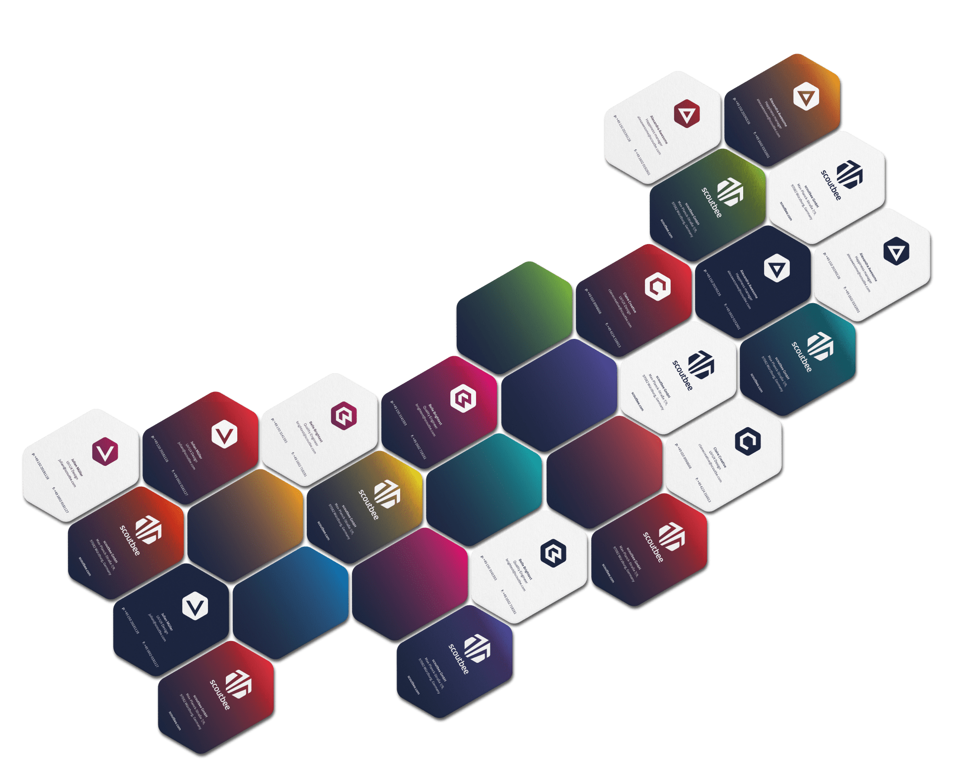
For team members who are heroes
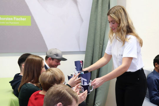
scoutbee brand cards represent the different skills and personalities in the scoutbee beehive
Who share their experiences
In both formal and informal ways
scoutbees are likeable nerds
With a sense of sharing, not competing
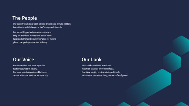
Professional growth, hobbies, leisure, and challenges
That’s the growth formula of scoutbee brand positioning
They love
their job
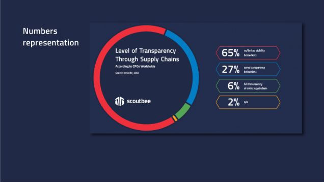
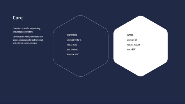
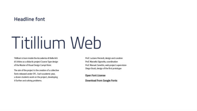
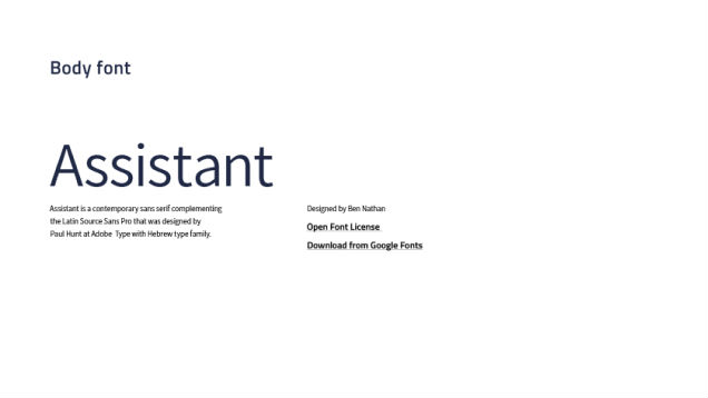
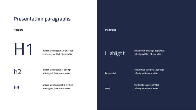
And don’t forget about formal part of corporate identity

Or data
representation
scoutbee brings
futuristic changes to the procurement industry
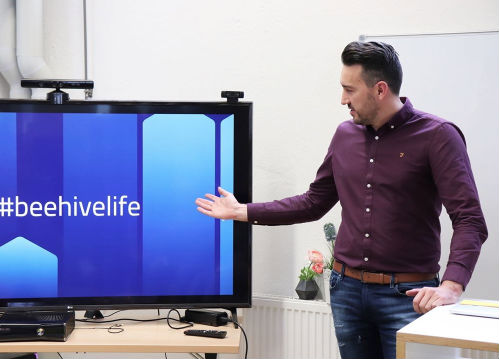
#beehivelife




Launching the new brand image!

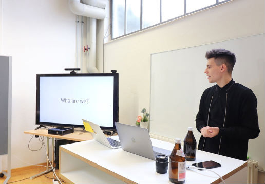
We found QubStudio through their Dribbble profile and visited their office for a workshop. Their in-depth discovery session of our project impressed us, especially for its insights and productivity.
Their approach completely caters to our needs. During the project, we have gapless communication, both in calls and in-person meetings. QubStudio dedicated their professionalism and efforts to our project such that working together feels like being a single team.
Project summary
Services:
Team:
Art Director
Graphic Designer
