Workforce Velocity
Streamlined Workforce Management Efficiency Through HRTech Platform Redesign
Workforce Velocity is an HRTech platform, which provides a comprehensive range of services and solutions for HR processes.
It includes Workforce Planning feature, which is used in unique Transaction-Based Scheduling and Gross Margin Calculations, that help users and branches achieve and calculate main KPIs. Also, the platform has features such as workforce recruitment, payroll, and timekeeping, as well as other tools to control labor costs.
Our team revamped the platform to enhance the user experience and facilitate seamless HR process management in a single, integrated solution.
Capabilities
Business Research
UI/UX Audit
User Interviews & Testing
UI Conceptualization
UI/UX Redesign
Prototyping
Product Design
Design System
Team
Product Designer
Business Analyst
Project Manager
Model of Cooperation
T&M
Industry
HRTech
Location
Georgia, USA
Duration
1 year, ongoing
Capabilities
Business Research
UI/UX Audit
User Interviews & Testing
UI Conceptualization
UI/UX Redesign
Prototyping
Product Design
Design System
Team
Product Designer
Business Analyst
Project Manager
Model of Cooperation
T&M
Industry
HRTech
Location
Georgia, USA
Duration
1 year, ongoing


Overhaul the Entire Platform Without Disrupting Existing Workflows
The client engaged us to completely revamp a complex ERP software solution. The platform required improvements in its user interface, navigation, and information architecture to enhance the efficiency of work processes.
Our challenge was twofold: maintain the platform’s feature set, and enhance its UX/UI, combining the platform’s navigation and easy steps to help users with onboarding into the new system.
In addition, since the platform catered to various types of users, we needed to consolidate their diverse needs in a unified platform, as well as create new roles and an easy way to assign sets of users to access their information quickly.


User-Focused Redesign to Enhance Operational Effectiveness
Understanding the diverse user base of the platform was crucial. To grasp the unique needs of each user persona and uncover existing challenges, we conducted an extensive Discovery Phase.
It involved a comprehensive analysis of the client’s business needs, conducting user interviews, and information architecture modeling. During the product design process, we primarily focused on identifying and addressing UX issues.
We implemented our UI/UX enhancements gradually, gathering feedback from real users along the way to ensure that we tailored changes to effectively resolve existing pain points.
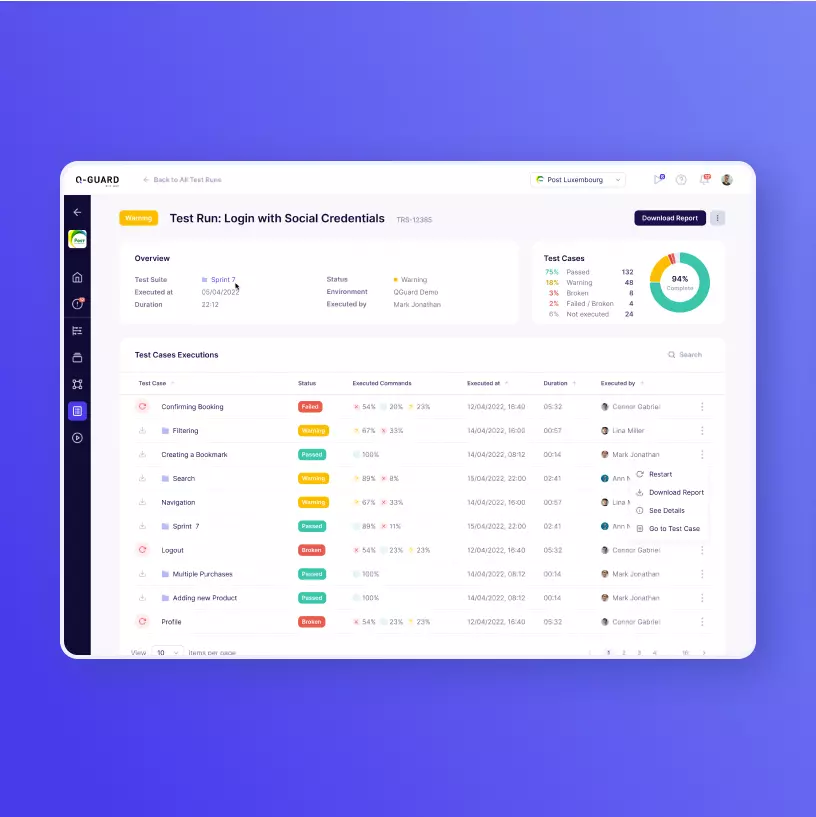
Comprehensive Platform Redesign Improved Workforce Management Processes
Our team revamped the platform, taking its usability to the next level:
- We refined both the UX and UI to simplify the system’s functions, and created new navigation and search features to help users quickly locate information;
- Increased learnability and improved onboarding for new users;
- Optimized the system’s workflow for different user types;

- Designed a dashboard to streamline the recruitment process for recruiters, making it easier to find and onboard suitable candidates;
- Created a step-by-step process for setting up new companies and new locations in a complex configuration system, built to eliminate user errors;
- Added a new feature to forecast labor cost and interactive plug-and-play scheduling projections to see changes in margins quickly.


94%
completion rate for redesigned flows
445
new UI
screens
64
user
flows