A guide to UX Strategy. Qubstudio way to bridge user experience gaps
Key takeaways
UX strategy: trend or necessity?
There might be only a few, who never heard about the UX strategy. But what makes that much hype around this issue? Let’s discuss how UX strategy can benefit your business, how to define if you need it at all whether you lead a startup or an enterprise.
What’s gonna happen?
Moving from one UX strategy essential checkpoint to another, you’ll understand the need for a strong discovery phase, check our UX mapping tips & tricks and see how making validation a religion can bring the product to another level. If that’s what you are looking for, jump directly to “Defining your UX Strategy” section.
What will it look like at the very end?
If you decide to undertake this journey, you’ll have a clear UX strategy vision, well-defined focus and step by step actions plan to be able to communicate it to all the cross-functional teams.
What do we mean by UX Strategy?
What a fancy, scarry and overused word. Trying to Google it, one will likely get lost in all these definitions. Actually we did at the very beginning. We’ve started with Michael Porter and ended with Chan Kim to pick up the best vision and then transform it into the answer to real-life challenges.
We dug really deep to make it simple.
So, we see the strategy as a “Smart and flexible plan:
- with a strong base, build on research insights and data analysis
- aimed at out-maneuvering threats and challenges attacks
- able to take us to desired outcomes following the timeline.”
Finally, when we talk about digital product UX strategy, we mean the flexible plan aimed to:
- match users’ needs to create user value,
- deliver this value to users,
- and provide a seamless experience while using this product.
Who needs the UX strategy?
You might be curious about how you will understand if you need the UX strategy? That’s a really good question!
If you’ll look through latest McKinsey, Forrester, Accenture, Genesys and other smart guys reports, you’ll find lots of statistical proofs of effective UX ability to: reduce costs in the product development process, increase company revenue and become a solid competitive advantage, as in digital age an experience becomes the main differentiator.
Check our recent research for the e-health domain, which brings UX value strong statistical proof. Сonvincingly, isn’t it? Seems like that 🙂
But we prefer to rely on self-tested cases! Check our UX improvements effects on a few recent projects examples:
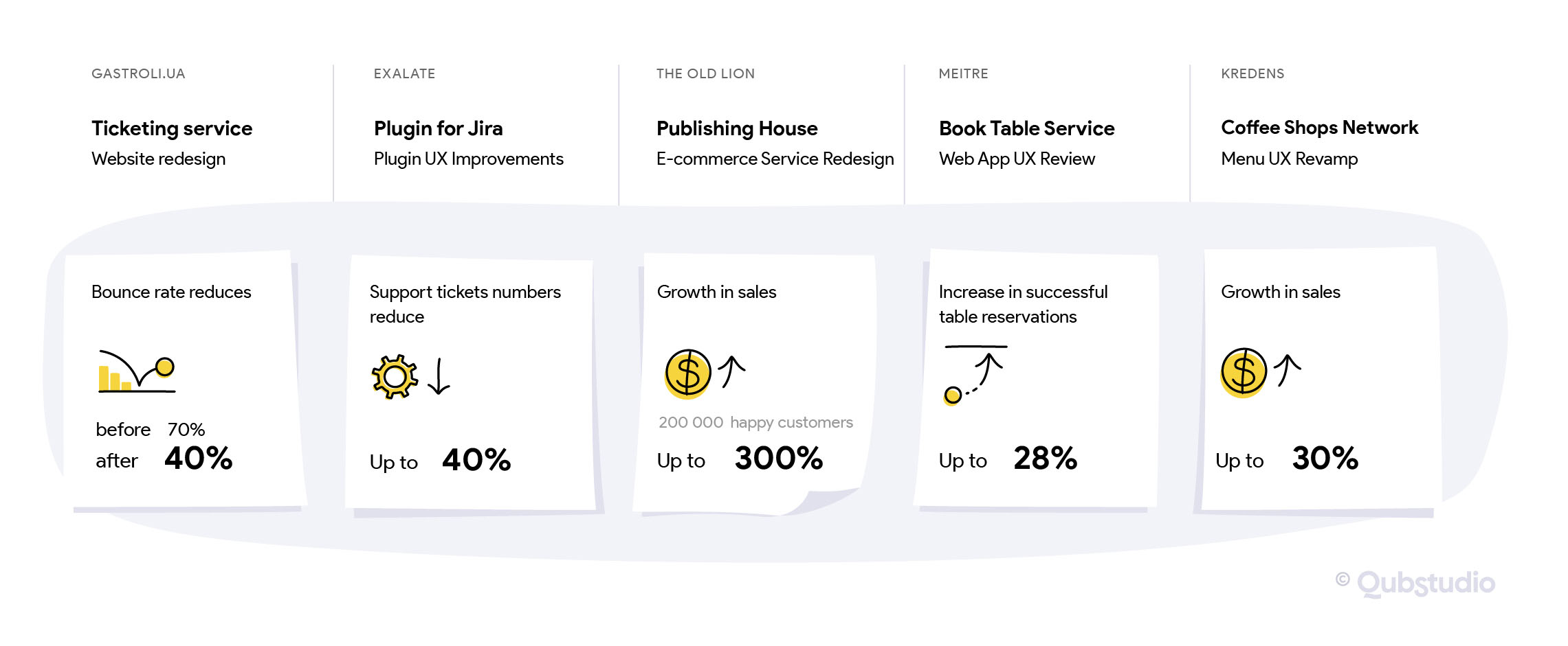
Well, what is your vision now? Does your product need an effective UX?
If it does, then you need a UX strategy.
Welcome to the club!
Defining your UX Strategy
Process matters
Now, when we discussed ‘What?’ and ‘Why?’ it’s the best time to start with ‘How?’ question. Throughout the years of catchy UX challenges, we came up with a strategy formulation process that works without a misfire.
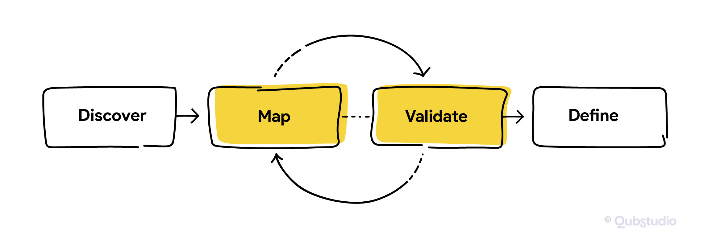
It’s as simple as that:
- Discover user, environment and yourself to build a strong decision base
- Map user experience & it’s delivery to choose the right direction, focus & flows
- Validate your each & every mapped hypothesis and go back as many times as needed to pick up only those that match
- Prepare your UX strategy document as a clear and well-grounded argument to communicate it to stakeholder
Here is our small cheat sheet for every stage ‘Where to start?’:
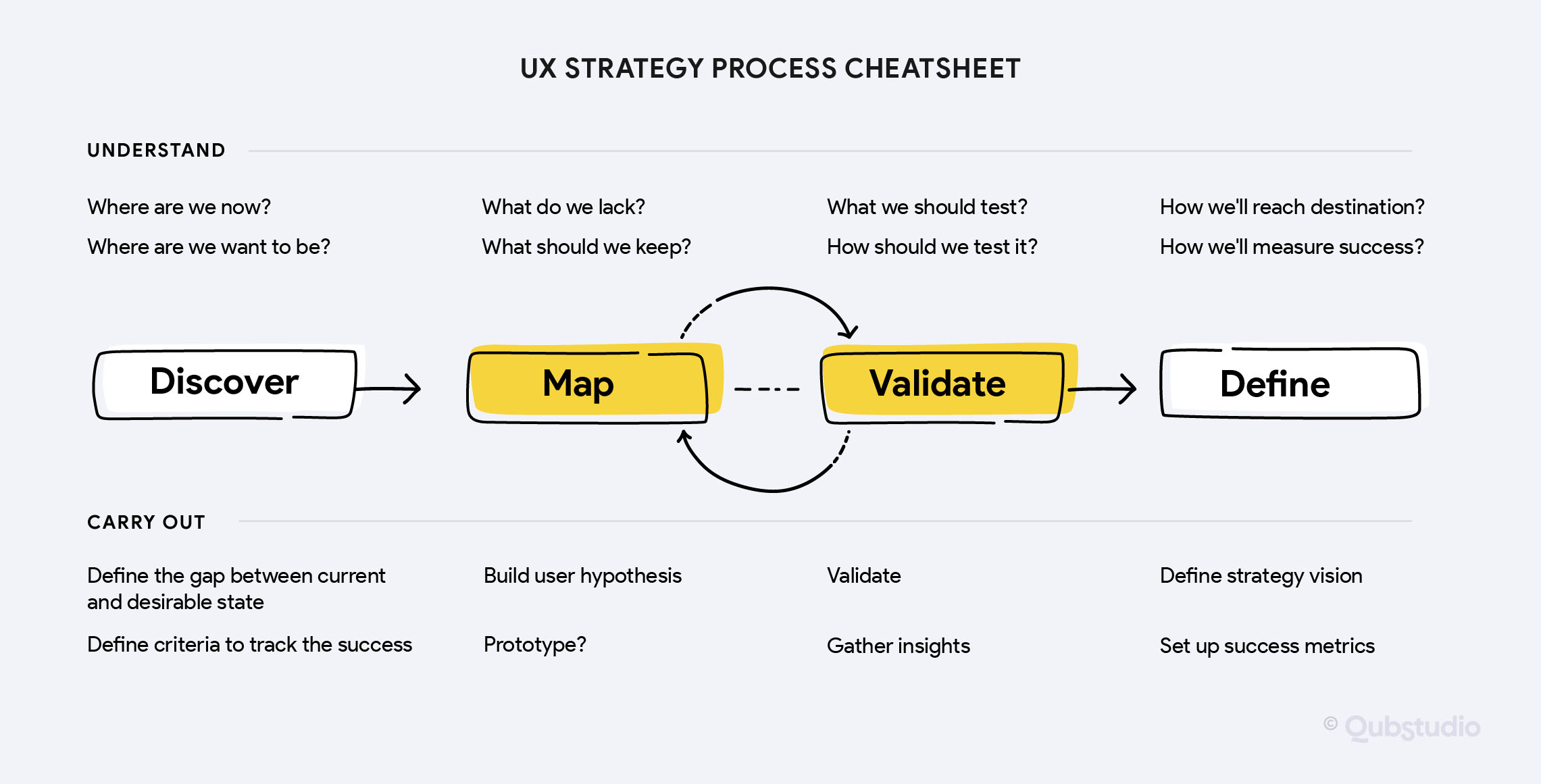
Step 1. Discover
Do you know what the TOP discovery drawback is? To concentrate too much on users’ goals and communicated needs. It’s a common case when customers don’t know what’s good for them. Remember Mr. Henry Ford: “If I had asked people what they wanted, they would have said faster horses”?
Our important insight is that relying on needs, identified by the users, often does not make sense to result in customer demand. That’s why we rely on diverse sources, creating an experience that works.
Relying only on needs, identified by the users, often does not make sense to predict the result of customer demand.
Applying this approach to discovery, we build the journey step by step, to Search, Analyse and Consider both: business and user sides. It allows us to shape insights for future vital products or services. Usually, we make it in three discovery workshops:
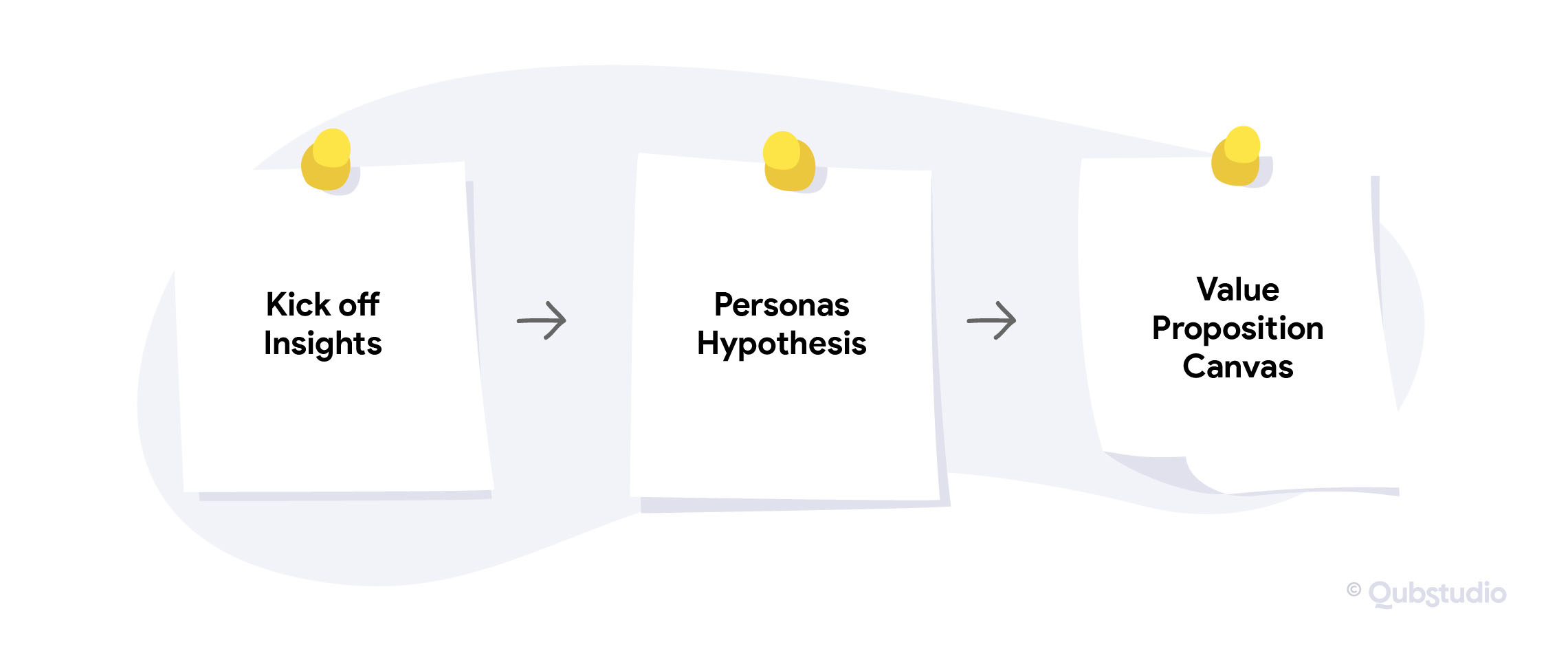
What will this stage ask from your side – you might wonder? It will take your knowledge of the market and user along with important stakeholders’ engagement in Discovery workshops, to help us define the main coordinates and directions.
Not sure if you are ready to be tightly involved in our workshops sessions?
Click here to find out more about what’s gonna happen 😉 We’re sure, this will discard your hesitations.
Kick-off Insights
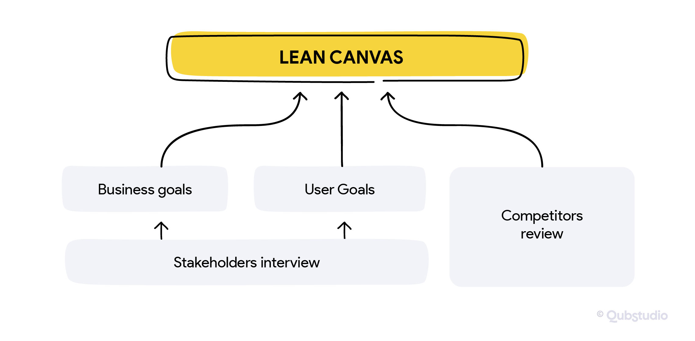
All types of product stakeholders’ interviews and competitors’ reviews are usually the sources of the most valuable information to define a product’s unique value proposition later.
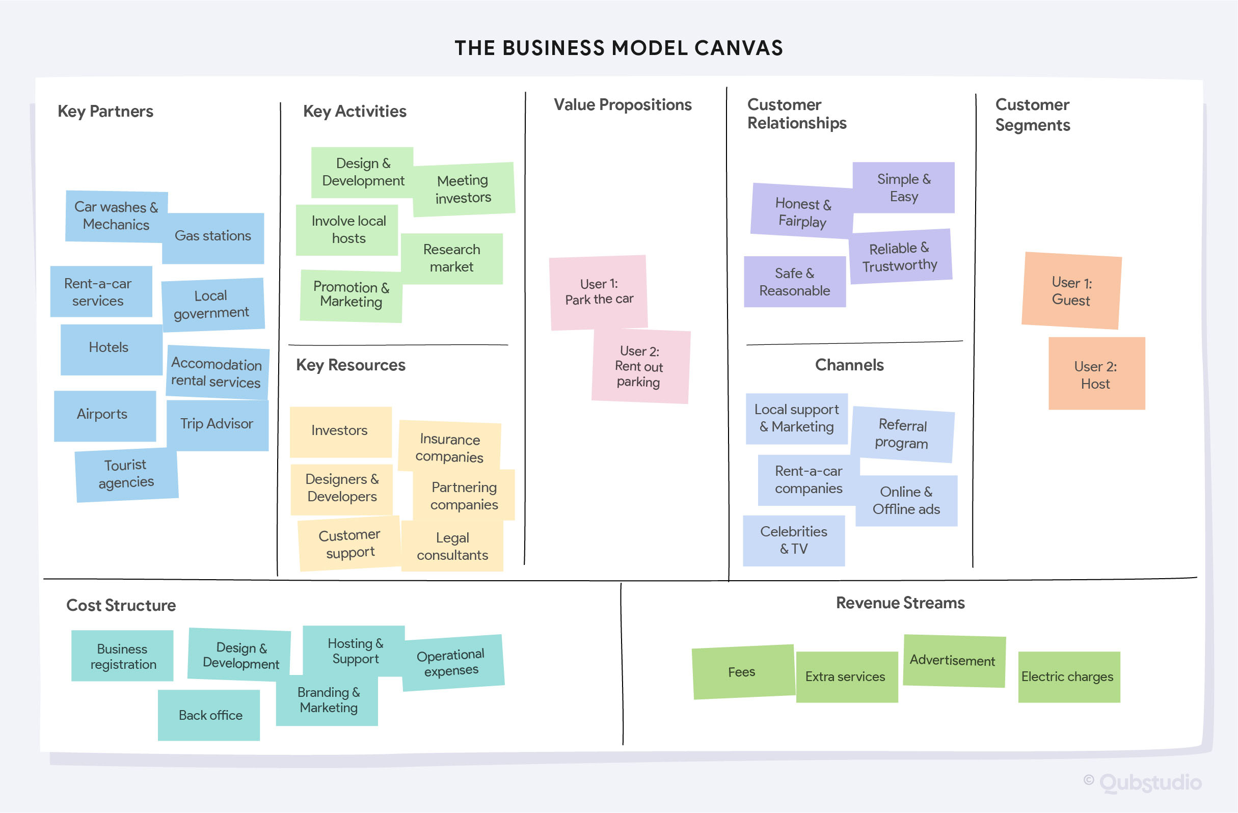
In the end we’ll visualise all the insights in Canvas, to make it easy to refer to them through the project. Check Qubstudio’s recent Lean Canvas, which turned out to be very helpful during the discovery workshop of Eastern Europe’s parking service creation.
Personas Hypothesis
Now, with defined customer segments, we can outline their portrait.
For this goal, we build the Persona hypothesis for each customer segment – a sort of educated guess on the identity of the common user of your solution. Persona is aimed to describe a typical user day with his/her wants, goals, frustrations and pains. To do it we dive into the research to understand the users, their motivations and their requirements. And this is what the result might look like.
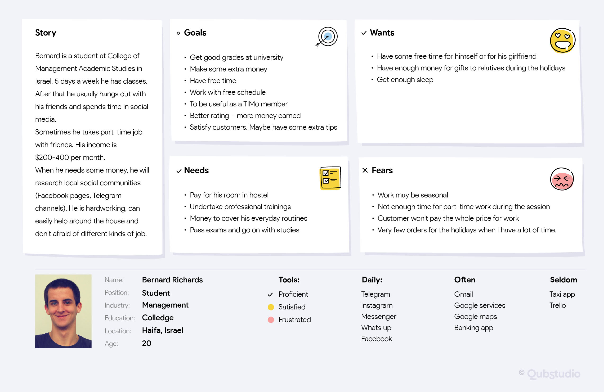
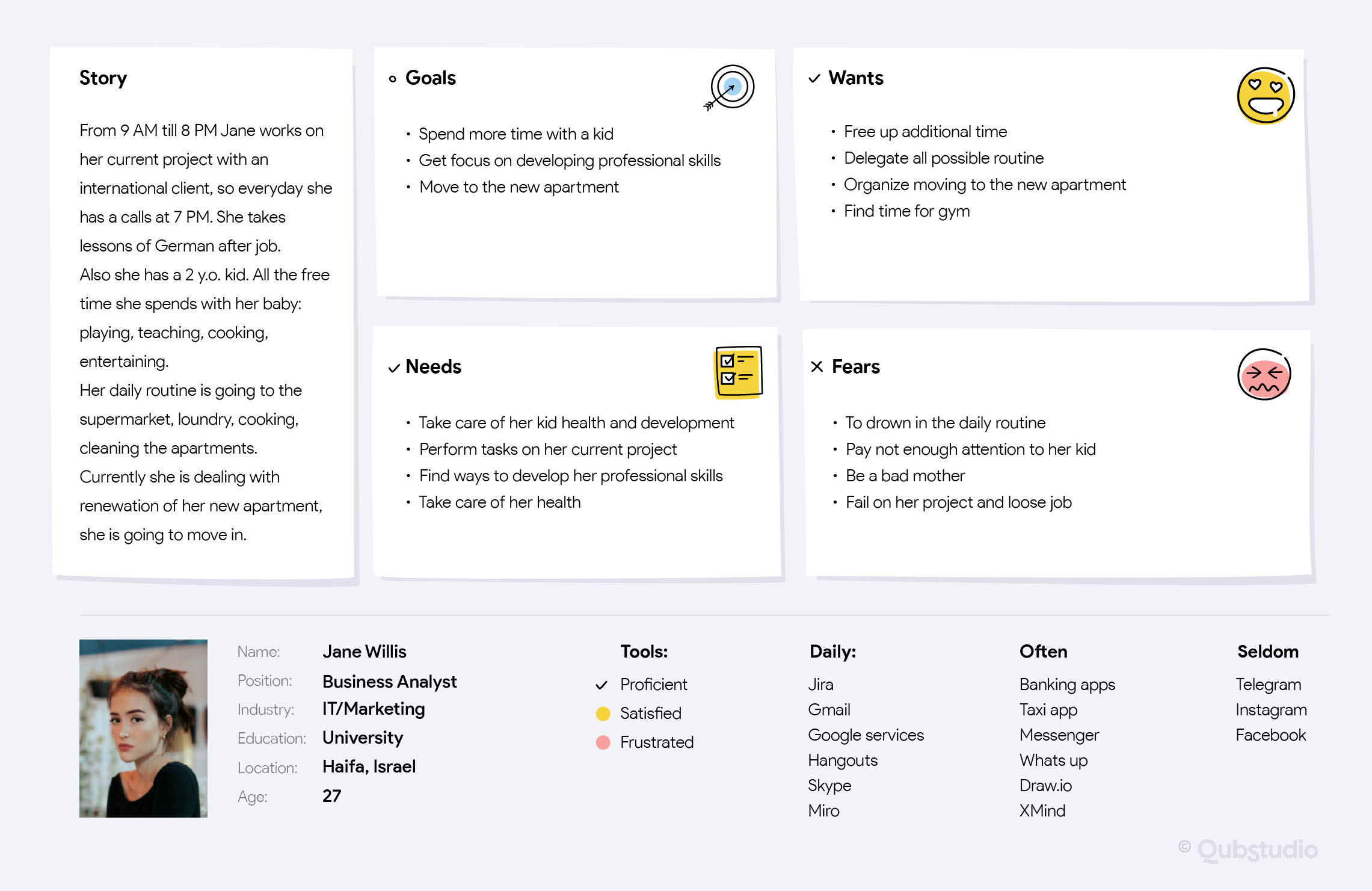
These are the Portraits of two core user segments in our recent project TIM (Check TIMs Case Here!) – the mobile APP for Israel jobs on-demand service.
Value Proposition Canvas
To understand how your product fits your customers’ needs, the value proposition canvas, developed by Alex Osterwalder at Strategyzer, is considered to be one of the best tools available to help you in this regard. And we absolutely agree with this thought!
Now, when we have customer segments described in Personas format along with high-level solution Value proposition definition in Lean Canvas, we are ready to move on with Value Proposition Canvas. Check its application on one of our favourite cases – TIM you already met above 😉
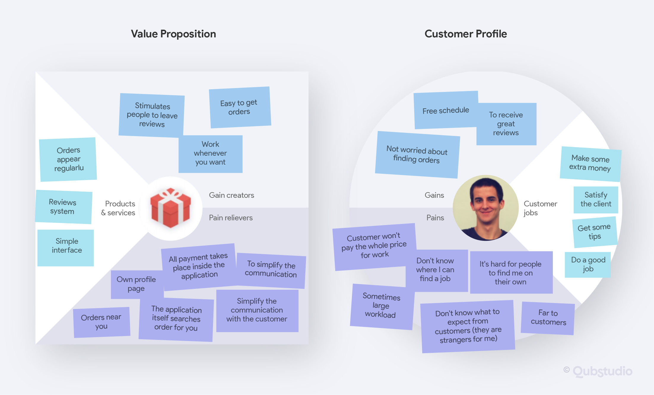
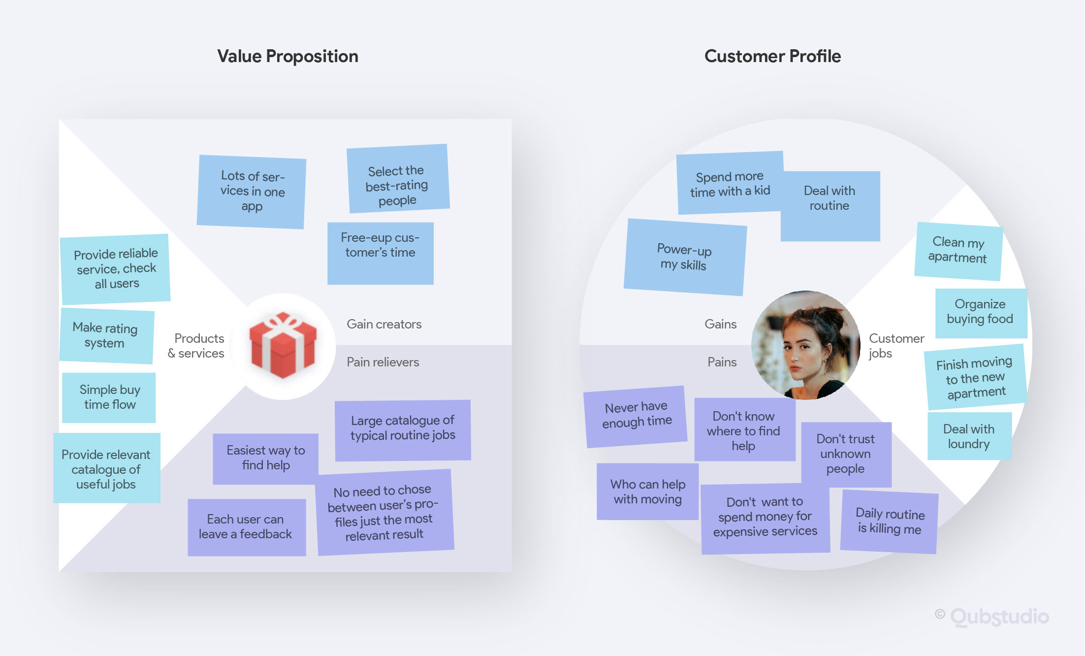
In Customer Profile, we collect user pains, gains, and jobs to be done from earlier applied research tools. In Value Proposition we build up the hypothesis on what pain relievers and gain creators we can offer to meet or user pains and gains. Based on them we formulate product & service value proposition hypotheses.
Step 2. Map
UX hypothesis
“More user hypothesis? Are you sure it’s not overkilling?”… Don’t worry – it’s a common reaction 🙂
Yes, we already have a user’s profile, understand his pains and gains. And yes, we already created our value proposition. But what we still have to uncover is: what is the best way and what are the right touchpoints for this value delivery.
Imagine you run a food delivery service. You have an order for lunch and your cooks made it taste delicious! But the delivery guy brought it to the user late in the evening, already cold in a smashed dinnerware… Will this influence the dinner value perception by the user? Absolutely!
It’s so obvious for a simple case! But for more complicated products or services it’s still a common case when owners try to pack it with more useful and valuable features but pay no attention to the overall journey of how the product will solve the user’s problems.
It’s still a common case when product owners try to pack it with more useful and valuable features, instead of focusing on the overall journey of the user's problems solving process.
To define user value delivery touchpoints, we use empathy research techniques and map the results to describe various aspects and processes associated with a product.
For this we use the following techniques:
- Empathy mapping
- Customer journey mapping
- User flows mapping
To apply UX mapping tools with the best result, you should research the user journey a few steps before and after user interaction with your product. It’s easier to understand mechanics following the specific case. Let’s refer to one of our last projects on lightweight online ticketing service design.
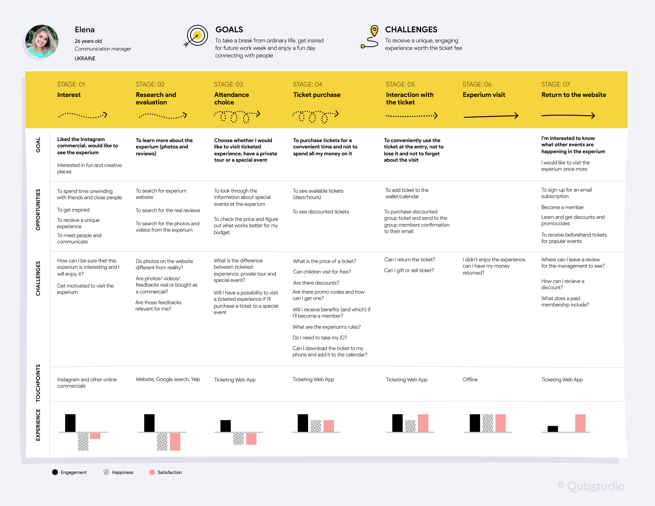
As you see, while designing the online ticketing service, we did not start user journey research from Sign up/Log in stage, the same as we did not end up with ticket purchase completion. We started and ended with offline touchpoints to understand what engages and brings our user to us, what are the possible service entry points and how we can maintain the contact with the user and increase delivered value after he purchased the tickets.
Ok! We discussed touchpoints. But how about the best ways of value delivery, mentioned at the very beginning of the UX mapping discussion?
Well, let’s mention here that we are talking about digital products and services mostly. Here the quality of value delivery within the user touchpoints will depend on how professional and intuitive user flows were outlined, built and mapped.
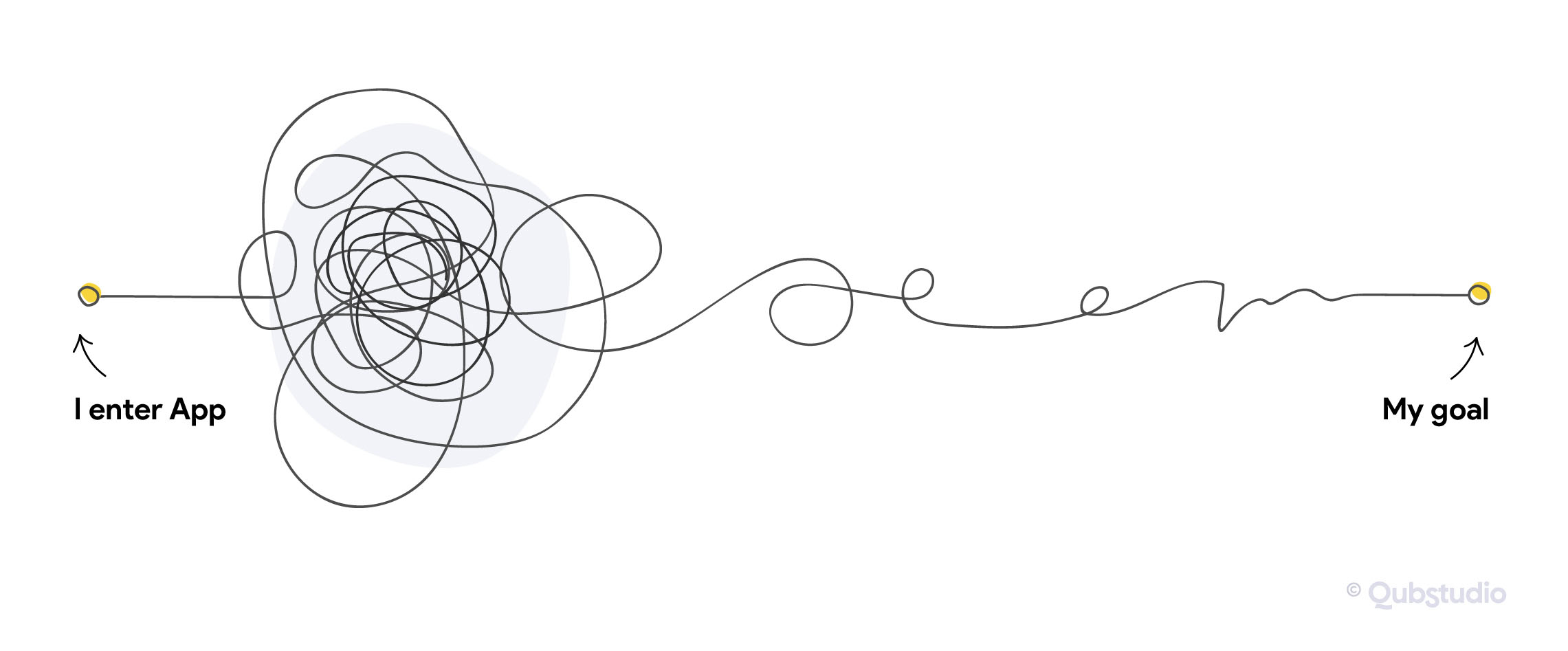
Have you ever felt like that inside of any application?
And how fast did you drop it?
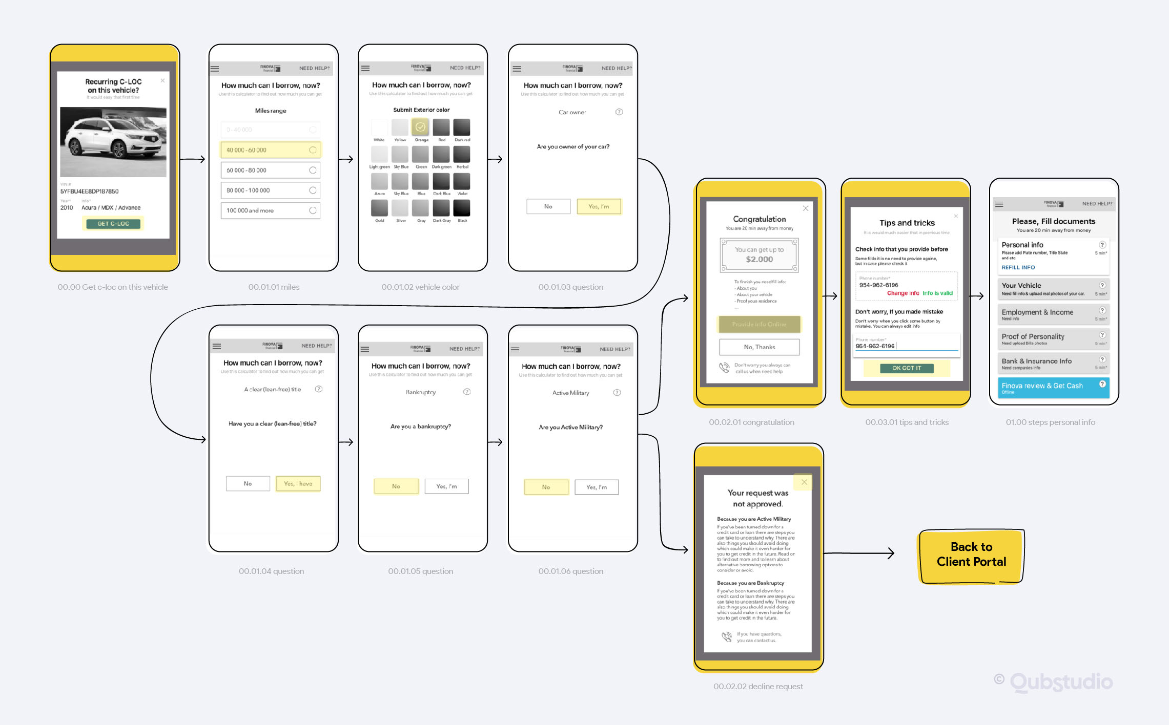
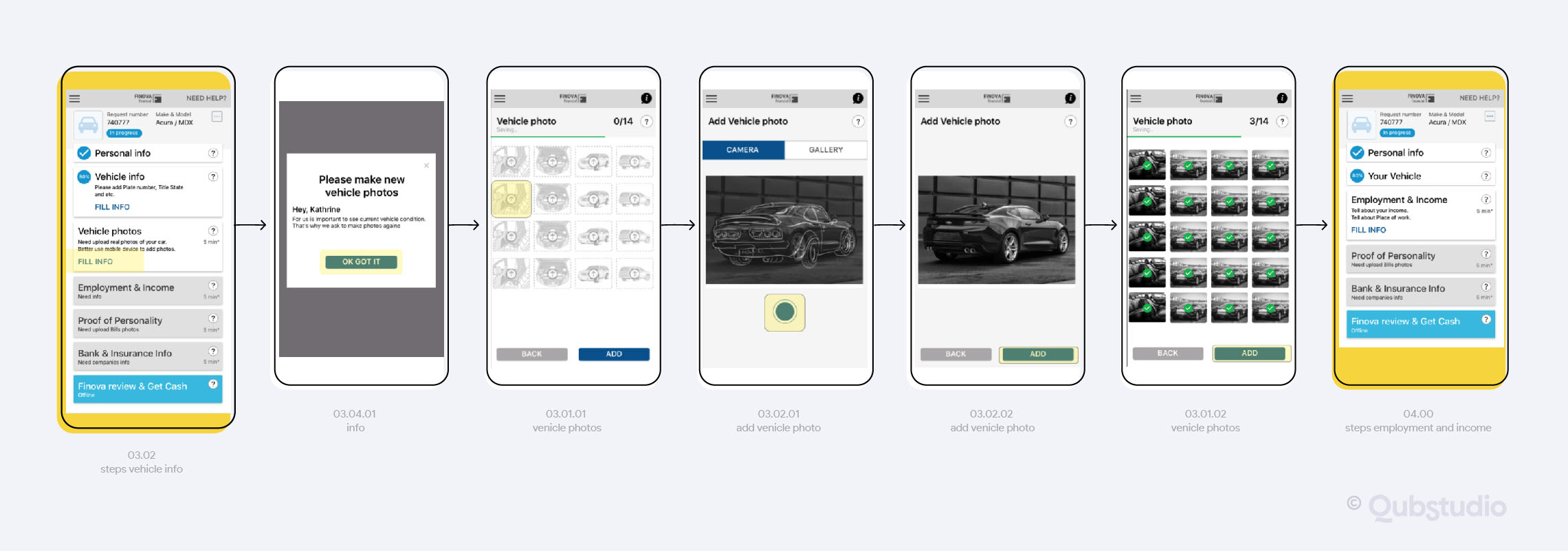
Such confusion usually comes from unintuitive and badly worked out users flows inside the product. Actually, one of our truly beloved customers, Finova – USA fintech startup, came to us with almost such a flow tangle , which hardly affected the speed of users’ loan decisions and overloaded the call center with help requests. Click here to find out more about the Finova case. It’s really outstanding 😉
We started with flow mapping to resolve this tangle , and then discovered main interaction guidance for each flow functional group. For example for Recurring Loans Flows the core interaction benefits for users turned out to be:
#1 interaction change: “You always see what info you need to check”
#2 interaction change: “You can always change your decision”
Following this guidance brought us to simple and intuitive flows and call center costs reduction.
Step 3. Prototype
At this stage, we create high-level product Information architecture and a low-fi clickable prototype in Figma or Invivsion to enable the validation stage.
This prototype is build upon previous stages results:
- Unique value proposition
- User-product touchpoints
- User flows
The essential step to start with Prototyping is high-level Information Architecture workout: it gives us the general vision of system hierarchy and helps each system element to find its place. Sometimes it might look a little bit scary… like that…
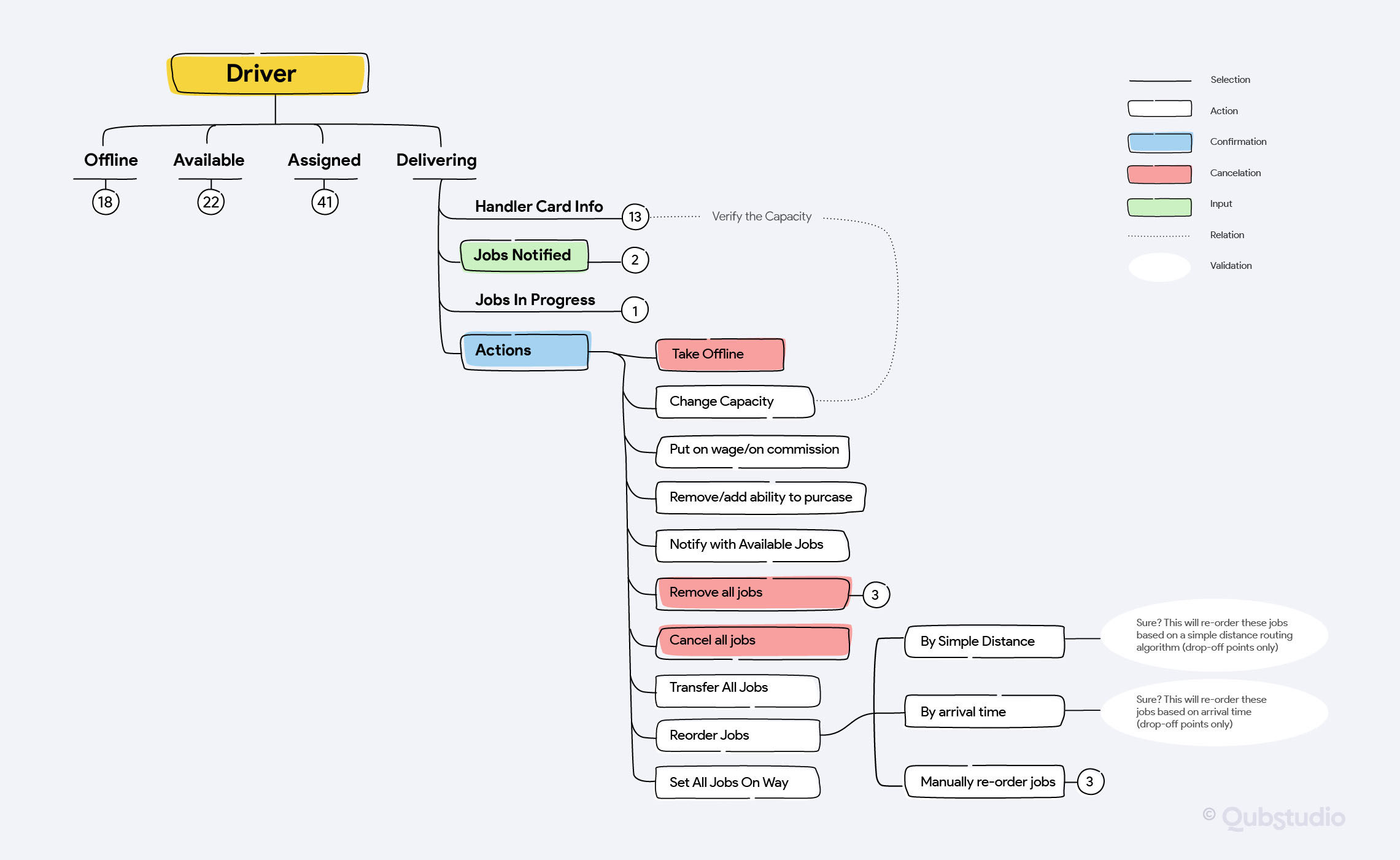
… but it does eliminate extra steps in the wireframing and prototyping process and provides perfect preliminary validation.
Wireframing stage is a common next stage before starting prototyping in case UX designers need to discuss ideas with team members or other internal stakeholders.
Check out what the result looks like after that! Here is one of TIM’s, we mentioned before, prototypes.
With the rest TIM prototypes, it faced really challenging user testing iterations. But we’ll tell you details a little bit later )
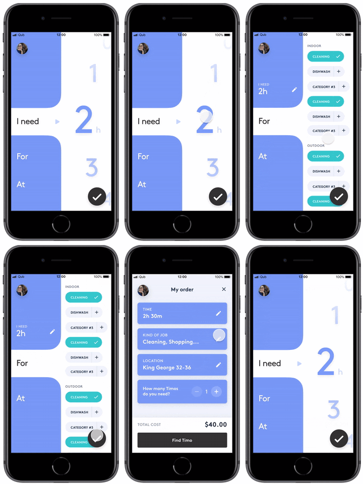
Copyright Qubstudio LLC
Prototype ready. Now you are ready to test! Let’s go in for some validation 🙂
Step 4. Validate
We performed such a huge discovery. We mapped user experience from A to Z. There can be no mistake! Why should we waste time on validation?
Well, let’s off the top a bit 😉
Such famous paintings, aren’t they?
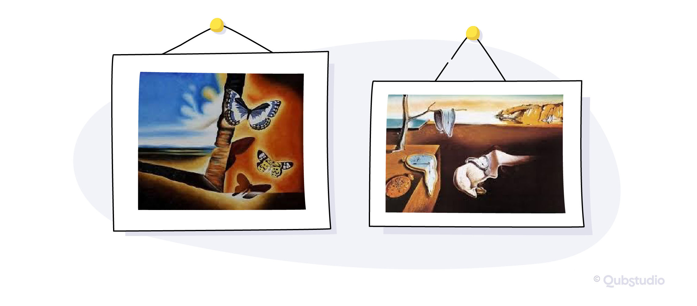
Of course! They belong to the popular Salvador Dali. It is so popular that you can find these prints on your T-shirt, diary or mug one day.
And who do you think is the author of these paintings?
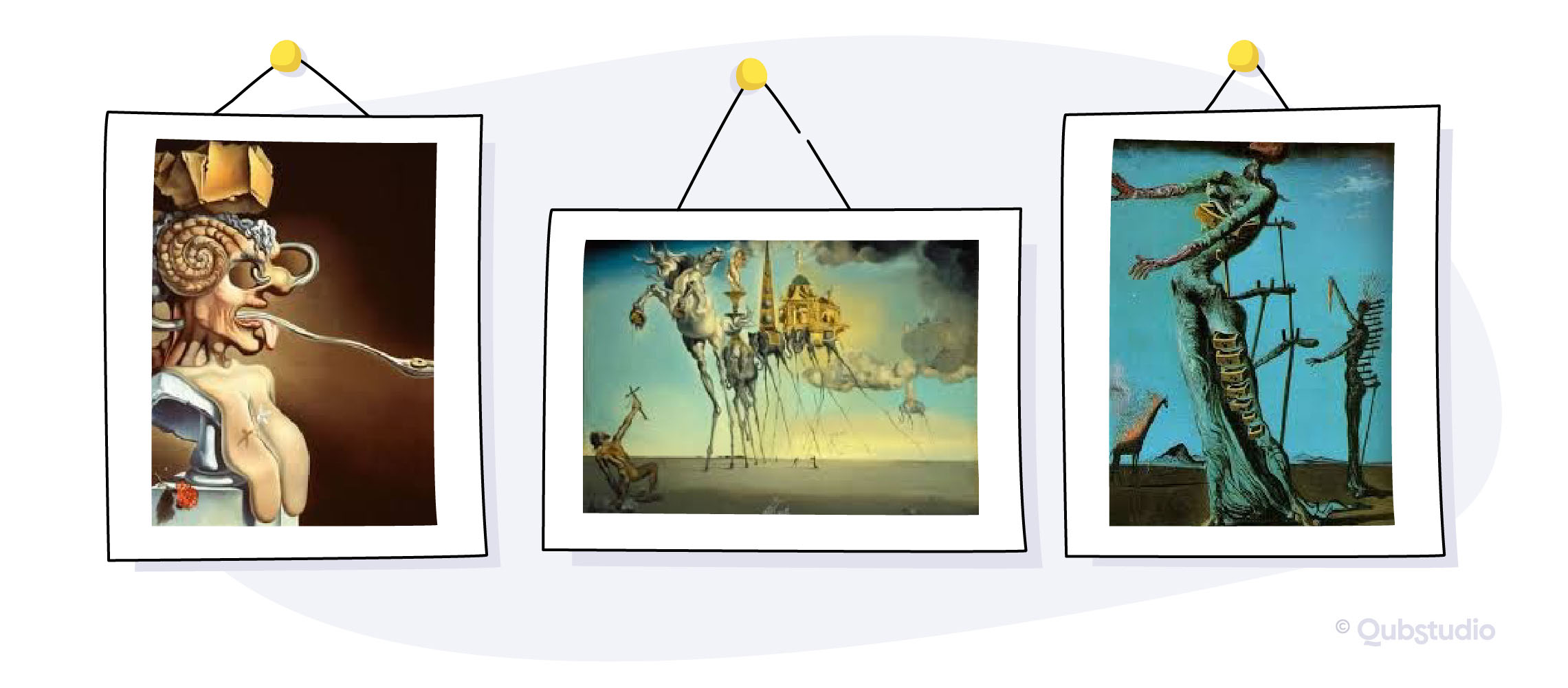
Yep! The same Salvador Dali, but far less popular and far less known.
When you interview users or other stakeholders (and that is the main data collection tool in the discovery phase!), they try to show you their “popular” side. That’s not because they are liars, that’s just an instinct or stereotypes pressure. While the unpopular side is hidden deep in subconscious and will reveal only in automatic reactions.
If you’ve been lucky enough to wake up respondents’ subconscious on the discovery stage – good for you! Now you can just engage an expert to check his unbiased opinion on your product’s heuristics, usability guidelines, principles of usability-related fields such as cognitive psychology and human-computer interaction, etc.
Otherwise – it’s the best time to validate all your hypotheses!
It’s a very rare luck to build a breaking solution without validation. That’s why we always recommend our customers to run user testing before final UX strategy formulation.
Running product or service user testing, we struggle to answer 4 main questions:
- Is it useful?
- Is it easy to use?
- Is it easy to start using?
- Is it fun and engaging?
Only if the answer to all 4 questions is ‘yes!’ – you’ll have seamless UX granted. How do we test it? We apply observation and driven testing along with product engagement metrics analysis to understand the value it can bring users.
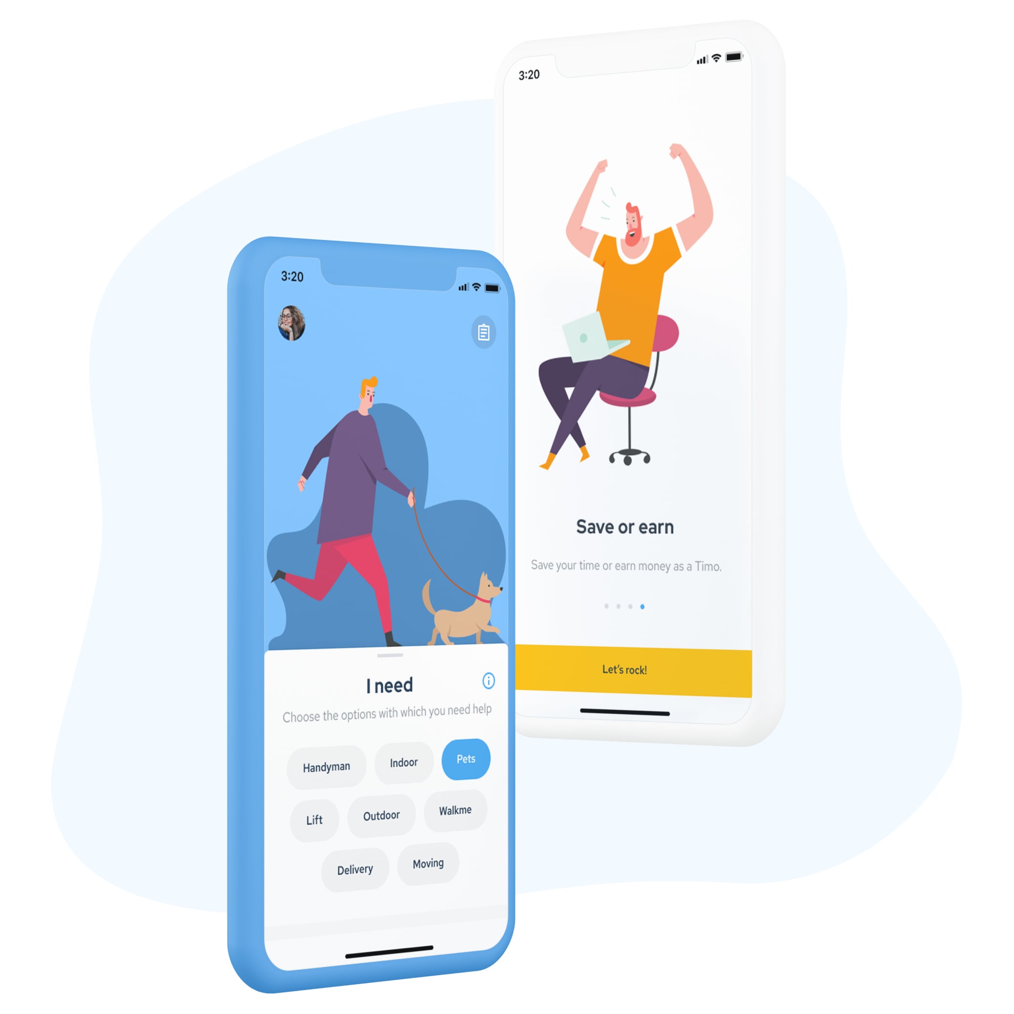
Validation can go as simple as A/B testing. But sometimes it becomes a challenge, especially if your product is aimed to make significant changes in users’ behavior. The most challenging testing throughout 13 years of our practice, we had with TIM. Remember, we promised to tell you about this case earlier?
Copyright Qubstudio LLC
TIM undertook the following guidance: “People should appreciate their time and benefit from it”. We realized that our customers wanted to change people’s mindsets by making “time is money” their new life credo. This became the main difficulty. We tested 15 design concepts and none of them worked. Then 10 more concepts. And none of them hit the goal. However, such great test iterations allowed us to put on users’ shoes, reinvent the general idea and create one PERFECT concept. Insights collected and applied while validation, allowed us to create the valuable and desirable for users app we’re proud of 🙂
Step 5. Define: Strategy Statement
Ok! So we’re almost done. The prototype is tested, fixed and ready for next design stages! Strategy Statement documentation – what is it for now if I can move further at once? Another time-consuming activity?
First of all you have to communicate your UX strategy to teams, who will develop product on next stages:
- UI team
- Graphical design team
- Development team
- Marketing team etc.
UX strategy will help to share a common vision at all product development levels and broadcast it to the entire cross-functional product team.
You have to be able to communicate to align it with Product, Brand, Cooperative strategies in collaboration with people, responsible for them. You should be able to track UX strategy implementation.These are ‘ off the top of the head’ stages, where you’ll find well visualised and communicated UX strategy statements priceless!
How do we usually perform this documentation? Depending on customer needs, it can be:
- UX strategy document, which outlines Purpose along with When? How? And What? Instructions
- UX strategy blueprint
And we will certainly won’t let you go without two main UX strategy artifacts:
- Prototypes and
- UX Scenarios, based on in-depth customer research and testing.
Final thoughts
Now you know all the backstage of our UX strategy definition process. There is only one issue left to discuss. Our customers often ask: “What if I’m a Startup? Isn’t it too early for me to start with the UX strategy?”
That’s an absolutely natural hesitation!
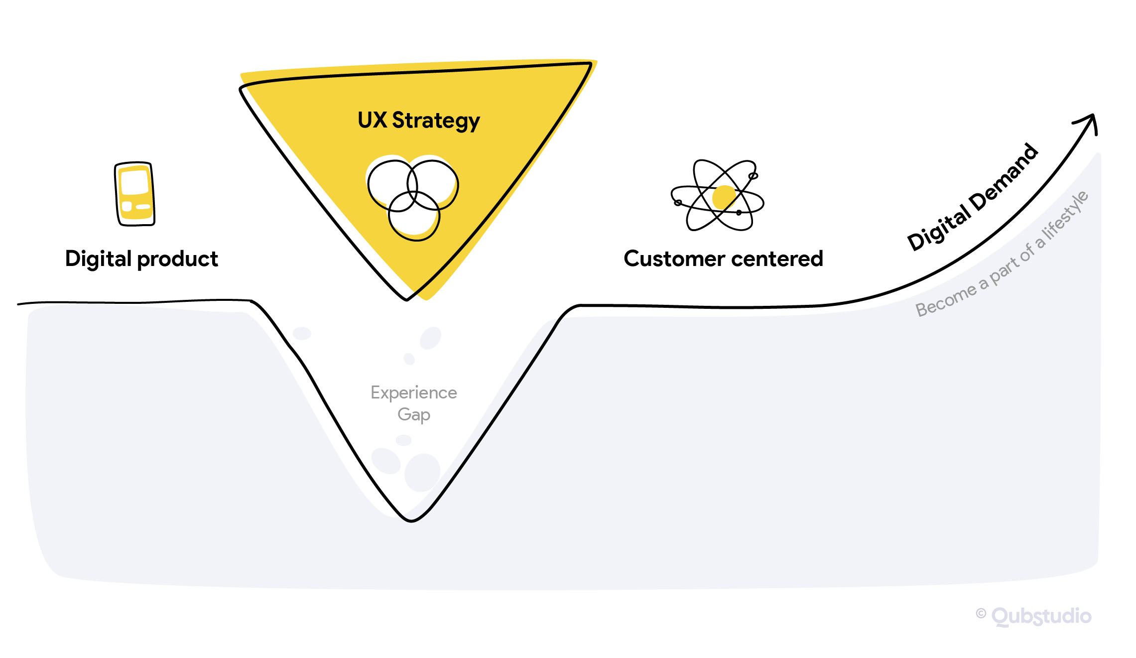
It’s obvious that for enterprise UX strategy is the must in the new phase of product development, as it will help in a shared vision at all development levels, broadcast it to the entire cross-functional product team, etc., which will increase efficiency. But if you’re bootstrapping a new product as a startup, still keep in mind this strategy bridge we showed at the very beginning of this story. It will help you to iterate your product concepts faster and get real market feedback if you decide to start with UX strategy.
Interested in the topic? We already started with an article to describe our experience of UX Strategy Blueprinting.
Don’t miss it!
