Crypto Web Design from A to Z: Main Elements, Best Practices, and Real-World Examples
- Crypto Website Design That Converts: The Main Features and Considerations
- A Couple of Words About NFTs
- Color Scheme for Your Crypto Website Design
- Best Crypto Web Designs for Inspiration for 2023
- How to Create Good Crypto Web Design: The Role of Research and Testing
- Custom Crypto Web Design with Qubstudio
- Conclusion
- FAQ
It’s no secret that web design has a direct connection to perceived trustworthiness. That is, users are more likely to stay loyal to businesses with clean, professional, and fast websites.
This connection is particularly relevant for blockchain projects struggling to gain trust among the general public. Given that the blockchain is hardly intuitive and every action on it is irreversible, your crypto web project won’t have much chance of survival without a customer-centric UI and UX.
As an established web design company, we’ve seen many poor crypto web designs and their sublime counterparts and have numerous successful FinTech projects under our belt. So we’ve distilled our expertise into this article, highlighting the best crypto web design practices.
Crypto Website Design That Converts: The Main Features and Considerations
We’ve mentioned two reasons why proper design is critical for crypto web projects—a lack of trust and complexity. But there’s one more.
The majority of crypto investors are under 40. This age group didn’t witness the UI horrors of the early web and expects an impeccable user experience. They won’t tolerate cluttered interfaces or lengthy load times.
Given all that, here’s what we consider quality crypto web design that converts.
What You Should Look Out for in Cryptocurrency Web Design
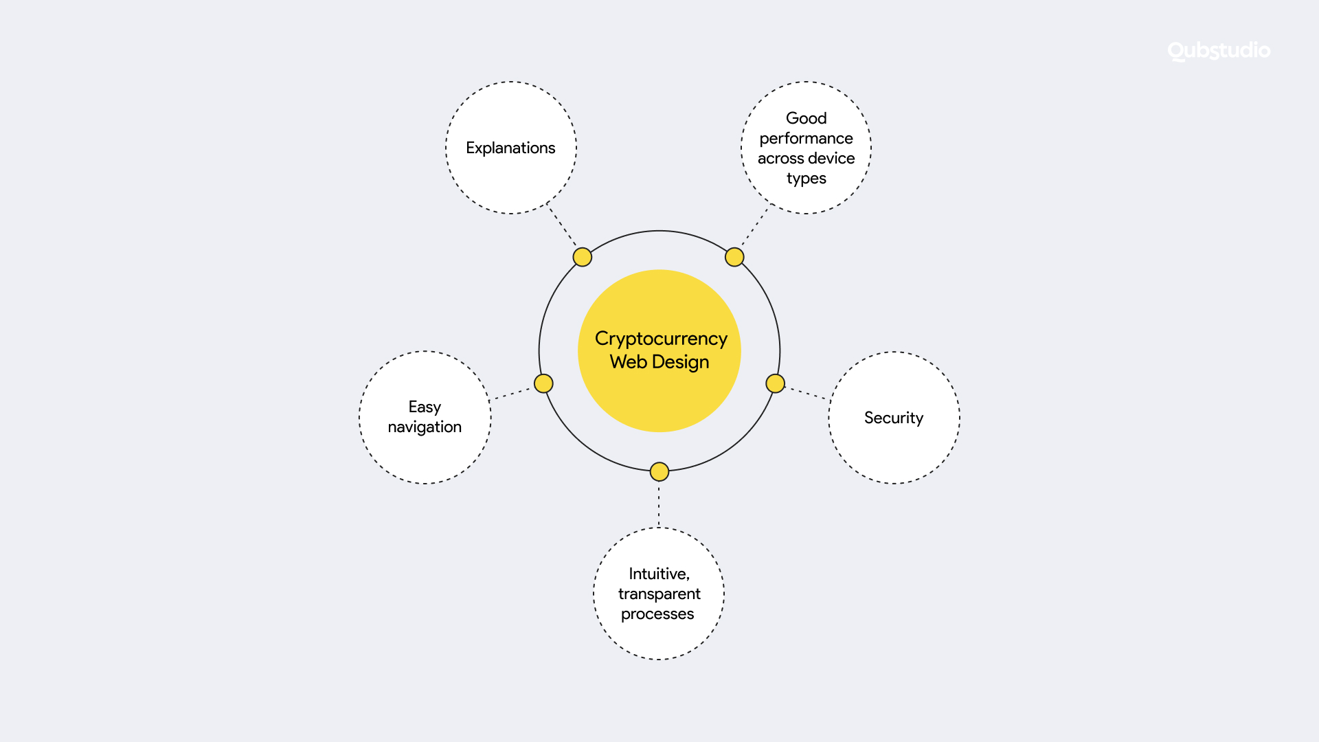
A decent crypto web design goes beyond visual attractiveness—although that is a vital aspect. Easy navigation, intuitive flows, comprehensive explanations, exceptional performance, and hacker-proof security are no less important.
1. Easy navigation
Navigation is one of the first things you should consider when creating crypto web design. Achieving effortless navigation is easy if you consider the following:
- The look of the crypto website UI elements. Your website should be clean, concise, and organized for users to find what they need as quickly as possible.
So, ensure that each screen serves a different purpose and that there are borders around page sections. Plus, your website shouldn’t be overcrowded with icons, buttons, pop-ups, and ads. Also, don’t forget about UX typography: make sure there’s the right amount of space between paragraphs, text lines, and letters. And on top of that, use color coding and employ a palette that doesn’t distract the user away from the website’s functionality (more on that later). - Features that streamline navigation. For instance, incorporate an internal search function equipped with handy filters that help users find the needed tokens, coins, and NFTs quickly. Easy access to customer support is also vital.
Crypto website UI elements that ease navigation are vital to helping users find their way around your crypto website or web wallet. Yet, this alone is not sufficient — every process should ooze intuitiveness.
2. Intuitive, transparent processes
Every feature should emanate clarity and ease of use. For example, if you’re building a crypto trading platform, don’t take shortcuts with quote charts for different trading pairs. These should reflect real-time price fluctuations and visualize the hundreds of metrics needed by different types of traders.
If you’re designing a crypto wallet, make it compatible with the coins popular among your target users—with the majority of wallets dedicated to separate coins, your audience will appreciate such diversity. Besides, allowing users to switch between blockchain networks easily will also give your wallet a competitive edge.
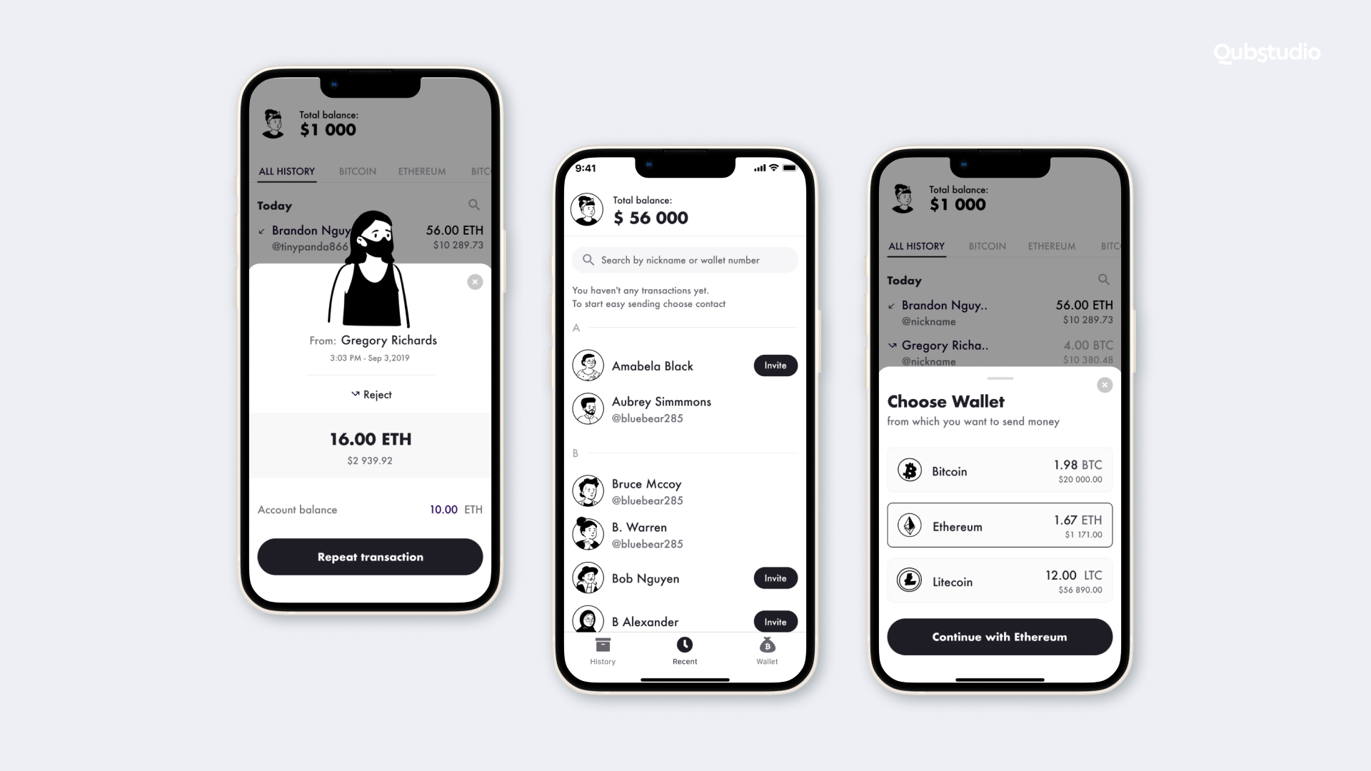
In addition, a user-friendly way of entering a wallet address will also give you additional “points”: rather than compelling your users to type a long jumble of characters manually, you, for example, can enable them to copy the entire address with a single tap. And don’t forget to design an easy payment flow with trackable transaction status.
3. Explanations
Of course, easy navigation and intuitive functionalities don’t guarantee that your users will figure out the nuances of crypto trading or whatever your web solution is designed for.
So why not offer onboarding tutorials? An insightful blog will help your users get the most out of your crypto web solution and avoid mistakes. You can also provide explanatory prompts that appear by hovering over content, buttons, or menu sections.
And, like it or not, users will make mistakes. In this respect, don’t just flash up a message that something went wrong—explain why. This will give your users confidence and increase the chances that they will continue using your web solution.
4. Good performance across device types
Modern users won’t wait long for a web page to load, especially if they generate profit from minute-by-minute price fluctuations. Given that, fast load speed is another essential component of good crypto web UX.
What’s more, a pleasant user experience isn’t the only advantage of lightning-fast load times. You’ll also get better Google search results: the browser favors websites with good performance. As a result, more users will be able to see your crypto website.
Also, don’t forget that we live in the mobile-first world, so make sure that your solution works seamlessly on mobile devices as well.
5. Security
If you search for “the largest crypto projects that failed,” you’ll notice that data breaches are the primary reason for shutdowns—which doesn’t inspire confidence in an already hesitant audience. Given that, your crypto web design should convey the message that it’s secure.
Aside from a secure backend, your web solution needs to come with two-factor authentication (2FA), biometrics, email verification, and cold storage for crypto assets. Also, set up IP address monitoring to allow receiving notifications after each transaction and every sign-in from an unknown device, browser, or location.
A Couple of Words About NFTs
The UI and UX design principles for NFT web platforms coincide with the best practices for crypto web design—easy to use, secure, and performs well no matter what.
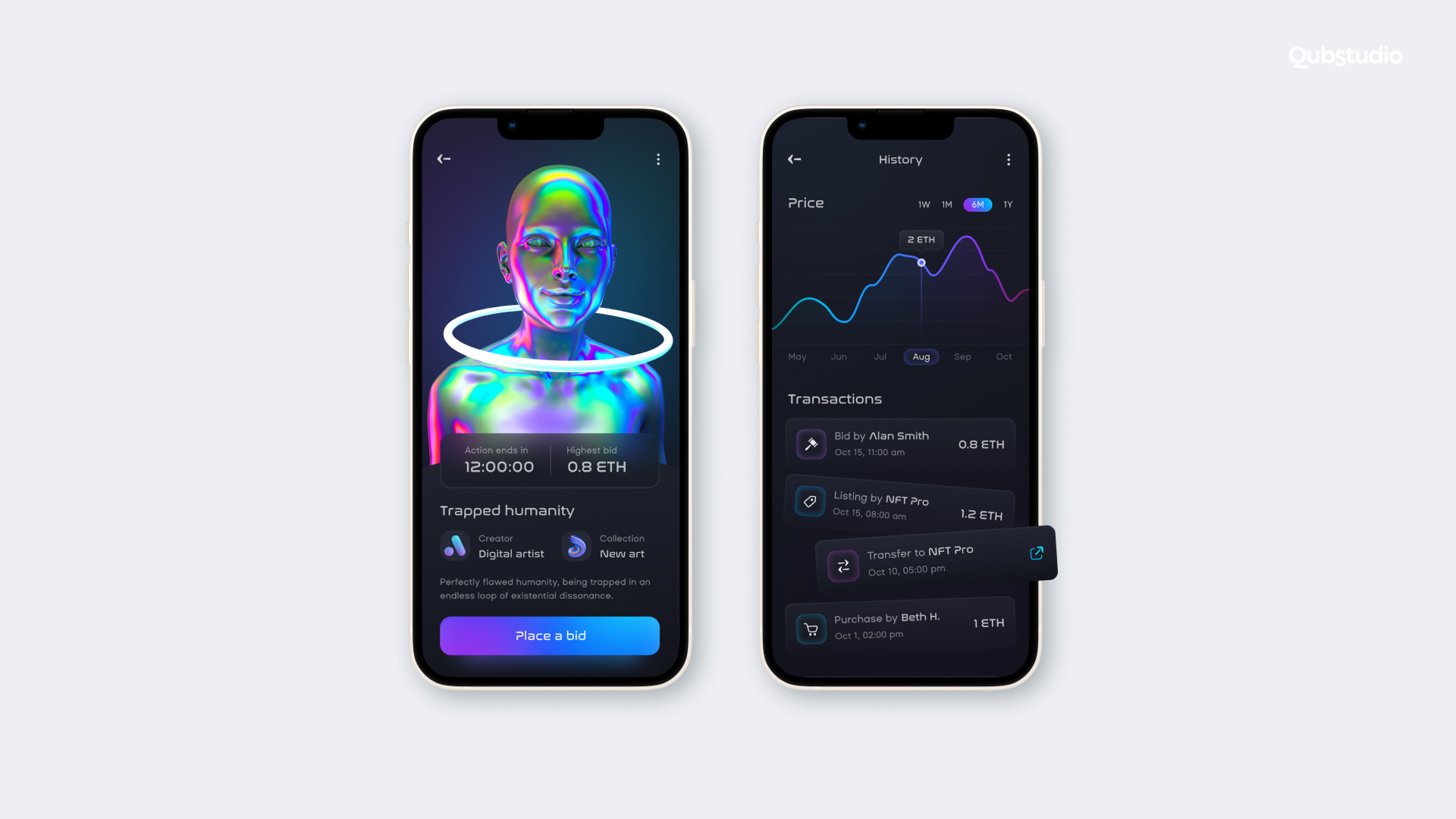
At the same time, there are a few nuances stemming from the specifics of non-tangible tokens. For example:
- The story. The story behind each NFT is what makes it valuable. So if you are designing an NFT marketplace, it’s crucial to add a detailed description for each token, containing details on the history of the artwork, its author, and previous owners.
- Internal search. Adding a convenient search with different filters is also beneficial—many users prefer collecting NFTs from a single artist or even a single collection.
- Diversity of blockchains. Consider enabling your users to buy, sell, and store NFTs from different blockchains. Given that most marketplaces focus on NFTs minted on a particular blockchain, yours will stand out.
- Separate dashboards for NFT buyers and sellers. These two groups need different functionalities. Buyers want to be able to find, place bids for, buy, and like works, as well as leave reviews on their authors. Meanwhile, sellers require features for minting, listing, setting prices for their NFTs, accepting bids, and receiving payments.
On top of that, the logic behind your color scheme choices will be slightly different.
Color Scheme for Your Crypto Website Design
Colors matter in any design, and crypto web design is no exception.
As a rule of thumb, choose no more than three colors: a primary one and two additional ones (to accentuate important information). We recommend basing your palette (at least the primary color) on the colors of your logo. But if that’s impossible, look at your use case. For instance, if you’re designing a wallet for crypto novices, consider a color scheme similar to popular e–banking solutions—after all, familiarity creates a feeling of safety.
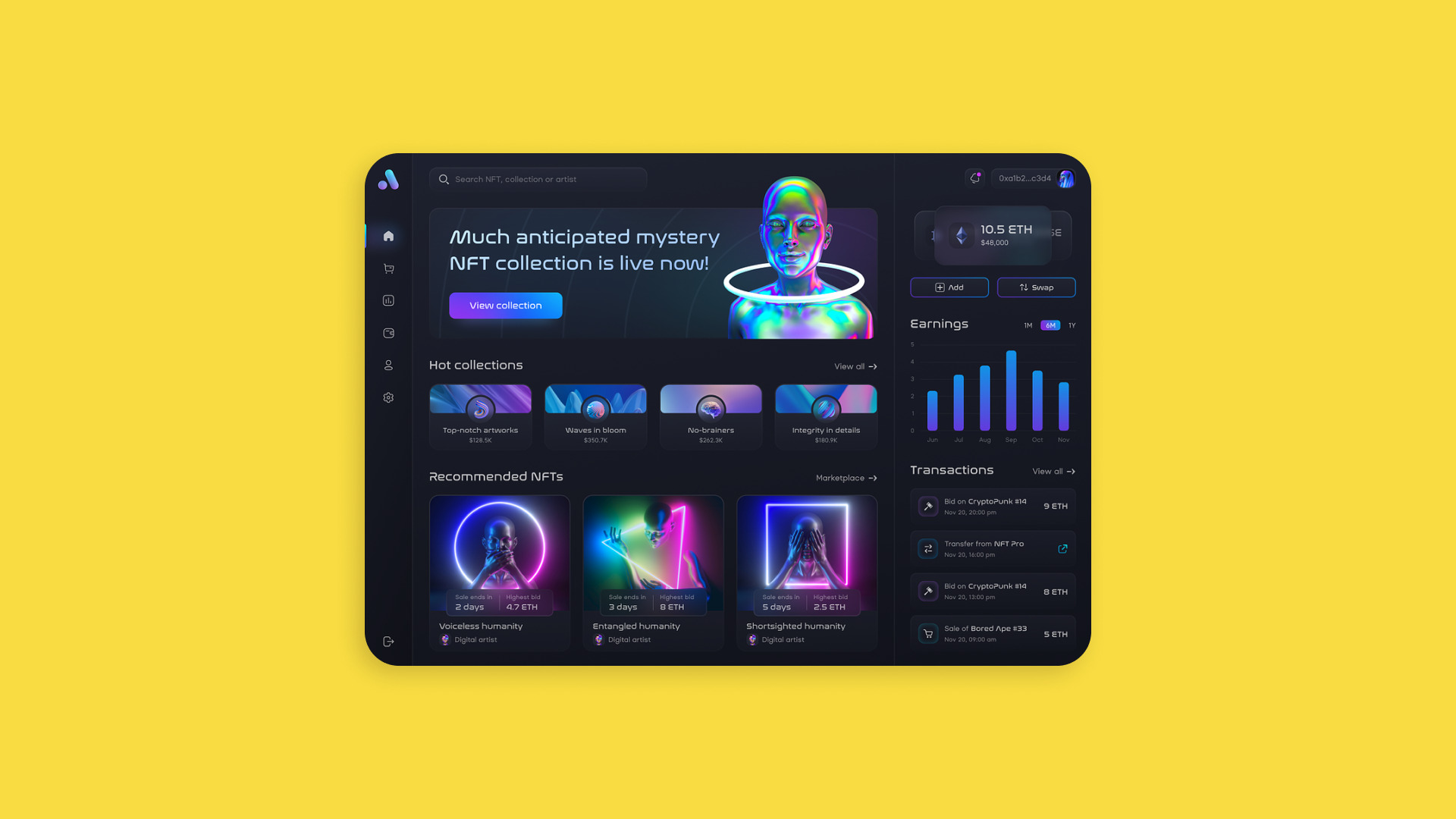
Besides this, use the power of light and dark themes. Some popular crypto platforms allow users to switch between modes. In general, if your platform revolves around graphics, a dark theme will accentuate it better (a perfect fit for NFT marketplaces). But if your solution has a lot of text and your target users are crypto beginners or the older generation, the light theme will work better.
Best Crypto Web Designs for Inspiration for 2023
Even a cursory glance at most crypto web solutions will reveal that usability isn’t a given: many crypto project owners entrust UX and UI to software engineers, not designers, hoping that users will figure everything out themselves.
Still, not all crypto web projects are the same. We’ve cherry-picked a few role models in terms of user-friendliness for your inspiration.
Coinbase
Coinbase is an online platform for buying, selling, trading, and storing cryptocurrencies.
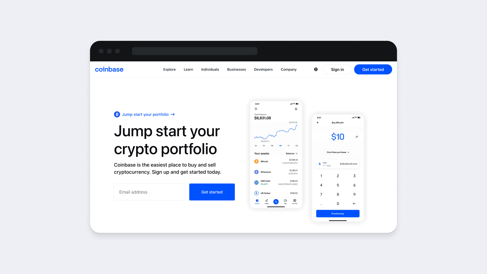
- UI. It has a clean, organized look with a concise color scheme and lots of negative space, exuding professionalism and allowing users’ eyes to rest. It also stands out due to its large typography and sticking to the best UX writing practices.
- Navigation. The website is easy to navigate with a fixed upper menu and accentuated call-to-action buttons.
- Usability of features. The platform offers comprehensive price charts, allowing users to make the most of crypto-market fluctuations.
- Performance. Both its desktop and mobile versions are responsive and load fast.
- Security. The website utilizes AES-256 encryption, 2FA, cold asset storage, and other security measures.
Kraken
Kraken is a well-known cryptocurrency exchange platform, established in 2011. Serving as a virtual marketplace, Kraken enables users to engage in buying, selling, and trading various digital cryptocurrencies.
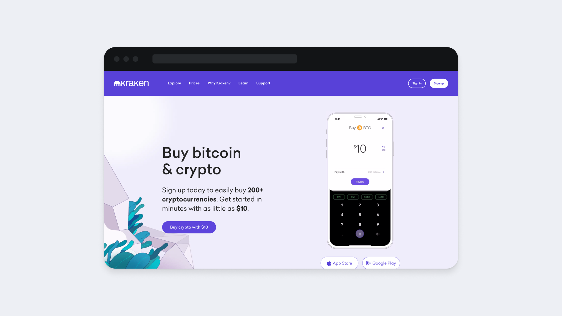
- UI. The UI is similar to that of Coinbase: it has a light color scheme with plentiful empty space.
- Navigation. Each section has its own color, making the website easy to navigate. Also, buttons change color upon hovering over them, and bold type highlights key parts of the content.
- Usability of features. Kraken is relatively easy to use. It’s well-suited for both newbies (with plenty of valuable insights for crypto beginners) and seasoned traders with features like futures, margin trading, shorting, and OTC desks.
- Performance. It’s optimized for desktop and mobile and loads pretty fast.
- Security. The website uses 2FA, cold asset storage, multi-layered encryption, user activity monitoring, and regular audits.
MetaMask
MetaMask is one of the most popular cryptocurrency hot wallets on the market. Free to use, it allows you to securely buy, sell, and trade a variety of crypto assets, including NFTs. It also provides access to Web 3 solutions running on the Ethereum blockchain.

- UI. The website is clean and uncluttered, with plenty of blank space. A toggle on the upper menu bar allows you to switch between light and dark modes. The platform’s UI is spruced up with visuals illustrating the information presented.
- Navigation. Each section of the main page has its own color. Buttons change color upon hovering over them. The upper menu is fixed, ensuring the main section is accessible.
- Usability of features. The setup process is straightforward. Once the wallet is created, users can buy, sell, and perform P2P transfers. One of the things that differentiates MetaMask from other wallets is that it allows working with a variety of cryptocurrencies and tokens rather than focusing on one coin only.
- Performance. Optimized for both desktop and mobile, it loads pretty fast.
- Security. The wallet is secured by a 12-word backup phrase and uses a unique private key for each transaction.
OpenSea
OpenSea is the leader in the NFT market. It’s the world’s first and largest NFT marketplace, allowing users to mint, buy, sell, and auction NFTs.
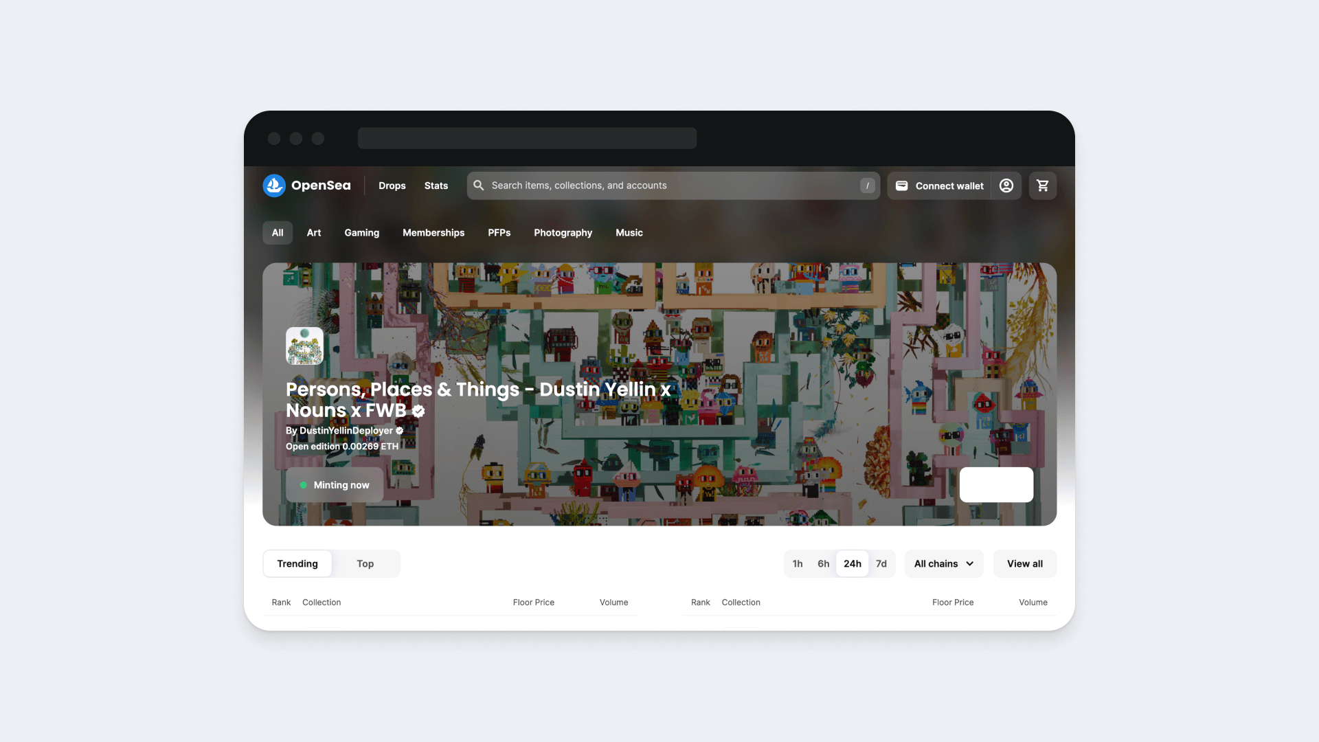
- UI. OpenSea combines different color schemes across the home page and the website overall to streamline the user’s navigation across sections. For example, while the upper part of the home page is designed in a dark palette, the remaining sections of the home page have a classic light color scheme. The user is welcomed with motion graphics featuring a popular NFT collection put up for auction.
- Navigation. There’s a search box on the upper menu bar. As you scroll down the home page, you can see a list of trending NFTs, which can be filtered against a variety of criteria. The “Connect wallet” button is always within reach—it’s alongside the upper menu—so you can start using the platform immediately.
- Usability of features. User-friendliness is one of the key advantages of OpenSea. The platform is famous for the ease of minting NFTs and allows you to tokenize different things, including photos, music, collectibles, trading cards, domain names, and beyond.
- Performance. It loads fast and is optimized for both desktop and mobile.
- Security. The platform enables users to store NFTs in their wallets, so security is largely in their hands.
What makes these and other popular websites stand out is that they have more than just advanced features. They have designs that convert. Let’s see how you can achieve this too.
How to Create Good Crypto Web Design: The Role of Research and Testing
A good cryptocurrency web design has an attractive UI, is intuitive in terms of navigation and usability, and performs well across browsers and devices under varying workloads.
At the same time, crypto web solutions range from basic crypto wallets for the general public to advanced crypto exchanges for seasoned traders. And each audience has different UI and UX expectations. To this end, we don’t recommend creating wireframes for your future solution right off the bat—instead, it’s advisable to understand who and what your project is intended for in as much detail as possible.
If you’re designing, say, a trading solution, it’s vital to know whether it’s for a seasoned trader or a newcomer. For example, a beginner might want to buy and sell cryptocurrency in a similar way to traditional e-banking, view portfolio statistics, and get access to the most popular spot pairs. Their more experienced counterpart might, in turn, be looking for an extensive toolset for comprehensive analysis.
Once you have defined your audience, you can outline user flows and, eventually, build your design. But that’s not all: it’s also critical to test your design thoroughly before giving the green light for release. A series of usability tests throughout the implementation will ensure you are on the right track. And don’t forget to test the functionality, performance, and security of your product before pushing it to production.
Does that sound overwhelming? Our web design agency can help.
Custom Crypto Web Design with Qubstudio
Creating a crypto web design that ticks all the boxes is a challenging process. Even UI/UX designers admit this: many of them even consider crypto web projects intimidating. But this doesn’t apply to our experts.
At Qubstudio, we’ve been building custom designs for FinTech for years. The highlights of our portfolio include:
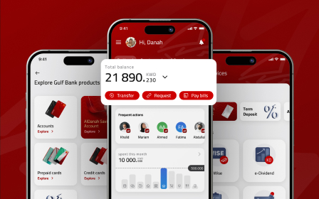
- ila Bank—a mobile-only bank, the first in the MENA market. In this project, we conducted thorough user research and based our design on its findings. In conjunction with the client’s team, our experts set up a streamlined implementation process, allowing the client to roll out the solution on time.
- Finova Financial—an online lender that allows borrowers to use their cars as security to get loans fast. Thanks to our efforts, the platform offers smooth onboarding with step-by-step instructions, convenient credit management through a personal cabinet, and a referral channel. It’s easy to use on any device.
- Aurora—a user-friendly platform for novice investors. It allows users to explore investment opportunities, evaluate stocks and funds with technical analysis, view insightful stock statistics, and make comparisons. The solution is available on mobile and accessible to people with visual impairments.
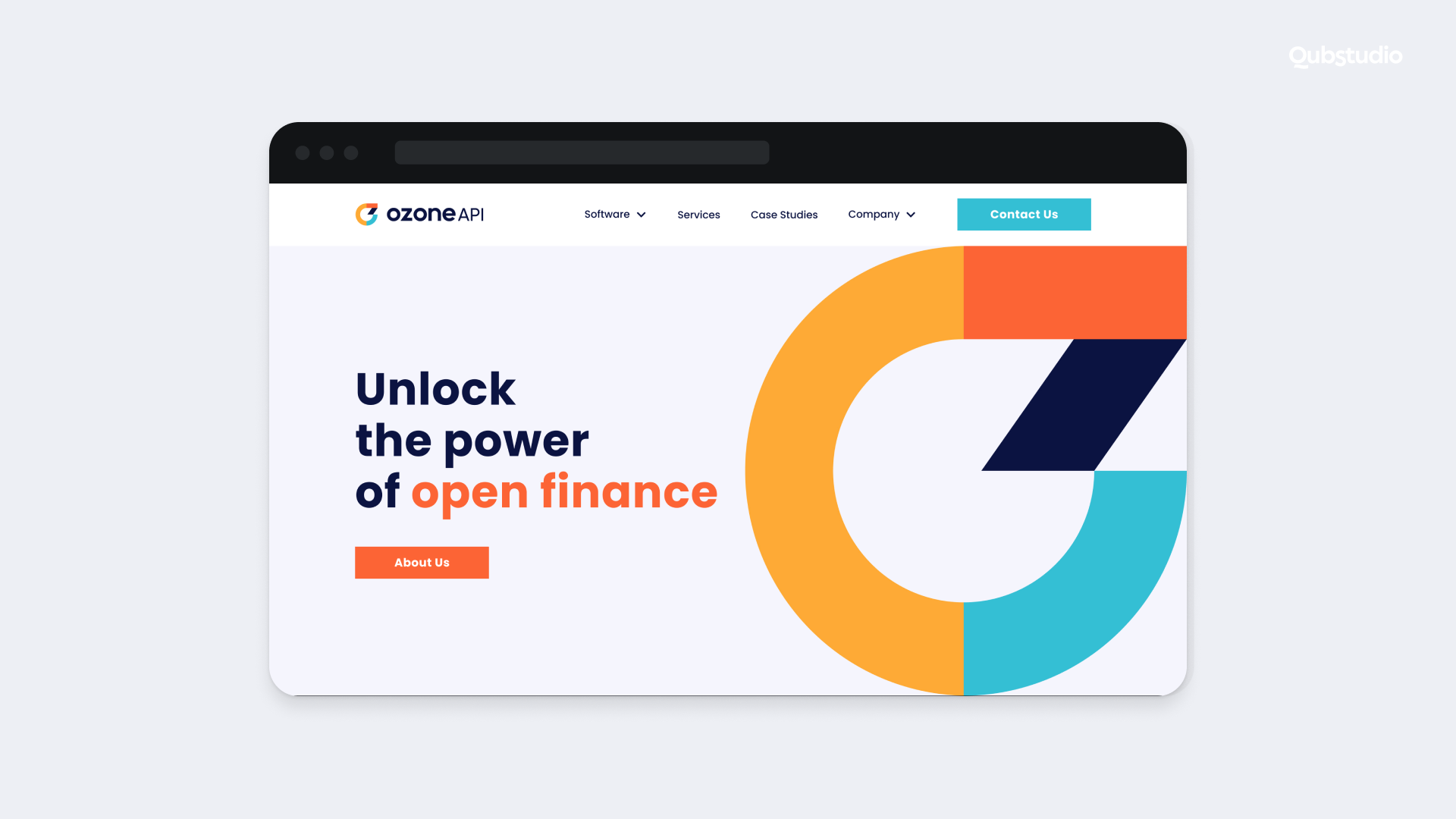
- Ozone API—a FinTech startup that allows banks and financial institutions to take advantage of open banking. We helped this client to develop their brand’s visual identity (including the logo) and create an attractive, customer-centric website.
Overall, we can support your cryptocurrency web design, conduct market and user research, provide consultancy services, audit your existing solution and suggest improvements, and design an interface and user experience for your solution.
Conclusion
The best practices for good crypto web design aren’t much different from those for the UI and UX of any modern website. However, due to the complicated nature of blockchain operations (like performing transactions, buying and selling funds, and trading), achieving the required level of usability, security, and performance is a lot more challenging.
And that’s where our FinTech UX/UI design services come in. Whether it’s a new crypto trading platform, a wallet for your brand-new coin, or an NFT marketplace on your mind, don’t hesitate to reach out to us.
FAQ
How much does it cost to design a crypto website?
There’s no universal cost for a crypto website UI/UX design. The final price will depend on the project’s complexity (graphics and motion effects, for instance). This will affect the technologies used, the professionals involved, and the time spent on implementation. If you need detailed estimations for your project, feel free to contact us.
What is the best color combination for crypto website design?
There’s no ideal color combination for crypto web design—the colors you choose will depend on the use case of your web crypto project and its audience. In general, try to stick to the colors of your brand identity. It’s recommended to go with no more than three colors—a primary one and two additional ones (for accents).
Why is good crypto web design important?
First, blockchain is very different from traditional finance and can appear complicated to those unfamiliar with crypto. A poor user experience can make things even worse, warding off even the most curious users. Second, since any change brings about skepticism, a good UI can help build trust. Third, the majority of crypto holders are millennials and Gen Zers—people used to seamless digital experiences.
